标签:
目录:
特点:
1)可以定义任意数量的行和列
2)行的高度和列的宽度可以使用绝对值、相对比例或自动调整的方式,可设置最大值和最小值
3)内部元素可以设置自己所在的行、列,还可以设置跨越几行、几列
4)可以设置内部元素的对齐方向
Grid类具有ColumnDefinitions和RowDefinitions两个属性,它们分别是ColumnDefinition和RowDefinition的集合,表示Grid定义了多少列、多少行,下面这段代码定义了一个3行4列的表格
    <Grid>
        <Grid.RowDefinitions>
            <RowDefinition Height="*" />
            <RowDefinition Height="20" />
            <RowDefinition Height="*" />
        </Grid.RowDefinitions>
        <Grid.ColumnDefinitions>
            <ColumnDefinition Width="*" />
            <ColumnDefinition Width="30" />
            <ColumnDefinition Width="*" />
            <ColumnDefinition Width="*" />
        </Grid.ColumnDefinitions>
    </Grid>
对于Grid 的行高和列宽,可以设置3类值:
1)绝对值:double数值加单位后缀,默认为像素
2)比例值:double数值后加*
3)自动值:字符串Auto
设置内部控件的起始行用Grid.Row属性,起始列用Grid.Column属性,跨越行使用Grid.RowSpan属性,跨越列使用Grid.ColumnSpan属性
上面代码结果如下

如果希望列宽可以拖动,Grip布局本身是不支持的,需要用Grid布局加上GridSplitter来实现,GridSplitter会改变Grid初始的行高、列宽,代码如下
    <Grid>
        <Grid.RowDefinitions>
            <RowDefinition Height="25"></RowDefinition>
            <RowDefinition></RowDefinition>
        </Grid.RowDefinitions>
        <Grid.ColumnDefinitions>
            <ColumnDefinition Width="150"></ColumnDefinition>
            <ColumnDefinition Width="Auto"></ColumnDefinition>
            <ColumnDefinition></ColumnDefinition>
        </Grid.ColumnDefinitions>
        <TextBox Grid.Row="0" Grid.Column="0" Grid.ColumnSpan="3" BorderBrush="Black" />
        <TextBox Grid.Row="1" Grid.Column="0" BorderBrush="Black" />
        <GridSplitter Grid.Row="1" Grid.Column="1" VerticalAlignment="Stretch" HorizontalAlignment="Center" Width="5" Background="Gray" ShowsPreview="True"></GridSplitter>
        <TextBox Grid.Row="1" Grid.Column="2" BorderBrush="Black" />
    </Grid>

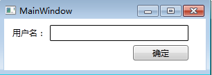
使用Canvas布局与在Windows Form窗体上布局基本上是一样的,当控件放置在Canvas里时附加上Canvas.X和Canvas.Y属性
示例代码:
    <Canvas>
        <TextBlock Text="用户名: " Canvas.Left="12" Canvas.Top="12" />
        <TextBox Height="23" Width="200" BorderBrush="Black" Canvas.Left="66" Canvas.Top="9" />
        <Button Content="确定" Width="80" Height="22" Canvas.Left="186" Canvas.Top="38"></Button>
    </Canvas>
效果如图
DockPanel内的元素会被附加上DockPanel.Dock这个属性,这个属性的数据类型为Dock枚举。Dock枚举可取Left、Top、Right和Bottom四个值,根据Dock的值,DockPanel内的元素会向指定方向累积、切分DockPanel内部剩余的空间,DockPanel的LastChildFill属性,用于设置DockPanel内最后一个元素是否会填充满全部的剩余空间
示例:
    <Grid>
        <DockPanel>
            <TextBox DockPanel.Dock="Top" Height="25" BorderBrush="Black"></TextBox>
            <TextBox DockPanel.Dock="Left" Width="150" BorderBrush="Black"></TextBox>
            <TextBox BorderBrush="Black"></TextBox>
        </DockPanel>
    </Grid>
效果如图:

StackPanel可以把内部元素在纵向或横向上紧凑排列,形成栈式布局
| 属性名称 | 数据类型 | 可取值 | 描述 | ||||
| Orientation | Orientation枚举 |
|
决定内部元素是横向累积还是纵向累积 | ||||
| HorizontalAlignment | HorizontalAlignment枚举 |
|
决定内部元素水平方向上的对齐方式 | ||||
| VerticalAlignment | VerticalAlignment |
|
决定内部元素竖直方向上的对齐方式 |
实例代码
    <Grid>
        <GroupBox Header="请选择没有错别字的成语"  BorderBrush="Black" Margin="5">
            <StackPanel Margin="5" Height="271">
                <CheckBox Content="A.迫不及待" />
                <CheckBox Content="B.首屈一指" />
                <CheckBox Content="C.陈词滥调" />
                <CheckBox Content="D.不可理喻" />
                <StackPanel Orientation="Horizontal" HorizontalAlignment="Right">
                    <Button Content="清空" Width="60" Margin="5" />
                    <Button Content="确定" Width="60" Margin="5" />
                </StackPanel>
            </StackPanel>
        </GroupBox>
    </Grid>
效果如图:

WrapPanel内部采用流式布局,使用orientation属性控制流延伸方向,用HorizontalAlignment和VerticalAlignment两个属性控制内部控件的对齐,例子如下
    <WrapPanel>
        <Button Width="50" Height="50" Content="OK" />
        <Button Width="50" Height="50" Content="OK" />
        <Button Width="50" Height="50" Content="OK" />
        <Button Width="50" Height="50" Content="OK" />
        <Button Width="50" Height="50" Content="OK" />
        <Button Width="50" Height="50" Content="OK" />
        <Button Width="50" Height="50" Content="OK" />
        <Button Width="50" Height="50" Content="OK" />
        <Button Width="50" Height="50" Content="OK" />
        <Button Width="50" Height="50" Content="OK" />
    </WrapPanel>
效果如下,改变窗口大小,内部控件的位置会自动调整

同样的代码,改成垂直布局后的效果

标签:
原文地址:http://www.cnblogs.com/Huaran1chendu/p/5004768.html