标签:
1.响应式布局:
<link rel="stylesheet" href="1.css" media="screen and (min-width:1000px)">
<style>
@media screen and (min-width: 600px) {
.one{
border:1px solid red;
height:100px;
width:100px;
}
}
</style>
and 逻辑与 not only ,设备列表
**这是一个简单的demo*******
<style>
@media screen and (min-width:1024px){
.list{
min-width:1024px;
height:300px;
border:1px solid red;
}
.left{
width:70%;height:100%;float:left;background:blue;
}
.right{
width:30%;height:100%;float:left;background:green;
}
}
@media screen and (max-width:1024px){
.list{
min-width:1024px;
height:300px;
border:1px solid red;
}
.left{
width:100%;height:100%;float:left;background:blue;
}
.right{
display:none;
}
}
</style>
*****************************
2.边框
border-style:solid;
border-width:2px;
border-radius:0;
border-color:red;
********************
box-shadow:2px 2px 5px #000;//x方向的偏移量,y方向的偏移量,阴影的模糊程度,阴影的颜色。
IE8需要做兼容的。
border-image-source:url(border.png);//用在边框图片的路径
border-image-slice:26; //图片边框向内偏移
border-image-width:26;//
border-image-outset:5;//边框图片超出边框的量
border-image-repeat:stretch round;//边框图片应该平铺repeat,铺满round,或拉伸stretch
/********这是利用背景属性的一个轮播图的demo**********/
3.
<script>
window.onload=function () {
var div=document.getElementsByTagName("div")[0];
var positionArr=(getStyle(div,"backgroundPosition")).split(",");
var num=0;
setInterval(function(){
if(num==positionArr.length){
num=0;
}
for (var i=0; i<positionArr.length; i++) {
if(i==num){
positionArr[i]="0 0";
}else{
positionArr[i]="-500px -500px";
}
}
div.style.backgroundPosition=positionArr.join(",");
num++
},3000)
}
function getStyle (obj,attr) {
if(window.getComputedStyle){
return getComputedStyle(obj,null)[attr];
}else{
return obj.currentStyle[attr];
}
}
</script>
<style>
div{
width:200px;height:200px;
background-image:url(1.jpg),url(2.jpg),url(3.jpg);
background-repeat:no-repeat;
background-size:100% 100%,100% 100%,100% 100%;
background-position:0px 0px,-500px -500px,-500px -500px;
}
</style>
</head>
<body>
<div>
</div>
</body>
/*******************/
4.文本模型:
使用文字溢出隐藏 text-overflow 属性: div.test { text-overflow:ellipsis; }
注:该容器必须设置 overflow:hidden
允许对长单词进行拆分,并换行到下一行: p {word-wrap:break-word;}
white-space:nowrap;中文强制不换行
/*简单的demo*/
<style>
div{
width:50px;border:1px solid red;
overflow:hidden;
white-space:nowrap;
text-overflow:ellipsis ;//变为了..
}
div:hover{
overflow:visible;
}
</style>
</head>
<body>
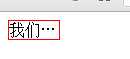
<div>
我们都是祖国的花朵
</div>
</body>
****************************
-webkit-text-fill-color:blue;
-webkit-text-stroke:1px red;//stroke可以理解为边框的意思
-webkit-text-stroke-width:1px;
-webkit-text-stroke-color:pink;
text-shadow: 5px 5px 5px #FF0000;//水平阴影、垂直阴影、模糊距离,以及阴影的颜色
/*这是一个简单的demo*/
<style>
div{
cursor:pointer;font-size:40px;
}
div:hover{
/*text-shadow:1px 1px 3px #000000;*/
}
</style>
<script>
window.onload=function () {
var div=document.getElementsByTagName("div")[0];
var num=0;
var t;
div.onmouseover=function () {
clearInterval(t);
t=setInterval(function(){
num++;
if(num>=5){
clearInterval(t)
}else{
div.style.textShadow=num+"px "+num+"px "+num+"px #333";
}
},60)
}
div.onmouseout=function () {
clearInterval(t);
t=setInterval(function(){
num--;
if(num<=0){
clearInterval(t)
}else{
div.style.textShadow=num+"px "+num+"px "+num+"px #333";
}
},60)
}
}
</script>
</head>
<body>
<div>
这是一首欢快的欢乐颂,哈哈哈,
</div>
5.颜色和渐变
HSL色彩模式是工业界的一种颜色标准,
background:hsla(0,100%,60%,0.5);// 色调,饱和度,亮度,透明度
注意:如果想让背景实现全透明,可以使用,background:transparent
简单的css3线性渐变 有一些版本较低的浏览器需要前缀,最新版本的都不需要加前缀
background: -webkit-linear-gradient(red, blue);
background: -o-linear-gradient(red, blue);
background: -moz-linear-gradient(red, blue);
background: linear-gradient(red, blue);
/* 标准的语法 */ 默认的渐变方向从上到下
从左到右的渐变
background: -webkit-linear-gradient(left, red , blue);
background: -o-linear-gradient(right, red, blue);
background: -moz-linear-gradient(right, red, blue);
background: linear-gradient(to right, red , blue);
/* 标准的语法 */ (从右向左 to left)
从左上角到右下角
background: -webkit-linear-gradient(left top, red , blue);
background: -o-linear-gradient(bottom right, red, blue);
background: -moz-linear-gradient(bottom right, red, blue);
background: linear-gradient(to bottom right, red , blue);
/* 标准的语法 */ (同理 其他对角线) 使用角度
background: -webkit-linear-gradient(40deg, red, blue);
background: -o-linear-gradient(40deg, red, blue);
background: -moz-linear-gradient(40deg, red, blue);
background: linear-gradient(40deg, red, blue);
/* 标准的语法 */
*************************************************************
多个颜色节点的渐变
渐变
background: -webkit-linear-gradient(red, green, blue);
background: -o-linear-gradient(red, green, blue);
background: -moz-linear-gradient(red, green, blue);
background: linear-gradient(red, green, blue);
/* 标准的语法 */ 示例:
彩虹渐变
background: -webkit-linear-gradient(left,red,orange,yellow,green,blue,indigo,violet);
background: -o-linear-gradient(left,red,orange,yellow,green,blue,indigo,violet);
background: -moz-linear-gradient(left,red,orange,yellow,green,blue,indigo,violet);
background: linear-gradient(to right, red,orange,yellow,green,blue,indigo,violet);
/*标准的语法*/
需要定义每种颜色所在的位置可以在颜色后面跟上百分号
background:linear-gradient(to right bottom,red 0%, green 50%, blue 100%);
/*标准的写法*/ 需要使用透明度可以将颜色格式设置为
rgba(255,255,255,0);
重复的线性渐变
background: -webkit-repeating-linear-gradient(red, yellow 10%, green 20%);
background: -o-repeating-linear-gradient(red, yellow 10%, green 20%);
background: -moz-repeating-linear-gradient(red, yellow 10%, green 20%);
background: repeating-linear-gradient(red, yellow 10%, green 20%); /* 标准的语法 */
矢量渐变:
简单的css3径向渐变 颜色结点均匀分布的径向渐变:
background: -webkit-radial-gradient(red, green, blue);
background: -o-radial-gradient(red, green, blue);
background: -moz-radial-gradient(red, green, blue);
background: radial-gradient(red, green, blue);
/* 标准的语法 */ 颜色节点分布不均匀的径向渐变:
background: -webkit-radial-gradient(red 5%, green 15%, blue 60%);
background: -o-radial-gradient(red 5%, green 15%, blue 60%);
background: -moz-radial-gradient(red 5%, green 15%, blue 60%);
background: radial-gradient(red 5%, green 15%, blue 60%);
/* 标准的语法 */
重复的径向渐变
background: -webkit-repeating-radial-gradient(red, yellow 10%, green 15%);
background: -o-repeating-radial-gradient(red, yellow 10%, green 15%);
background: -moz-repeating-radial-gradient(red, yellow 10%, green 15%);
background: repeating-radial-gradient(red, yellow 10%, green 15%); /* 标准的语法 */
**********************************************************
还有一种特殊的文字的渐变:


<style>
div{
font-size:12em;
color:green;
background:-webkit-gradient(linear,0 0,0 bottom,from(red),to(green));
-webkit-background-clip:text;
-webkit-text-fill-color:rgba(0,0,0,0);
}
</style>
</head>
<body>
<div>
莫愁前路无知己,天下谁人不识君
</div>
*********************************************************************
6.列的几个属性:
column-count 规定元素应该被分隔的列数。
column-gap 规定列之间的间隔。
column-rule 设置所有 column-rule-* 属性的简写属性。
column-width 规定列的宽度。
7. resize: none|both|horizontal|vertical; //最后两个属性的意思是,一个表示可以调整的宽度,一个表示可以调整的高度。
8. box-sizing: content-box|border-box|inherit;
9.除了IE剩下都支持
outline:2px solid green;
outline-offset:9px;
10.css3清楚浮动
selector:before,selector:after { content: " "; display: block; } selector:after { clear: both; }
11.
标签:
原文地址:http://www.cnblogs.com/coding4/p/5450228.html