标签:
附上总的代码:
<!DOCTYPE html>
<html>
<head>
<title>立方体</title>
<meta charset="utf-8">
<style type="text/css">
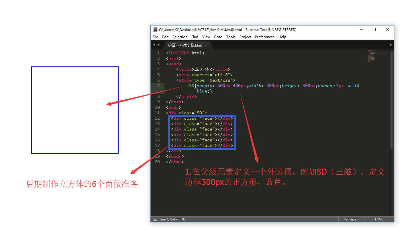
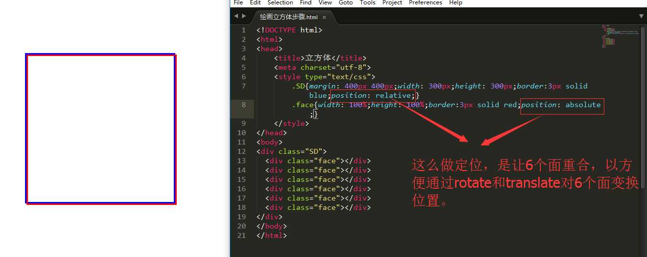
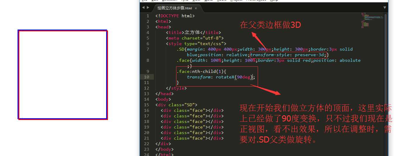
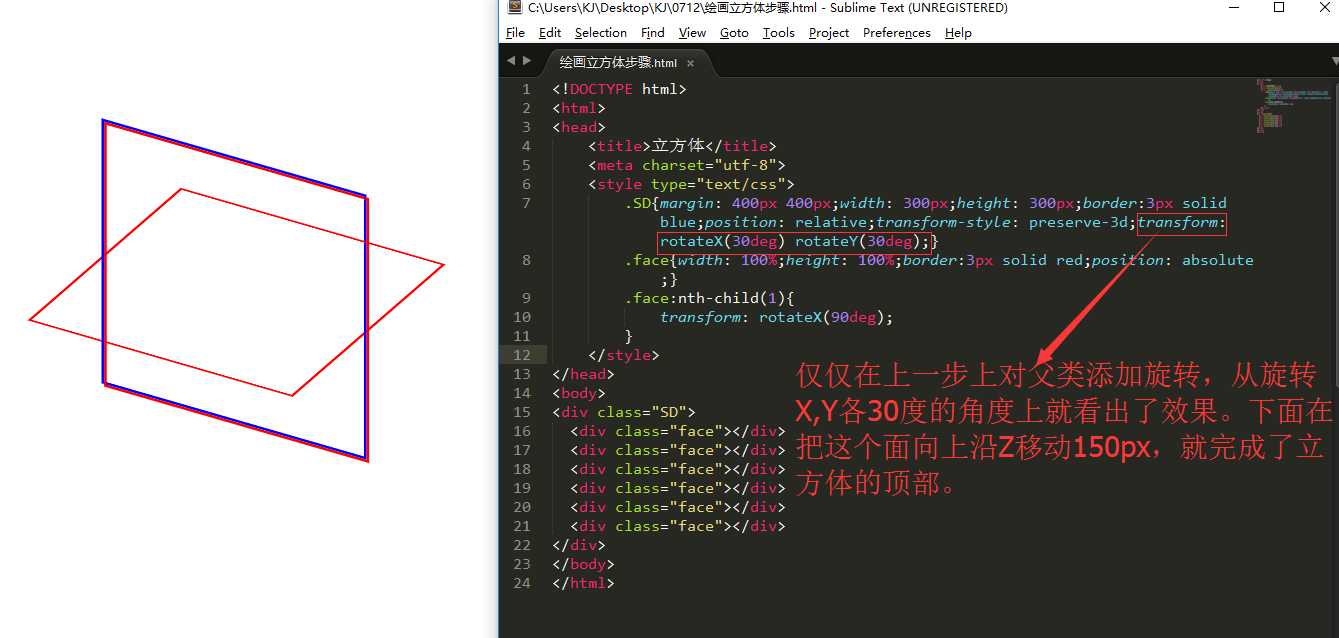
.SD{margin: 400px 400px;width: 300px;height: 300px;position: relative;transform-style: preserve-3d;transform: rotateX(30deg) rotateY(30deg);}
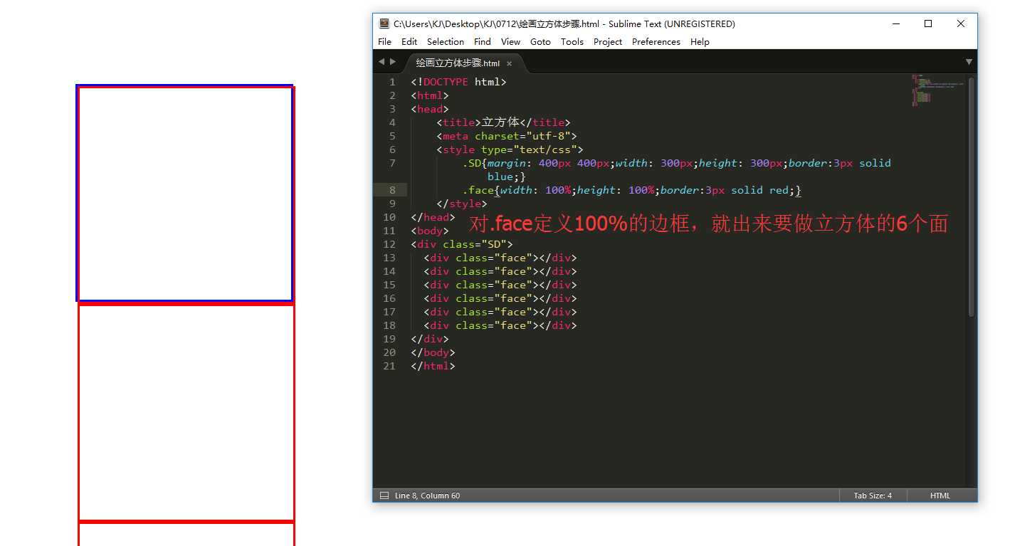
.face{width: 100%;height: 100%;border:3px solid red;position: absolute;}
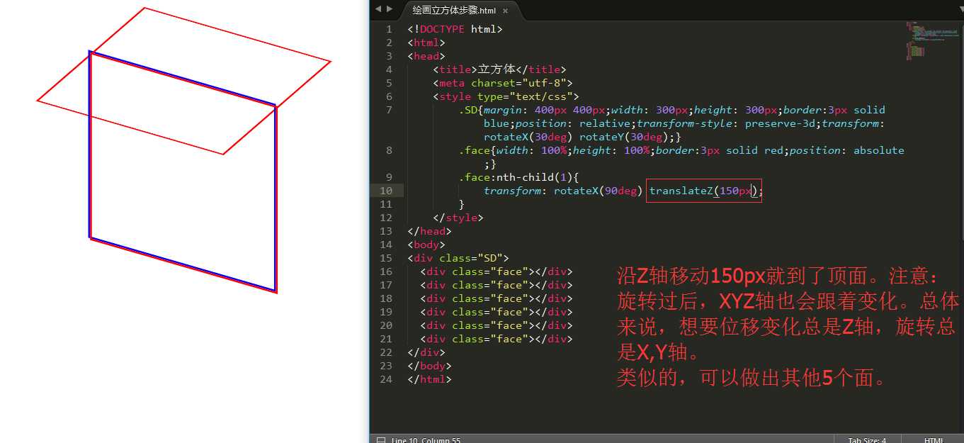
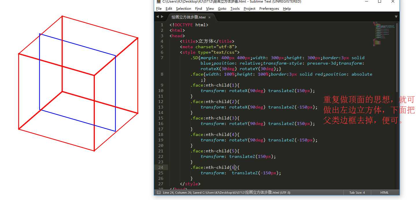
.face:nth-child(1){
transform: rotateX(90deg) translateZ(150px);
}
.face:nth-child(2){
transform: rotateX(90deg) translateZ(-150px);
}
.face:nth-child(3){
transform: rotateY(90deg) translateZ(150px);
}
.face:nth-child(4){
transform: rotateY(90deg) translateZ(-150px);
}
.face:nth-child(5){
transform: translateZ(150px);
}
.face:nth-child(6){
transform: translateZ(-150px);
}
</style>
</head>
<body>
<div class="SD">
<div class="face"></div>
<div class="face"></div>
<div class="face"></div>
<div class="face"></div>
<div class="face"></div>
<div class="face"></div>
</div>
</body>
</html>
标签:
原文地址:http://www.cnblogs.com/KJ-Z/p/5663439.html