标签:
如
<a href="#tab1">tab1</a>
<div id="tab1" class="tab">This is a tab1</div>
:target{
    color:red;
}
但点击a标签的时候,连接到id是tab1的div,对这个div起作用color:red;
如:
<a href="#tab">Test :target</a>
<a href="#tab2">Test 2:target</a>
<div id="tab">This is a tab.</div>
<div id="tab2">This is another tab.</div>
#tab:target{
    color:red;
}
#tab2:target{
    color:blue;
}
结果:
点击第一个a标签时连接到id是tab的div,对这个div起作用color:red;
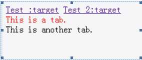
点击第二个a标签时连接到id是tab2的div,不对这个div起作用color:red;
利用target的特性,可以实现纯css的tab效果切换
具体代码:(ie8以及ie8以下实现不了)
<!DOCTYPE html>
<html>
<head>
<meta charset="UTF-8">
<style>
/*public*/
body{
        margin: 0;
        padding: 0;
    }
a {
    color:#98a61a
}
a:hover {
    color:#006acd
}
ul {
    list-style:none
}

 /*样式开始 */
.tablist {
    position:relative;
    margin:200px;                      /*为了效果*/
    width: 632px;                    /*宽度为单个文本框宽度+padding+border*/
    height:200px;                    /*高度为单个文本框高度+padding*/
}
.tabmenu {
    position:absolute;
    top:100%;                        /*标签选项在文本框下面显示*/
    margin:0;
}
.tabmenu li{
    display:inline-block;            /*标签选项并排显示*/
}
.tabmenu li a {
    display:block;
    padding:5px 10px;
    margin:0 10px 0 0;                  /*为了效果    */
    border:1px solid #91a7b4;         /*边框效果    */
    border-radius:0 0 5px 5px;
    -moz-border-radius:0 0 5px 5px;
    -webkit-border-radius:0 0 5px 5px;  /*圆角效果*/
    color:#333;                         /*字体颜色*/
    background:#e3f1f8;                /*背景颜色*/
}
.tab_content {
        position: absolute;
        width:600px;
        height:170px;                    /*大小*/
        padding:15px;                    /*为了效果*/
        border:1px solid #91a7b4;        /*边框效果    */
        border-radius:3px;
        -moz-border-radius:3px;
        -webkit-border-radius:3px;         /*圆角效果*/
        box-shadow:0 2px 3px rgba(0,0,0,0.1);
        -moz-box-shadow:0 2px 3px rgba(0,0,0,0.1);
        -webkit-box-shadow:0 2px 3px rgba(0,0,0,0.1);         /*阴影效果*/
        word-wrap: break-word;                                 /*超出换行*/
        font-size:18px;                    /*字体大小*/
        line-height:27px;
        color:#666;                        /*字体颜色*/
        background:#fff;                /*背景颜色*/
    }

 /*核心代码 */
#tab1:target, #tab2:target, #tab3:target {
    z-index: 1;
}
</style>
</head>
<body>
<div class="tablist" >
    <ul class="tabmenu">
        <li><a href="#tab1">tab1</a></li>
        <li><a href="#tab2">tab2</a></li>
        <li><a href="#tab3">tab3</a></li>
    </ul>
    <div id="tab1" class="tab_content">tab1</div>
    <div id="tab2" class="tab_content">tab2tab2</div>
    <div id="tab3" class="tab_content">tab3tab3tab3</div>
</div>
</body>
</html>
效果图如下:

最关键的代码:
#tab1:target, #tab2:target, #tab3:target {//链接到#tab1,#tab2,#tab3时z-index为 1
        z-index: 1;
}
原理其实很简单,就是把tab元素设为绝对对定位absolute,再通过:target伪类改变它们的层级(z-index)。
先根据target的特性锚链接到对应的div,再根据z-index的属性,改变div的层级关系,从而实现tab的切换效果!
初始z-index:auto,根据target的特性锚链接到对应的div,设置z-index:1;


Tab1按钮
<a href="#tab1">tab1</a>
指向的是

Tab2按钮
<a href="#tab1">tab1</a>
指向的是第二个
Tab3按钮
<a href="#tab1">tab1</a>
指向的是第三个
点击Tab1按钮时z-index值:


知识点:
1. CSS3 :target 选择器(w3school)
定义和用法
URL 带有后面跟有锚名称 #,指向文档内某个具体的元素。这个被链接的元素就是目标元素(target element)。
:target 选择器可用于选取当前活动的目标元素。

例子:
<!DOCTYPE html>
<html>
<head>
<style>
:target
{
border: 2px solid #D4D4D4;
background-color: #e5eecc;
}
</style>
</head>
<body>

<h1>这是标题</h1>

<p><a href="#news1">跳转至内容 1</a></p>
<p><a href="#news2">跳转至内容 2</a></p>

<p>请点击上面的链接,:target 选择器会突出显示当前活动的 HTML 锚。</p>

<p id="news1"><b>内容 1...</b></p>
<p id="news2"><b>内容 2...</b></p>

<p><b>注释:</b> Internet Explorer 8 以及更早的版本不支持 :target 选择器。</p>

</body>
</html>
结果:
当我点击“跳转至内容 1”的时候,变成了这样

延伸知识点:(参考资料CSS3制作手风琴——CSS3 :target的应用)
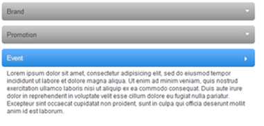
我们可以先来看看今天我们要实现的效果
代码:
<!DOCTYPE html>
<html>
<head>
<meta charset="UTF-8">
<style>
    a {
        color: #424242;
        text-decoration: none;
    }
    .accordionMenu {
        width: 500px;
        font: 12px Arial, Verdana, sans-serif;    /*字体设置*/
        color:#424242;                            /*字体颜色*/
        background: #fff;                        /*背景颜色*/
    }
    .accordionMenu h2 {
        margin:5px 0;                            /*清除样式*/
        position: relative;
    }
    .accordionMenu h2:before {
        content:"";
        border: 5px solid #fff;
        border-color: #fff transparent transparent;
        width: 0;
        height: 0;
        position:absolute;
        right: 10px;
        top: 15px;
    }
    .accordionMenu h2 a {
        font-size: 13px;
        display: block;
        padding:10px;
        background: #8f8f8f;
        background: -moz-linear-gradient( top, #cecece, #8f8f8f);
        background: -webkit-gradient(linear, left top, left bottom, from(#cecece), to(#8f8f8f));
        background: -webkit-linear-gradient( top, #cecece, #8f8f8f);
        background: -o-linear-gradient( top, #cecece, #8f8f8f);     /*css渐变色,下次专门开篇文章介绍*/
        filter: progid:DXImageTransform.Microsoft.gradient(startColorstr=#ffcecece, endColorstr=#ff8f8f8f);
        -ms-filter: "progid:DXImageTransform.Microsoft.gradient(startColorstr=#ffcecece, endColorstr=#f8f8f8f)"; /*针对ie浏览器的css渐变色*/
        -webkit-border-radius: 5px;
        -moz-border-radius: 5px;
        border-radius: 5px;                                /*圆角*/
        text-shadow:2px 2px 2px #aeaeae;
        -webkit-text-shadow:2px 2px 2px #aeaeae;
        -moz-text-shadow:2px 2px 2px #aeaeae;            /*文字阴影,下次专门开篇文章介绍*/
    }
    .accordionMenu :target h2 a,
    .accordionMenu h2 a:focus,
    .accordionMenu h2 a:hover,
    .accordionMenu h2 a:active {
    background: #2288dd;
    background: -moz-linear-gradient( top, #6bb2ff, #2288dd);
    background: -webkit-gradient(linear, left top, left bottom, from(#6bb2ff), to(#2288dd));
    background: -webkit-linear-gradient( top, #6bb2ff, #2288dd);
    background: -o-linear-gradient( top, #6bb2ff, #2288dd);/*css渐变色,下次专门开篇文章介绍*/
    filter: progid:DXImageTransform.Microsoft.gradient(startColorstr=#ff6bb2ff, endColorstr=#ff2288dd);
    -ms-filter: "progid:DXImageTransform.Microsoft.gradient(startColorstr=#ff6bb2ff, endColorstr=#ff2288dd)";
    color:#FFF;
    }

    .accordionMenu p {
        margin:0;/*清除样式*/
        height: 0;
        overflow: hidden;/*初始不显示,所以高度设为0,超出隐藏*/
        -moz-transition: height 0.5s ease-in;
        -webkit-transition: height 0.5s ease-in;
        -o-transition: height 0.5s ease-in;
        transition: height 0.5s ease-in;            /*动画transition,下次专门开篇文章介绍*/
    }
    .accordionMenu :target p {
        overflow: auto;
        height:100px;
    }
    .accordionMenu :target h2:before {
        border-color: transparent transparent transparent #fff;
    }

</style>
</head>
<body>
<div class="accordionMenu">
    <div class="menuSection" id="brand">
        <h2><a href="#brand">Brand</a></h2>
        <p>content for Brand</p>
    </div>
    <div class="menuSection" id="promotion">
        <h2><a href="#promotion">Promotion</a></h2>
        <p>content for promotion</p>
    </div>
    <div class="menuSection" id="event">
        <h2><a href="#event">Event</a></h2>
        <p>content for Event</p>
    </div>
</div>

</body>
</html>
难理解的样式
1.accordionMenu :target p
2.accordionMenu :target h2:before
3.accordionMenu :target h2 a
下面我们来分析一下:
原理:
1.使用了“div.accordionMenu”包装了手风琴所有块;
2.“div.menuSection”包含手风琴每块的标题和主内容
3.把手风琴每块的标题定义为“h2”
4手风琴每块主内容放在了一个“p”中,并与“h2”相邻,当然大家也可以把主内容放置在一个“div”中,容易管理
5.此处最关键的一点是正如前面介绍“target”,我们使用“target”来达到点击展开动画效果,我们每一块需要ID来配合使用,因此我们在手风琴中的每一块中定义了一个ID号,并且在标题中的“<a>”链接的“href”属性链接了相对应块的ID号。
这一步是我们这个教程中最为关键的一步,我们使用了CSS3的伪类“:target”实现点击面板标题时,改变面板主内容“p”的高度。
.accordionMenu :target p {
                overflow: auto;
                height:100px;
 }

第一个a标签点击链接到
<div class="menuSection" id="brand"></div>
也就是这里

要想使brand模块展开的话,改变面板主内容“p”的高度。
可以这样写
# brand:target p {
        overflow: auto;
        height:100px;
    }
第二个a标签点击链接到
<div class="menuSection" id="promotion"></div>
也就是这里

要想使promation模块展开的话,改变面板主内容“p”的高度。
可以这样写
# promation:target p {
        overflow: auto;
        height:100px;
    }
第三个a标签点击链接到
<div class="menuSection" id="event"></div>

要想使Event模块展开的话,改变面板主内容“p”的高度。
可以这样写
#Event:target p {
        overflow: auto;
        height:100px;
}
这三个样式的的内容是一样的,
可以用他们的父元素:target p来设置样式以优化代码
得到:
.accordionMenu :target p {
        overflow: auto;
        height:100px;
}
2. 超链接
(1) 伪类(参考资料:CSS中伪类及伪元素用法详解)
link 适用于未被用户访问过的链接(只有超链接才会有)
visited适用于已被用户访问过的链接(只有超链接才会有)
hover 适用于光标(鼠标指针)置于其上的连接(可以应用于任何元素)
active 适用于被点击过的连接(可以应用于任何元素)
注意:
在使用超链接的伪类的时候,需要按照link->visited->hover->active的顺序来定义。
1):active 适用于一个元素被激活时的样式,例如鼠标在此元素的区域内按下但还没有释放时
所有主流浏览器都支持 :active 伪类。
<!DOCTYPE html>
<html>
<head>
<meta charset="UTF-8">
<style>
#box{
    width:100px;
    height:100px;
    background:blue;
}
#box:active{
    background:red;
}
</style>
</head>
<body>
<div id="box"></div>
</body>
</html>
结果:

解释:鼠标松开是指针样式,又变回蓝色。
小结:
1.一般a:active样式效果是瞬间效果观察不了,所以使用时候可以不用设置。同时超链接默认情况下是自动加下划线的,如果要去掉或再增加下划线可以设置css text-decoration 。
2.最常见的例子就是在 HTML 文档中点击一个超链接:在鼠标按钮按下期间,这个链接是激活的。
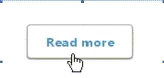
正如之前所说的:active经常用在按钮的点击上:
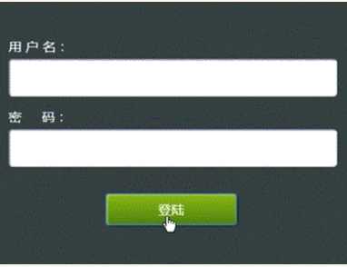
大致写法就是:在点击之后让按钮的坐标下移1-2像素并缩小外部阴影,由此给人一种立体的感觉。
大致的效果:

代码:
<!DOCTYPE html>
<html>
<head>
<meta charset="UTF-8">
<style>
body{
    margin:0;
    padding:0;
}
#box{
    width:100px;
    height:50px;
    margin:0 auto;
    line-height:50px;                    /*字水平垂直居中*/
    text-align:center;                    /*字水平垂直居中*/
    background:#56a1e4;                    /*背景颜色*/
    border:1px solid #569AD7;            /*边框颜色*/
    color:#fff;
    border-radius:8px;
    -moz-border-radius:8px;
    -webkit-border-radius:8px;            /*圆角*/
    box-shadow:0 0 8px #204080;
    -moz-box-shadow:0 0 8px #204080;
    -webkit-box-shadow:0 0 8px #204080;    /*阴影*/
    cursor: pointer;
}
#box:hover {
    background:#4891dd;                    /*hover背景颜色*/
    border:1px solid #4A90D9;            /*hover边框颜色*/
}
#box:active{
    background: #08c;                    /*激活时背景颜色*/
    border:1px solid #0389CD;            /*激活时背景颜色*/
    box-shadow:0 0 3px #204080;
    -moz-box-shadow:0 0 3px #204080;
    -webkit-box-shadow:0 0 3px #204080;    /*激活时阴影*/
    margin-top:2px;
}
</style>
</head>
<body>
<div style="height:100px;"></div>
<div id="box">登录</div>
</body>
</html>
2)当我们需要对某一对象添加当鼠标悬浮之上时改变样式,就可以用到:hover伪类。
这里还是用按钮来做演示:
1.当光标放在按钮上,按钮的背景色和文字颜色做一反色并加上渐变
2. :hover的好搭档cursor属性,当属性值为pointer时,光标覆盖目标时会变成手型。
3.cursor还有url属性,其为设置图片地址。在之后用javascript或者HTML5做游戏时,系统的光标就显得格格不入了。这里可以通过cursor将光标变成你想要的手型图片,比如这样的: 此时cursor属性可以放在全局body{}里或者任何你需要的地方。
举个例子:
鼠标图案为
<!DOCTYPE html>
<html>
<head>
<meta charset="UTF-8">
<style>
#box{
    width:100px;
    height:100px;
    background:blue;
}
#box:active{
    background:red;
}
#box:hover{
    cursor:url("mfb.gif"),pointer
}
</style>
</head>
<body>
<div id="box"></div>
</body>
</html>
效果图:

延伸:
反色效果:invert滤镜(ie11无效)
invert滤镜就是为了设置元素的反色效果,他的值设置范围为:0-100%,100%为完
转以后的效果。
我们看到Invert属性实际上达到的是一种“底片”的效果
invert:反色
语法:
STYLE="filter:Invert"
【反色】
style="filter:Invert"
图片反色代码例子:
<!DOCTYPE html>
<html>
<head>
<meta charset="UTF-8">
<style>
 .inverted {
    filter: invert(100%);
    -webkit-filter:invert(100%);
    -moz-filter:invert(100%);
    -ms-filter:invert(100%);
    -o-filter:invert(100%);
}
</style>
</head>
<body>
<p>原图</p>
<img src="kitty.jpeg" width="100" height="150">
<p>反转色图</p>
<img src="kitty.jpeg" width="100" height="150" class="inverted" alt="反转色图">
</script>
</body>
</html>
效果图:

样式背景反色:
<!DOCTYPE html>
<html>
<head>
<meta charset="UTF-8">
<style>
#box{
    width:100px;
    height:100px;
    background:#FFB8B4;
}
#box:hover{
    filter: invert(100%);
    -webkit-filter:invert(100%);
    -moz-filter:invert(100%);
    -ms-filter:invert(100%);
    -o-filter:invert(100%);
}

</style>
</head>
<body>
<div id="box"></div>
</body>
</html>
效果图:

cursor:(cursor的样式可以参照学习mdn技术文档)
3) :focus
当我们需要让点击之后的元素一直拥有某些样式,这时用:active就不行了,因为松开鼠标样式会消失。:focus可以用在<input>标签上。
(2) href(参考资料:超链接的那些事(二))
定义
href 属性用于指定超链接目标的 URL。
用法
①. 锚点
同一页面添加锚点
(1)<a href="#test">连接到本页面的锚的超链接</a> //点击的连接
(2)<a name="test">锚</a> //放到要跳转内容的地方
跨页面添加锚点
(1)在test2.html创建锚<a name="test">锚</a>
(2)在test1.html设置好连接<a href="test2.html#test">连接到另外页面的锚的超链接</a>
②. 下载
<a href="download.rar"></a>
href中的url需要有效,文件最好是rar格式
<a href="tel:电话号码"></a>
邮箱标签: mailto
属 性: cc: 抄送
bcc: 暗抄
subject:主题
body:邮箱内容
常规
<a href="mailto: xxx@xx.com"></a>
利用逗号(,) 多地址发送
<a href="mailto: xxx@xx.com, xxx@xx.com"></a>
利用属性
<a href="mailto: xxx@xx.com?cc=xxx@xx.com&bcc=xxx@xx.com&subject=主题&body=内容"></a>
⑤. Javascript
直接调用javascript
<a href="javascript: function_name()"></a>
W3C标准不推荐在href里面执行javascript语句.这种方法在传递this等参数的时候很容易出问题,而且javascript:协议作为a的href属性的时候不仅会导致不必要的触发window.onbeforeunload事件,在IE里面更会使gif动画图片停止播放。
使用void, ::, undefined, 配合onclick
 <a href="javascript::" onclick="function_name()"></a>

  <a href="javascript:void(0)" onclick="function_name()"></a>

  <a href="javascript:undefined" onclick="function_name()"></a>
最常用的方法,也是最周全的方法,地址不发生跳转,不会在地址栏暴露Js方法
‘#‘和onclick
<a href="#" onclick="function_name()"></a>
‘#‘是标签内置的一个方法,代表top的作用,所以执行方法后返回页面最顶端。
<a href="#" onclick="function_name(); return false;"></a>
执行‘return false‘后,页面不发生跳转,页面停留在当前位置。
3.border-radius,box-shadow 注意下写法,具体看代码
4.word-wrap: break-word; /*超出换行*/
注意:本文为原创,转载请以链接形式标明本文地址 ,谢谢合作。
本文地址:http://www.cnblogs.com/wanghuih/p/5669937.html
标签:
原文地址:http://www.cnblogs.com/wanghuih/p/5669937.html