标签:
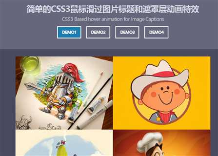
这是一款使用CSS3制作的简单的鼠标滑过图片标题和遮罩层动画特效。该鼠标滑过特效通过 CSS3transitions 和 transform 属性,在鼠标滑过图片时制作遮罩层和图片标题动画效果。
该鼠标滑过图片特效的HTML结构非常简单:使用一个<div>元素作为图片遮罩层,在里面放置图片的描述信息。
|
1
2
3
4
5
6
7
8
|
<img src="img/01.jpg" alt=""><div class="caption"> <div class="blur"></div> <div class="caption-text"> <h1>图片标题</h1> <p>描述信息</p> </div></div> |
第一个DEMO使用透明度opacity属性来制作遮罩层的导入效果,并通过transition来制作平滑过渡动画。
|
1
2
3
4
5
6
7
8
9
10
11
12
13
14
15
16
17
18
19
20
21
22
23
24
25
26
27
28
29
30
31
32
33
34
35
36
37
38
39
40
41
42
43
44
45
46
47
48
49
50
51
|
.caption-style-1 li{ float: left; padding: 0px; position: relative; overflow: hidden;}.caption-style-1 li:hover .caption{ opacity: 1;}.caption-style-1 img{ margin: 0px; padding: 0px; float: left; z-index: 4;}.caption-style-1 .caption{ cursor: pointer; position: absolute; opacity: 0; -webkit-transition:all 0.45s ease-in-out; -moz-transition:all 0.45s ease-in-out; -o-transition:all 0.45s ease-in-out; -ms-transition:all 0.45s ease-in-out; transition:all 0.45s ease-in-out;}.caption-style-1 .blur{ background-color: rgba(0,0,0,0.65); height: 300px; width: 400px; z-index: 5; position: absolute;}.caption-style-1 .caption-text h1{ text-transform: uppercase; font-size: 24px;}.caption-style-1 .caption-text{ z-index: 10; color: #fff; position: absolute; width: 400px; height: 300px; text-align: center; top:100px;} |
其它效果的制作也非常简单,具体请参考下载的源文件。
标签:
原文地址:http://www.cnblogs.com/AnotherLife/p/5764232.html