标签:
作者:ly婠婠
出处:http://www.cnblogs.com/46ly/
一、2D变换
1、transform 设置或检索对象的转换
取值:
none::以一个含六值的(a,b,c,d,e,f)变换矩阵的形式指定一个2D变换,相当于直接应用一个[a,b,c,d,e,f]变换矩阵
translate(<length>[, <length>])。第一个参数对应X轴,第二个参数对应Y轴。如果第二个参数未提供,则默认值为0。
translateX(<length>):指定对象X轴(水平方向)的平移
translateY(<length>):指定对象Y轴(垂直方向)的平移
rotate(<angle>):指定对象的2D rotation(2D旋转)。第一个参数对应X轴,第二个参数对应Y轴。如果第二个参数未提供,则默认取第一个参数的值
scaleX(<number>):指定对象X轴的(水平方向)缩放
scaleY(<number>):指定对象Y轴的(垂直方向)缩放
skew(<angle> [, <angle>]):指定对象skew transformation(斜切扭曲)。第一个参数对应X轴,第二个参数对应Y轴。如果第二个参数未提供,则默认值为0 skewX(<angle>):指定对象X轴的(水平方向)扭曲
skewY(<angle>):指定对象Y轴的(垂直方向)扭曲
注:不同浏览器需写以下前缀。
| 内核类型 | 写法 |
|---|---|
| Webkit(Chrome/Safari) | -webkit-transform |
| Gecko(Firefox) | -moz-transform |
| Presto(Opera) | -o-transform |
| Trident(IE) | -ms-transform |
| W3C | transform |
例子:
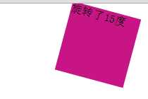
CSS代码:

      #transform1
        {
            margin: 0 auto;
            width: 100px;
            height: 100px;
            background-color: mediumvioletred;
            -webkit-transform: rotate(15deg);
         }
HTML代码:
<div id="transform1">旋转了15度</div>
2、transform-origin 设置或检索对象以某个原点进行转换。
取值:
<percentage>:用百分比指定坐标值。可以为负值。
<length>:用长度值指定坐标值。可以为负值。
left:指定原点的横坐标为leftcenter①:指定原点的横坐标为
centerright:指定原点的横坐标为
righttop:指定原点的纵坐标为
topcenter②:指定原点的纵坐标为
centerbottom:指定原点的纵坐标为bottom
不同浏览器下的写法:
| 内核类型 | 写法 |
|---|---|
| Webkit(Chrome/Safari) | -webkit-transform-origin |
| Gecko(Firefox) | -moz-transform-origin |
| Presto(Opera) | -o-transform-origin |
| Trident(IE) | -ms-transform-origin |
| W3C | transform-origin |
例子:
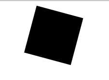
CSS代码:
        #transform1
        {
            margin: 0 auto;
            width: 100px;
            height: 100px;
            background-color: mediumvioletred;
            -webkit-transform: rotate(15deg);/*旋转15度*/
            -webkit-transform-origin: left center; /*以左上角为原点旋转*/
        }
HTML代码:
<div id="transform1"></div>
二、过渡样式
1、transition-property 检索或设置对象中的参与过渡的属性。
取值:
         #transform1
        {
            margin: 0 auto;
            width: 100px;
            height: 100px;
            background-color: red;
            transition-property: background-color;

        }
        #transform1:hover
        {
            transition-duration:.5s;
            transition-timing-function:ease-in;
            background-color: yellow;
        }
<div id="transform1">请将鼠标放在上面</div>
        #delay1
        {
            background-color: antiquewhite;
            width:100px;
            height:100px;
        }
        #delay1:hover
        {
            transition-duration:1s;
            transition-timing-function:ease-in;
            background-color: black;
        }
        #delay2
        {
            background-color: antiquewhite;
            width:100px;
            height:100px;
        }
        #delay2:hover
        {
            transition-duration:4s;
            transition-timing-function:ease-in;
            background-color: blue;
        }
<div id="delay1">延迟1s后开始过渡</div>
<div id="delay2">延迟4s后开始过渡</div>
        #all
        {
            width: 100px;
            height: 100px;
            background-color: red;
        }
        #all:hover
        {
            background-color: yellow;
            transition-delay: .5s;
            transition-timing-function: ease-in;
            transform: scale(1.5,1.5);
            transition-duration: 1s;
        }
<div id="all">请把鼠标放在上面查看效果</div>