标签:border .sh 三角形 ott 绘制 images text parent abs
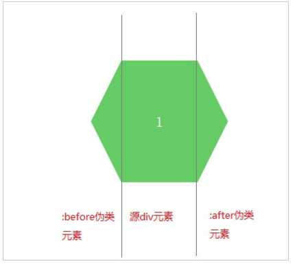
六边形思路:使用CSS3绘制六边形主要使用伪类:before和:after在源元素之前和之后再绘制两个元素,并利用css3的边框样式,将这两个元素变成三角形放置在源元素的两端即可。
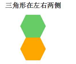
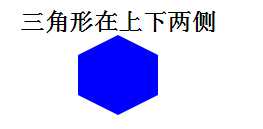
<h2>三角形在左右两侧</h2>
<!-- 第一种方法 不兼容低版本浏览器 -->
   <div class="hexagon1"></div>
   <!-- 第二种方法  兼容低版本浏览器 -->
   <div class="hexagon2">
        <div class="left"></div>
        <div class="right"></div>
   </div>

    <h2>三角形在上下两侧</h2>
    <div class="hexagon3"></div>
.hexagon1{
        width: 50px;
        height: 80px;
        background-color:#6c6 ;
        position: relative;
        margin:0 auto;
    }
    .hexagon1::before{
        width: 0;
        height: 0;
        content: ‘‘;
        position: absolute;
        top: 0;
        left:-20px;
        border-right: 20px solid #6c6;
        border-top:40px solid transparent;
        border-bottom:40px solid transparent;
    }
    .hexagon1::after{
        width: 0;
        height: 0;
        content: ‘‘;
        position: absolute;
        top: 0;
        right:-20px;
        border-left: 20px solid #6c6;
        border-top:40px solid transparent;
        border-bottom:40px solid transparent;
    }

    .hexagon2{
        width: 50px;
        height: 80px;
        background-color:orange ;
        position: relative;
        margin:0 auto;
    }
      .hexagon2 .left{
        width: 0;
        height: 0;
        position: absolute;
        left: -20px;
        top: 0;
        border-right: 20px solid orange;
        border-top: 40px solid transparent;
        border-bottom: 40px solid transparent;
      }
      .hexagon2 .right{
        width: 0;
        height: 0;
        position: absolute;
        right: -20px;
        top: 0;
        border-left: 20px solid orange;
        border-top: 40px solid transparent;
        border-bottom: 40px solid transparent;
      }

      /*三角形在上下侧*/
      .hexagon3{
        width: 80px;
        height: 40px;
        background-color: blue;
        margin:0 auto;
        position: relative;
      }
      .hexagon3::before{
        width: 0;
        height: 0;
        content: ‘‘;
        position: absolute;
        top: -20px;
        left: 0;
        border-bottom: 20px solid blue;
        border-left: 40px solid transparent;
        border-right: 40px solid transparent;
      }
      .hexagon3::after{
        width: 0;
        height: 0;
        content: ‘‘;
        position: absolute;
        bottom: -20px;
        left: 0;
        border-top: 20px solid blue;
        border-left: 40px solid transparent;
        border-right: 40px solid transparent;
      }
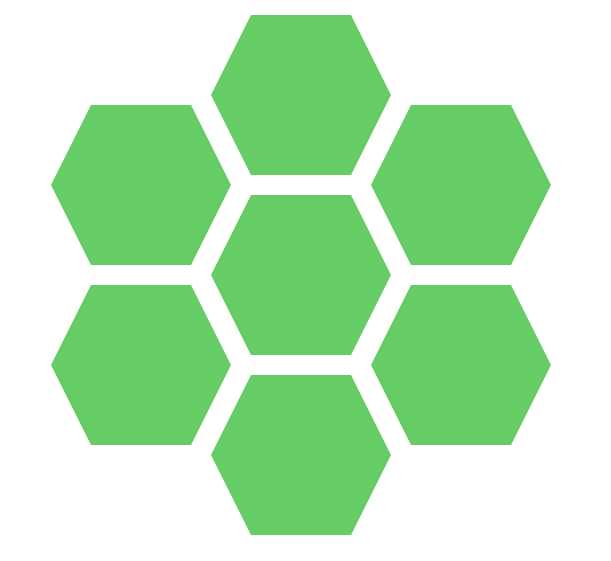
.sharp:before{
         content:"";
         width:0px;
         border-bottom:80px solid transparent;
         border-top:80px solid transparent;
         border-right:40px solid #6c6;
         position:absolute;
         left:-40px;
         top:0px;
     }
     .sharp{
         min-width:100px;
         height:160px;
         background:#6c6;
         display: inline-block;
         position: absolute;
         line-height: 160px;
         color:#FFFFFF;
         font-size: 20px;
         text-align: center;
     }
     .sharp:after{
         content:"";
         width:0px;
         border-bottom:80px solid transparent;
         border-top:80px solid transparent;
         border-left:40px solid #6c6;
         position:absolute;
         right:-40px;
         top:0px;
     }
        #sharpContainer{
            width:100%;
            height: 600px;
        }
        #sharpContainer .center{
            top:200px;
            left:300px;
        }
         #sharpContainer .top{
             top:20px;
             left:300px;
         }
         #sharpContainer .top-left{
             top:110px;
             left:140px;
         }
         #sharpContainer .top-right{
             top:110px;
             left:460px;
         }
         #sharpContainer .bottom{
             top:380px;
             left:300px;
         }
         #sharpContainer .bottom-left{
             top:290px;
             left:140px;
         }
         #sharpContainer .bottom-right{
             top:290px;
             left:460px;
         }
<div id="sharpContainer">
    <div class="sharp center"></div>
    <div class="sharp top"></div>
    <div class="sharp top-left"></div>
    <div class="sharp top-right"></div>
    <div class="sharp bottom"></div>
    <div class="sharp bottom-left"></div>
    <div class="sharp bottom-right"></div>
</div>
标签:border .sh 三角形 ott 绘制 images text parent abs
原文地址:http://www.cnblogs.com/coldfishdt/p/6204156.html