标签:自己的 定义 多少 n+1 translate 负数 ansi second 缩小
1.transition
语法:transition: property duration timing-function delay;
transition-property 设置过渡效果的css 属性名称
语法: transition-property: none | all | property
none 没有属性会获得过度效果
all 所有属性都将获得过度效果。
property 定义应用过度效果css 属性名称列表,列表以逗号分割。
indent 元素属性名称
transition-duration 完成过度效果需要多少秒或者毫秒
语法:transition-duration:time;
time 规定完成过渡效果需要的花费的时间。默认值是0, 意味着不会有效果
transition-timing-function 规定速度效果的速度曲线。
语法: transition-timing-function: linear|ease|ease-in|ease-out|ease-in-out|cubic-bezier(n,n,n,n);
linear 规定以相同速度开始至结束的过度效果。
ease 规定慢速度开始,然后边快,然后慢速度结束。
ease-in 规定以慢速度开始的过度效果。
ease-out 规定以慢速度结束的过度效果。
ease-in-out 规定以慢速度开始和结束的过渡效果。
cubic-bezier(n,n,n,n) 在cubic-bezier中定义自己的值,可能的值是0至1之间的数值。
transition-delay 定义过度效果何时开始
语法:transititon-delay: time;
time 规定在过渡效果开始之前需要等待的时间。
示例:
<style>
.box{width:100px;height:100px;background:red; transition:width 1s ;}
.box:hover{ background:blue;width:300px;height:150px;}
</style>
<div class="box"></div>
结果:如图
示例:(贝塞尔曲线)
<style>
.box{width:100px;height:100px;background:red; transition:5swidth cubic-bezier(0.145,1.295,0.000,1.610);}
.box:hover{width:500px;}
</style>
<div class="box"></div>
结果:如图

示例:(多种变化一起写)
<style>
.box{width:100px;height:100px;background:red; transition:1swidth,2s height,3s background;}
.box:hover{width:300px;height:150px;background:blue;}
</style>
<div class="box"></div>
结果:如图
2.transform
字母上就是变形,改变的意思,在css3中transform主要包括一下几种,旋转rotate,扭曲skew,缩放scale和移动translate 以及矩阵变形matrix
语法:transform : none | <transform-function> [ <transform-function> ]*
也就是: transform: rotate | scale | skew | translate |matrix;
none表示不进怎么变换;<transform=function>表示一个或者多个变换函数,以空格分开;
rotate,scale,translate 三种,但这里需要提醒大家的,以往我们叠加效果都是用逗号(“,”)隔开,
但transform中使用多个属性时却需要有空格隔开。大家记住了是空格隔开。
旋转rotate
通过指定的角度参数对原元素指定一个2D rotation(2D 旋转),需先有transform-origin属性的定义。
transform-origin定义的是旋转的基点,其中angle是指旋转角度
如果设置的值为正数表示顺时针旋转,如果设置的值为负数,则表示逆时针旋转。
如:transform:rotate(30deg):
移动translate
移动translate我们分为三种情况:translate(x,y)水平方向和垂直方向同时移动(也就是X轴和Y轴同时移动);translateX(x)仅水平方向移动(X轴移动translateY(Y)仅垂直方向移动(Y轴移动)
缩放scale
缩放scale和移动translate是极其相似,他也具有三种情况:scale(x,y)使元素水平方向和垂直方向同时缩放(也就是X轴和Y轴同时缩放);scaleX(x)元素仅水平方向缩放(X轴缩放);
scaleY(y)元素仅垂直方向缩放(Y轴缩放),但它们具有相同的缩放中心点和基数,
其中心点就是元素的中心位置,缩放基数为1,如果其值大于1元素就放大,反之其值小于1,元素缩小。
扭曲skew
扭曲skew和translate,secale skew(x,y)使元素在水平和垂直方向同时扭曲(X轴和Y轴同时按一定的角度值进行扭曲变形);skewX(x)仅使元素在水平方向扭曲变形(X轴扭曲变形);
skewY(y)仅使元素在垂直方向扭曲变形(Y轴扭曲变形)
矩阵matrix
matrix(<number>, <number>, <number>, <number>, <number>,
<number>) 以一个含六值的(a,b,c,d,e,f)
变换矩阵的形式指定一个2D变换,相当于直接应用一个[a b c d e f]变换矩阵。就是基于水平方向(X轴)和垂
直方向(Y轴)重新定位元素,改变元素的基点 transform-origin他的主要作用就是让我们在进行transform动作之前可以改变元素的基点位置,
因为我们元素默认基点就是其中心位置,换句话说我们没有使用transform-origin改变元素基点位置的情况下,
transform进行的rotate,translate,scale,skew,matrix等操作都是以元素自己中心位置进行变化的。
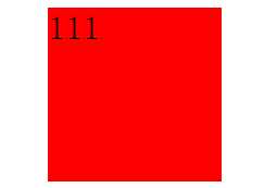
示例: (旋转)
<style>
.box{width:100px;height:100px;background:red;margin:100px auto 0; transition:2s;}
.box:hover { -webkit-transform:rotate(45deg);}
</style>
<div class="box">111</div>
结果:如图
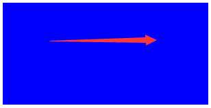
示例:(位移)
<style>
.box{width:100px;height:100px;background:red;margin:100px auto 0; transition:2s;}
.box:hover{-webkit-transform:translate(-100px,200px);}
</style>
<div class="box">111</div>
结果:元素的位置发生变化。
示例:(缩放)
<style>
.box{width:100px;height:100px;background:red;margin:100px auto 0; transition:2s;}
.box:hover{webkit-transform:scale(2);}
</style>
<div class="box">111</div>
结果:如图
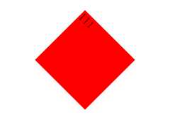
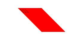
示例:(扭曲)
<style>
.box{width:80px;height:80px;background:red;margin:100px auto 0; transition:2s;}
.box:hover{-webkit-transform:skewX(45deg);}
</style>
<div class="box">111</div>
结果:如图
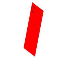
示例:(矩阵)
<style>
.box{width:80px;height:80px;background:red;margin:100px auto 0; transition:2s;}
.box:hover{-webkit-transform:matrix(0.5,0.38,-0.38,2,0,0);}
</style>
<div class="box">111</div>
结果:如图
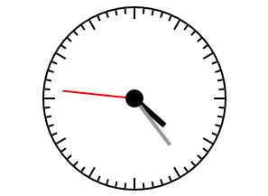
demo 示例:
<style id="css">
#wrap{width:200px;height:200px;border:2px solid #000; margin:100px auto; border-radius:50%; position:relative;}
#wrap ul{margin:0;padding:0;height:200px; position:relative; list-style:none;}
#wrap ul li{ width:2px;height:6px;background:#000; position:absolute;left:99px;top:0; -webkit-transform-origin:center 100px;}
#wrap ul li:nth-of-type(5n+1){ height:12px;}
#hour{width:6px;height:45px;background:#000; position:absolute;left:97px;top:55px;-webkit-transform-origin:bottom;}
#min{width:4px;height:65px;background:#999; position:absolute;left:98px;top:35px;-webkit-transform-origin:bottom;}
#sec{width:2px;height:80px;background:red; position:absolute;left:99px;top:20px;-webkit-transform-origin:bottom;}
.ico{width:20px;height:20px;background:#000; border-radius:50%; position:absolute;left:90px;top:90px;}
</style>
<div id="wrap">
<ul id="list">
</ul>
<div id="hour"></div>
<div id="min"></div>
<div id="sec"></div>
<div class="ico"></div>
</div>
<script>
var oList=document.getElementById("list");
var oCss=document.getElementById("css");
var oHour=document.getElementById("hour");
var oMin=document.getElementById("min");
var oSec=document.getElementById("sec");
var aLi="";
var sCss="";
for(var i=0;i<60;i++)
{
sCss+="#wrap ul li:nth-of-type("+(i+1)+"){ -webkit-transform:rotate("+i*6+"deg);}";
aLi+="<li></li>"
}
oList.innerHTML=aLi;
oCss.innerHTML+=sCss;
toTime();
setInterval(toTime,1000);
function toTime()
{
var oDate=new Date();
var iSec=oDate.getSeconds();
var iMin=oDate.getMinutes()+iSec/60;
var iHour=oDate.getHours()+iMin/60;
oSec.style.WebkitTransform="rotate("+iSec*6+"deg)";
oMin.style.WebkitTransform="rotate("+iMin*6+"deg)";
oHour.style.WebkitTransform="rotate("+iHour*30+"deg)";
};
</script>
结果:如图
标签:自己的 定义 多少 n+1 translate 负数 ansi second 缩小
原文地址:http://www.cnblogs.com/nmxs/p/6378977.html