标签:bcd cte png sse hot button linear orm top
之前不会用blend,感觉好难的,但美工给出的效果自己有没办法实现,所以研究了一下blend,感觉没有想象中的那么难
废话不多说,开始界面设计
今天拿到美工给的一个界面效果图
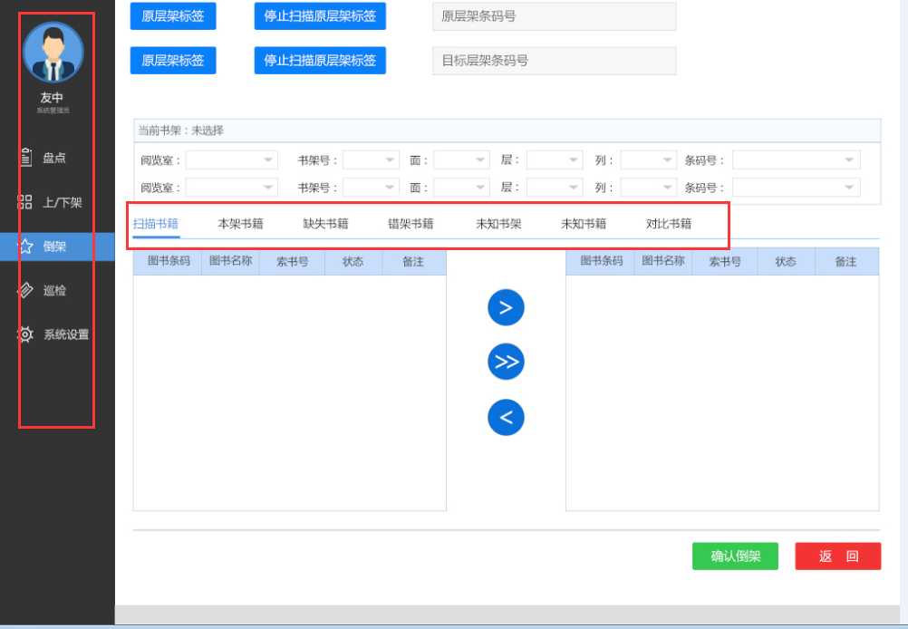
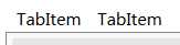
这个界面说实话,还可以吧,勉强说得过去。拿到界面效果图,难的两个部分都让我框起来的,这一看就是wpf里面的控件TabControl美化而来,其他部分都是很好弄得,这一篇我们下来美化一个tabControl控件。如下图:

这里我们借助vs 2015 自带的blend,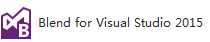 ,这个软件安装vs2015就会默认安装上。
我们来新建一个wpf项目,然后在里面修改这个控件
这是我的blend for vs2015
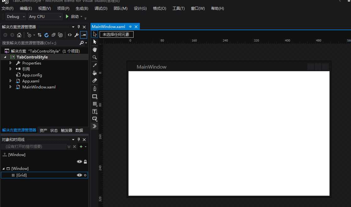
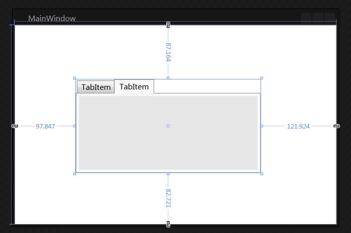
根据图中的标识,我们拖拽一个TabControl控件到界面上去,然后调整好大小,如下图:
接下来我们就拿它开刀吧
首先分析,明显的TabItem部分不符合我们的要求,这样我们就编辑这部分样式即可
这样我们可以看到代码会变为如下

 1 <Grid>
 2         <TabControl x:Name="tabControl" Margin="97.847,87.164,121.924,82.721">
 3             <TabItem Header="TabItem" Style="{DynamicResource TabItemStyle1}">
 4                 <Grid Background="#FFE5E5E5"/>
 5             </TabItem>
 6             <TabItem Header="TabItem" Style="{DynamicResource TabItemStyle1}">
 7                 <Grid Background="#FFE5E5E5"/>
 8             </TabItem>
 9         </TabControl>
10
11     </Grid>
后面的一个样式是我后加上去的,这样方便查看效果
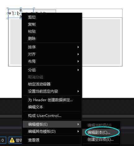
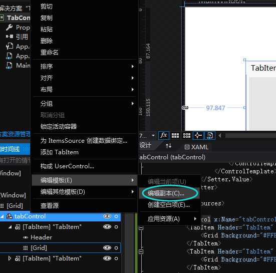
我们在样式中找到key=”TabItemStyle1”,这个样式就决定了我们现在TabItem展示样式。
 我们可以看到,这个样式中有个边框,我们可以在样式中找到这个边框,然后去掉它,看样是
1  <Border x:Name="Bd" BorderBrush="{TemplateBinding BorderBrush}" BorderThickness="1,1,1,0" Background="{TemplateBinding Background}" Padding="{TemplateBinding Padding}">
2                                 <ContentPresenter x:Name="Content" ContentSource="Header" HorizontalAlignment="{Binding HorizontalContentAlignment, RelativeSource={RelativeSource AncestorType={x:Type ItemsControl}}}" RecognizesAccessKey="True" SnapsToDevicePixels="{TemplateBinding SnapsToDevicePixels}" VerticalAlignment="{Binding VerticalContentAlignment, RelativeSource={RelativeSource AncestorType={x:Type ItemsControl}}}"/>
3                             </Border>
修改为
1  <Border x:Name="Bd" BorderBrush="{TemplateBinding BorderBrush}" BorderThickness="0,0,0,0" Background="{TemplateBinding Background}" Padding="{TemplateBinding Padding}">
2                                 <ContentPresenter x:Name="Content" ContentSource="Header" HorizontalAlignment="{Binding HorizontalContentAlignment, RelativeSource={RelativeSource AncestorType={x:Type ItemsControl}}}" RecognizesAccessKey="True" SnapsToDevicePixels="{TemplateBinding SnapsToDevicePixels}" VerticalAlignment="{Binding VerticalContentAlignment, RelativeSource={RelativeSource AncestorType={x:Type ItemsControl}}}"/>
3                             </Border>
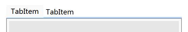
现在就可以看到边框消失了

下面我们将背景图改为白色,我们先来看他目前的背景颜色定义 <Setter Property="Background" Value="{StaticResource ButtonNormalBackground}"/>,这个就是定义了背景颜色,下面我们修改key=ButtonNormalBackground的颜色即可修改TabItem的背景颜色了。
我们可以找到现在定义为:
1 <LinearGradientBrush x:Key="ButtonNormalBackground" EndPoint="0,1" StartPoint="0,0">
2             <GradientStop Color="#F3F3F3" Offset="0"/>
3             <GradientStop Color="#EBEBEB" Offset="0.5"/>
4             <GradientStop Color="#DDDDDD" Offset="0.5"/>
5             <GradientStop Color="#CDCDCD" Offset="1"/>
6         </LinearGradientBrush>
我们把渐变去掉,只要白色即可修改为:<SolidColorBrush x:Key="ButtonNormalBackground" Color="White"/>,现在我们再来看效果
 ,怎么样,是不是接近了美工给的效果图呢,
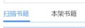 好吧,还是差挺多,我们继续修改
TabItem下面有个横线,而选中的下面还有个粗横线,并且被选中额TabItem文字为浅蓝色背景,接下来我们逐一进行修改。
先来添加TabItem下面的横线,我们可以看到这个横线在TabItem与下面的面板之间,所以我们不能修改TabItem来添加这条横线,所以我们来修改整个TabControl的样式,
在代码中查找新生成的TabControlStyle1样式
我们可以看到以下代码
 1 <Grid ClipToBounds="true" SnapsToDevicePixels="true" KeyboardNavigation.TabNavigation="Local">
 2                             <Grid.ColumnDefinitions>
 3                                 <ColumnDefinition x:Name="ColumnDefinition0"/>
 4                                 <ColumnDefinition x:Name="ColumnDefinition1" Width="0"/>
 5                             </Grid.ColumnDefinitions>
 6                             <Grid.RowDefinitions>
 7                                 <RowDefinition x:Name="RowDefinition0" Height="Auto"/>
 8                                 <RowDefinition x:Name="RowDefinition1" Height="*"/>
 9                             </Grid.RowDefinitions>
10                             <TabPanel x:Name="HeaderPanel" Grid.Column="0" IsItemsHost="true" Margin="2,2,2,0" Grid.Row="0" KeyboardNavigation.TabIndex="1" Panel.ZIndex="1"/>
11                             <Border x:Name="ContentPanel" BorderBrush="{TemplateBinding BorderBrush}" BorderThickness="{TemplateBinding BorderThickness}" Background="{TemplateBinding Background}" Grid.Column="0" KeyboardNavigation.DirectionalNavigation="Contained" Grid.Row="1" KeyboardNavigation.TabIndex="2" KeyboardNavigation.TabNavigation="Local">
12                                 <ContentPresenter x:Name="PART_SelectedContentHost" ContentSource="SelectedContent" Margin="{TemplateBinding Padding}" SnapsToDevicePixels="{TemplateBinding SnapsToDevicePixels}"/>
13                             </Border>
14                         </Grid>
我们可以分析看出,控件是分了两行两列,TabItem在上面一行,Panel放在了下面一样,我们可以巧妙的加入一个Grid控件(将两行改为3行,Grid放在第二行,而原来的panel改为第三行),并设置背景颜色,及高度,然后让Grid控件位于TabItem及panel之间,代码如下
 1 <Grid ClipToBounds="true" SnapsToDevicePixels="true" KeyboardNavigation.TabNavigation="Local">
 2                             <Grid.ColumnDefinitions>
 3                                 <ColumnDefinition x:Name="ColumnDefinition0"/>
 4                                 <ColumnDefinition x:Name="ColumnDefinition1" Width="0"/>
 5                             </Grid.ColumnDefinitions>
 6                             <Grid.RowDefinitions>
 7                                 <RowDefinition x:Name="RowDefinition0" Height="Auto"/>
 8                                 <RowDefinition x:Name="RowDefinition2" Height="Auto"/>
 9                                 <RowDefinition x:Name="RowDefinition1" Height="*"/>
10                             </Grid.RowDefinitions>
11                             <TabPanel x:Name="HeaderPanel" Grid.Column="0" IsItemsHost="true" Margin="2,2,2,0" Grid.Row="0" KeyboardNavigation.TabIndex="1" Panel.ZIndex="1"/>
12                             <Grid Grid.Row="1" Background="#A8D3FE" VerticalAlignment="Top" Height="2">
13
14                             </Grid>
15                             <Border x:Name="ContentPanel" BorderBrush="{TemplateBinding BorderBrush}" BorderThickness="{TemplateBinding BorderThickness}" Background="{TemplateBinding Background}" Grid.Column="0" KeyboardNavigation.DirectionalNavigation="Contained" Grid.Row="2" KeyboardNavigation.TabIndex="2" KeyboardNavigation.TabNavigation="Local">
16                                 <ContentPresenter x:Name="PART_SelectedContentHost" ContentSource="SelectedContent" Margin="{TemplateBinding Padding}" SnapsToDevicePixels="{TemplateBinding SnapsToDevicePixels}"/>
17                             </Border>
18                         </Grid>
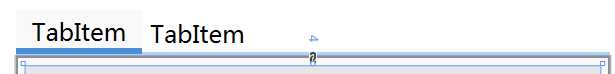
现在我们再来看一下效果
是不是离成功又进了一步呢,下面我们来添加选中状态下的比较粗的下划线
这次我们又该回来修改TabItem的样式了。
在代码中找到如下:
1 <Trigger Property="IsSelected" Value="true">
2        <Setter Property="Panel.ZIndex" Value="1"/>
3        <Setter Property="Background" TargetName="Bd" Value="{StaticResource TabItemSelectedBackground}"/>
4 </Trigger>
这个样式定义了被选中是的状态,这样我们可以在TabItem中添加一个粗的下划线,平时的时候让其hidden,而选中时隐藏。同样这个下划线使用Grid控件来构造
代码修改后如下:
1 <Grid SnapsToDevicePixels="true">
2
3      <Border x:Name="Bd" BorderBrush="{TemplateBinding BorderBrush}" BorderThickness="0,0,0,0" Background="{TemplateBinding Background}" Padding="{TemplateBinding Padding}">
4               <ContentPresenter x:Name="Content" ContentSource="Header" HorizontalAlignment="{Binding HorizontalContentAlignment, RelativeSource={RelativeSource AncestorType={x:Type ItemsControl}}}" RecognizesAccessKey="True" SnapsToDevicePixels="{TemplateBinding SnapsToDevicePixels}" VerticalAlignment="{Binding VerticalContentAlignment, RelativeSource={RelativeSource AncestorType={x:Type ItemsControl}}}"/>
5      </Border>
6      <Grid Height="3" x:Name="bottomLine" VerticalAlignment="Bottom" Background="#498FD7" Visibility="Hidden">
7       </Grid>
8</Grid>
注意,上面的代码只由6,7行是后添加的
下面我们来修改被选中状态的属性值
1 <Trigger Property="IsSelected" Value="true">
2      <Setter Property="Panel.ZIndex" Value="1"/>
3      <Setter Property="Background" TargetName="Bd" Value="{StaticResource TabItemSelectedBackground}"/>
4      <Setter Property="Visibility" TargetName="bottomLine" Value="Visible"/>
5</Trigger>
同样需要注意的是,只有第4行是我后添加的代码
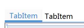
现在我们可以来看下效果了
怎么样,已经无限接近了吧,还剩下一个被选中状态是文字的颜色,我想大家都知道怎么修改了吧。
来,这就修改一下,添加一行代码即可,
<Setter Property="Foreground" Value="#498FD7"/>
好了,这个简单的控件样式到此就全部结束了
是不是跟美工设计的差不多呢,如果运行起来看,还有些地方需要修改,例如鼠标在头部悬浮,头部的样式就会发生变化,这样我们还需要继续修改样式。
我们可以通过删除一行代码就可以达到效果了
1 <Trigger Property="IsMouseOver" Value="true">
2                                 <!--
3                                 <Setter Property="Background" TargetName="Bd" Value="{StaticResource TabItemHotBackground}"/>
4                                 -->
5                             </Trigger>
over,有时间我还会将美工设计的另一个控件美化篇贴出来
标签:bcd cte png sse hot button linear orm top
原文地址:http://www.cnblogs.com/ljs0322/p/7084691.html
