标签:微软 alt char lazy 不同 bsp 效果 分享 img

在制作网上中,经常会遇到绘制其它不规则的图形,如六边形,八边形这类的,在复杂的图形,也是由我们的基本图形组成了,如上面的六边形,就是由两个三角形,一个矩形组成。
先看看,如何绘制三角形 ,与四边形。 三角形:
<div class="triangle"></div>
.triangle{
width: 0px;
height: 0px;
border-width: 80px;
border-color:transparent transparent green;
border-style: solid;
}
注: 将宽与高设置为0,设置边框的宽度,及样式的样式,最后将上,左,右边的边框,设置成透明色,这样我们就可以得到想到的三角形。
如图: 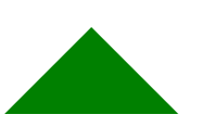
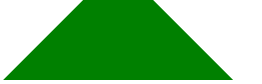
四边形:
与三角形设置类似,不同的是,需要设置div的宽度,我们需要一个小的四边形与一个大的四边形,改变宽度的大小即可:
<div class="fourangle"></div>
<div class="fourangle2"></div>
.fourangle{
width: 70px;
height: 0px;
border-width: 80px;
border-color:transparent transparent green;
border-style: solid;
}
.fourangle2{
width: 100px;
height: 0px;
border-width: 80px;
border-color:transparent transparent green;
border-style: solid;
}
效果如图:
完整六边形代码如下:
<!DOCTYPE html>
<html>
<head lang="en">
<meta charset="UTF-8">
<title></title>
<style type="text/css">
#shape{
margin: 200px 0px 0px 200px;
position: relative;
width: 300px;
height: 500px;
/*border: 1px solid red;*/
overflow: hidden;
background-image: url("img/bg/bg1.png");
background-position: center;
}
#div1{
position: absolute;
top:-150px;
width: 0px;
height: 0px;
border-width: 150px;
border-color:white white transparent;
border-style: solid;
}
#rect{
/*border: 1px solid green;*/
position: absolute;
top:150px;
width: 300px;
height: 200px;
}
#div2{
position: absolute;
top:350px;
width: 0px;
height: 0px;
border-width: 150px;
border-color:transparent white;
border-style: solid;
}
</style>
</head>
<body>
<div id="shape">
<div id="div1"></div>
<div id="rect"></div>
<div id="div2"></div>
</div>
</body>
</html>
标签:微软 alt char lazy 不同 bsp 效果 分享 img
原文地址:http://www.cnblogs.com/doubolexiang/p/7222423.html