标签:type 技术 log 分享 慕课 blog alt nbsp 浮动
<html>
	<head>
		<title>混合布局学习</title>
		<style type="text/css">
			body{margin:0;padding:0;text-align:center}
			.top{height:50px;background:#00f;margin:0 auto}
			.head{height:50px;width:700px;background:#f96;margin:0 auto}
			.main{width:700px;height:600px;background:#ccc;margin:0 auto}
			.foot{width:700px;height:50px;background:#0f0;margin:0 auto}
			/*中间部分布局*/
				/*float:left向左浮动*/
			.left{width:500px;height:600px;background:#f00;float:left}
			.sub_ll{width:100px;height:600px;background:#f33;float:left}
			.sub_lr{width:400px;height:600px;background:#f66;float:right}
			.right{width:200px;height:600px;background:#ff0;float:right}
		</style>
	</head>
	<body>
	混合布局样式<br/>
	<div class="top">
		<div class="head">标题</div>
	</div>
	<div class="main">
		<div class="left">
			<div class="sub_ll">左侧的子1</div>
			<div class="sub_lr">左侧的子2</div>
		</div>
		<div class="right">我是右侧的内容哦</div>
	</div>
	<div class="foot">04</div>
	 <br/>
	 <br/>

	</body>
</html>
效果如下:
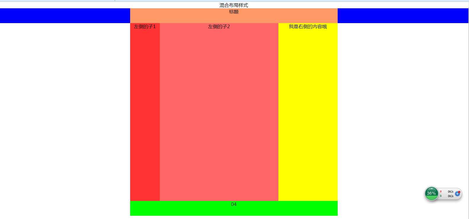
关键知识点:
通过div的嵌套,利用float对div的布局进行控制,注意子div的宽度之和应该与父div的宽度大小一样
标签:type 技术 log 分享 慕课 blog alt nbsp 浮动
原文地址:http://www.cnblogs.com/soulsjie/p/7255753.html