标签:dip ... -- render -o explorer 页面 组元 浮动
以下从官网抄来的,感觉还是很实用的,运用得好,灵活运用,非常方便快捷,能大大提高开发效率,也为调整不同尺寸的屏幕节省了时间。
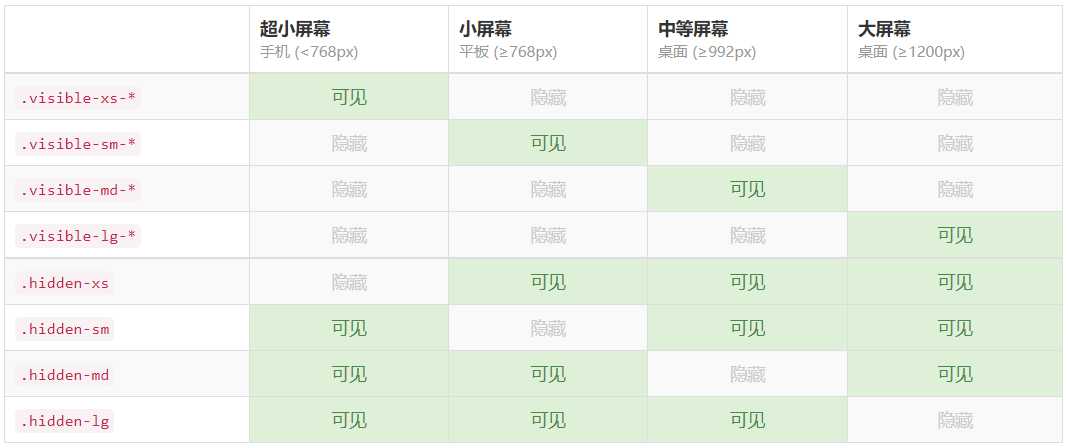
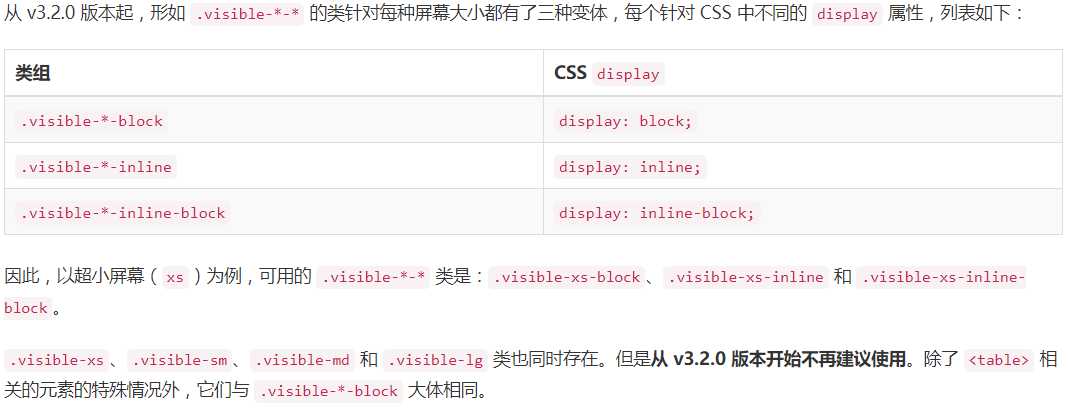
hidden-xs @media (max-width: 767px){ .hidden-xs { display: none!important; } } @media (max-width: 991px) and (min-width: 768px){ .hidden-sm { display: none!important; } } @media (min-width: 768px){ .col-sm-2 { width: 16.66666667%; } } //当有很多btn-block兄弟元素时,紧接在第一个btn-block后面的兄弟btn-block与上面间距5px; .btn-block+.btn-block { margin-top: 5px; } 用斜体强调一段文本。 <em>rendered as italicized text</em> 通过文本对齐类,可以简单方便的将文字重新对齐。 <p class="text-left">Left aligned text.</p> <p class="text-nowrap">No wrap text.</p> .text-nowrap { white-space: nowrap; } 通过这几个类可以改变文本的大小写。 <p class="text-lowercase">Lowercased text.</p> <p class="text-uppercase">Uppercased text.</p> <p class="text-capitalize">Capitalized text.</p> .text-uppercase { text-transform: uppercase; } 缩略语 当鼠标悬停在缩写和缩写词上时就会显示完整内容,Bootstrap 实现了对 HTML 的 <abbr> 元素的增强样式。 <p>An abbreviation of the word attribute is <abbr title="attribute">attr</abbr>.</p> 多种引用样式 对于标准样式的 <blockquote>,可以通过几个简单的变体就能改变风格和内容。 <blockquote> <p>Lorem ipsum dolor sit amet, consectetur adipiscing elit. Integer posuere erat a ante.</p> <footer>Someone famous in <cite title="Source Title">Source Title</cite></footer> </blockquote> 无样式列表 移除了默认的 list-style 样式和左侧外边距的一组元素(只针对直接子元素)。这是针对直接子元素的,也就是说,你需要对所有嵌套的列表都添加这个类才能具有同样的样式。 <ul class="list-unstyled"> <li>Lorem ipsum dolor sit amet</li> <li>Consectetur adipiscing elit</li> <li>Integer molestie lorem at massa</li> <li>Facilisis in pretium nisl aliquet</li> <li>Nulla volutpat aliquam velit <ul> <li>Phasellus iaculis neque</li> <li>Purus sodales ultricies</li> <li>Vestibulum laoreet porttitor sem</li> <li>Ac tristique libero volutpat at</li> </ul> </li> <li>Faucibus porta lacus fringilla vel</li> <li>Aenean sit amet erat nunc</li> <li>Eget porttitor lorem</li> </ul> 内联列表 通过设置 display: inline-block; 并添加少量的内补(padding),将所有元素放置于同一行。 <ul class="list-inline"> <li>Lorem ipsum</li> <li>Phasellus iaculis</li> <li>Nulla volutpat</li> </ul> 描述 带有描述的短语列表。 <dl> <dt>...</dt> <dd>...</dd> </dl> 用户输入 通过 <kbd> 标签标记用户通过键盘输入的内容。 <kbd><kbd>ctrl</kbd> + <kbd>,</kbd></kbd> 代码块 多行代码可以使用 <pre> 标签。为了正确的展示代码,注意将尖括号做转义处理。 <pre><p>Sample text here...</p></pre> 状态类 通过这些状态类可以为行或单元格设置颜色。 .active 鼠标悬停在行或单元格上时所设置的颜色 .success 标识成功或积极的动作 .info 标识普通的提示信息或动作 .warning 标识警告或需要用户注意 .danger 标识危险或潜在的带来负面影响的动作 水平排列的表单 <form class="form-horizontal"> <div class="form-group"> <label for="inputEmail3" class="col-sm-2 control-label">Email</label> <div class="col-sm-10"> <input type="email" class="form-control" id="inputEmail3" placeholder="Email"> </div> </div> <div class="form-group"> <label for="inputPassword3" class="col-sm-2 control-label">Password</label> <div class="col-sm-10"> <input type="password" class="form-control" id="inputPassword3" placeholder="Password"> </div> </div> <div class="form-group"> <div class="col-sm-offset-2 col-sm-10"> <div class="checkbox"> <label> <input type="checkbox"> Remember me </label> </div> </div> </div> <div class="form-group"> <div class="col-sm-offset-2 col-sm-10"> <button type="submit" class="btn btn-default">Sign in</button> </div> </div> </form> 文本域 支持多行文本的表单控件。可根据需要改变 rows 属性。 <textarea class="form-control" rows="3"></textarea> 多选和单选框 <div class="checkbox"> <label> <input type="checkbox" value=""> Option one is this and that—be sure to include why it‘s great </label> </div> <div class="checkbox disabled"> <label> <input type="checkbox" value="" disabled> Option two is disabled </label> </div> <div class="radio"> <label> <input type="radio" name="optionsRadios" id="optionsRadios1" value="option1" checked> Option one is this and that—be sure to include why it‘s great </label> </div> <div class="radio"> <label> <input type="radio" name="optionsRadios" id="optionsRadios2" value="option2"> Option two can be something else and selecting it will deselect option one </label> </div> <div class="radio disabled"> <label> <input type="radio" name="optionsRadios" id="optionsRadios3" value="option3" disabled> Option three is disabled </label> </div> 内联单选和多选框 通过将 .checkbox-inline 或 .radio-inline 类应用到一系列的多选框(checkbox)或单选框(radio)控件上,可以使这些控件排列在一行。 <label class="checkbox-inline"> <input type="checkbox" id="inlineCheckbox1" value="option1"> 1 </label> <label class="checkbox-inline"> <input type="checkbox" id="inlineCheckbox2" value="option2"> 2 </label> <label class="checkbox-inline"> <input type="checkbox" id="inlineCheckbox3" value="option3"> 3 </label> <label class="radio-inline"> <input type="radio" name="inlineRadioOptions" id="inlineRadio1" value="option1"> 1 </label> <label class="radio-inline"> <input type="radio" name="inlineRadioOptions" id="inlineRadio2" value="option2"> 2 </label> <label class="radio-inline"> <input type="radio" name="inlineRadioOptions" id="inlineRadio3" value="option3"> 3 </label> 下拉列表(select) 注意,很多原生选择菜单 - 即在 Safari 和 Chrome 中 - 的圆角是无法通过修改 border-radius 属性来改变的。 <select class="form-control"> <option>1</option> <option>2</option> <option>3</option> <option>4</option> <option>5</option> </select> 对于标记了 multiple 属性的 <select> 控件来说,默认显示多选项。 <select multiple class="form-control"> <option>1</option> <option>2</option> <option>3</option> <option>4</option> <option>5</option> </select> 静态控件 如果需要在表单中将一行纯文本和 label 元素放置于同一行,为 <p> 元素添加 .form-control-static 类即可。 <form class="form-horizontal"> <div class="form-group"> <label class="col-sm-2 control-label">Email</label> <div class="col-sm-10"> <p class="form-control-static">email@example.com</p> </div> </div> <div class="form-group"> <label for="inputPassword" class="col-sm-2 control-label">Password</label> <div class="col-sm-10"> <input type="password" class="form-control" id="inputPassword" placeholder="Password"> </div> </div> </form> 禁用状态 为输入框设置 disabled 属性可以禁止其与用户有任何交互(焦点、输入等)。被禁用的输入框颜色更浅,并且还添加了 not-allowed 鼠标状态。 <input class="form-control" id="disabledInput" type="text" placeholder="Disabled input here..." disabled> 只读状态 为输入框设置 readonly 属性可以禁止用户修改输入框中的内容。处于只读状态的输入框颜色更浅(就像被禁用的输入框一样),但是仍然保留标准的鼠标状态。 <input class="form-control" type="text" placeholder="Readonly input here…" readonly> 校验状态 Bootstrap 对表单控件的校验状态,如 error、warning 和 success 状态,都定义了样式。使用时,添加 .has-warning、.has-error 或 .has-success 类到这些控件的父元素即可。任何包含在此元素之内的 .control-label、.form-control 和 .help-block 元素都将接受这些校验状态的样式。 <div class="form-group has-success"> <label class="control-label" for="inputSuccess1">Input with success</label> <input type="text" class="form-control" id="inputSuccess1" aria-describedby="helpBlock2"> <span id="helpBlock2" class="help-block">A block of help text that breaks onto a new line and may extend beyond one line.</span> </div> <div class="form-group has-warning"> <label class="control-label" for="inputWarning1">Input with warning</label> <input type="text" class="form-control" id="inputWarning1"> </div> <div class="form-group has-error"> <label class="control-label" for="inputError1">Input with error</label> <input type="text" class="form-control" id="inputError1"> </div> <div class="has-success"> <div class="checkbox"> <label> <input type="checkbox" id="checkboxSuccess" value="option1"> Checkbox with success </label> </div> </div> <div class="has-warning"> <div class="checkbox"> <label> <input type="checkbox" id="checkboxWarning" value="option1"> Checkbox with warning </label> </div> </div> <div class="has-error"> <div class="checkbox"> <label> <input type="checkbox" id="checkboxError" value="option1"> Checkbox with error </label> </div> </div> 添加额外的图标 你还可以针对校验状态为输入框添加额外的图标。只需设置相应的 .has-feedback 类并添加正确的图标即可。 反馈图标(feedback icon)只能使用在文本输入框 <input class="form-control"> 元素上。 图标、label 和输入控件组 对于不带有 label 标签的输入框以及右侧带有附加组件的输入框组,需要手动为其图标定位。为了让所有用户都能访问你的网站,我们强烈建议为所有输入框添加 label 标签。如果你不希望将 label 标签展示出来,可以通过添加 .sr-only 类来实现。如果的确不能添加 label 标签,请调整图标的 top 值。对于输入框组,请根据你的实际情况调整 right 值。 <div class="form-group has-success has-feedback"> <label class="control-label" for="inputSuccess2">Input with success</label> <input type="text" class="form-control" id="inputSuccess2" aria-describedby="inputSuccess2Status"> <span class="glyphicon glyphicon-ok form-control-feedback" aria-hidden="true"></span> <span id="inputSuccess2Status" class="sr-only">(success)</span> </div> <div class="form-group has-warning has-feedback"> <label class="control-label" for="inputWarning2">Input with warning</label> <input type="text" class="form-control" id="inputWarning2" aria-describedby="inputWarning2Status"> <span class="glyphicon glyphicon-warning-sign form-control-feedback" aria-hidden="true"></span> <span id="inputWarning2Status" class="sr-only">(warning)</span> </div> <div class="form-group has-error has-feedback"> <label class="control-label" for="inputError2">Input with error</label> <input type="text" class="form-control" id="inputError2" aria-describedby="inputError2Status"> <span class="glyphicon glyphicon-remove form-control-feedback" aria-hidden="true"></span> <span id="inputError2Status" class="sr-only">(error)</span> </div> <div class="form-group has-success has-feedback"> <label class="control-label" for="inputGroupSuccess1">Input group with success</label> <div class="input-group"> <span class="input-group-addon">@</span> <input type="text" class="form-control" id="inputGroupSuccess1" aria-describedby="inputGroupSuccess1Status"> </div> <span class="glyphicon glyphicon-ok form-control-feedback" aria-hidden="true"></span> <span id="inputGroupSuccess1Status" class="sr-only">(success)</span> </div> 控件尺寸 通过 .input-lg 类似的类可以为控件设置高度,通过 .col-lg-* 类似的类可以为控件设置宽度。 <input class="form-control input-lg" type="text" placeholder=".input-lg"> <input class="form-control" type="text" placeholder="Default input"> <input class="form-control input-sm" type="text" placeholder=".input-sm"> <select class="form-control input-lg">...</select> <select class="form-control">...</select> <select class="form-control input-sm">...</select> 水平排列的表单组的尺寸 通过添加 .form-group-lg 或 .form-group-sm 类,为 .form-horizontal 包裹的 label 元素和表单控件快速设置尺寸。 <form class="form-horizontal"> <div class="form-group form-group-lg"> <label class="col-sm-2 control-label" for="formGroupInputLarge">Large label</label> <div class="col-sm-10"> <input class="form-control" type="text" id="formGroupInputLarge" placeholder="Large input"> </div> </div> <div class="form-group form-group-sm"> <label class="col-sm-2 control-label" for="formGroupInputSmall">Small label</label> <div class="col-sm-10"> <input class="form-control" type="text" id="formGroupInputSmall" placeholder="Small input"> </div> </div> </form> 调整列(column)尺寸 用栅格系统中的列(column)包裹输入框或其任何父元素,都可很容易的为其设置宽度。 <div class="row"> <div class="col-xs-2"> <input type="text" class="form-control" placeholder=".col-xs-2"> </div> <div class="col-xs-3"> <input type="text" class="form-control" placeholder=".col-xs-3"> </div> <div class="col-xs-4"> <input type="text" class="form-control" placeholder=".col-xs-4"> </div> </div> 按钮 可作为按钮使用的标签或元素 为 <a>、<button> 或 <input> 元素添加按钮类(button class)即可使用 Bootstrap 提供的样式。 <form class="bs-example" data-example-id="btn-tags"> <a class="btn btn-default" href="#" role="button">Link</a> <button class="btn btn-default" type="submit">Button</button> <input class="btn btn-default" type="button" value="Input"> <input class="btn btn-default" type="submit" value="Submit"> </form> 针对组件的注意事项 虽然按钮类可以应用到 <a> 和 <button> 元素上,但是,导航和导航条组件只支持 <button> 元素。 链接被作为按钮使用时的注意事项 如果 <a> 元素被作为按钮使用 -- 并用于在当前页面触发某些功能 -- 而不是用于链接其他页面或链接当前页面中的其他部分,那么,务必为其设置 role="button" 属性。 预定义样式 使用下面列出的类可以快速创建一个带有预定义样式的按钮。 <button type="button" class="btn btn-default">(默认样式)Default</button> <button type="button" class="btn btn-primary">(首选项)Primary</button> <button type="button" class="btn btn-success">(成功)Success</button> <button type="button" class="btn btn-info">(一般信息)Info</button> <button type="button" class="btn btn-warning">(警告)Warning</button> <button type="button" class="btn btn-danger">(危险)Danger</button> <button type="button" class="btn btn-link">(链接)Link</button> 尺寸 需要让按钮具有不同尺寸吗?使用 .btn-lg、.btn-sm 或 .btn-xs 就可以获得不同尺寸的按钮。 通过给按钮添加 .btn-block 类可以将其拉伸至父元素100%的宽度,而且按钮也变为了块级(block)元素。 <div class="well center-block" style="max-width: 400px;"> <button type="button" class="btn btn-primary btn-lg btn-block">(块级元素)Block level button</button> <button type="button" class="btn btn-default btn-lg btn-block">(块级元素)Block level button</button> </div> 激活状态 当按钮处于激活状态时,其表现为被按压下去(底色更深、边框夜色更深、向内投射阴影)。对于 <button> 元素,是通过 :active 状态实现的。对于 <a> 元素,是通过 .active 类实现的。然而,你还可以将 .active 应用到 <button> 上(包含 aria-pressed="true" 属性)),并通过编程的方式使其处于激活状态。 <button type="button" class="btn btn-primary btn-lg active">Primary button</button> <button type="button" class="btn btn-default btn-lg active">Button</button> 禁用状态 通过为按钮的背景设置 opacity 属性就可以呈现出无法点击的效果。 button 元素 为 <button> 元素添加 disabled 属性,使其表现出禁用状态。 <button type="button" class="btn btn-lg btn-primary" disabled="disabled">Primary button</button> <button type="button" class="btn btn-default btn-lg" disabled="disabled">Button</button> 图片形状 通过为 <img> 元素添加以下相应的类,可以让图片呈现不同的形状。 请时刻牢记:Internet Explorer 8 不支持 CSS3 中的圆角属性。 <img src="..." alt="..." class="img-rounded"> <img src="..." alt="..." class="img-circle"> <img src="..." alt="..." class="img-thumbnail"> 情境文本颜色 <p class="text-muted">...</p> <p class="text-primary">...</p> <p class="text-success">...</p> <p class="text-info">...</p> <p class="text-warning">...</p> <p class="text-danger">...</p> 情境背景色 <p class="bg-primary">...</p> <p class="bg-success">...</p> <p class="bg-info">...</p> <p class="bg-warning">...</p> <p class="bg-danger">...</p> 关闭按钮 通过使用一个象征关闭的图标,可以让模态框和警告框消失。 <button type="button" class="close" aria-label="Close"><span aria-hidden="true">×</span></button> 三角符号 通过使用三角符号可以指示某个元素具有下拉菜单的功能。注意,向上弹出式菜单中的三角符号是反方向的。 <span class="caret"></span> 快速浮动 通过添加一个类,可以将任意元素向左或向右浮动。!important 被用来明确 CSS 样式的优先级。这些类还可以作为 mixin(参见 less 文档) 使用。 <div class="pull-left">...</div> <div class="pull-right">...</div> .pull-left { float: left !important; } .pull-right { float: right !important; } 不能用于导航条组件中 排列导航条中的组件时可以使用这些工具类:.navbar-left 或 .navbar-right 。 参见导航条文档以获取更多信息。 让内容块居中 .center-block { display: block; margin-left: auto; margin-right: auto; } 显示或隐藏内容 .show 和 .hidden 类可以强制任意元素显示或隐藏(对于屏幕阅读器也能起效)。这些类通过 !important 来避免 CSS 样式优先级问题,就像 quick floats 一样的做法。注意,这些类只对块级元素起作用,另外,还可以作为 mixin 使用。 响应式工具 为了加快对移动设备友好的页面开发工作,利用媒体查询功能并使用这些工具类可以方便的针对不同设备展示或隐藏页面内容。另外还包含了针对打印机显示或隐藏内容的工具类。 有针对性的使用这类工具类,从而避免为同一个网站创建完全不同的版本。相反,通过使用这些工具类可以在不同设备上提供不同的展现形式。 可用的类 通过单独或联合使用以下列出的类,可以针对不同屏幕尺寸隐藏或显示页面内容。 测试用例 调整你的浏览器大小,或者用其他设备打开页面,都可以测试这些响应式工具类。 在...上可见 带有绿色标记的元素表示其在当前浏览器视口(viewport)中是可见的。 <div class="row responsive-utilities-test visible-on"> <div class="col-xs-6"> <span class="hidden-xs">超小屏幕</span> <span class="visible-xs-block">? 在超小屏幕上可见</span> </div> <div class="col-xs-6"> <span class="hidden-sm">小屏幕</span> <span class="visible-sm-block">? 在小屏幕上可见</span> </div> <div class="clearfix visible-xs-block"></div> <div class="col-xs-6"> <span class="hidden-md">中等屏幕</span> <span class="visible-md-block">? 在中等屏幕上可见</span> </div> <div class="col-xs-6"> <span class="hidden-lg">大屏幕</span> <span class="visible-lg-block">? 在大屏幕上可见</span> </div> </div> <div class="row responsive-utilities-test visible-on"> <div class="col-xs-6"> <span class="hidden-xs hidden-sm">超小屏幕和小屏幕</span> <span class="visible-xs-block visible-sm-block">? 在超小屏幕和小屏幕上可见</span> </div> <div class="col-xs-6"> <span class="hidden-md hidden-lg">中等屏幕和大屏幕</span> <span class="visible-md-block visible-lg-block">? 在中等屏幕和大屏幕上可见</span> </div> <div class="clearfix visible-xs-block"></div> <div class="col-xs-6"> <span class="hidden-xs hidden-md">超小屏幕和中等屏幕</span> <span class="visible-xs-block visible-md-block">? 在超小屏幕和中等屏幕上可见</span> </div> <div class="col-xs-6"> <span class="hidden-sm hidden-lg">小屏幕和大屏幕</span> <span class="visible-sm-block visible-lg-block">? 在小屏幕和大屏幕上可见</span> </div> <div class="clearfix visible-xs-block"></div> <div class="col-xs-6"> <span class="hidden-xs hidden-lg">超小屏幕和大屏幕</span> <span class="visible-xs-block visible-lg-block">? 在超小屏幕和大屏幕上可见</span> </div> <div class="col-xs-6"> <span class="hidden-sm hidden-md">小屏幕和中等屏幕</span> <span class="visible-sm-block visible-md-block">? 在小屏幕和中等屏幕上可见</span> </div> </div> 在...上隐藏 带有绿色标记的元素表示其在当前浏览器视口(viewport)中是隐藏的。 <div class="row responsive-utilities-test hidden-on"> <div class="col-xs-6 col-sm-3"> <span class="hidden-xs">超小屏幕</span> <span class="visible-xs-block">? 在超小屏幕上隐藏</span> </div> <div class="col-xs-6 col-sm-3"> <span class="hidden-sm">小屏幕</span> <span class="visible-sm-block">? 在小屏幕上隐藏</span> </div> <div class="clearfix visible-xs-block"></div> <div class="col-xs-6 col-sm-3"> <span class="hidden-md">中等屏幕</span> <span class="visible-md-block">? 在中等屏幕上隐藏</span> </div> <div class="col-xs-6 col-sm-3"> <span class="hidden-lg">大屏幕</span> <span class="visible-lg-block">? 在大屏幕上隐藏</span> </div> </div> <div class="row responsive-utilities-test hidden-on"> <div class="col-xs-6"> <span class="hidden-xs hidden-sm">超小屏幕与小屏幕</span> <span class="visible-xs-block visible-sm-block">? 在超小屏幕和小屏幕上隐藏</span> </div> <div class="col-xs-6"> <span class="hidden-md hidden-lg">中等屏幕和大屏幕</span> <span class="visible-md-block visible-lg-block">? 在 medium 和 large 上隐藏</span> </div> <div class="clearfix visible-xs-block"></div> <div class="col-xs-6"> <span class="hidden-xs hidden-md">超小屏幕和中等屏幕</span> <span class="visible-xs-block visible-md-block">? 在超小屏幕和中等屏幕上隐藏</span> </div> <div class="col-xs-6"> <span class="hidden-sm hidden-lg">小屏幕和大屏幕</span> <span class="visible-sm-block visible-lg-block">? 在小屏幕和大屏幕上隐藏</span> </div> <div class="clearfix visible-xs-block"></div> <div class="col-xs-6"> <span class="hidden-xs hidden-lg">超小屏幕和大屏幕</span> <span class="visible-xs-block visible-lg-block">? 在超小屏幕和大屏幕上隐藏</span> </div> <div class="col-xs-6"> <span class="hidden-sm hidden-md">小屏幕和中等屏幕</span> <span class="visible-sm-block visible-md-block">? 在小屏幕和中等屏幕上隐藏</span> </div> </div> 截断文本 .text-overflow() { overflow: hidden; text-overflow: ellipsis; white-space: nowrap; }
标签:dip ... -- render -o explorer 页面 组元 浮动
原文地址:http://www.cnblogs.com/tenWood/p/7342730.html