标签:out name direct div block ide 常见 hit png
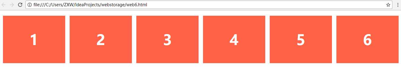
<!DOCTYPE html>

<head>
    <meta charset="utf-8">

    <style type="text/css">
        .flex-container{
            padding:0;
            margin:0;
            list-style:none;
            display:-webkit-box;
            display:-moz-box;
            display:-ms-flexbox;
            display:-webkit-flex;
            display:flex;
            -webkit-flex-flow:row nowrap;
            justify-content:space-around;
        }
        .flex-item{
            background:tomato;
            padding:5px;
            width:200px;
            height:150px;
            margin-top:10px;
            line-height:150px;
            color:white;
            font-weight:bold;
            font-size:3em;
            text-align:center
        }

    </style>
</head>
<body>
<ul class="flex-container">
   <li class="flex-item">1</li>
    <li class="flex-item">2</li>
    <li class="flex-item">3</li>
    <li class="flex-item">4</li>
    <li class="flex-item">5</li>
    <li class="flex-item">6</li>

</ul>
</body>
</html>
效果:
<!DOCTYPE html>

<head>
    <meta charset="utf-8">

    <style type="text/css">
        .navigation{
            list-style:none;
            margin:0;
            background:deepskyblue;
            display:-webkit-box;
            display:-moz-box;
            display:-ms-flexbox;
            display:-webkit-flex;
            display:flex;
            -webkit-flex-flow:row wrap;
            justify-content:flex-end
        }
        .navigation a{
            text-decoration:none;
            display:block;
            padding:1em;
            color:white
        }
        .navigation a:hover{
            background:#00AEE8
        }
        @media all and (max-width:800px){
            .navigation{justify-content:space-around}
        }
        @media all and (max-width:600px){
            .navigation{
                -webkit-flex-flow:column wrap;
                padding:0
            }
            .navigation a{
                text-align:center;
                padding:10px;
                border-top:1px solid rgba(255,255,255,0.3);
                border-bottom:1px solid rgba(0,0,0,0.1)}
            .navigation li:last-of-type a{border-bottom:none}
        }


    </style>
</head>
<body>
<ul class="navigation">
    <li><a href="#">Home</a></li>
    <li><a href="#">About</a></li>
    <li><a href="#">Products</a></li>
    <li><a href="#">Contact</a></li>
</ul>
</body>
</html>
效果:

/* Large */
.navigation {
  display: flex;
  flex-flow: row wrap;
  /* This aligns items to the end line on main-axis */
  justify-content: flex-end;
}

/* Medium screens */
@media all and (max-width: 800px) {
  .navigation {
    /* When on medium sized screens, we center it by evenly distributing empty space around items */
    justify-content: space-around;
  }
}

/* Small screens */
@media all and (max-width: 500px) {
  .navigation {
    /* On small screens, we are no longer using row direction but column */
    flex-direction: column;
  }
}
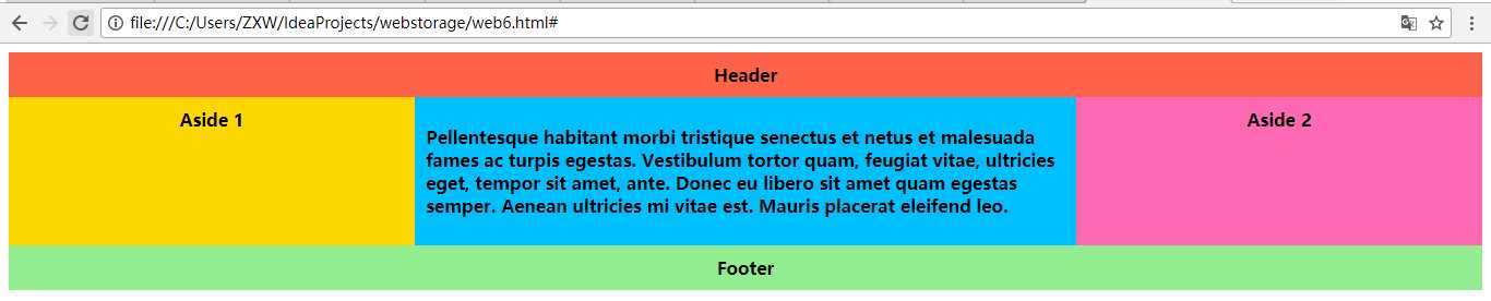
<!DOCTYPE html>

<head>
    <meta charset="utf-8">

    <style type="text/css">
        .wrapper{
            display:-webkit-box;
            display:-moz-box;
            display:-ms-flexbox;
            display:-webkit-flex;
            display:flex;
            -webkit-flex-flow:row wrap;
            font-weight:bold;
            text-align:center
        }
        .wrapper > *{padding:10px;flex:1 100%}
        .header{background:tomato}
        .footer{background:lightgreen}
        .main{text-align:left;background:deepskyblue}
        .aside-1{background:gold}
        .aside-2{background:hotpink}
        @media all and (min-width:600px){.aside{flex:1 auto}
        }
         @media all and (min-width:800px){.main{flex:2 0px}
            .aside-1{order:1}
            .main{order:2}
            .aside-2{order:3}
            .footer{order:4}
        }

    </style>
</head>
<body>
<div class="wrapper">
    <header class="header">Header</header>
    <article class="main">
        <p>Pellentesque habitant morbi tristique senectus et netus et malesuada fames ac turpis egestas. Vestibulum tortor quam, feugiat vitae, ultricies eget, tempor sit amet, ante. Donec eu libero sit amet quam egestas semper. Aenean ultricies mi vitae est. Mauris placerat eleifend leo.</p>
    </article>
    <aside class="aside aside-1">Aside 1</aside>
    <aside class="aside aside-2">Aside 2</aside>
    <footer class="footer">Footer</footer>
</div>
</body>
</html>
效果:
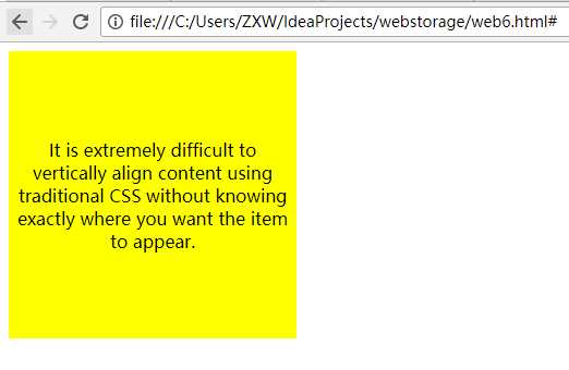
<!DOCTYPE html>

<head>
    <meta charset="utf-8">

    <style type="text/css">
        著作权归作者所有。
        商业转载请联系作者获得授权,非商业转载请注明出处。
        链接:http://caibaojian.com/flexbox-example.html
                                 来源:http://caibaojian.com

                                           body {
                                               display: -webkit-flex;
                                               display: flex;
                                               flex-flow: column;

                                               -webkit-align-items: center;
                                               align-items: center;
                                               -webkit-justify-content: center;
                                               justify-content: center;

                                               width: 100%;
                                               height: 100%;
                                               background: lightgrey;
                                           }

        .content {
            /* also making content into a flex box so we can also vertically center its content */
            display: -webkit-flex;
            display: flex;
            -webkit-flex-flow: column;
            flex-flow: column;

            -webkit-justify-content: center;
            justify-content: center;
            text-align: center;

            width: 250px;
            height: 250px;
            padding: 7px;

            background: yellow;
        }

    </style>
</head>
<body>
<form>
    <body>
    <div class="content">
        <p>It is extremely difficult to vertically align content using traditional CSS without knowing exactly where you want the item to appear.
            </p>
    </div>
    </body>
</form>
</body>
</html>
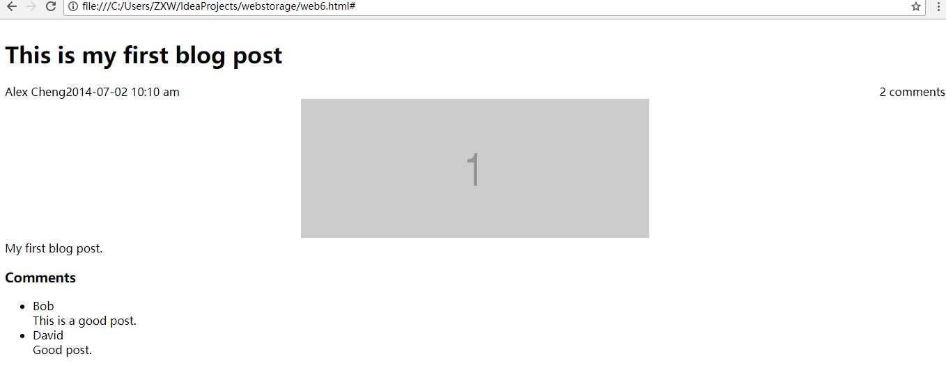
博客帖子的典型页面布局
<!DOCTYPE html>

<head>
    <meta charset="utf-8">

    <style type="text/css">
        .post {
            display: flex;
            flex-flow: column wrap;
        }
        .post-meta {
            display: flex;
            flex-flow: row wrap;
            order: 1;
        }
        .post-body {
            order: 3;
        }
        .post-comments {
            order: 4;
        }
        .comments-count {
            margin-left: auto;
        }
        .post-image {
            order: 2;
            align-self: center;
        }

    </style>
</head>
<body>
<div class="post">
    <h1>This is my first blog post</h1>
    <div class="post-meta">
        <div class="author">Alex Cheng</div>
        <div class="datetime">2014-07-02 10:10 am</div>
        <div class="comments-count">2 comments</div>
    </div>
    <div class="post-body">
        My first blog post.

    </div>
    <div class="post-image">
        <img src="http://placehold.it/500x200&text=1">
    </div>
    <div class="post-comments">
        <h3>Comments</h3>
        <ul>

            <li><div class="author">Bob</div><div>This is a good post.</div></li>
            <li><div class="autho">David</div><div>Good post.</div></li>

        </ul>
    </div>
</div>
</body>
</html>
2017-08-23 23:25:48
标签:out name direct div block ide 常见 hit png
原文地址:http://www.cnblogs.com/guangzhou11/p/7420812.html