标签:tween body 样式 lin dir lang row doctype justify
一、什么是flex?
flex是css3中引入的一种布局方式,可以非常灵活高效控制元素的排列与对齐方式,大多数人称之为弹性布局.
二、怎么使用flex?
任何一个容器都可以指定为flex布局
1 #box {
2     display:flex;
3 }
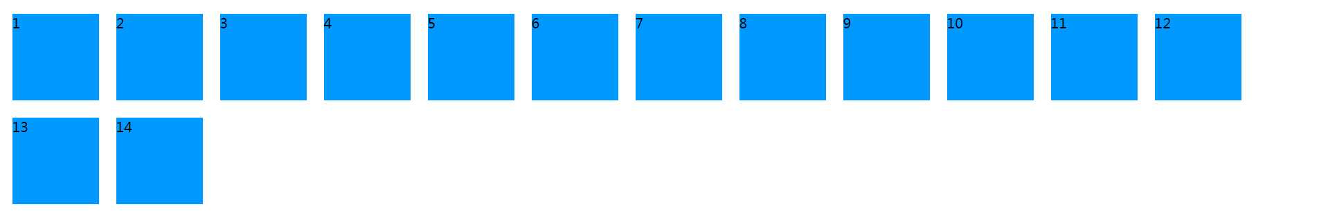
三、flex的基本术语
四、有六个属性设置在父容器上,来控制子元素的显示方式:
| 属性 | 含义 |
|---|---|
flex-direction |
主轴方向 |
flex-wrap |
换行样式 |
flex-flow |
前两个的简写形式 |
justify-content |
主轴对齐方式 |
align-items |
单行的副轴对齐方式 |
align-content |
多行的副轴对齐方式 |
五、flex-direction,设置主轴的对齐方向,有四个值:
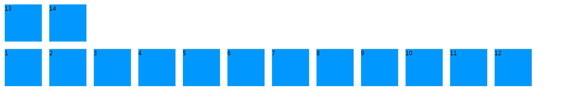
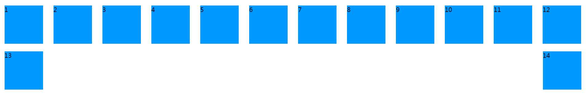
row(默认值):主轴为水平方向,起点在左端。 row-reverse:主轴为水平方向,起点在右端。column:主轴为垂直方向,起点在上沿。column-reverse:主轴为垂直方向,起点在下沿。1 <!DOCTYPE html> 2 <html lang="en"> 3 4 <head> 5 <meta charset="UTF-8"> 6 <meta name="viewport" content="width=device-width, initial-scale=1.0"> 7 <meta http-equiv="X-UA-Compatible" content="ie=edge"> 8 <title>flex布局 - by ghostwu</title> 9 <style> 10 #box { 11 display: flex; 12 flex-direction: row; 13 } 14 #box div { 15 width: 100px; 16 height: 100px; 17 background: #09f; 18 margin: 10px; 19 } 20 </style> 21 </head> 22 23 <body> 24 <div id="box"> 25 <div>1</div> 26 <div>2</div> 27 <div>3</div> 28 <div>4</div> 29 <div>5</div> 30 <div>6</div> 31 <div>7</div> 32 <div>8</div> 33 <div>9</div> 34 <div>10</div> 35 <div>11</div> 36 <div>12</div> 37 <div>13</div> 38 <div>14</div> 39 </div> 40 </body> 41 42 </html>
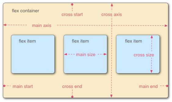
flex-direction设置为row:

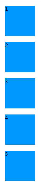
flex-direction设置为row-reverse:

flex-direction设置为column,下面的示意图我只截取了前面5个div,后面如果截取的话,图片占的位置太多了,影响体验.
flex-direction设置为column-reverse:
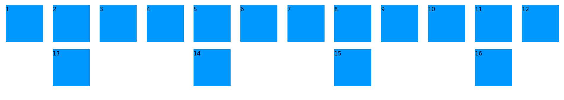
六、flex-wrap :定义子元素超过一行,如何换行,常用属性值:
1 #box {
2     display: flex;
3     flex-direction: row;
4     flex-wrap: nowrap;
5 }
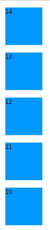
flex-wrap:nowrap;

七、flex-flow:是flex-direction 和flex-wrap的简写形式,默认是 row nowrap
1 #box {
2     display:flex;
3     /* flex-flow: row nowrap; */
4     /* flex-flow: row wrap; */
5     /* flex-flow: row wrap-reverse; */
6     /* flex-flow: row-reverse wrap-reverse; */
7     flex-flow: column wrap;
8 }
八、 justify-content: 子元素在主轴对齐方式
flex-start(默认值):左对齐flex-end:右对齐center: 居中space-between:两端对齐,项目之间的间隔都相等。space-around:每个项目两侧的间隔相等。1 #box { 2 display:flex; 3 flex-flow: row wrap; 4 /* justify-content: flex-start; */ 5 /* justify-content: flex-end; */ 6 /* justify-content: center; */ 7 /* justify-content: space-between; */ 8 justify-content: space-around; 9 }
标签:tween body 样式 lin dir lang row doctype justify
原文地址:http://www.cnblogs.com/ghostwu/p/7652793.html