标签:css linear near nsf 制作 demo text color end
#loda {
width: 200px;
height: 200px;
border-radius: 50%;
border: 15px solid #ffff00;;
border-left-color: #32cd32;
border-top-color: #32cd32;
animation: demo 10s linear 0s infinite;
}
@keyframes demo {
from {
transform: rotate(0deg);
}
to {
transform: rotate(360deg);
}
}
#lodaing {
text-align: center;
color: #00bfff;
font-size: 25px;
margin: -125px 70px;
position: absolute;
}
<div id="lod">
<div id="loda"></div>
<p id="lodaing">Lodaing</p>
</div>
效果: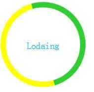
<div class="wangyi">
<div class="wangyi1"></div>
<div class="wangyi2"></div>
<div class="wangyi3"></div>
<div class="wangyi4"></div>
<div class="wangyi5"></div>
<div class="wangyi6"></div>
</div>
/* 网易云音乐符*/
.wangyi {
margin-top: 100px;
margin-left: 85px;
}
.wangyi1 {
width: 6px;
height: 40px;
background: #ffc0cb;
display: inline-block;
animation: wangyi 1s linear 0.2s infinite;
}
.wangyi2 {
width: 6px;
height: 40px;
background: #ffc0cb;
display: inline-block;
animation: wangyi 1s linear 0.4s infinite;
}
.wangyi3 {
width: 6px;
height: 40px;
background: #ffc0cb;
display: inline-block;
animation: wangyi 1s linear 0.6s infinite;
}
.wangyi4 {
width: 6px;
height: 40px;
background: #ffc0cb;
display: inline-block;
animation: wangyi 1s linear 0.8s infinite;
}
.wangyi5 {
width: 6px;
height: 40px;
background: #ffc0cb;
display: inline-block;
animation: wangyi 1s linear 1s infinite;
}
.wangyi6 {
width: 6px;
height: 40px;
background: #ffc0cb;
display: inline-block;
animation: wangyi 1.2s linear 1s infinite;
}
@keyframes wangyi {
from {
transform: scale(0.4);
}
to {
transform: scale(0.6);
}
}
/*end网易云*/
效果: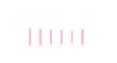
标签:css linear near nsf 制作 demo text color end
原文地址:http://www.cnblogs.com/qian21/p/7839599.html