标签:form round 执行 count 表示 播放 col repeat str
首先声明动画 @keyframes
@keyframes  动画名称 {
/*定义关键帧即不同时间点上的动画状态*/
from | 0%{
/*动画的开始状态(样式)*/
transform:rotate(0deg)
}
/*...若干关键帧*/
20%{
/*动画在执行到20%的时候的状态(样式)*/
}
25%{
}
26%{
}

to | 100%{
/*动画结束时候的状态(样式)*/
transform:rotate(360deg)
}
}
transform-function:表示要实现转换的函数
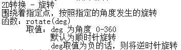
旋转:rotate( )
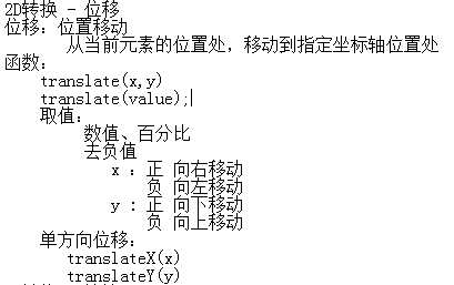
位移:translate()
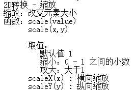
缩放:scale()
倾斜:skew()
然后 通过 animation 属性 调用已声明动画
animation 动画名称 +动画属性【一般调用前五】
动画属性(调用)
      1、animation-name : 调用动画的名称,指定 @keyframes 的名字
      2、animation-duration:动画执行的时常以 s或ms
      3、animation-timing-function:动画执行时的速度效果
         取值 ease,linear,ease-in,ease-out,ease-in-out
      4、animation-delay:延迟时间,以s或ms为单位
      5、animation-iteration-count
         动画执行的次数
     取值 :
        1、具体数值
        2、infinite : 无限次播放
      6、animation-direction : 动画播放方向
         取值:
        normal
        alternate :
           奇数次播放为正向播放(状态从from - to)
           偶数次播放为逆向播放(状态从to - from)
      7、动画综合属性 : animation:mingcheng 2s ease 1s 3
         ainimation:name duration timing-function delay iteration-count direction;
      8、animation-fill-mode
         指定动画在播放之前或之后的效果
     none : 默认行为
     forwards:动画完成后,保持最后一个状态
     backwards : 动画显示之前,保持在第一个状态
     both:动画完成后,动画显示前,都被相应的状态所保持着。

      9、animation-play-state
         定义动画播放状态
     配合着 Javascript使用,用于播放过程中暂停动画
     取值:
        paused :暂停
        running :播放
例子:音乐跳动符

html
<div class="music">
        <div class="music1"></div>
        <div class="music2"></div>
        <div class="music3"></div>
        <div class="music4"></div>
        <div class="music5"></div>
    </div>
css
.music div{
    width: 5px;
    height: 40px;
    background-color: #1F1E1E;
    display: inline-block;
}
.music1 {
    animation:music 1s linear 0.2s infinite;
}
.music2 {
    animation:music 1s linear 0.4s infinite;
}
.music3 {
    animation:music 1s linear 0.6s infinite;
}
.music4 {
    animation:music 1s linear 0.8s infinite;
}
.music5 {
    animation:music 1s linear 1s infinite;
}
@keyframes music {
    from {
        transform: scaleY(0.1);
    }
    to{
        transform: scaleY(0.5);
    }
}
图标位移
html
<div class="icon">
        <ul>
            <li class="icon_one"></li>
            <li class="icon_two"></li>
            <li class="icon_three"></li>
            <li class="icon_four"></li>
            <li class="icon_five"></li>
        </ul>
    </div>
css
.icon {
    position: relative;
}
.icon li {
    width: 173px;
    height: 173px;
    list-style: none;
    display: inline-block;
    position: absolute;
}
.icon_one {
    background: url(../images/iconlist_1.png) no-repeat;
    animation: icon_one 10s linear 1;
}
.icon_two {
    background: url(../images/iconlist_1.png) no-repeat;
    background-position: -174px;
    animation: icon_two 10s linear 1;
}
.icon_three {
    background: url(../images/iconlist_1.png) no-repeat;
    background-position: -348px;
    animation: icon_three 10s linear 1;
}
.icon_four {
    background: url(../images/iconlist_1.png) no-repeat;
    background-position: -522px;
    animation: icon_four 10s linear 1;
}
.icon_five {
    background: url(../images/iconlist_1.png) no-repeat;
    background-position: -696px;
    animation: icon_five 10s linear 1;
}
@keyframes  icon_one {
    from {
        transform: translate(0px);
    }
    to {
        transform: translate(150px);
    }
}
@keyframes  icon_two {
    from {
        transform: translate(0px);
    }
    to {
        transform: translate(300px);
    }
}
@keyframes  icon_three {
    from {
        transform: translate(0px);
    }
    to {
        transform: translate(450px);
    }
}
@keyframes  icon_four {
    from {
        transform: translate(0px);
    }
    to {
        transform: translate(600px);
    }
}
@keyframes  icon_five {
    from {
        transform: translate(0px);
    }
    to {
        transform: translate(750px);
    }
}
圆旋转
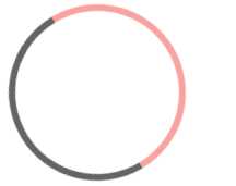
html
<div class="circle"></div>
css
.circle {
    width: 150px;
    height: 150px;
    border-radius: 50%;
    border:6px solid #656363;
    border-bottom-color: #F9A2A2;
    border-right-color: #F9A2A2;
    animation:anmiate 2s linear 0s infinite;
}
@keyframes anmiate {
    from {
        transform: rotate(0deg);
    }
    to{
        transform: rotate(360deg);
    }
}
标签:form round 执行 count 表示 播放 col repeat str
原文地址:http://www.cnblogs.com/ssn15874065323/p/7840465.html