标签:gen 线图 print and double size 数据可视化 sub span
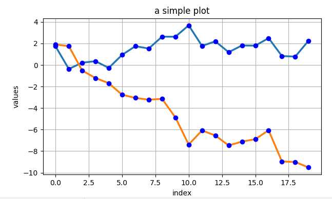
import matplotlib as mpl
import numpy as np
import matplotlib.pyplot as plt

np.random.seed(2000)
y = np.random.standard_normal((20,2))
# print(y)

‘‘‘
不同的求和
print(y.cumsum())
print(y.sum(axis=0))
print(y.cumsum(axis=0))
‘‘‘

# 绘图
plt.figure(figsize=(7,4))
plt.plot(y.cumsum(axis=0),linewidth=2.5)
plt.plot(y.cumsum(axis=0),‘bo‘)

plt.grid(True)
plt.axis("tight")

plt.xlabel(‘index‘)
plt.ylabel(‘values‘)
plt.title(‘a simple plot‘)

plt.show()
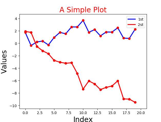
2.下面分别提取两组数据,进行绘图。
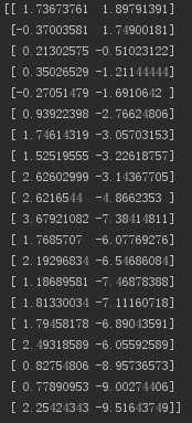
import matplotlib as mpl
import numpy as np
import matplotlib.pyplot as plt

np.random.seed(2000)
date = np.random.standard_normal((20,2))
y = date.cumsum(axis=0)

print(y)

# 重点下面两种情况的区别
print(y[1])      # 取得是 第1行的数据 [-0.37003581  1.74900181]
print(y[:,0])    # 取得是 第1列的数据 [ 1.73673761 -0.37003581  0.21302575  0.35026529 ...

# 绘图
plt.plot(y[:,0],lw=2.5,label="1st",color=‘blue‘)
plt.plot(y[:,1],lw=2.5,label="2st",color=‘red‘)
plt.plot(y,‘ro‘)

# 添加细节
plt.title("A Simple Plot",size=20,color=‘red‘)
plt.xlabel(‘Index‘,size=20)
plt.ylabel(‘Values‘,size=20)

# plt.axis(‘tight‘)
plt.xlim(-1,21)
plt.ylim(np.min(y)-1,np.max(y)+1)

# 添加图例
plt.legend(loc=0)

plt.show()
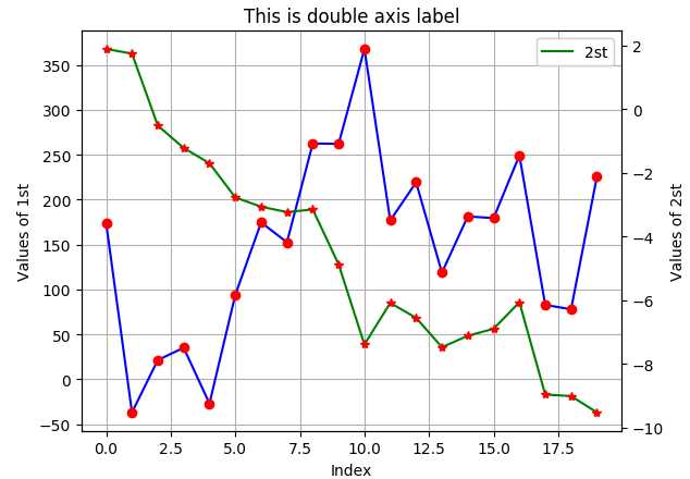
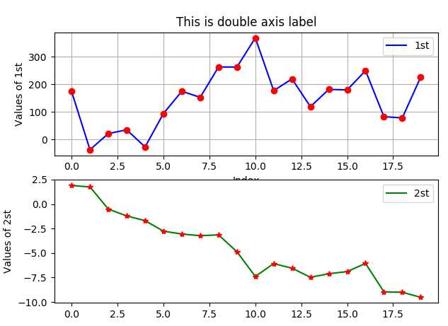
3.双坐标轴。
import matplotlib as mpl
import numpy as np
import matplotlib.pyplot as plt

np.random.seed(2000)
date = np.random.standard_normal((20,2))
y = date.cumsum(axis=0)

y[:,0]=y[:,0]*100

fig,ax1 = plt.subplots()
plt.plot(y[:,0],‘b‘,label="1st")
plt.plot(y[:,0],‘ro‘)

plt.grid(True)
plt.axis(‘tight‘)
plt.xlabel("Index")
plt.ylabel(‘Values of 1st‘)
plt.title("This is double axis label")

plt.legend(loc=0)

ax2=ax1.twinx()
plt.plot(y[:,1],‘g‘,label="2st")
plt.plot(y[:,1],‘r*‘)
plt.ylabel("Values of 2st")
plt.legend(loc=0)

plt.show()
4. 分为两个图绘画。
import matplotlib as mpl
import numpy as np
import matplotlib.pyplot as plt

np.random.seed(2000)
date = np.random.standard_normal((20,2))
y = date.cumsum(axis=0)

y[:,0]=y[:,0]*100

plt.figure(figsize=(7,5))       # 确定图片大小
plt.subplot(211)                # 确定第一个图的位置 (行,列,第几个)两行一列第一个图

plt.plot(y[:,0],‘b‘,label="1st")
plt.plot(y[:,0],‘ro‘)

plt.grid(True)
plt.axis(‘tight‘)
plt.xlabel("Index")
plt.ylabel(‘Values of 1st‘)
plt.title("This is double axis label")

plt.legend(loc=0)

plt.subplot(212)               # 确定第一个图的位置
plt.plot(y[:,1],‘g‘,label="2st")
plt.plot(y[:,1],‘r*‘)
plt.ylabel("Values of 2st")
plt.legend(loc=0)

plt.show()
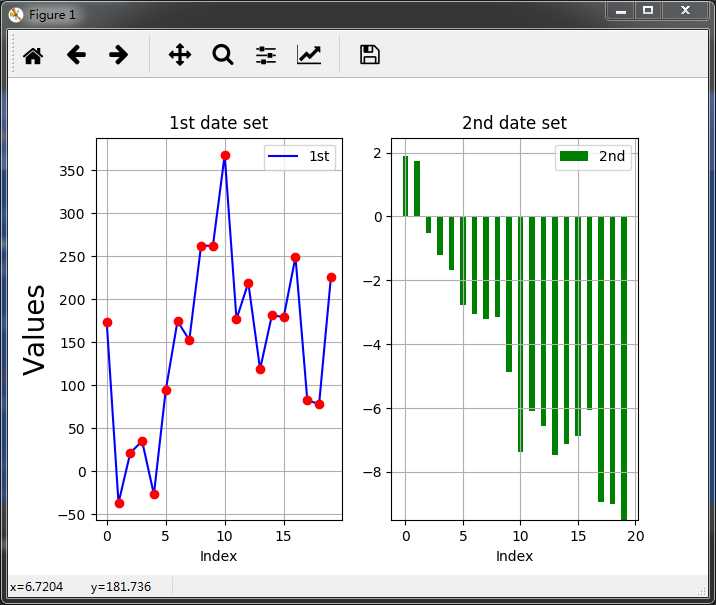
5.在两个图层中绘制两种不同的图(直线图立方图)
import matplotlib as mpl
import numpy as np
import matplotlib.pyplot as plt

np.random.seed(2000)
date = np.random.standard_normal((20,2))
y = date.cumsum(axis=0)

y[:,0]=y[:,0]*100

plt.figure(figsize=(7,5))       # 确定图片大小
plt.subplot(121)                # 确定第一个图的位置

plt.plot(y[:,0],‘b‘,label="1st")
plt.plot(y[:,0],‘ro‘)

plt.grid(True)
plt.axis(‘tight‘)
plt.xlabel("Index")
plt.ylabel(‘Values‘,size=20)
plt.title("1st date set")

plt.legend(loc=0)

plt.subplot(122)               # 确定第一个图的位置
plt.bar(np.arange(len(y[:,1])),y[:,1],width = 0.5,color=‘g‘,label="2nd")  # 直方图的画法
plt.grid(True)
plt.xlabel("Index")
plt.title(‘2nd date set‘)
plt.legend(loc=0)

plt.show()
Python 金融数据可视化(两列数据的提取//分别画//双坐标轴//双图//两种不同的图)
标签:gen 线图 print and double size 数据可视化 sub span
原文地址:http://www.cnblogs.com/hanbb/p/7846452.html