标签:begin 3.4 区域 ubi form har 1.2 position 图片放大
源码:
<!DOCTYPE html>
<html lang="en">
<head>
<meta charset="UTF-8">
<title>css3伪放大镜(图片放大动画)效果</title>
<style>
.gallery{list-style:none}
.gallery:before,.gallery__item:last-child{position:fixed;top:50%;left:50%;margin:-31.25em;width:62.5em;height:62.5em}
.gallery:before{z-index:-1;border-radius:50%;content:‘‘;box-shadow:inset 0 0 5em dimgrey,0 0 0 50vw dimgrey}
.gallery__item{background-blend-mode:luminosity;transition:-webkit-transform .5s cubic-bezier(0.175,0.885,0.32,1.275),background-image .5s}
.gallery__item:not(:last-child){position:absolute;top:50%;left:50%;width:32vmin;height:32vmin;border-radius:50%;box-shadow:0 0 .5em white}
.gallery__item:nth-child(1){margin:13.87457vmin -4.53223vmin;-webkit-transform:scale(0.5);background:url("images/1.jpg") 50% 50% fixed whitesmoke}
.gallery__item:nth-child(1):hover{-webkit-transform:scale(1);background-blend-mode:normal;cursor:pointer}
.gallery__item:nth-child(1):hover ~:last-child{background:url("images/1.jpg") 50% 50% fixed dimgray}
.gallery__item:nth-child(1):hover ~:last-child:after{opacity:.001}
.gallery__item:nth-child(2){margin:4.13825vmin -40.86867vmin;-webkit-transform:scale(0.5);background:url("images/2.jpg") 50% 50% fixed whitesmoke}
.gallery__item:nth-child(2):hover{-webkit-transform:scale(1);background-blend-mode:normal;cursor:pointer}
.gallery__item:nth-child(2):hover ~:last-child{background:url("images/2.jpg") 50% 50% fixed dimgray}
.gallery__item:nth-child(2):hover ~:last-child:after{opacity:.001}
.gallery__item:nth-child(3){margin:-33.42845vmin -42.83746vmin;-webkit-transform:scale(0.5);background:url("images/3.jpg") 50% 50% fixed whitesmoke}
.gallery__item:nth-child(3):hover{-webkit-transform:scale(1);background-blend-mode:normal;cursor:pointer}
.gallery__item:nth-child(3):hover ~:last-child{background:url("images/3.jpg") 50% 50% fixed dimgray}
.gallery__item:nth-child(3):hover ~:last-child:after{opacity:.001}
.gallery__item:nth-child(4){margin:-46.90963vmin -7.71779vmin;-webkit-transform:scale(0.5);background:url("images/4.jpg") 50% 50% fixed whitesmoke}
.gallery__item:nth-child(4):hover{-webkit-transform:scale(1);background-blend-mode:normal;cursor:pointer}
.gallery__item:nth-child(4):hover ~:last-child{background:url("images/4.jpg") 50% 50% fixed dimgray}
.gallery__item:nth-child(4):hover ~:last-child:after{opacity:.001}
.gallery__item:nth-child(5){margin:-17.67475vmin 15.95615vmin;-webkit-transform:scale(0.5);background:url("images/5.jpg") 50% 50% fixed whitesmoke}
.gallery__item:nth-child(5):hover{-webkit-transform:scale(1);background-blend-mode:normal;cursor:pointer}
.gallery__item:nth-child(5):hover ~:last-child{background:url("images/5.jpg") 50% 50% fixed dimgray}
.gallery__item:nth-child(5):hover ~:last-child:after{opacity:.001}
.gallery__item:last-child{z-index:-2}
.gallery__item:last-child:after{position:absolute;top:0;right:0;bottom:0;left:0;opacity:.999;background:dimgrey;transition:opacity 2s;content:‘‘}
</style>
</head>
<body>
<!--代码部分begin-->
<ul class="gallery">
<li class="gallery__item"></li>
<li class="gallery__item"></li>
<li class="gallery__item"></li>
<li class="gallery__item"></li>
<li class="gallery__item"></li>
<li class="gallery__item"></li>
</ul>
<div style="text-align: center;"></div>
<!--代码部分end-->
</body>
</html>
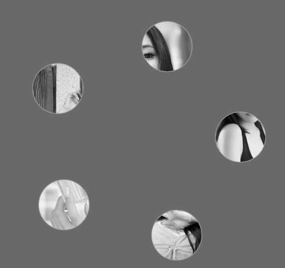
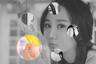
css3伪放大镜(图片放大动画)效果(鼠标移入圆形区域放大图片)
标签:begin 3.4 区域 ubi form har 1.2 position 图片放大
原文地址:http://www.cnblogs.com/jj-z/p/7999694.html