一.水平居中
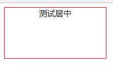
1.文字水平居中
<div class="one">
测试居中
</div>
<style>
.one{
width: 200px;
height: 100px;
border:1px solid red;
text-align: center;
}
</style>
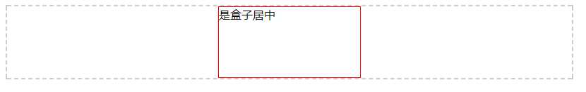
2.盒子居中
<div class="one">是盒子居中</div>
<style>
.one{
width: 200px;
height: 100px;
border:1px solid red;
margin: 0 auto;
}
</style>
3.多块级元素水平居中
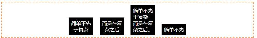
<div class="container">
<div class="child">
简单不先于复杂
</div>
<div class="child">
而是在复杂之后
</div>
<div class="child">
简单不先于复杂,而是在复杂之后。
</div>
<div class="child">
简单不先
</div>
</div>
<style>
.container {
height:100px;
padding: 8px;
text-align: center;
border: 2px dashed #f69c55;
}
.child {
padding: 8px;
width: 4rem;
margin: 0 8px;
color: #fff;
background: #000;
display: inline-block;
}
</style>
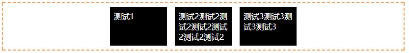
4.弹性布局,多块级水平居中
<div class="flex-center">
<div>
测试1
</div>
<div>
测试2测试2测试2测试2测试2测试2测试2
</div>
<div>
测试3测试3测试3测试3
</div>
</div>
<style>
.flex-center {
width: 800px;
padding: 8px;
display: flex;
justify-content: center;
border: 2px dashed #f69c55;
}
.flex-center >div {
padding: 8px;
width: 100px;
margin: 0 8px;
color: #fff;
background: #000;
}
</style>
display: flex;兼容性不好可以这样解决:最少支持ie10以上
.flex-center{ display: -webkit-flex; /* 新版本语法: Chrome 21+ */
display: flex; /* 新版本语法: Opera 12.1, Firefox 22+ */
display: -webkit-box; /* 老版本语法: Safari, iOS, Android browser, older WebKit browsers. */
display: -moz-box; /* 老版本语法: Firefox (buggy) */ display: -ms-flexbox; /* 混合版本语法: IE 10 */
}
.flex-center>div { -webkit-flex: 1; /* Chrome */
-ms-flex: 1 /* IE 10 */
flex: 1; /* NEW, Spec - Opera 12.1, Firefox 20+ */
-webkit-box-flex: 1 /* OLD - iOS 6-, Safari 3.1-6 */
-moz-box-flex: 1; /* OLD - Firefox 19- */
}
5.垂直居中
1.元素是display:block和display:inline-block都可以使用height:100px ,line-height:100px;
2.利用display:table-cell
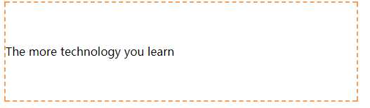
<div class="center-table">
<p class="v-cell">The more technology you learn</p>
</div>
<style>
.center-table {
width: 800px;
display: table;
height: 140px;
border: 2px dashed #f69c55;
}
.v-cell {
display: table-cell;
vertical-align: middle;
}
</style>
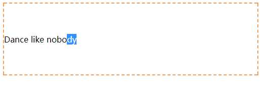
3.用flex布局
<div class="center-flex">
<p>Dance like nobody </p>
</div>
<style>
.center-flex {
width: 500px;
height: 140px;
display: flex;
flex-direction: column;
justify-content: center;
border: 2px dashed #f69c55;
}
</style>
4.块级元素固定高度(这个应该是大家最熟悉的,例子就不放了)
.parent {
position: relative;
}
.child {
position: absolute;
top: 50%;
height: 100px;
margin-top: -50px;
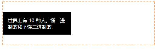
}5.不知高度
<div class="parent">
<div class="child">世界上有 10 种人,懂二进制的和不懂二进制的。</div>
</div>
<style>
.parent {
height: 140px;
position: relative;
border: 2px dashed #f69c55;
}
.child {
position: absolute;
top: 50%;
transform: translateY(-50%);
background: black;
color: #fff;
padding: 1rem;
width: 12rem;
}
</style>
transform的兼容性:
transform: translate(50px,100px);
-ms-transform: translateY(-50%)		/* IE 9 */
-webkit-transform:  translateY(-50%)	/* Safari and Chrome */
-o-transform: translateY(-50%)/* Opera */
-moz-transform:  translateY(-50%);	/* Firefox */
三,水平居中,垂直居中
1.固定宽高的水平垂直居中(大家熟悉的)
parent {
    position: relative;
}
.child {
    width: 300px;
    height: 100px;
    padding: 20px;
    position: absolute;
    top: 50%;
    left: 50%;
    margin: -70px 0 0 -170px;
}
2.不知宽高-水平垂直居中
.parent {
    position: relative;
}
.child {
    position: absolute;
    top: 50%;
    left: 50%;
    transform: translate(-50%, -50%);
}
3.flex布局(上面水居中和垂直居中有例子就不写了)
.parent {
    display: flex;
    justify-content: center;
    align-items: center;
}
4.利用grid实现水平垂直居中,兼容性较差,不推荐。
.parent {
  height: 140px;
  display: grid;
}
.child {
  margin: auto;
}
5.弹窗的水平居中(截图不好放,就不放了,大家粘贴就可以运行)
<div class="element">
<div>水平垂直居中了,好开心哦</div>
</div>
<style>
.element{
width: 300px;
height: 300px;
position: absolute;
left: 0;
right: 0;
top: 0;
bottom: 0;
margin: auto;
}
</style>