标签:lex osi padding src auto sla doc title content
直接上代码,只需切换class就可看效果
<!DOCTYPE html>
<html>
<head>
    <title>水平垂直居中</title>
    <style type="text/css">
    *{
        margin: 0;
        padding: 0;
    }
        .myDiv{
            width:200px;
            height: 200px;
            background: lightblue;
        }
        /*方法一*/
        .divToCenter1{

            position: absolute;
            top:0;
            left: 0;
            bottom: 0;
            right: 0;
            margin: auto;
        }
        /*方法二*/
        .divToCenter2{
            position:absolute;
            top:50%;
            left:50%;
            margin:-100px;
        }
        /*方法三*/
        .divToCenter3{
            position: absolute;
            top: 50%;
            left:50%;
            transform: translate(-50%,-50%);
        }


    </style>
</head>
<body>
    <div  class="myDiv divToCenter3">

    </div>

</body>
</html>
运行结果:
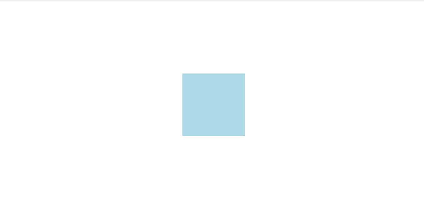
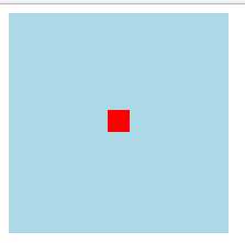
相对父组件(div)水平垂直居中
效果如下:
<!DOCTYPE html>
<html>
<head>
    <title>水平垂直居中</title>
    <style type="text/css">
    *{
        margin: 0;
        padding: 0;
    }
        .myDiv{
            width:200px;
            height: 200px;
            background: lightblue;
        }

        /*方法四*/
        .divToCenter4{

            display: flex;
            justify-content: center;
            align-items: center;
        }
        .myDiv .box1{
            width:20px;
            height: 20px;
            background: red;

        }
        /*方法五*/
        .divToCenter5{
            display: table-cell;
            vertical-align: middle;
            text-align: center;
        }
        .myDiv .box2{
            width:20px;
            height: 20px;
            background: red;
            display: inline-block;
        }

    </style>
</head>
<body>
    <div  class="myDiv divToCenter5">
        <div class="box2"></div>
    </div>

</body>
</html>
标签:lex osi padding src auto sla doc title content
原文地址:https://www.cnblogs.com/xingguozhiming/p/8847632.html