标签:ber tle ack isp lib img 散点图 to_date code
import pandas as pd
unrate = pd.read_csv(‘unrate.csv‘)
unrate[‘DATE‘] = pd.to_datetime(unrate[‘DATE‘])#可将1948/1/1时间格式转换为1948-01-01
print(unrate.head(12))
结果:

         DATE  VALUE
0  1948-01-01    3.4
1  1948-02-01    3.8
2  1948-03-01    4.0
3  1948-04-01    3.9
4  1948-05-01    3.5
5  1948-06-01    3.6
6  1948-07-01    3.6
7  1948-08-01    3.9
8  1948-09-01    3.8
9  1948-10-01    3.7
10 1948-11-01    3.8
11 1948-12-01    4.0
import matplotlib.pyplot as plt
#%matplotlib inline
#Using the different pyplot functions, we can create, customize, and display a plot. For example, we can use 2 functions to :
plt.plot()
plt.show()
结果:

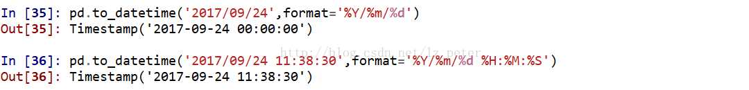
first_twelve = unrate[0:12]
plt.plot(first_twelve[‘DATE‘], first_twelve[‘VALUE‘])
plt.show()
结果:
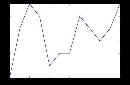
#While the y-axis looks fine, the x-axis tick labels are too close together and are unreadable
#We can rotate the x-axis tick labels by 90 degrees so they don‘t overlap
#We can specify degrees of rotation using a float or integer value.
plt.plot(first_twelve[‘DATE‘], first_twelve[‘VALUE‘])
plt.xticks(rotation=45)#指定x轴标注的角度,这里选的为45度
#print help(plt.xticks)
plt.show()
结果:
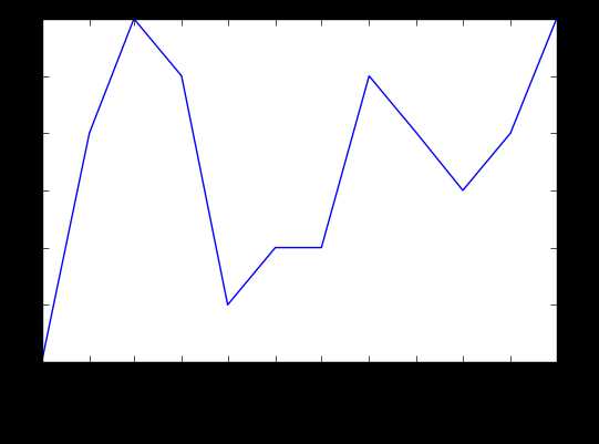
#xlabel(): accepts a string value, which gets set as the x-axis label.
#ylabel(): accepts a string value, which is set as the y-axis label.
#title(): accepts a string value, which is set as the plot title.

plt.plot(first_twelve[‘DATE‘], first_twelve[‘VALUE‘])
plt.xticks(rotation=90)
plt.xlabel(‘Month‘)
plt.ylabel(‘Unemployment Rate‘)
plt.title(‘Monthly Unemployment Trends, 1948‘)
plt.show()
结果:
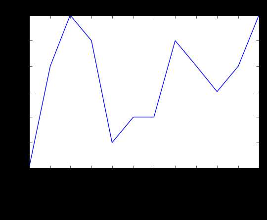
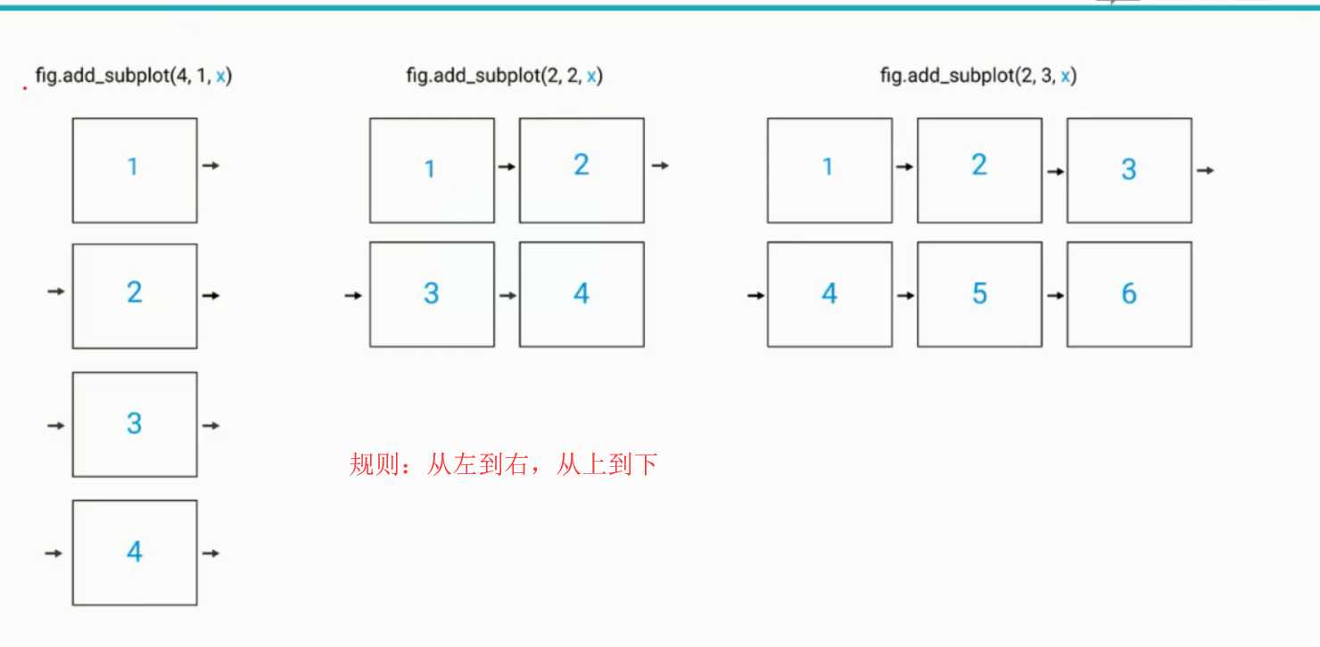
#add_subplot(first,second,index) first means number of Row,second means number of Column.

import matplotlib.pyplot as plt
fig = plt.figure()#规定画图区间(画图域)
ax1 = fig.add_subplot(3,2,1)
ax2 = fig.add_subplot(3,2,2)
ax3 = fig.add_subplot(3,2,6)
plt.show()
结果:

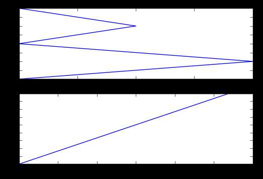
import numpy as np
fig = plt.figure()
#fig = plt.figure(figsize=(3, 3))#figsize指定图的长和宽
ax1 = fig.add_subplot(2,1,1)
ax2 = fig.add_subplot(2,1,2)

ax1.plot(np.random.randint(1,5,5), np.arange(5))
ax2.plot(np.arange(10)*3, np.arange(10))
plt.show()
结果:
unrate[‘MONTH‘] = unrate[‘DATE‘].dt.month
unrate[‘MONTH‘] = unrate[‘DATE‘].dt.month
fig = plt.figure(figsize=(6,3))
#同一个图中画出两条线
plt.plot(unrate[0:12][‘MONTH‘], unrate[0:12][‘VALUE‘], c=‘red‘)#c的值可以用小写或缩写或rgb颜色通道值也可以
plt.plot(unrate[12:24][‘MONTH‘], unrate[12:24][‘VALUE‘], c=‘blue‘)

plt.show()
结果:
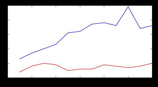
fig = plt.figure(figsize=(10,6))
colors = [‘red‘, ‘blue‘, ‘green‘, ‘orange‘, ‘black‘]
for i in range(5):
    start_index = i*12
    end_index = (i+1)*12
    subset = unrate[start_index:end_index]
    plt.plot(subset[‘MONTH‘], subset[‘VALUE‘], c=colors[i])

plt.show()
结果:
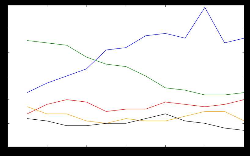
fig = plt.figure(figsize=(10,6))
colors = [‘red‘, ‘blue‘, ‘green‘, ‘orange‘, ‘black‘]
for i in range(5):
    start_index = i*12
    end_index = (i+1)*12
    subset = unrate[start_index:end_index]
    label = str(1948 + i)
    plt.plot(subset[‘MONTH‘], subset[‘VALUE‘], c=colors[i], label=label)
plt.legend(loc=‘best‘)#显示label   loc指的是label所放置位置,best是自动选择最好位置
#print help(plt.legend)
plt.show()
结果:
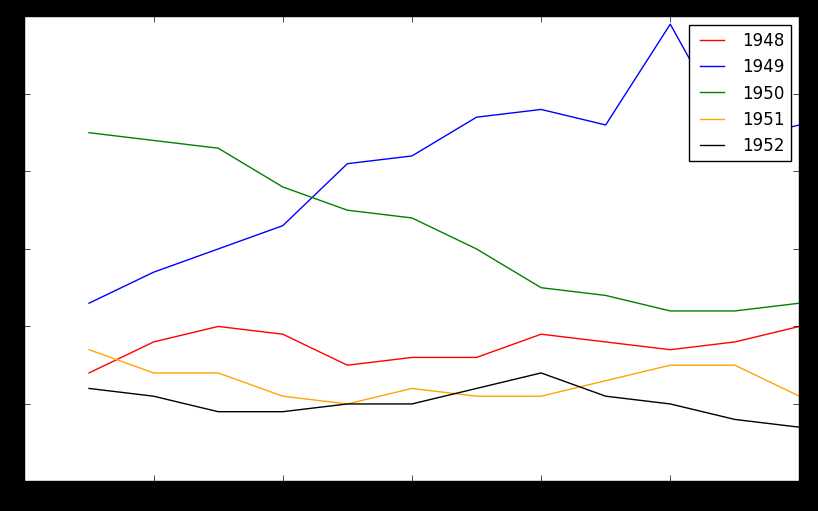
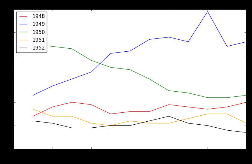
fig = plt.figure(figsize=(10,6))
colors = [‘red‘, ‘blue‘, ‘green‘, ‘orange‘, ‘black‘]
for i in range(5):
    start_index = i*12
    end_index = (i+1)*12
    subset = unrate[start_index:end_index]
    label = str(1948 + i)
    plt.plot(subset[‘MONTH‘], subset[‘VALUE‘], c=colors[i], label=label)
plt.legend(loc=‘upper left‘)
plt.xlabel(‘Month, Integer‘)
plt.ylabel(‘Unemployment Rate, Percent‘)
plt.title(‘Monthly Unemployment Trends, 1948-1952‘)

plt.show()
结果:
标签:ber tle ack isp lib img 散点图 to_date code
原文地址:https://www.cnblogs.com/tianqizhi/p/9189170.html
