标签:情况 文字 第一个 cursor hidden 一个 IV 定位 伪类
CSS是指层叠样式表(Cascading Style Sheets),样式定义如何显示HTML元素,样式通常又会存在于样式表中。
也就是说把HTML元素的样式都统一收集起来写在一个地方或一个CSS文件里。
1.内容与表现分离
2.网页的表现统一,容易修改
3.丰富的样式,使页面布局更加灵活
4.减少网页的代码量,增加网页浏览器速度,节省网络带宽
5.运用独立页面的css,有利于网页被搜索引擎收录
  1.内嵌式
        一般不写内嵌式,以后不好维护

        <h1 style="font-size: 10px;color: yellow">我是h1路飞学城</h1>

  2.内链式
        <style type="text/css">
            h2{font-size:30px;color:red;}
        </style>

  3.外链式

        链接式
            link css 同时加载的!
            <link rel="stylesheet" type="text/css" href="./css/index.css">

        导入式
            实际用的很少,先加载html,在加载css
            import 是css2.1特有的,对于不兼容css2.1的浏览器是无效的eg:IE5以下
            <style type="text/css">
                @import url(‘./css/index.css‘);
            </style>
            注意:@import url()必须写在文件最开始的位置。

        链接式与导入式的区别:
            1、<link/>标签属于XHTML,@import是属性css2.1
            2、使用<link/>链接的css文件先加载到网页当中,再进行编译显示
            3、使用@import导入的css文件,客户端显示HTML结构,再把CSS文件加载到网页当中
            4、@import是属于CSS2.1特有的,对于不兼容CSS2.1的浏览器来说就是无效的

    生效优先级:内嵌式 > 内链式 > 外链式
css样式优先级:
行内样式 > 内部样式表 > 外部样式表
ID选择器 > 类选择器 > 标签选择器
/*1.标签选择器
        p {
          color: red;
        }


 /*2.id选择器:

        #user {
          background-color: yellow;
        }

 /*3.类选择器

        .c1 {
          color: blue;
        }
        .c2{
            background-color: red;
        }
        .c3{
            font-size: 12px;
        }

/*4.通配符选择器*/
        *{
            margin: 0;
            padding: 0;
        }
/*5.子代选择器 (选择器之间用 > )*/
        ul > li {
            color: red;
        }

/*6.后代选择器 (选择器之间用 空格)*/
        ul a {
            color: green;
        }

/*7.群组选择器 (中间用,)*/
        .title, .content, .footer {
            width: 900px;
            margin: 0 auto;
            background-color: red;
            border: 1px solid red;
        }

/*8.交集选择器 (选择器之间不能有空格,第一个标签必须是标签选择器,第二个标签可以是id或者类选择器)*/
        p.p1 {
            color: red;
        }

        p#title1 {
            font-size: 30px;
            color: red;
        }

/*9.毗邻选择器 (选择器之间用 +  紧跟着h3标题的标签)*/
        h3 + p {
            color: red;
        }

/*10.兄弟选择器 (选择器之间用~)*/
        h3 ~ p {
            color: red;
        }
^ 以...开头,
$ 以...结尾,
* 包含...,
~ 有多个值中的其中一个
        [class="baidu"]{
            color:red;
        }
        [class^="btn"]{
            color:yellow;
            font-size:12px;
        }
        [class$="ault"]{
            font-size:12px;
            color:red;
        }
        [class]{
            color:red;
        }
        [class*=‘baidu‘]{
            color:red;
        }
        [class~=‘baidu‘]{
            color:red;
        }
        input[input="text"]{
            background-color:red;
        }
a标签的 lover hate
    a:link{ }   超链接  未被访问时的状态
    a:hover{ color: green;}                    鼠标悬停时的状态
    a:visited{ color: yellow;}                 鼠标单击时的状态
    a:active{ color:blue;}                     鼠标不松手的状态
    input:focus{ background-color:red;}        获取焦点时的状态
nth-child(n)
        div ul li:first-child{color: red;}           /*选中第一个元素*/
        div ul li:last-child{color: yellow;}         /*选中最后一个元素*/
        div ul li:nth-child(3){color: purple;}        /*选中当前指定的元素  数值从1开始*/
        div ul li:nth-child(n){color: red;}           /*n表示选中所有 从0开始的  0的时候表示没有选中*/
        div ul li:nth-child(2n){color: gold;}          /*偶数*/
        div ul li:nth-child(2n-1){color: yellow;}     /*奇数*/
        div ul li:nth-child(5n+1){color: red;}       /*隔几换色  隔行换色*/
    p:first-letter{ font-size:30px;}        p段落 为文本的首字母设置特殊样式
    p:before{                               用于在元素的内容前面插入新内容
        content:"开头";
        color:red;
    }
    p:after{                                用于在元素的内容后面插入新内容(清除浮动)
        content:"结尾";
        color:green;
    }

使用此伪元素选择器一定要结合content属性
(1)字体样式
 默认字体大小: 16px = 1em  12px = 0.75em

        1) font-size:30px;
            注:文字大小:如果设置成inherit表示继承父元素的字体大小值。

        2) font-style:oblique;
            注:文字的样式:italic 也表示斜体;
                        推荐设置斜体的时候使用oblique

        3) font-weight:bolder;  字体的粗细
            注:  文字的粗细:normal   默认值,标准粗细
                           bord    粗体
                           border  更粗
                           lighter 更细
                           100~900 设置具体粗细,400等同于normal,而700等同于bold
                           inherit 继承父元素字体的粗细值

        4) font-family:"微软雅黑";
           font-family: "Microsoft Yahei", "微软雅黑", "Arial", "sans-serif";
            注:文字的类型:
                    如果浏览器不支持第一个字体,则会尝试下一个。浏览器会使用它可识别的第一个值。
                    如果设置成inherit,则表示继承父元素的字体。

        5) color:red;
             注:文字颜色:支持三种颜色值: #FF0000  RGB(255,0,0)  red
(2)文本属性
        (1)#  text-decoration:underline;
                注:线:overline 上
                        line-through 中
                        underline 下
                        none    无(默认 定义标准的文本)
                        inherit 继承父元素的text-decoration属性的值。
        (2)#  text-indent:20px;
                注:首行缩进:20px

        (3)#  text-align:center;
                注:文本对齐可水平居中:left(默认值) right center justify(两端对齐只针对英文)

        (4)#  text-shadow: 10px 10px 0.5px #fff;
                注:阴影:左右,上下,0-1,颜色

        (5)#  cursor:pointer;
                注: 鼠标形状:pointer 指针,
                             cell 十字,
                             default 鼠标

        (6)#   height:200px;
            #  line-height:200px;
                注:文本垂直居中:height = line-height
(3)背景属性
        (1)#  background-color:red;
                注:背景颜色。
        (2)#  background-image:url("./images/***.png");
                注:背景图像
        (3)#  background-size: 300px 300px;
                注:背景图片的尺寸

        (4)#  background-repeat:no-repeat;
            注:
                如何重复背景图像
                repeat     默认。背景图像将在垂直方向和水平方向重复。
                repeat-x   背景图像将在水平方向重复。
                repeat-y   背景图像将在垂直方向重复。
                no-repeat  背景图像将仅显示一次。
                inherit        规定应该从父元素继承background-repeat属性的设置。

        (5)#  background-attachment:fixed;
            注:
                背景图像是否固定或者滚动
                scroll 默认值。背景图像会随着页面其余部分的滚动而移动。
                fixed  当页面的其余部分滚动时,背景图像不会移动。
                inherit    规定应该从父元素继承background-attachment属性的设置。

        (6)#  background-position:10px 20px;
                注:
                    背景图像的位置
                    top left          如果只设置了一个关键词,那么第二个值就是"center"。
                    top center
                    top right
                    center left
                    center center
                    center right
                    bottom left
                    bottom center
                    bottom right
        background: green;
        background: url("./homesmall1.png") no-repeat 10px 12px red;
        background: url("./homesmall1.png") no-repeat center red fixed;
        注:
            简写

        body {
          background-color: red;
          backgraound-image: url(xx.png);
          background-size: 300px 300px;
          background-repeat: no-repeat;
          background-position: center
        }


        body {
          background: red url(xx.png) no-repeat fixed center/300px 300px;
        }
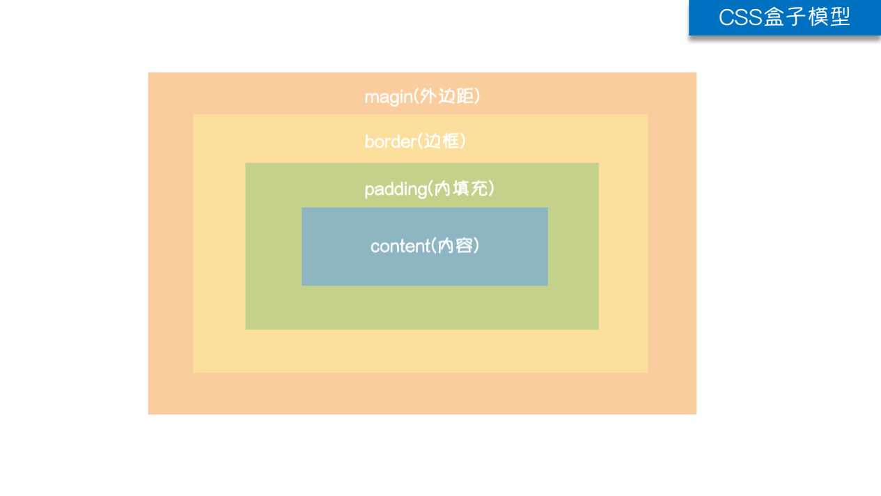
HTML文档中的每个元素都被描绘成矩形盒子,这些矩形盒子通过一个模型来描述其占用空间,这个模型称为盒子模型。
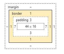
盒子模型通过四个边界来描述:margin(外边距),border(边框),padding(内填充),content(内容区域)
(1)padding
内边距:控制内容到边框的距离,内边距会扩大元素所在的区域,width+padding;
注意:为元素设置内边距,只能影响自己,不会影响其他的元素,padding不支持负值。
    /*小属性设置*/
    padding-top: 30px;
    padding-right: 30px;
    padding-bottom: 30px;
    padding-left: 30px;


    /*上 右 下 左*/
    padding: 20px 30px 40px 50px ;

    /*上 左右  下*/
    padding: 20px 30px 40px;

    /* 上下 左右*/
    padding: 20px 30px;

    /*上下左右*/
    padding: 20px;
(2) border
        border-top-width: 5px;
        border-bottom-width: 10px;
        border-left-width: 15px;
        border-right-width: 20px;

        border-top-color: red;
        border-bottom-color: yellowgreen;
        border-left-color: yellow;
        border-right-color: blue;

        border-top-style: solid;        实线
        border-bottom-style: dashed;    矩形虚线边框
        border-left-style: dotted;      点状虚线边框
        border-right-style: double;     两条实线
        简写:
            border: none   无边框
            border: 10px solid yellow;
        border-radius: 50%;                  # 设置圆
        border-radius: 10px 20px 30px 40px;  # 设置边角
        /*小三角 箭头指向下方*/
        div{
            width: 0;
            height: 0;
            border-bottom: 20px solid red;
            border-left: 20px solid transparent;
            border-right: 20px solid transparent;
        }
(3)margin
外边距: 控制元素与元素之间的距离
注意:margin会改变实际大小,背景色不会渲染到margin区域 这个区域会以空白显示,但是也属于盒子的一部分。
        margin-top: 20px;
        margin-left: 40px;
        margin-bottom: 20px;
        margin-right: 40px;

        #上 右 下 左
            margin: 20px 30px 40px 50px;
        #上 左右 下
            margin: 20px 30px 40px;
        #上下 左右
            margin: 20px 40px;
        #上下左右
            margin-bottom: 50px;
        #水平居中 盒子元素
            margin: 0 auto;
注意:
margin塌陷:当给两个兄弟盒子 设置垂直方向上的margin 那么以较大的为准,那么我们称这种现象叫塌陷
善用父级的padding,而不是使用margin :因为父亲没有border,那么儿子margin实际上踹的是“流” 踹的是行
所以父亲就掉下来
# dispaly
1.控制HTML元素的显示和隐藏
2.块级元素与行内元素的转换。

display:block
display:inline
display:inline-block
display:none

# visibility
visibility:hidden


# 区别
visibility:hidden----将元素隐藏,但是还占着位置,影响页面布局
display:none----将元素的显示设为无,不占任何的位置,不影响
文档流:指的是元素排版布局过程中,元素会自动从左往右,从上往下的流式排列。
浮动特性
1.浮动的元素脱标
2.浮动的元素互相贴靠
3.浮动的元素有“字围”效果
4.收缩的效果
浮动影响:
浮动可以使元素按指定方向排列,直到遇到父元素的边界或另一个浮动元素停止。
float:left:左浮动 左侧为起始,从左向右排列
float:right:右浮动  右侧为起始,从右向左排列
float:none :不浮动,默认不浮动
浮动效果:
1.浮动可以使元素脱离文档流,不占位置
脱离文档流,也就是将元素从普通的布局排版中拿走,
其他盒子在定位的时候,会当做脱离文档流的元素不存在而进行定位。
2.浮动会使元素提升层级
3.浮动可以使块元素在一行内排列,不设置宽高时,可以使元素适应内容
4.浮动可以使行内元素支持宽高
# 浮动产生的问题:
        父元素不设置高度时,子元素设置了浮动,不会撑开父元素的高度,此时父盒子没有高度了。因为子元素不占位置了!
        如果在父盒子下面还有一个标准流的盒子,那么就会影响页面的布局。------清除浮动

# 解决办法:
        1.给父盒子设定固定高度;缺点:不灵活;
        2.给浮动元素最后一个加一个空的块级元素,且该元素为不浮动float:none,设置clear:both,就会撑开盒子。
            缺点:结构冗余
        3.官方推荐:推荐使用:
            .wrap:after{
                content: ‘.‘;
                display: block;
                height: 0;
                visibility: hidden;
                clear: both;
            }
       4.推荐使用:给父元素添加overflow:hidden  eg: .warp{overflow: hidden;}
(1)position
        position: absolute;
        top: 20px;
        bottom: 10px;
        left: 20px;
        right: 0px;

        static : 默认值
        relative : 相对定位 有bug
            1. 不设置偏移量的时候,对元素没有任何影响。
            2. 相对定位可以提升层级关系。
            3. 相对定位是相对于自身定位。

        absolute : 绝对定位
            1. 可以提升层级关系。
            2. 脱离文档流。
            3. 在没有父级元素定位时,以浏览器的左上角为基准定位的。
            4. 有父级的情况下,父级设置相对定位,子集设置绝对定位,是以父盒子进行定位的。
               (父相子绝) 来进行位置的调整

        fixed : 固定定位(返回顶部)
父相子绝
        .box{
            width: 300px;
            height: 300px;
            border: 5px solid red;
            margin: 100px;
            /*父盒子设置相对定位*/
            position: relative;
            padding: 50px;
        }


        .box p{
            width: 100px;
            height: 100px;
            background-color: pink;
            /*子元素设置了绝对定位*/
            position: absolute;
            top: 10px;
            left: 20px;
        }
绝对定位盒子居中
        .box .c{
            width: 960px;
            height: 69px;
            background-color: pink;
            /*margin: 0 auto;*/
            position: relative;
            left: 50%;
            margin-left: -480px;

            /*设置绝对定位之后,margin:0 auto;不起任何作用,
            如果想让绝对定位的盒子居中。当做公式记下来
                设置子元素绝对定位,
                然后left:50%;
                margin-left等于元素宽度的一半,
            实现绝对定位盒子居中*/
        }
(2)z-index
  position: absolute;
  z-index: 3;
  z-index: 1000;
  注:
    数字大的压着数字小的,默认为0
            从父现象
    网页布局:
        上下 结构
        上中下 结构
        上左右下 结构: 1-2-1 结构
        上左中右下 结构: 1-3-1 结构
    一般css先这样写:
        *{padding:0;margin:0;}
        ul>li{list-style:none;}
        a{text-decoration:none;}
        .wrap{width:100%;}
        .header{}
        .content{}
        .footer{}
        ...
        ...
标签:情况 文字 第一个 cursor hidden 一个 IV 定位 伪类
原文地址:https://www.cnblogs.com/venicid/p/9218720.html