标签:有一个 body display set 响应式 快速开发 tar lex 17.
知识内容:
1.浮动相关
2.display属性
3.居中显示
4.盒模型和box-sizing
5.position属性
6.响应式设计
7.flexbox布局
8.其他
1.浮动相关
(1)float
float可以让一个元素浮动起来,可以让其向左浮动或者向右浮动
float实例:

 1 <!--__author__ = "wyb"-->
 2 <!DOCTYPE html>
 3 <html lang="en">
 4 <head>
 5     <meta charset="UTF-8">
 6     <title>文字环绕图形</title>
 7     <style>
 8         img{
 9             float: right;
10             width: 100px;
11             height: 100px;
12             margin: 5px;
13         }
14     </style>
15 </head>
16 <body>
17
18 <p style="margin: 0 auto; width: 333px;">
19     <img src="1.jpg" alt="">
20     This is some text. This is some text. This is some text.
21     This is some text. This is some text. This is some text.
22     This is some text. This is some text. This is some text.
23     This is some text. This is some text. This is some text.
24     This is some text. This is some text. This is some text.
25     This is some text. This is some text. This is some text.
26     This is some text. This is some text. This is some text.
27     This is some text. This is some text. This is some text.
28     This is some text. This is some text. This is some text.
29     This is some text. This is some text. This is some text.
30 </p>
31
32 </body>
33 </html>
(2)clear
clear用于控制浮动,一般是用来清除浮动,浮动会引发一些不好的后果,见下面的实例1,这些后果可以用实例2中的方法消除,即清除浮动
clear实例1:
 1 <!--__author__ = "wyb"-->
 2 <!DOCTYPE html>
 3 <html lang="en">
 4 <head>
 5     <meta charset="UTF-8">
 6     <title>clear</title>
 7     <style>
 8         .box {
 9             float: left;
10             width: 200px;
11             height: 100px;
12             margin: 1em;
13         }
14         .border1{
15             border: 1px solid red;
16         }
17         .border2 {
18             border: 1px solid darkgreen;
19         }
20     </style>
21 </head>
22 <body>
23
24 <div class="box border1">Box: 我浮起来了 浪啊</div>
25 <section class="border2" style="height: 50px; text-align: center">
26     Section: 在这个例子中, section 元素实际上是在 div 之后的(DOM结构上)。然而 div 元素是浮动到左边的,于是 section 中的文字
27     就围绕了 div ,并且 section 元素包围了整个元素。如果我们想让 section 显示在浮动元素之后呢?
28 </section>
29
30 </body>
31 </html>
clear实例2:
 1 <!--__author__ = "wyb"-->
 2 <!DOCTYPE html>
 3 <html lang="en">
 4 <head>
 5     <meta charset="UTF-8">
 6     <title>clear</title>
 7     <style>
 8         .box {
 9             float: left;
10             width: 200px;
11             height: 100px;
12             margin: 1em;
13         }
14         .border1{
15             border: 1px solid red;
16         }
17         .border2 {
18             border: 1px solid darkgreen;
19         }
20         .clear{
21             clear: left;
22         }
23     </style>
24 </head>
25 <body>
26
27 <div class="box border1">Box: 我浮起来了 浪啊</div>
28 <section class="border2 clear" style="height: 50px; text-align: center">
29     Section: 使用 clear 我们就可以将这个段落移动到浮动元素 div 下面;  用 left 清除元素的向左浮动;
30     还可以用 right 或 both 来清除向右浮动或同时清除向左向右浮动
31 </section>
32
33 </body>
34 </html>
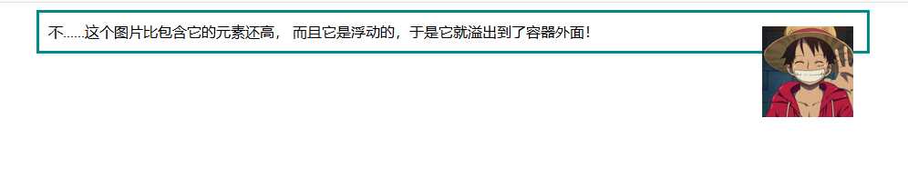
(3)清除浮动(图片溢出容器)
清除浮动实例1:
 1 <!--__author__ = "wyb"-->
 2 <!DOCTYPE html>
 3 <html lang="en">
 4 <head>
 5     <meta charset="UTF-8">
 6     <title>清除浮动</title>
 7     <style>
 8         img{
 9             float: right;
10             width: 100px;
11             height: 100px;
12             margin: 5px;
13         }
14         div{
15             margin: 0 auto;
16             width: 888px;
17             border: 3px solid darkcyan;
18             padding: 10px;
19         }
20     </style>
21 </head>
22 <body>
23
24 <div>
25     这个图片比包含它的元素还高, 而且它是浮动的,于是它就溢出到了容器外面!
26     <img src="1.jpg" alt="">
27 </div>
28
29 </body>
30 </html>
最后效果:
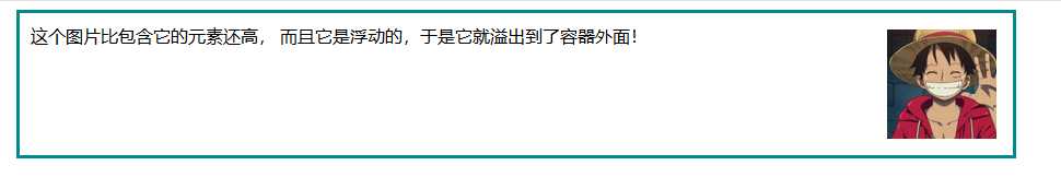
清除浮动实例2:
 1 <!--__author__ = "wyb"-->
 2 <!DOCTYPE html>
 3 <html lang="en">
 4 <head>
 5     <meta charset="UTF-8">
 6     <title>清除浮动</title>
 7     <style>
 8         img{
 9             float: right;
10             width: 100px;
11             height: 100px;
12             margin: 5px;
13         }
14         div{
15             margin: 0 auto;
16             width: 888px;
17             border: 3px solid darkcyan;
18             padding: 10px;
19         }
20         .clearfix {
21             overflow: auto;
22         }
23     </style>
24 </head>
25 <body>
26
27 <div class="clearfix">
28     这个图片比包含它的元素还高, 而且它是浮动的,于是它就溢出到了容器外面!
29     <img src="1.jpg" alt="">
30 </div>
31
32 </body>
33 </html>
最后效果:
清除浮动实例3
上述实例2的方法可以在现代浏览器上工作。如果想要支持IE6,就需要将实例2中的clearfix样式改成下面这个样子:
1 .clearfix {
2   overflow: auto;
3   zoom: 1;
4 }
(4)浮动布局
完全使用 float 来实现页面的布局是很常见的,下面是一个使用float实现布局的实例:
 1 <!--__author__ = "wyb"-->
 2 <!DOCTYPE html>
 3 <html lang="en">
 4 <head>
 5     <meta charset="UTF-8">
 6     <title>浮动布局</title>
 7     <style>
 8         nav {
 9             float: left;
10             width: 200px;
11             border: 3px solid darkblue;
12         }
13         section {
14             margin-left: 200px;
15             border: 3px solid darkred;
16         }
17         .container{
18             width: 888px;
19             margin: 0 auto;
20             border: 3px dotted #8628ff;
21         }
22         .clearfix{
23             overflow: auto;
24             zoom: 1;
25         }
26     </style>
27 </head>
28 <body>
29
30 <div class="container clearfix">
31     <nav>
32         nav:
33         <ul>
34             <li><a href="">首页</a></li>
35             <li><a href="">登录</a></li>
36             <li><a href="">注册</a></li>
37             <li><a href="">注册</a></li>
38             <li><a href="">注册</a></li>
39             <li><a href="">注册</a></li>
40             <li><a href="">注册</a></li>
41         </ul>
42     </nav>
43
44     <section>
45         section:
46         注意在容器上做了“清除浮动”!
47         当 nav 比非浮动的内容还要高时就需要清除浮动,否则可以不清除浮动
48     </section>
49
50     <section>
51         section:
52         this is some text.this is some text.this is some text.
53         this is some text.this is some text.this is some text.
54         this is some text.this is some text.this is some text.
55         this is some text.this is some text.this is some text.
56         this is some text.this is some text.this is some text.
57         this is some text.this is some text.this is some text.
58         this is some text.this is some text.this is some text.
59         this is some text.this is some text.this is some text.
60     </section>
61 </div>
62
63 </body>
64 </html>
2.display属性
(1)display
display 是CSS中最重要的用于控制布局的属性。每个元素都有一个默认的 display 值,这与元素的类型有关。对于大多数元素它们的默认值通常是 block 或 inline 。一个 block 元素通常被叫做块级元素。一个 inline 元素通常被叫做行内元素
(2)块级标签和内联标签
(3)display属性的值
 1 <!--__author__ = "wyb"-->
 2 <!DOCTYPE html>
 3 <html lang="en">
 4 <head>
 5     <meta charset="UTF-8">
 6     <title>行内标签和块级标签通过display转换</title>
 7     <style>
 8         .inline{
 9             background: red;
10             display: inline;
11         }
12         .block{
13             background: red;
14             display: block;
15         }
16     </style>
17 </head>
18 <body>
19     <!--将块级标签变成行内标签-->
20     <div class="inline">div</div>
21     <!--将行内标签变成块级标签-->
22     <span class="block">span</span>
23 </body>
24 </html>
3.居中显示
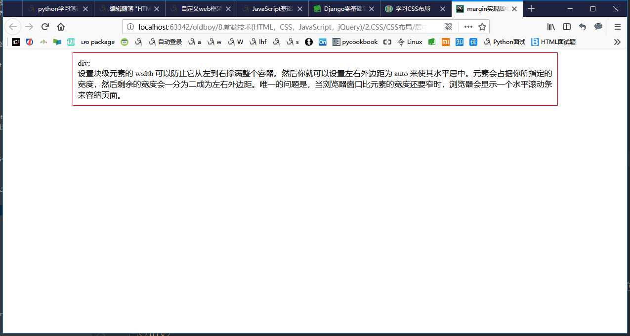
(1)margin
 1 <!--__author__ = "wyb"-->
 2 <!DOCTYPE html>
 3 <html lang="en">
 4 <head>
 5     <meta charset="UTF-8">
 6     <title>margin实现居中</title>
 7     <style>
 8         .container{
 9             width: 960px;
10             margin: 0 auto;
11             border: 1px solid red;
12             padding: 10px;
13         }
14     </style>
15 </head>
16 <body>
17
18 <div class="container">
19     div: <br/>
20     设置块级元素的 width 可以防止它从左到右撑满整个容器。然后你就可以设置左右外边距为 auto 来使其水平居中。元素会占据你所指定的宽度,
21     然后剩余的宽度会一分为二成为左右外边距。
22     唯一的问题是,当浏览器窗口比元素的宽度还要窄时,浏览器会显示一个水平滚动条来容纳页面。
23 </div>
24
25 </body>
26 </html>
效果:
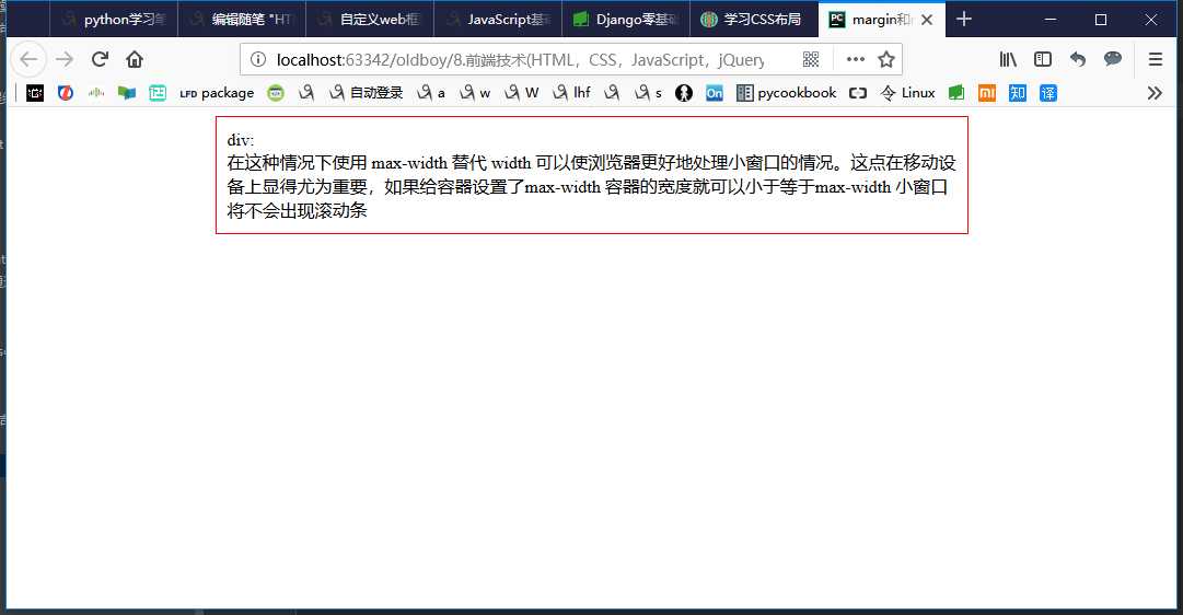
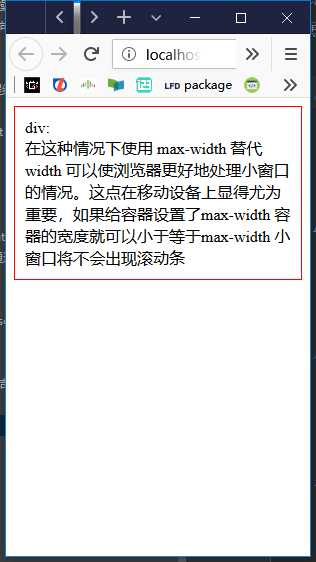
(2)max-width
 1 <!--__author__ = "wyb"-->
 2 <!DOCTYPE html>
 3 <html lang="en">
 4 <head>
 5     <meta charset="UTF-8">
 6     <title>margin和max-width结合实现居中</title>
 7     <style>
 8         .container{
 9             max-width: 666px;
10             margin: 0 auto;
11             border: 1px solid red;
12             padding: 10px;
13         }
14     </style>
15 </head>
16 <body>
17
18 <div class="container">
19     div: <br/>
20     在这种情况下使用 max-width 替代 width 可以使浏览器更好地处理小窗口的情况。这点在移动设备上显得尤为重要,
21     如果给容器设置了max-width 容器的宽度就可以小于等于max-width 小窗口将不会出现滚动条
22 </div>
23
24 </body>
25 </html>
效果:
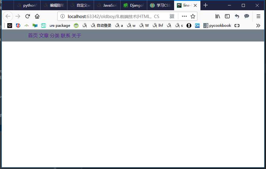
(3)line-height -> 设置垂直居中
 1 <!--__author__ = "wyb"-->
 2 <!DOCTYPE html>
 3 <html lang="en">
 4 <head>
 5     <meta charset="UTF-8">
 6     <title>line-height</title>
 7     <style>
 8         *{
 9             margin: 0;
10             padding: 0;
11         }
12         a{
13             text-decoration: none;
14         }
15         .content-box{
16             height: 40px;
17             background: #747F8C;
18         }
19         .content{
20             margin: 0 auto;
21             width: 80%;
22             /*下面实现上下居中*/
23             height: 40px;
24             line-height: 40px;
25         }
26     </style>
27 </head>
28 <body>
29 <div class="content-box">
30     <div class="content">
31         <a href="">首页</a>
32         <a href="">文章</a>
33         <a href="">分类</a>
34         <a href="">联系</a>
35         <a href="">关于</a>
36     </div>
37 </div>
38 </body>
39 </html>
效果:
(4)vertical-align -> 设置垂直居中
(5)text-align -> 设置水平居中
4.盒模型和box-sizing
(1)盒模型
元素的大小由其中的内容和padding和border决定,margin是元素与元素之间的距离
注:两个挨着的margin浏览器最后会取其中的最大值
(2)box-sizing
人们意识到传统的盒子模型不直接,所以新增了一个叫做 box-sizing 的CSS属性。当你设置一个元素为 box-sizing: border-box; 时,此元素的内边距和边框不再会增加它的宽度
 1 <!--__author__ = "wyb"-->
 2 <!DOCTYPE html>
 3 <html lang="en">
 4 <head>
 5     <meta charset="UTF-8">
 6     <title>box-sizing</title>
 7     <style>
 8         .container{
 9             max-width: 960px;
10             margin: 0 auto;
11         }
12         .simple {
13             width: 500px;
14             margin: 20px auto;
15             padding: 20px;
16             border: solid red 3px;
17             -webkit-box-sizing: border-box;
18             -moz-box-sizing: border-box;
19             box-sizing: border-box;
20         }
21
22         .fancy {
23             width: 500px;
24             margin: 20px auto;
25             padding: 50px;
26             border: solid blue 3px;
27             -webkit-box-sizing: border-box;
28             -moz-box-sizing: border-box;
29             box-sizing: border-box;
30         }
31     </style>
32 </head>
33 <body>
34
35 <div class="container">
36     <div class="simple">
37         div.simple: <br/>
38         我们现在一样大了
39     </div>
40
41     <div class="fancy">
42         div.fancy <br/>
43         666
44     </div>
45
46 </div>
47
48 </body>
49 </html>
如果想要页面上所有的元素都有如此表现,可以写上以下CSS代码:
1 * {
2   -webkit-box-sizing: border-box;
3      -moz-box-sizing: border-box;
4           box-sizing: border-box;
5 }
这样可以确保所有的元素都会用这种更直观的方式排版。
5.position属性(用于定位)
(1)fixed -> 固定在页面某个位置
一个固定定位(position属性的值为fixed)元素会相对于视窗来定位,这意味着即便页面滚动,它还是会停留在相同的位置
 1 <!--__author__ = "wyb"-->
 2 <!DOCTYPE html>
 3 <html lang="en">
 4 <head>
 5     <meta charset="UTF-8">
 6     <title>position_fixed</title>
 7     <style>
 8         .pg-header{
 9             position: fixed;
10             top: 0;
11             left: 0;
12             right: 0;
13             width: 100%;
14             height: 48px;
15             background-color: #2459a2;
16         }
17         .pg-body{
18             background-color: #ededed;
19             height: 3000px;
20             margin-top: 58px;
21             margin-left: 30px;
22             margin-right: 30px;
23         }
24         .return_top{
25             position: fixed;
26             right: 0;
27             bottom: 50px;
28             width: 80px;
29             height: 40px;
30             line-height: 40px;
31             background-color: #747F8C;
32         }
33     </style>
34 </head>
35 <body>
36
37 <div class="pg-header">
38     头部
39 </div>
40 <div class="pg-body">
41     内容
42 </div>
43
44 <div class="return_top">返回顶部</div>
45
46 </body>
47 </html>
(2)relative/absolute -> 联合使用进行相对定位
详细解释:https://segmentfault.com/a/1190000006924181
 1 <!--__author__ = "wyb"-->
 2 <!DOCTYPE html>
 3 <html lang="en">
 4 <head>
 5     <meta charset="UTF-8">
 6     <title>relative and absolute</title>
 7     <style>
 8         .container{
 9             position: relative;
10             width: 60%;
11             height: 200px;
12             border: 1px solid red;
13             margin: 0 auto;
14         }
15         .box{
16             position: absolute;
17             width: 70px;
18             height: 70px;
19             background: black;
20         }
21         .left_bottom{
22             left: 0;
23             bottom: 0;
24         }
25         .right_bottom{
26             right: 0;
27             bottom: 0;
28         }
29         .right_top{
30             right: 0;
31             top: 0;
32         }
33     </style>
34 </head>
35 <body>
36
37 <div class="container">
38     <div class="box left_bottom"></div>
39 </div>
40
41 <div class="container">
42     <div class="box right_bottom"></div>
43 </div>
44
45 <div class="container">
46     <div class="box right_top"></div>
47 </div>
48
49 </body>
50 </html>
6.响应式设计
7.flexbox布局
8.其他
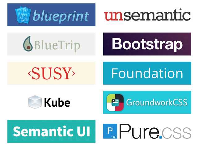
(1)CSS框架
CSS 布局很难使用,故催生了不少 CSS 框架来帮助开发者快速开发。只有在框架的功能满足你的需求时,使用框架才是个好主意。掌握CSS的工作方式是无可替代的。常用的框架如下:
(2)column属性
标签:有一个 body display set 响应式 快速开发 tar lex 17.
原文地址:https://www.cnblogs.com/wyb666/p/9191600.html
