标签:order parent 线性 ado ref position direction 标准 size
一:渐变
补充:
shape 参数定义了形状。它可以是值 circle 或 ellipse。其中,circle 表示圆形,ellipse 表示椭圆形。默认值是 ellipse。
size 参数定义了渐变的大小。它可以是以下四个值:
#grad {
  background: -webkit-radial-gradient(circle, red, yellow, green); /* Safari 5.1 - 6.0 */
  background: -o-radial-gradient(circle, red, yellow, green); /* Opera 11.6 - 12.0 */
  background: -moz-radial-gradient(circle, red, yellow, green); /* Firefox 3.6 - 15 */
  background: radial-gradient(circle, red, yellow, green); /* 标准的语法 */
}
二:currentcolor(css第一变量)
比图想要hr线的颜色和字体颜色保持一致,可以这样写:
hr{
        height:.5em;
        background: currentcolor;
   }
类似这些border-color outline-color text-shadow box-shadow都可以使用
三:border-radius(/”前面的值设置其水平半径,“/”后面值设置其垂直半径。)
border-radius:30px / 20px 40px;
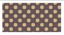
四:波点
<head>
<meta charset="UTF-8">
<title></title>
<style>
.one {
width: 200px;
height: 100px;
background:#655;
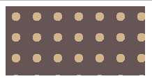
background-image: radial-gradient(tan 30%,transparent 0),radial-gradient(tan 30%,transparent 0); //如果这里只有一项,没有background-position,效果图第二个图
background-size: 30px 30px;
background-position:0 0, 15px 15px;
}
</style>
</head>
<body>
<div class="box">
<div class="one"></div>
</div>
</body>
效果图:
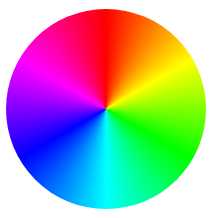
五:色轮
.two{
        margin-top: 100px;
        width:200px;
        height: 200px;
        border-radius: 100px;
        background: conic-gradient(red,yellow,lime,aqua,blue,fuchsia,red);
}
效果图:
标签:order parent 线性 ado ref position direction 标准 size
原文地址:https://www.cnblogs.com/wanan-01/p/9140847.html