标签:repeat 4.6 near mpi count clear 图片加载 加载文件 isp
进度条加载是页面加载时的一种交互效果,这样做的目的是提高用户体验。
进度条的的实现分为3大部分:1、页面布局,2、进度条动效,3、何时进度条增加。
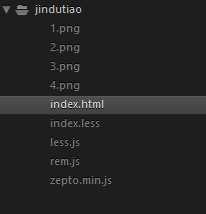
<link rel="stylesheet/less" href="./index.less">
<script src="./zepto.min.js"></script>
<script src="./less.js"></script>
<script src="./rem.js"></script>
index.less是样式文件
zepto是引入的库
less.js是编译less的
rem.js是移动端屏幕自适应

页面布局采用position布局,进度条居中,css采用less,布局风格为移动端,采用rem单位。
<section class="loadingBox">
        <div class="progress">
            <div class="run"></div>
        </div>
</section>
html,body{
    height: 100%;
}
.loadingBox{
    background: #000000;
    height: 100%;
    overflow: hidden;
    position: relative;
    display: none;
    .progress{
        @w:4.6;
        @h:.3;
        position: absolute;
        width: unit(@w,rem);
        height: unit(@h,rem);
        top: 50%;
        left: 50%;
        margin-left: unit(-@w/2,rem);
        margin-top: unit((-@h/2)+1, rem);
        background: #fff;
        border-radius: unit(@h/2,rem);
        .run{
            position: absolute;
            top: 0;
            left: 0;
            width: 0;
            height: unit(@h, rem);
            // 起始颜色和终点颜色一致就没渐变效果
            transition: .3s;
            background: -webkit-linear-gradient(left bottom,#5cd85c 0%,#5cd85c 25%,#74c274 25%,#74c274 50%,#5cd85c 50%,#5cd85c 75%,#74c274 75%,#74c274 100%);
            background: linear-gradient(left bottom,#5cd85c 0%,#5cd85c 25%,#74c274 25%,#74c274 50%,#5cd85c 50%,#5cd85c 75%,#74c274 75%,#74c274 100%);
            background-size:unit(@h, rem) unit(@h, rem);
            // 从上往下动实现动的效果。
            -webkit-border-radius: unit(@h/2, rem);
            border-radius: unit(@h/2, rem);
            // loadingMove 1s linear infinite both停在最后一帧
            -webkit-animation: loadingMove .8s linear  infinite both;
            animation: loadingMove .8s linear  infinite both;
        }
    }
}
@-webkit-keyframes loadingMove{
    0%{
        background-position: 0 0;
    }
    100%{
        background-position: 0 -.3rem;
    }
}
@keyframes loadingMove{
    0%{
        background-position: 0 0;
    }
    100%{
        background-position: 0 -.3rem;
    }
}
那么问题来了进度条有一个向上走的波纹,波纹是如何实现的,波纹是如何动的,这两个问题的原理是什么
波纹的实现用到的background的 linear-gradient 0-25%是一个颜色,25%-50%是一个颜色,50%-75%是一个颜色,75%-100%是一个颜色,让其不repeat 默认就是repeat的,完全填充进度条长度与宽度,代码如下
background: linear-gradient(left bottom,#5cd85c 0%,#5cd85c 25%,#74c274 25%,#74c274 50%,#5cd85c 50%,#5cd85c 75%,#74c274 75%,#74c274 100%);
动起来用到了css中的animation,让进度条的背景从上往下走,就能实现动的效果,那么如何实现从上往下走呢?答案就是用css3的animation的keyframes,0%是让其position为0 0 100%的时候让其position 0 -.3rem 。-.3rem就是进度条的高度,代码如下,loadingMove是桢函数,.8s是持续时间0.8s,linear是线性变化,infinite是无限重复,both是每一循环停在最后一帧。
animation: loadingMove .8s linear infinite both;
@keyframes loadingMove{
    0%{
        background-position: 0 0;
    }
    100%{
        background-position: 0 -.3rem;
    }
}
众所周知页面上耗费最多的时间是图片,那么可不可以每加载一张图片,就让count加1,那么加载n张再除以总的图片数就是加载进度,加载进度。代码中的逻辑就是,遍历每张图片,等待每张图片加载完毕,count加1,同时更改进度条宽度,达到一个实时加载的效果。
let loadingRender = (function(){
    let $loadingBox = $(".loadingBox"),
        $run = $loadingBox.find(".run");
    // 计算图片加载进度
    let imgList =["./1.png","./2.png","./3.png","./4.png"];
    let total = imgList.length,
        cur = 0;
    let computed = function(){
        imgList.forEach(function(item){
            let tempImg =  new Image();
            tempImg.src = item;
            tempImg.onload = function(){
                cur++;
                runFn();
                tempImg = null;
            }
        })
    }
    let runFn = function(){
        $run.css("width",(cur/total)*100+"%");
        if (cur>=total) {
            // 进入的下一个区域的时间节点
            let delay = setTimeout(function(){
                clearTimeout(delay);
            },1500)
        }
    }
    return {
        init:function(){
            $loadingBox.css("display","block");
            computed();
        }
    }
})();
loadingRender.init();
其中runFn是增加宽度的函数,用了了setTimeout,目的是延缓一会加载,让加载有点节奏,同理,css中transition: .3s;也是为了让加载有节奏。
标签:repeat 4.6 near mpi count clear 图片加载 加载文件 isp
原文地址:https://www.cnblogs.com/dirkhe/p/9344719.html