标签:tables 垂直居中 img htm lock Fix footer block table
首先来看看display: table的兼容性:
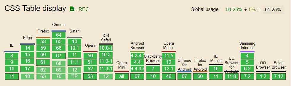
可以看到,除非你还要跟IE6/7较劲,否则display: table不需考虑兼容性。
table:指定对象作为块元素级的表格,相当于html标签<table>
inline-table:指定对象作为内联元素级的表格,相当于html标签<table>
table-caption:指定对象作为表格标题,相当于html标签<caption>
table-cell:指定对象作为表格单元格,相当于html标签<td>
table-row:指定对象作为表格行,相当于html标签<tr>
table-row-group:指定对象作为表格行组,相当于html标签<tbody>
table-column:指定对象作为表格列,相当于html标签<col>
table-column-group:指定对象作为表格列组显示,相当于html标签<colgroup>
table-header-group:指定对象作为表格标题组,相当于html标签<thead>
table-footer-group:指定对象作为表格脚注组,相当于html标签<tfoot>
border-collpase:用来决定表格的边框是分开的还是合并的。在分隔模式下,相邻的单元格都拥有独立的边框。在合并模式下,相邻单元格共享边框。border-spacing: 规定相邻单元格边框之间的距离(只适用于 边框分离模式 )。相当于 HTML 中的 cellspacing 属性,但是第二个可选的值可以用来设置不同于水平间距的垂直间距。table-layout:定义了用于布局表格单元格,行和列的算法。(auto:表格及单元格的宽度取决于其包含的内容。fixed:表格和列的宽度通过表格的宽度来设置,某一列的宽度仅由该列首行的单元格决定。)vertical-align:用来指定行内元素(inline)或表格单元格(table-cell)元素的垂直对齐方式。
下面是四个实例:
公用CSS:
/*CSS Table*/
.table {
    display: table;
}
.table-fixed {
    table-layout: fixed;
}
.table-row {
    display: table-row;
}
.table-cell {
    display: table-cell;
}
.table-colgroup {
    display: table-column-group;
}
.table-caption {
    display: table-caption;
}
.table-col {
    display: table-column;
}
.table-body {
    display: table-row-group;
}
.table-header {
    display: table-header-group;
}
.table-footer {
    display: table-footer-group;
}
.table-vt {
    vertical-align: top;
}
.table-vm {
    vertical-align: middle;
}
.table-vb {
    vertical-align: bottom;
}

/*CSS Table*/
html,body {
    height: 100%;
    margin: 0;
    padding: 0;
    background: #333;
}
.box1 {
    background: #6D5CAE;
}
.box2 {
    background: #48B0F7;
}
.box3 {
    background: #10CFBD;
}
h3 {
    padding-left: 20px;
    color: #fff;
}
HTML:
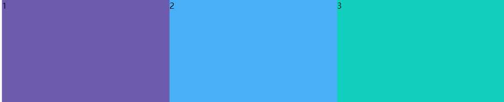
1 <h3>响应式布局</h3>
2 <div class="table demo1">
3    <div class="box1 table-cell">1</div>
4   <div class="box2 table-cell">2</div>
5   <div class="box3 table-cell">3</div>
6 </div>
CSS:
div.demo1 {
    width: 100%;
    height: 200px;
}
效果:
html:
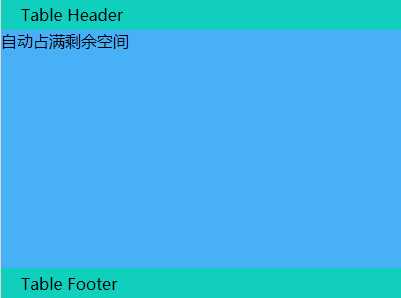
1 <h3>自动占满剩余空间</h3>
2 <div class="table demo2">
3     <div class="table-header-group">Table Header</div>
4     <div class="main table-row">自动占满剩余空间</div>
5     <div class="table-footer-group">Table Footer</div>
6 </div>
css:
.demo2 {
    width: 400px;
    height: 300px;
}
.demo2 div.table-header-group {
    padding: 5px 20px;
    background: #10CFBD;
}
.demo2 .main {
    height: 100%;
    background: #48B0F7;
}
.demo2 div.table-footer-group {
    padding: 5px 20px;
    background: #10CFBD;
}
效果:
html:
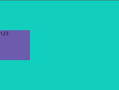
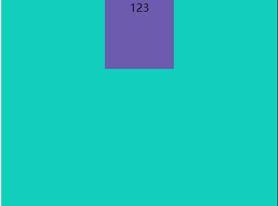
1 <h3>动态垂直居中对齐</h3>
2 <div class="table demo3">
3     <div class="table-cell table-vm">
4         <div class="center-box">123</div>
5     </div>
6 </div>
css:
.demo3 {
    width: 400px;
    height: 300px;
    background: #10CFBD;
}
.center-box {
    width: 100px;
    height: 100px;
    background: #6D5CAE;
    display: inline-block;
}
效果:
html:
1 <h3>动态水平居中对齐</h3>
2 <div class="table demo4">
3     <div class="center-box">123</div>
4 </div>
css:
.demo4 {
    width: 400px;
    height: 300px;
    background: #10CFBD;
    text-align: center;
}

.center-box {
    width: 100px;
    height: 100px;
    background: #6D5CAE;
    display: inline-block;
}
效果:
标签:tables 垂直居中 img htm lock Fix footer block table
原文地址:https://www.cnblogs.com/feixiablog/p/9360061.html