标签:out margin doctype round content ide display 默认值 传送门
纯CSS带阴影贴纸标签按钮效果:
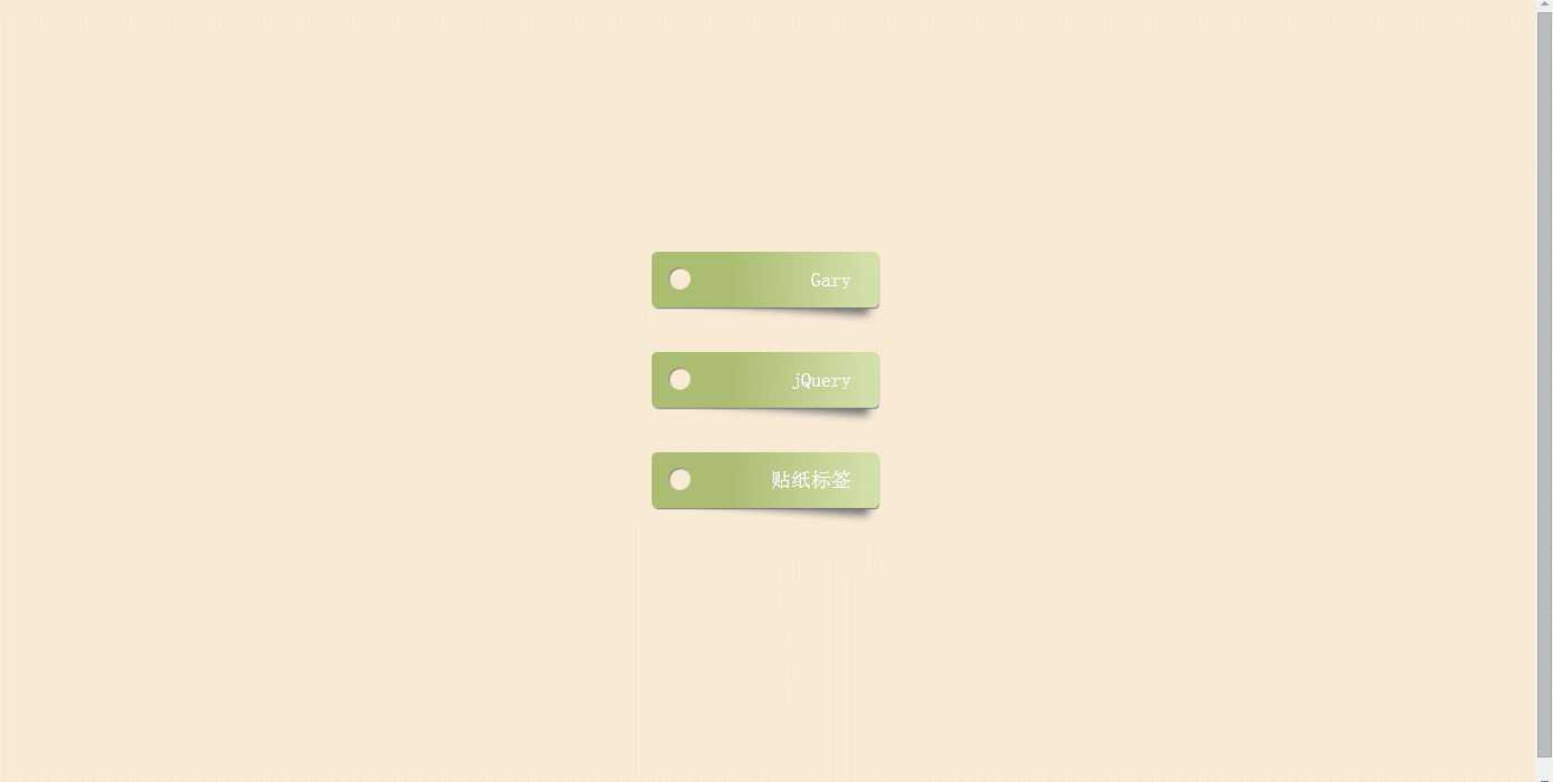

<!doctype html>
<html>
<head>
<meta charset="utf-8">
<title>CSS3带阴影贴纸标签按钮样式</title>

<style>
html {
  box-sizing: border-box;
  font: 18px PT Mono;
  background: antiquewhite;
}

*,
*::before,
*::after {
  box-sizing: inherit;
}

body {
  display: flex;
  align-items: center;
  justify-content: center;
  flex-direction: column;
  height: 100vh;
}

.box {
  width: 15%;
  min-width: 150px;
  display: block;
  height: 50px;
  position: relative;
  border-radius: 5px;
  background: linear-gradient(to right, #abbd73 35%, #d6e2ad 100%);
  margin-bottom: 40px;
  padding: 15px 25px 0 40px;
  color: darkslategray;
  box-shadow: 1px 2px 1px -1px #777;
  transition: background 200ms ease-in-out;
  text-align:right;
}

.box a{color:#fff;text-decoration:none;}

.shadow {
  position: relative;
}
.shadow:before {
  z-index: -1;
  position: absolute;
  content: "";
  bottom: 13px;
  right: 7px;
  width: 75%;
  top: 0;
  box-shadow: 0 15px 10px #777;
  -webkit-transform: rotate(4deg);
          transform: rotate(4deg);
  transition: all 150ms ease-in-out;
}

.box:hover {
  background: linear-gradient(to right, #abbd73 0%, #abbd73 100%);
}

.shadow:hover::before {
  -webkit-transform: rotate(0deg);
          transform: rotate(0deg);
  bottom: 20px;
  z-index: -10;
}

.circle {
  position: absolute;
  top: 14px;
  left: 15px;
  border-radius: 50%;
  box-shadow: inset 1px 1px 1px 0px rgba(0, 0, 0, 0.5), inset 0 0 0 25px antiquewhite;
  width: 20px;
  height: 20px;
  display: inline-block;
  text-align:right;
  padding:0 20px 0 0;
}
</style>
</head>
<body>


<div class="box shadow">
    <a href="#">Gary</a>
  <div class="circle"></div>
</div>
<div class="box shadow">
    <a href="#">jQuery</a>
  <div class="circle"></div>
</div>
<div class="box shadow">
    <a href="#">贴纸标签</a>
  <div class="circle"></div>
</div>


</div>
</body>
</html>
实现过程:
一、设置CSS样式
justify-content 用于设置或检索弹性盒子元素在主轴(横轴)方向上的对齐方式。

flex-start    默认值。项目位于容器的开头
flex-end    项目位于容器的结尾
center    项目位于容器的中心
space-between    项目位于各行之间留有空白的容器内
space-around    项目位于各行之前、之间、之后都留有空白的容器内
1、绘制标签盒子
.box {
  width: 15%;
  min-width: 150px;
  display: block;
  height: 50px;
  position: relative;
  border-radius: 5px;
  background: linear-gradient(to right, #abbd73 35%, #d6e2ad 100%);
  margin-bottom: 40px;
  padding: 15px 25px 0 40px;
  color: darkslategray;
  box-shadow: 1px 2px 1px -1px #777;
  transition: background 200ms ease-in-out;
  text-align:right;
}
min-width :设置元素的最小宽度。
border-radius:向 div 元素添加圆角边框
background: linear-gradient(direction, color-stop1, color-stop2, ...) 百度经验
linear-gradient(线性渐变)
radial-gradient(径向渐变)
direction:渐变方法
color-stop1, color-stop2:要呈现平稳过渡的颜色
margin-bottom :设置元素的下外边距
color: darkslategray;深石板灰......(英语差)
transition:鼠标碰到时触发过度动画 传送门
2、绘制盒子阴影
.shadow:before {
  z-index: -1;
  position: absolute;
  content: "";
  bottom: 13px;
  right: 7px;
  width: 75%;
  top: 0;
  box-shadow: 0 15px 10px #777;
  -webkit-transform: rotate(4deg);
          transform: rotate(4deg);
  transition: all 150ms ease-in-out;
}
z-index :设置元素的堆叠顺序。拥有更高堆叠顺序的元素总是会处于堆叠顺序较低的元素的前面
使得阴影位于标签按钮下方
bottom :规定盒子的底部边缘与阴影之间的偏移(调大了会有点丑∑(= = !))
transform: rotate(4deg)定义 2D 旋转4度
3、绘制标签圆角
.circle {
  position: absolute;
  top: 14px;
  left: 15px;
  border-radius: 50%;
  box-shadow: inset 1px 1px 1px 0px rgba(0, 0, 0, 0.5), inset 0 0 0 25px antiquewhite;
  width: 20px;
  height: 20px;
  display: inline-block;
  text-align:right;
  padding:0 20px 0 0;
}
border-radius:向标签添加圆角边框
antiquewhite颜色:古董白(石材百科说是中国产花岗岩!!!)上一张图
二、在Body中给“标签”添加CSS样式
<body>

<div class="box shadow">
    <a href="#">Gary</a>
<div class="circle"></div>
</div>

<div class="box shadow">
    <a href="#">jQuery</a>
  <div class="circle"></div>
</div>

<div class="box shadow">
    <a href="#">贴纸标签</a>
  <div class="circle"></div>
</div>
</div>

</body>
标签:out margin doctype round content ide display 默认值 传送门
原文地址:https://www.cnblogs.com/1138720556Gary/p/9379648.html
