标签:style blog http color io os ar for sp
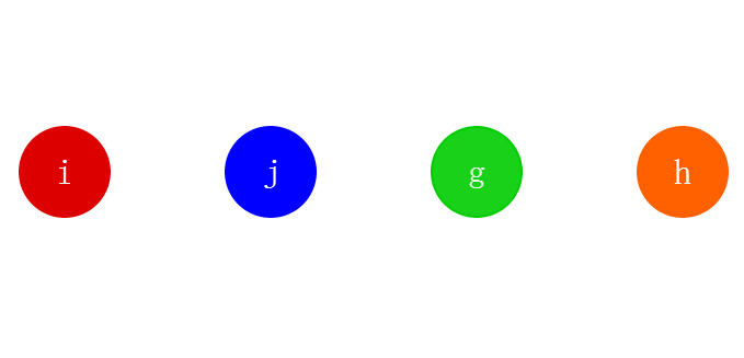
之前为大家介绍过一款纯css3实现的圆形旋转分享按钮。今天要给大家带来一款基于jquery的圆形动画按钮。这款按钮鼠标经过的时候以边框转圈,然后逐渐消息,在实例中给出了四种颜色的demo。效果图如下:
实现的代码。
html代码:
 <figure class=‘red‘>
        <div class=‘icon‘>
            i</div>
        <div class=‘circle‘>
        </div>
    </figure>
    <figure class=‘blue‘>
        <div class=‘icon‘>
            j</div>
        <div class=‘circle‘>
        </div>
    </figure>
    <figure class=‘green‘>
        <div class=‘icon‘>
            g</div>
        <div class=‘circle‘>
        </div>
    </figure>
    <figure class=‘orange‘>
        <div class=‘icon‘>
            h</div>
        <div class=‘circle‘>
        </div>
    </figure>
css代码:
 .blue .circle {
  background: #0000ff;
  border-color: #0000ff;
}
.blue:hover .circle {
  border-right-color: #0000ff;
}
.blue:hover .icon {
  color: #0000ff;
}

.green .circle {
  background: #00cc00;
  border-color: #00cc00;
}
.green:hover .circle {
  border-right-color: #00cc00;
}
.green:hover .icon {
  color: #00cc00;
}

.orange .circle {
  background: #ff6000;
  border-color: #ff6000;
}
.orange:hover .circle {
  border-right-color: #ff6000;
}
.orange:hover .icon {
  color: #ff6000;
}

body {
  height: 100%;
  width: 100%;
  margin: 100px auto;
  width: 100%;
  padding-left: 25px;
  text-align: center;
  overflow: hidden;
}

figure {
  cursor: pointer;
  display: inline-block;
  margin-right: 60px;
  position: relative;
  width: 80px;
  height: 80px;
}

.circle {
  position: absolute;
  top: 0;
  left: 0;
  width: 100%;
  height: 100%;
  border-radius: 47.05882px;
  background: #dd0000;
  transition: background .5s linear;
  border: 2px solid #dd0000;
  backface-visibility: hidden;
}

figure:hover .circle {
  border-color: transparent;
  background: #fff;
  animation: hoorai cubic-bezier(0.18, 0.14, 0.29, 1) 1s;
  animation-fill-mode: forwards;
  border-right-color: #dd0000;
}

.icon {
  position: absolute;
  top: 0;
  left: 0;
  z-index: 2;
  width: 100%;
  height: 100%;
  font-family: ‘fontello‘;
  font-size: 32px;
  color: #fff;
  text-align: center;
  line-height: 84px;
  margin-left: 2px;
  transition: color .5s linear;
}

figure:hover .icon {
  color: #dd0000;
}

@keyframes hoorai {
  0% {
    transform: rotate(-90deg);
    opacity: 1.0;
  }
  50% {
    opacity: 1.0;
  }
  100% {
    transform: rotate(360deg);
    opacity: 0.0;
  }
}
注:本文爱编程原创文章,转载请注明原文地址:http://www.w2bc.com/Article/8078
标签:style blog http color io os ar for sp
原文地址:http://www.cnblogs.com/liaohuolin/p/4018253.html