标签:eating car user use nts option tps navig having
Recently, a client brought in a project with very specific, complex implementations of an accessible color system. This opened my eyes not only to how important this subject is, but also how much there is to learn.Let’s learn how to go color accessible using the design principles you already know.(作者从近期的项目中体会到色彩易用性设计原则很重要也很值得学习)
Accessibility in digital product design is the practice of crafting experiences for all people, including those of us with visual, speech, auditory, physical, or cognitive disabilities. As designers, developers, and general tech people, we have the power to create a web we’re all proud of: an inclusive web made for and consumable by all people.
Also, not creating accessible products is just rude, so don’t be rude.(不易用的产品时粗鲁的,所以别那么做)
Color accessibility enables people with visual impairments or color vision deficiencies to interact with digital experiences in the same way as their non-visually-impaired counterparts. In 2017, The World Health Organization estimated that roughly 217 million people live with some form of moderate to severe vision impairment. That statistic alone is reason enough to design for accessibility.(色彩易用性可能会影响到用户视觉健康,数据表明有很多的人正在遭受不同程度由色彩易用性设计缺陷造成的视觉损伤)
Apart from accessibility being an ethical best practice, there are also potential legal implications for not complying with regulatory requirements around accessibility. In 2017, plaintiffs filed at least 814 federal lawsuits about allegedly inaccessible websites, including a number of class actions. Various organizations have sought to establish accessibility standards, most notably the United States Access Board (Section 508) and the World Wide Web Consortium (W3C). Here’s an overview of these standards:(于是就产生以下这两项标准)
Section 508: 508 compliance refers to Section 508 of the Rehabilitation Act of 1973. You can read the in-depth ordinance here, but to summarize, Section 508 requires that your site needs to be accessible if you are a federal agency or create sites on behalf of a federal agency (like contractors).
W3C: The World Wide Web Consortium (W3C) is an international, voluntary community that was established in 1994 and develops open standards for the web. The W3C outlines their guidelines for web accessibility within WCAG 2.1, which is essentially the gold standard for web accessibility best practices.
Accounting for accessibility early on in a product’s life cycle is best?—?it reduces the time and money you’ll spend to make your products accessible retroactively. Color accessibility requires a little up-front work when selecting your product’s color palette, but ensuring your colors are accessible will pay dividends down the road.(色彩以易用性设计应该从项目一开始就被重视)
Here are some quick tips to ensure you’re creating color-accessible products.(以下是一些建议)
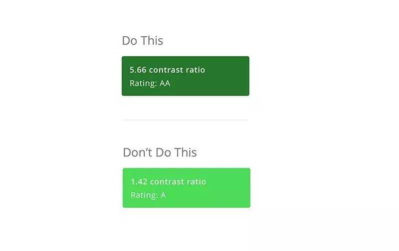
To meet W3C’s minimum AA rating, your background-to-text contrast ratio should be at least 4.5:1. So, when designing things like buttons, cards, or navigation elements, be sure to check the contrast ratio of your color combinations.(w3c要求的最低对比时aa级别,背景和内容的对比度至少应该时4.5:1)
There are lots of tools to help you test the accessibility of color combinations, but the ones I’ve found most helpful are Colorable and Colorsafe. I like Colorable because it has sliders that allow you to adjust Hue, Saturation, and Brightness in real time to see how it affects the accessibility rating of a particular color combination.
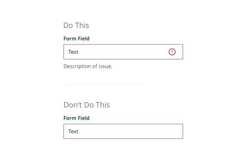
You can also ensure accessibility by making sure you don’t rely on color to relay crucial system information. So, for things like error states, success states, or system warnings, be sure to incorporate messaging or iconography that clearly calls out what’s going on.(对于一些错误、成功、警告等状态信息,不要只依赖色彩,要结合提示语和图标去做出清晰明确的提示)
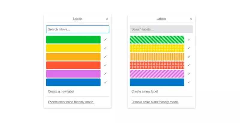
Also, when displaying things like graphs or charts, giving users the option to add texture or patterns ensures that those who are colorblind can distinguish between them without having to worry about color affecting their perception of the data. Trello does a great job of this with their Colorblind-Friendly Mode.(对于色盲用户使用色盲友好的色彩设计方案)
Focus states help people to navigate your site with a keyboard by giving them a visual indicator around elements. They’re helpful for people with visual impairments, people with motor disabilities, and people who just like to navigate with a keyboard.(对于那些喜欢用键盘或者不得不用键盘去浏览页面的用户来说,焦点状态有很清晰的对比度是很必要的)
All browsers have a default focus state color, but if you plan on overriding that within your product, it’s crucial to ensure you’re providing enough color contrast. This ensures those with visual impairments or color deficiencies can navigate with focus states.
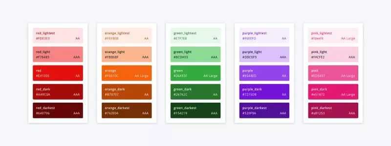
Lastly, the most important aspect of creating an accessible color system is giving your team the ability to reference it when needed, so everyone is clear about proper usage. This not only reduces confusion and churn, but also ensures that accessibility is always a priority for your team. In my experience, explicitly calling out the accessibility rating of a specific color combination within a UI Kit or Design System is most effective, especially when socializing that across the team with a tool (like InVision Craft or InVision DSM). Here’s an example of how to document background to text color combinations and the accessibility rating of each combination.(一开始统一制订出来一份团队共用的色彩系统方案会大有裨益)
These are just a few tips to make your product more accessible, but keep in mind, these only relate to color accessibility. To understand accessibility guidelines in detail, I recommend familiarizing yourself with WCAG 2.1. While these guidelines can be a bit daunting, there are tons of resources out there to help you along the way, and when in doubt, don’t hesitate to reach out to designers in your area (or via the internet) for help.
A guide to color accessibility in product design(产品设计中的色彩易用性指南)
标签:eating car user use nts option tps navig having
原文地址:https://www.cnblogs.com/lixiang12/p/10261516.html