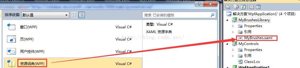
1、定义 资源字典
-
<ResourceDictionary xmlns="http://schemas.microsoft.com/winfx/2006/xaml/presentation"
-
xmlns:x="http://schemas.microsoft.com/winfx/2006/xaml">
-
<RadialGradientBrush x:Key="mybrush">
-
<GradientStop Color="#FF0000" Offset="0"/>
-
<GradientStop Color="#00ff00" Offset="1"/>
-
<GradientStop Color="#0000ff" Offset="0.6669"/>
-
</RadialGradientBrush>
-
</ResourceDictionary>
2、引用 资源字典
-
<!--定义应用程序对象-->
-
<Application x:Class="WpfApplication1.App"
-
xmlns="http://schemas.microsoft.com/winfx/2006/xaml/presentation"
-
xmlns:x="http://schemas.microsoft.com/winfx/2006/xaml"
-
StartupUri="Window5.xaml" Exit="AppExit">
-
<!--StartupUri 启动时,显示那个xaml-->
-
<x:Code>
-
<![CDATA[
-
private void AppExit(object sender,ExitEventArgs e)
-
{
-
MessageBox.Show("App has Exit!");
-
}
-
]]>
-
</x:Code>
-
-
<Application.Resources>
-
<ResourceDictionary>
-
<ResourceDictionary.MergedDictionaries>
-
<!--外部库名称;Component/编译的二进制资源名称-->
-
<ResourceDictionary Source="/MyBrushesLibrary;Component/MyBrushes.xaml"/>
-
<ResourceDictionary Source="......"/>
-
</ResourceDictionary.MergedDictionaries>
-
</ResourceDictionary>
-
</Application.Resources>
-
</Application>
3、应用
-
<Window x:Class="WpfApplication1.Window5"
-
xmlns="http://schemas.microsoft.com/winfx/2006/xaml/presentation"
-
xmlns:x="http://schemas.microsoft.com/winfx/2006/xaml"
-
Title="Window5" Height="300" Width="300">
-
<StackPanel Orientation="Vertical">
-
<Button Width="204" Height="73" Content="OK" x:Name="BtnOK" Background="{DynamicResource myBrush}" Click="BtnOK_Click"></Button>
-
<Button Width="204" Height="73" Content="Cancel" x:Name="BtnName2" Background="{StaticResource myBrush}"/>
-
</StackPanel>
-
</Window>
推荐阅读:http://blog.csdn.net/pan_junbiao/article/details/50987932
一、样式
1、定义样式
-
<Window.Resources>
-
<!--定义按钮公共样式-->
-
<!--x:Key 引用这个样式,TargetType作用目标类型-->
-
<Style x:Key="gButton" TargetType="{x:Type Button}">
-
<!--Setter设置目标属性-->
-
<Setter Property="Cursor" Value="Hand"/>
-
<Setter Property="Width" Value="150"/>
-
<Setter Property="Height" Value="80"/>
-
</Style>
-
</Window.Resources>
2、引用样式
-
<Grid>
-
<Button Content="红色">
-
<Button.Style>
-
<!--BasedOn属性:通过设置BasedOn属性,可以继承某个样式-->
-
<Style TargetType="{x:Type Button}" BasedOn="{StaticResource gButton}">
-
<Setter Property="Background" Value="Red"/>
-
<Setter Property="FontSize" Value="24"/>
-
<Setter Property="Foreground" Value="Red"/>
-
<Setter Property="Margin" Value="20"/>
-
</Style>
-
</Button.Style>
-
</Button>
-
</Grid>
二、样式作用域
1、全局样式
把样式写在App.xaml中即可
-
<Application x:Class="WpfApplication1.App"
-
xmlns="http://schemas.microsoft.com/winfx/2006/xaml/presentation"
-
xmlns:x="http://schemas.microsoft.com/winfx/2006/xaml"
-
StartupUri="MainWindow.xaml">
-
<!--全局应用程序资源-->
-
<Application.Resources>
-
<!--定义全局样式-->
-
-
</Application.Resources>
-
</Application>
2、局部样式
-
<!--窗口资源-->
-
<Window.Resources>
-
<!--定义局部样式-->
-
-
</Window.Resources>
3、内部样式
-
<Button Content="红色" Width="150" Height="80">
-
<Button.Style>
-
<!--定义内部-->
-
<Style TargetType="{x:Type Button}" BasedOn="{StaticResource gBut}">
-
<!--背景色-->
-
<Setter Property="Background" Value="Red"/>
-
<!--字号-->
-
<Setter Property="FontSize" Value="24"/>
-
</Style>
-
</Button.Style>
-
</Button>
以上的样式引用时的方法是一样的,都是使用Resources,内部样式的使用仅限于改控件本身,因为它没有被放到资源字典之中,xxx.Resources是支持向下继承的,并可以应用它在资源中的定义样式,例如:
-
<Grid>
-
<!--定义Grid控件的资源-->
-
<Grid.Resources>
-
<!--定义按钮样式1-->
-
<Style x:Key="grid_button" TargetType="{x:Type Button}">
-
<Setter Property="Width" Value="260"/>
-
<Setter Property="Height" Value="160"/>
-
<Setter Property="FontSize" Value="26"/>
-
<Setter Property="Content" Value="应用父级样式"/>
-
</Style>
-
</Grid.Resources>
-
<!--应用父级样式的按钮-->
-
<Button Style="{StaticResource grid_button}"></Button>
-
</Grid>
运行结果所示,XAML代码中的按钮除了Style="{StaticResource grid_button}"之外并没有声明任何属性,按钮的尺寸和内容都是通过应用父级Grid资源样式来呈现的,所以只要父级的对象定义了资源,父级以下的元素均可以访问它的资源字典。
三、Style中的Trigger
Trigger,触发器,即当某些条件满足时会触发一个行为(比如某些值的变化或动画的发生等)。触发器比较像事件。事件一般是由用户操作触发的,而触发器除了有事件触发型的EventTrigger外还有数据变化触发型的Trigger/DataTrigger及多条件触发型MultiTrigger/MultiDataTrigger等。
1、基础Trigger
Trigger类是最基本的触发器。类似于Setter,Trigger也有Property和Value这两个属性,Property是Trigger关注的属性名称,Value是触发条件。Trigger类还有一个Setters属性,此属性值是一组Setter,一旦触发条件被满足,这组Setter的“属性—值”就会被应用,触发条件不再满足后,各属性值会被还原。
下面这个例子中包含一个针对CheckBox的Style,当CheckBox的IsChecked属性为true的时候前景色和字体会改变。XAML代码如下:
-
<Window.Resources>
-
<Style TargetType="CheckBox">
-
<Style.Triggers>
-
<Trigger Property="IsChecked" Value="True">
-
<Setter Property="FontSize" Value="20"/>
-
<Setter Property="Foreground" Value="Orange"/>
-
</Trigger>
-
</Style.Triggers>
-
</Style>
-
</Window.Resources>
-
-
<StackPanel>
-
<CheckBox Content="111" Margin="5"/>
-
<CheckBox Content="222" Margin="5"/>
-
<CheckBox Content="333" Margin="5"/>
-
</StackPanel>
2、MultiTrigger
MultiTrigger比Trigger多了一个Conditions属性,需要同时成立的条件就储存在这个集合中。
让我们稍微改动一下上面的例子,要求同时满足CheckBox被选中且Content为“333”时才会被触发。
XAML代码如下:
-
<Window.Resources>
-
<Style TargetType="CheckBox">
-
<Style.Triggers>
-
<MultiTrigger>
-
<MultiTrigger.Conditions>
-
<Condition Property="IsChecked" Value="true"/>
-
<Condition Property="Content" Value="333"/>
-
</MultiTrigger.Conditions>
-
<MultiTrigger.Setters>
-
<Setter Property="FontSize" Value="20"/>
-
<Setter Property="Foreground" Value="Orange"/>
-
</MultiTrigger.Setters>
-
</MultiTrigger>
-
</Style.Triggers>
-
</Style>
-
</Window.Resources>
-
-
<StackPanel>
-
<CheckBox Content="111" Margin="5"/>
-
<CheckBox Content="222" Margin="5"/>
-
<CheckBox Content="333" Margin="5"/>
-
</StackPanel>
3、数据触发的DataTrigger
程序中经常会遇到基于数据执行某些判断情况,遇到这种情况时我们可以考虑使用DataTrigger。
DataTrigger对象的Binding属性会把数据源不断送过来,一旦送了的值与Value属性一致,DataTrigger即被触发。
下面例子中,当TextBox的Text长度小于7个字符时其Border会保持红色。
XAML代码如下:
-
<Window x:Class="WpfApplication2.MainWindow"
-
xmlns="http://schemas.microsoft.com/winfx/2006/xaml/presentation"
-
xmlns:x="http://schemas.microsoft.com/winfx/2006/xaml"
-
xmlns:local="clr-namespace:WpfApplication2"
-
Title="MainWindow" Height="350" Width="525">
-
<Window.Resources>
-
<local:L2BConverter x:Key="cvtr"/>
-
<Style TargetType="TextBox">
-
<Style.Triggers>
-
<DataTrigger Binding="{Binding RelativeSource={x:Static RelativeSource.Self},
-
Path=Text.Length,
-
Converter={StaticResource cvtr}}" Value="false">
-
<Setter Property="BorderBrush" Value="Red"/>
-
<Setter Property="BorderThickness" Value="1"/>
-
</DataTrigger>
-
</Style.Triggers>
-
</Style>
-
</Window.Resources>
-
-
<StackPanel>
-
<TextBox Margin="5"/>
-
<TextBox Margin="5,0"/>
-
<TextBox Margin="5"/>
-
</StackPanel>
-
</Window>
-
public class L2BConverter:IValueConverter
-
{
-
public object Convert(object value, Type targetType, object parameter, System.Globalization.CultureInfo culture)
-
{
-
int textLength = (int)value;
-
return textLength > 6 ? true : false;
-
}
-
-
public object ConvertBack(object value, Type targetType, object parameter, System.Globalization.CultureInfo culture)
-
{
-
throw new NotImplementedException();
-
}
-
}
4、多条件触发的MultiDataTrigger
有时候我们会遇到要求多个数据条件同时满足时才能触发变化的需求,此时可以考虑使用MultiDataTrigger。
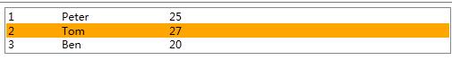
比如有这样一个需求:用户界面使用ListBox显示了一列Student数据,当Student对象同时满足ID为2、Name为Tom的时候,条目就高亮显示,
XAML代码如下:
-
using System;
-
using System.Collections.Generic;
-
using System.Linq;
-
using System.Text;
-
using System.Windows;
-
using System.Windows.Controls;
-
using System.Windows.Data;
-
using System.Windows.Documents;
-
using System.Windows.Input;
-
using System.Windows.Media;
-
using System.Windows.Media.Imaging;
-
using System.Windows.Navigation;
-
using System.Windows.Shapes;
-
-
namespace WpfApplication2
-
{
-
/// <summary>
-
/// MainWindow.xaml 的交互逻辑
-
/// </summary>
-
public partial class MainWindow : Window
-
{
-
public MainWindow()
-
{
-
InitializeComponent();
-
List<Student> stuList = new List<Student>(){
-
new Student(){ID="1",Name="Peter",Age=25},
-
new Student(){ID="2",Name="Tom",Age=27},
-
new Student(){ID="3",Name="Ben",Age=20}
-
};
-
-
this.listBoxStudent.ItemsSource = stuList;
-
}
-
}
-
-
/// <summary>
-
/// 学生类
-
/// </summary>
-
public class Student
-
{
-
public string ID { get; set; }
-
public string Name { get; set; }
-
public int Age { get; set; }
-
}
-
}
-
<Window x:Class="WpfApplication2.MainWindow"
-
xmlns="http://schemas.microsoft.com/winfx/2006/xaml/presentation"
-
xmlns:x="http://schemas.microsoft.com/winfx/2006/xaml"
-
Title="MainWindow" Height="350" Width="525">
-
<Window.Resources>
-
<Style TargetType="ListBoxItem">
-
<!--使用Style设置DataTemplate-->
-
<Setter Property="ContentTemplate">
-
<Setter.Value>
-
<DataTemplate>
-
<StackPanel Orientation="Horizontal">
-
<TextBlock Text="{Binding ID}" Width="60"/>
-
<TextBlock Text="{Binding Name}" Width="120"/>
-
<TextBlock Text="{Binding Age}" Width="60"/>
-
</StackPanel>
-
</DataTemplate>
-
</Setter.Value>
-
</Setter>
-
<!--MultiDataTrigger-->
-
<Style.Triggers>
-
<MultiDataTrigger>
-
<MultiDataTrigger.Conditions>
-
<Condition Binding="{Binding Path=ID}" Value="2"/>
-
<Condition Binding="{Binding Path=Name}" Value="Tom"/>
-
</MultiDataTrigger.Conditions>
-
<MultiDataTrigger.Setters>
-
<Setter Property="Background" Value="Orange"/>
-
</MultiDataTrigger.Setters>
-
</MultiDataTrigger>
-
</Style.Triggers>
-
</Style>
-
</Window.Resources>
-
-
<StackPanel>
-
<ListBox x:Name="listBoxStudent" Margin="5"/>
-
</StackPanel>
-
</Window>
效果:
5、由事件触发的EventTrigger
EventTrigger是触发器中最特殊的一个。首先,它不是由属性值或数据的变化来触发而是由事件来触发;其次,被触发后它并非应用一组Setter,而是执行一段动画。
因此,UI层的动画效果往往与EventTrigger相关联。
在下面这个例子中创建了一个针对Button的Style,这个Style包含两个EventTrigger,一个由MouseEnter事件触发,另一个由MouseLeave事件触发。
鼠标进入按钮时变大,离开时恢复原样。
XAML代码如下:
-
<Window.Resources>
-
<Style TargetType="Button">
-
<Style.Triggers>
-
<!--鼠标进入-->
-
<EventTrigger RoutedEvent="MouseEnter">
-
<BeginStoryboard>
-
<Storyboard>
-
<DoubleAnimation To="150" Duration="0:0:0.2" Storyboard.TargetProperty="Width"/>
-
<DoubleAnimation To="150" Duration="0:0:0.2" Storyboard.TargetProperty="Height"/>
-
</Storyboard>
-
</BeginStoryboard>
-
</EventTrigger>
-
<!--鼠标离开-->
-
<EventTrigger RoutedEvent="MouseLeave">
-
<BeginStoryboard>
-
<Storyboard>
-
<DoubleAnimation Duration="0:0:0.2" Storyboard.TargetProperty="Width"/>
-
<DoubleAnimation Duration="0:0:0.2" Storyboard.TargetProperty="Height"/>
-
</Storyboard>
-
</BeginStoryboard>
-
</EventTrigger>
-
</Style.Triggers>
-
</Style>
-
</Window.Resources>
-
-
<Canvas>
-
<Button Width="40" Height="40" Content="OK"/>
-
</Canvas>