标签:top table lin enter main padding mes sim img
利用border属性实现
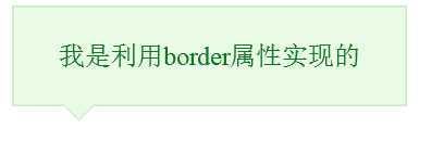
 .messageBox{
           position: relative;
           width: 240px;
           height: 60px;
           line-height: 60px;
           background: #e9fbe4;
           border: 1px solid #c9e9c0;
           border-radius: 4px;
           text-align: center;
           color: #0c7823;
       }
        .triangleBorder{
            position: absolute;
            left: 30px;
            overflow: hidden;
            width: 0;
            height: 0;border-width: 10px;border-style: solid dashed dashed dashed;
        }
        .tbBorder{
            bottom: -20px;
            border-color: #c9e9c0 transparent transparent transparent;
        }
        .tbBackground{
            bottom: -19px;border-color: #e9fbe4 transparent transparent transparent;
        }
<div class="messageBox">
    <span>我是利用border属性实现的</span>
    <div class="triangleBorder tbBorder"></div>
    <div class="triangleBorder tbBackground"></div>
</div>
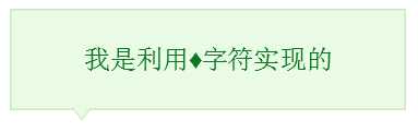
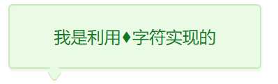
第2种:利用“?”字符实现(谷歌浏览器显示不正常)
 |
 |
| IE 火狐 | 谷歌 |
.messageBox{
           position: relative;
           width: 240px;
           height: 60px;
           line-height: 60px;
           background: #e9fbe4;
           box-shadow: 1px 2px 3px #e9f4e4;
           border: 1px solid #c9e9c0;
           border-radius: 4px;
           text-align: center;
           color: #0c7823;
       }
        .triangleBorder{
            position: absolute;
            left: 30px;
            overflow: hidden;
            width: 26px;
            height: 26px;
            font: normal 26px "SimSun";
        }
        .tbBorder{
            bottom: -12px;
            color: #c9e9c0;
        }
        .tbBackground{
            bottom: -11px;color: #e9fbe4;
        }
<div class="messageBox">
    <span>我是利用?字符实现的</span>
    <div class="triangleBorder tbBorder">?</div>
    <div class="triangleBorder tbBackground">?</div>
</div>
第3种
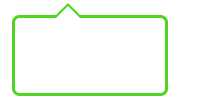
.triangle {
            position: relative;
            width: 100px;
            height: 50px;
            border: 2px solid #4ed621;
            border-radius: 5px;
        }

        .triangle:before {
            position: absolute;
            content: "";
            top: -10px;
            left: 25px;
            border-left: 10px solid transparent;
            border-right: 10px solid transparent;
            border-bottom: 10px solid #4ed621;
        }
        /* 白色覆盖*/
        .triangle:after {
            position: absolute;
            content: "";
            /*减少两像素*/
            top: -8px;
            left: 25px;
            border-left: 10px solid transparent;
            border-right: 10px solid transparent;
            border-bottom: 10px solid #fff;
        }
<div class="triangle"></div>
第4种
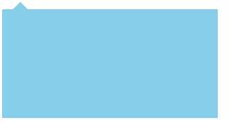
 .box{
            position: relative;
            padding-top: 8px;
        }
        .con{
            width: 200px;
            height: 100px;
            border: 1px skyblue solid;
            border-radius: 3px;
            background-color: skyblue;
        }
        .con-ret {
            border: 7px solid transparent;
            border-bottom-color: skyblue;
            position: absolute;
            left: 10px;
            top: -6px;

        }
<div class="box">
    <div class="con-ret"></div>
    <div class="con"></div>
</div>
第5种
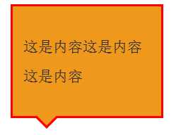
.main{
            width: 120px;
            padding: 10px;
            font-size: 14px;
            color: #333;
            line-height: 28px;
            background: #F0981C;
            border: 2px solid #FF0000;
            position: relative;
            -webkit-border-radius:5px;
            -moz-border-radius:5px;
            border-radius: 5px;
            display: inline-block;
        }

        .main:before,.main:after{
            content: ‘ ‘;
            border-top: 12px solid #FF0000;
            border-left: 12px solid transparent;
            border-right: 12px solid transparent;
            position: absolute;
            bottom: -12px;
            left: 20px;
        }
        .main:after{
            border-top: 12px solid #F0981C;
            bottom: -9px;
        }
<div class="main">
    <p>这是内容这是内容这是内容</p>
</div>
标签:top table lin enter main padding mes sim img
原文地址:https://www.cnblogs.com/coldfishdt/p/10357649.html