标签:color 兼容 mic state -name one ref 实现 function
首先,先介绍一下主要用到的css属性:animation,text-shadow。
text-shadow就不再介绍了,上一篇已经详细介绍了用法。这里先介绍一下animation属性。
animation是css3的属性,主要有以下几项:
| 属性 | 描述 | |
|---|---|---|
| @keyframes | 规定动画。 | |
| animation | 所有动画属性的简写属性,除了 animation-play-state 属性。 | |
| animation-name | 规定 @keyframes 动画的名称。 | |
| animation-duration | 规定动画完成一个周期所花费的秒或毫秒。默认是 0。 | |
| animation-timing-function | 规定动画的速度曲线。默认是 "ease"。 | |
| animation-delay | 规定动画何时开始。默认是 0。 | |
| animation-iteration-count | 规定动画被播放的次数。默认是 1。 | |
| animation-direction | 规定动画是否在下一周期逆向地播放。默认是 "normal"。 | |
| animation-play-state | 规定动画是否正在运行或暂停。默认是 "running"。 | |
| animation-fill-mode | 规定对象动画时间之外的状态。 |
指定动画和播放的速度时间等相关设置。
关键帧是css动画的另一个重要属性。要设置动画必须指定要关键帧。
用百分比来规定变化发生的时间,或用关键词 "from" 和 "to",等同于 0% 和 100%。0% 是动画的开始,100% 是动画的完成,我们也可以设置好0-100中间的各个时间阶段的样式。比如这里,我们指定了首尾两个节点的样式:
1 @keyframes ani1 {
2       from {
3         text-shadow: 0 0 10px #fff,0 0 20px #fff,0 0 30px #fff, 0 0 40px #ff1177, 0 0 70px #ff1177, 0 0 80px #ff1177, 0 0 150px #ff1177;
4       }
5       to {
6         text-shadow: 0 0 5px #fff,0 0 15px #fff,0 0 20px #fff, 0 0 30px #ff1177, 0 0 40px #ff1177, 0 0 50px #ff1177, 0 0 60px #ff1177;
7       }
8     }
其原理,就是利用text-shadow的渐变过渡结合动画,来实现呼吸灯的亮暗效果。
我们可以设置更准确的百分比样式,如:
1 @keyframes myfirst
2 {
3 0%   {background: red;}
4 25%  {background: yellow;}
5 50%  {background: blue;}
6 100% {background: green;}
7 }
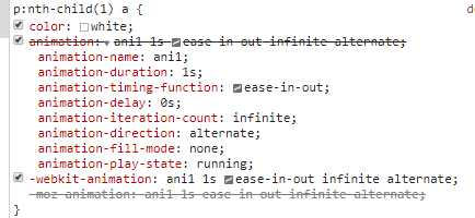
 1 <!DOCTYPE html>
 2 <html>
 3 <head>
 4   <meta charset="UTF-8">
 5   <style type="text/css">
 6     body {
 7       font-weight: 400;
 8       background-color: black;
 9       text-align: center;
10     }
11     a {
12       font-size: 7em;
13       text-decoration: none;
14     }
15     p:nth-child(1) a {
16       color: #FF1177;
17     }
18     p:nth-child(1) a:hover {
19       color: white;
20       animation: ani1 1s ease-in-out infinite alternate;
21       -webkit-animation: ani1 1s ease-in-out infinite alternate;
22       -moz-animation: ani1 1s ease-in-out infinite alternate;
23     }
24     @keyframes ani1 {
25       from {
26         text-shadow: 0 0 10px #fff,0 0 20px #fff,0 0 30px #fff, 0 0 40px #ff1177, 0 0 70px #ff1177, 0 0 80px #ff1177, 0 0 150px #ff1177;
27       }
28       to {
29         text-shadow: 0 0 5px #fff,0 0 15px #fff,0 0 20px #fff, 0 0 30px #ff1177, 0 0 40px #ff1177, 0 0 50px #ff1177, 0 0 60px #ff1177;
30       }
31     }
32     @-webkit-keyframes ani1 {
33       from {
34         text-shadow: 0 0 10px #fff,0 0 20px #fff,0 0 30px #fff, 0 0 40px #ff1177, 0 0 70px #ff1177, 0 0 80px #ff1177, 0 0 150px #ff1177;
35       }
36       to {
37         text-shadow: 0 0 5px #fff,0 0 15px #fff,0 0 20px #fff, 0 0 30px #ff1177, 0 0 40px #ff1177, 0 0 50px #ff1177, 0 0 60px #ff1177;
38       }
39     }
40     @-moz-keyframes ani1 {
41       from {
42         text-shadow: 0 0 10px #fff,0 0 20px #fff,0 0 30px #fff, 0 0 40px #ff1177, 0 0 70px #ff1177, 0 0 80px #ff1177, 0 0 150px #ff1177;
43       }
44       to {
45         text-shadow: 0 0 5px #fff,0 0 15px #fff,0 0 20px #fff, 0 0 30px #ff1177, 0 0 40px #ff1177, 0 0 50px #ff1177, 0 0 60px #ff1177;
46       }
47     }
48   </style>
49 </head>
50 <body>
51   <div id="container">
52   <p><a href="#">
53     RED
54   </a></p>
55 </div>
56 </body>
57 </html>
需要注意的是,由于存在浏览器兼容性,IE9以上和谷歌火狐等才支持。因而写样式的时候,keyframes和animation需要使用谷歌和火狐的前缀来进行兼容:-webkit-,-moz-
标签:color 兼容 mic state -name one ref 实现 function
原文地址:https://www.cnblogs.com/ljwsyt/p/10552892.html