标签:实现 ott orm float 代码生成 制作 ack 属性 utf-8
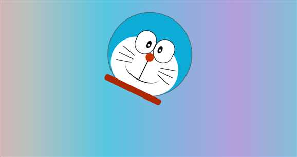
###下面代码同学可以查看一下,每个线条及椭圆都是纯CSS代码生成。
使用background属性的-webkit-gradient() / -moz-linear-gradient() 画出身体部分的线性色彩变化。
<!DOCTYPE html>
<html lang="en">
<head>
 <meta charset="UTF-8">
 <title>哆啦A梦(机器猫)动画版</title>
</head>
<body>
  <!-- content是整个哆啦A梦的主体 -->
  <div class="content">
      <!-- 哆啦A梦的头部 -->
      <div class="head"></div>
      <!-- 哆啦A梦的脸部 -->
      <div class="face">
      </div>
      <div class="eye">
          <div></div>
          <div></div>
      </div>
      <div class="eye-2">
          <div>
              <div></div>
          </div>
          <div>
              <div></div>
          </div>
      </div>
      <!-- 哆啦A梦的鼻子 -->
      <div class="nose">
          <div class="nose-2"></div>
          <div class="nose-3"></div>
      </div>
      <!-- 哆啦A梦的胡子 -->
      <div class="huzi">
          <div></div>
          <div></div>
          <div></div>
          <div></div>
          <div></div>
          <div></div>
      </div>
      <div class="huzi2">
          <div></div>
          <div></div>
          <div></div>
          <div></div>
          <div></div>
          <div></div>
      </div>
      <!-- 哆啦A梦围巾 -->
      <div class="weijin"></div>
  </div>
</body>
</html><style>
/*给背景设置渐变色*/
body {
background-image:linear-gradient(to right, #eea2a2 0%, #bbc1bf 19%, #57c6e1 42%, #b49fda 79%, #7ac5d8 100%);
}
/*给哆啦A梦整体设置宽度*/
.content{
width: 333px;
height: 350px;
position: relative;
margin: 50px auto;
/*让content 执行keyframes动画*/
animation: play 5s linear infinite;
}
/*头设置*/
.head {
width: 325px;
height: 325px;
border-radius: 50%;
background-color: #0dacd7;
border: 2px solid #555555;
transition: 3s;
}
/*脸设置*/
.face{
width: 270px;
height: 200px;
background-color: white;
border-radius: 130px;
position: absolute;
top: 115px;
left: 31px;
transition: 3s;
}
/*眼睛设置*/
.eye {
width: 158px;
position: absolute;
top: 82px;
left: 90px;
transition: 3s;
}
.eye>div{
width: 75px;
height: 90px;
background-color: white;
border: 2px solid black;
border-radius: 40px;
float: left;
transition: 3s;
}
.eye-2>div{
width: 17px;
height: 30px;
border-radius: 50%;
background-color: black;
position: relative;
}
.eye-2>div:nth-child(1){
position: absolute;
top: 116px;
left: 136px;
}
.eye-2>div:nth-child(2){
position: absolute;
top: 116px;
left: 184px;
}
.eye-2>div>div {
width: 9px;
height: 9px;
background-color: white;
border-radius: 50%;
position: absolute;
top: 13px;
left: 5px;
}
/*鼻子设置*/
.nose{
width: 32px;
height: 32px;
background-color: #c93300;
border-radius: 50%;
position: absolute;
top: 159px;
left: 153px;
}
.nose-2 {
width: 3px;
height: 80px;
background-color: black;
position: absolute;
top: 32px;
left: 14px;
}
.nose-3 {
width: 147px;
height: 77px;
border-bottom: 3px solid black;
border-radius: 50%;
position: absolute;
top: 35px;
left: -58px;
}
/*围巾设置*/
.weijin{
width: 240px;
height: 24px;
background-color: #ab2800;
border-radius: 9px;
position: absolute;
top: 305px;
left: 45px;
}
/*胡子设置*/
.huzi {
position: absolute;
top: 186px;
left: 54px;
}
.huzi>div:nth-child(1){
width: 60px;
height: 2px;
background-color: black;
transform: rotate(15deg);
transition: 3s;
}
.huzi>div:nth-child(2){
width: 60px;
height: 2px;
background-color: black;
margin-top: 20px;
margin-bottom: 20px;
transition: 3s;
}
.huzi>div:nth-child(3){
width: 60px;
height: 2px;
background-color: black;
transform: rotate(-15deg);
}
.huzi2 {
position: absolute;
top: 186px;
left: 224px;
}
.huzi2>div:nth-child(1){
width: 60px;
height: 2px;
background-color: black;
transform: rotate(165deg);
}
.huzi2>div:nth-child(2){
width: 60px;
height: 2px;
background-color: black;
margin-top: 20px;
margin-bottom: 20px;
}
.huzi2>div:nth-child(3){
width: 60px;
height: 2px;
background-color: black;
transform: rotate(-165deg);
}
/*设置哆啦A梦移动路径的动画*/
@keyframes play {
0{
transform: rotate(0deg) translateX(0);
}
15%{
transform: translateX(400px) rotate(190deg);
}
30%{
transform: translateX(0px) rotate(-80deg);
}
45%{
transform: translateX(-400px) rotate(-175deg);
}
60%{
transform: translateX(-100px) rotate(-20deg);
}
80%{
transform: rotate(190deg) translateY(-300px);
}
100%{
transform: rotate(-20 deg) translateY(200px);
}
}
</style>
标签:实现 ott orm float 代码生成 制作 ack 属性 utf-8
原文地址:https://www.cnblogs.com/zhaohongcheng/p/10843155.html