标签:zip aci groupby dex dataset img edr line generate

import pandas as pd  # Data analysis
import numpy as np #Data analysis
import seaborn as sns # Data visualization
import matplotlib.pyplot as plt # Data Visualization
import  matplotlib.gridspec as gridspec # subplots and grid
from wordcloud import WordCloud, STOPWORDS # Visualize text

import json
import folium # Map
import folium.plugins as plugins # Map
from mpl_toolkits.basemap import Basemap # Map

import warnings
warnings.filterwarnings(‘ignore‘)
import scipy.stats
import gc

# Plotting style and setting
plt.style.use(‘fivethirtyeight‘) #Plot style
#plt.style.use(‘bmh‘)
plt.rc(‘axes‘, labelsize=12) # plot setting
plt.rc(‘xtick‘, labelsize=12)
plt.rc(‘ytick‘, labelsize=12)
pd.options.display.max_rows = 100
% matplotlib inline
#path = ‘file/‘ # local file loaction
path = ‘F:\\kaggleDataSet\\human-development\\‘
loan = pd.read_csv(path+‘kiva_loans.csv‘)
mpi = pd.read_csv(path+‘kiva_mpi_region_locations.csv‘)
#loan_theme = pd.read_csv(path+‘loan_theme_ids.csv‘)
#loan_theme_region = pd.read_csv(path+‘loan_themes_by_region.csv‘)

# MPI
#mpi_world = pd.read_csv(‘file/MPI_national.csv‘)
#mpi_subnational = pd.read_csv(‘file/MPI_subnational.csv‘)

#HDI
path = ‘F:\\kaggleDataSet\\human-development\\‘
hdi = pd.read_csv(path+‘HDI.csv‘)
continent_hdi = pd.read_csv(path+‘Continent_HDI.csv‘)
geo_world_data = json.load(open(path+‘countries.geojson‘))
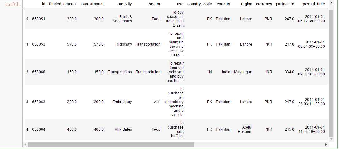
loan.head()
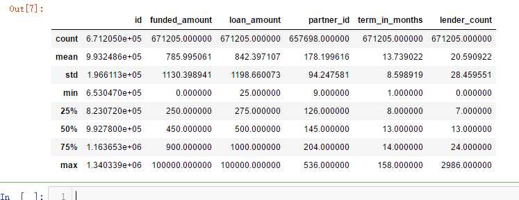
loan.describe()
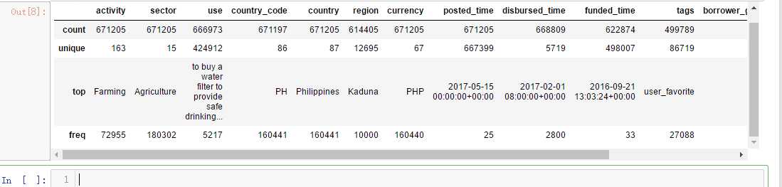
loan.describe(include=[‘O‘]) # Discribe categorical data
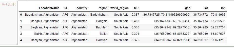
mpi.head()
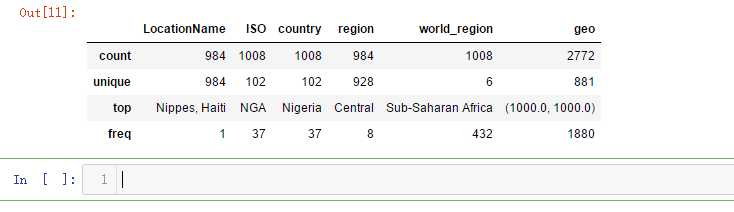
mpi.describe(include=[‘O‘]) # Discribe categorical data
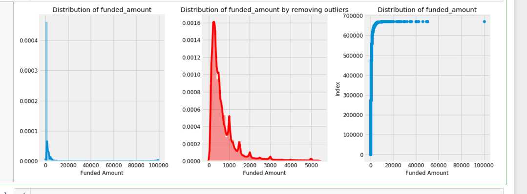
f,ax = plt.subplots(1,3,figsize=(16,6))
sns.distplot(loan[‘funded_amount‘],ax=ax[0])
ax[0].set_title(‘Distribution of funded_amount‘)
ax[0].set_xlabel(‘Funded Amount‘)

ulimit = np.percentile(loan[‘funded_amount‘],99)
llimit= np.percentile(loan[‘funded_amount‘],1)
value = loan[(llimit<loan[‘funded_amount‘])&(loan[‘funded_amount‘]<ulimit)][‘funded_amount‘]
sns.distplot(value,color=‘r‘,ax=ax[1])
ax[1].set_title(‘Distribution of funded_amount by removing outliers‘);
ax[1].set_xlabel(‘Funded Amount‘)

ax[2].scatter(np.sort(loan[‘funded_amount‘].values),range(loan.shape[0]),)
ax[2].set_title(‘Distribution of funded_amount‘);
ax[2].set_xlabel(‘Funded Amount‘)
ax[2].set_ylabel(‘Index‘)
plt.subplots_adjust(wspace=0.3)
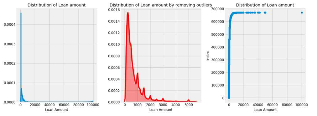
f,ax = plt.subplots(1,3,figsize=(16,6))
sns.distplot(loan[‘loan_amount‘],ax=ax[0])
ax[0].set_title(‘Distribution of Loan amount‘)
ax[0].set_xlabel(‘Loan Amount‘)

ulimit = np.percentile(loan[‘loan_amount‘],99)
llimit= np.percentile(loan[‘loan_amount‘],1)
value = loan[(llimit<loan[‘loan_amount‘])&(loan[‘loan_amount‘]<ulimit)][‘loan_amount‘]
sns.distplot(value,color=‘r‘,ax=ax[1])
ax[1].set_xlabel(‘Loan Amount‘)
ax[1].set_title(‘Distribution of Loan amount by removing outliers‘);

ax[2].scatter(np.sort(loan[‘loan_amount‘].values),range(loan.shape[0]),)
ax[2].set_title(‘Distribution of Loan amount‘);
ax[2].set_xlabel(‘Loan Amount‘)
ax[2].set_ylabel(‘Index‘)
plt.subplots_adjust(wspace=0.3)
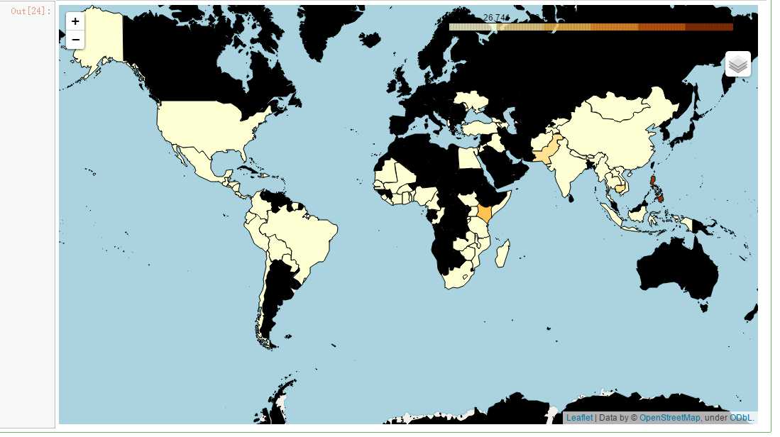
m = folium.Map(location=[0,0],zoom_start=2)
poo = loan.groupby([‘country_code‘]).agg({‘count‘,‘count‘})[‘id‘].reset_index()
m.choropleth(geo_data= geo_world_data,data = poo,
             columns=[‘country_code‘,‘count‘],key_on=‘feature.properties.wb_a2‘,
             name=‘Listed Country‘,fill_opacity=1,fill_color=‘YlOrBr‘,
             highlight=True,legend_name=‘Count‘)
folium.LayerControl().add_to(m)
m
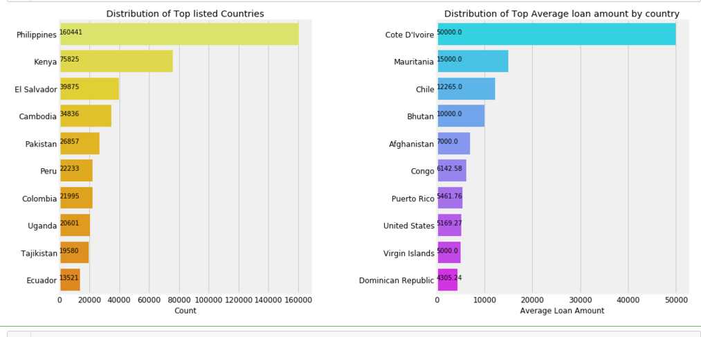
f,ax = plt.subplots(1,2,figsize=(16,8))
poo = loan[‘country‘].value_counts()[:10]
sns.barplot(poo.values,poo.index, palette=‘Wistia‘, ax=ax[0])
ax[0].set_title(‘Distribution of Top listed Countries‘)
ax[0].set_xlabel(‘Count‘)

for i, v in enumerate(poo.values):
    ax[0].text(.6,i, round(v,2),fontsize=10,color=‘k‘)
poo = loan.groupby(‘country‘).mean()[‘loan_amount‘].sort_values(ascending=False)[:10]
sns.barplot(poo.values, poo.index, palette=‘cool‘, ax=ax[1])
ax[1].set_title(‘Distribution of Top Average loan amount by country‘)
ax[1].set_ylabel(‘‘)
ax[1].set_xlabel(‘Average Loan Amount‘)

for i, v in enumerate(poo.values):
    ax[1].text(.6,i, round(v,2),fontsize=10,color=‘k‘)

plt.subplots_adjust(wspace=0.5);
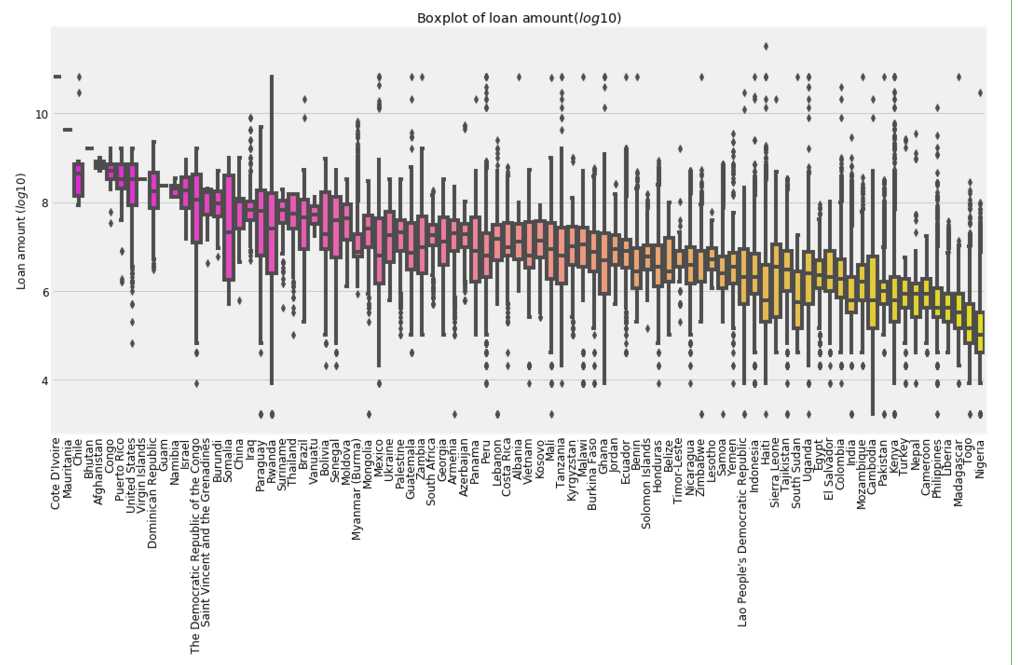
plt.figure(figsize=(16,8))

poo = loan.groupby(‘country‘).mean()[‘loan_amount‘].sort_values(ascending=False)
sns.boxplot(loan[‘country‘], np.log(loan[‘loan_amount‘]), palette=‘spring‘,order=poo.index)
plt.xlabel(‘‘)
plt.ylabel(‘Loan amount ($log10$)‘)
plt.title(‘Boxplot of loan amount($log10$)‘)
plt.xticks(rotation=90);
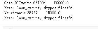
print("Cote D‘Ivoire",loan[loan[‘country‘] == "Cote D‘Ivoire"][‘loan_amount‘])
print("Mauritania",loan[loan[‘country‘] == "Mauritania"][‘loan_amount‘])
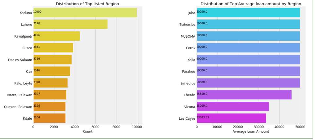
f,ax = plt.subplots(1,2,figsize=(16,8))
poo = loan[‘region‘].value_counts()[:10]
sns.barplot(poo.values,poo.index, palette=‘Wistia‘, ax=ax[0])
ax[0].set_title(‘Distribution of Top listed Region‘)
ax[0].set_xlabel(‘Count‘)

for i, v in enumerate(poo.values):
    ax[0].text(.6,i, round(v,2),fontsize=10,color=‘k‘)
poo = loan.groupby(‘region‘).mean()[‘loan_amount‘].sort_values(ascending=False)[:10]
sns.barplot(poo.values, poo.index, palette=‘cool‘, ax=ax[1])
ax[1].set_title(‘Distribution of Top Average loan amount by Region‘)
ax[1].set_ylabel(‘‘)
ax[1].set_xlabel(‘Average Loan Amount‘)

for i, v in enumerate(poo.values):
    ax[1].text(.6,i, round(v,2),fontsize=10,color=‘k‘)

plt.subplots_adjust(wspace=0.5);
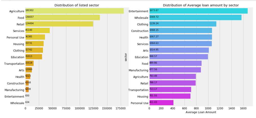
plt.figure( figsize =(16,8))
gridspec.GridSpec(2,2)

plt.subplot2grid((1,2),(0,0))
poo = loan[‘sector‘].value_counts()
#plt.pie(poo.values, labels = poo.index, autopct=‘%1.1f%%‘,colors=sns.color_palette(‘Wistia‘),startangle=60,)
sns.barplot(poo.values,poo.index,palette=‘Wistia‘)
for i, v in enumerate(poo.values):
    plt.text(.6,i, round(v,2),fontsize=10,color=‘k‘)
plt.title(‘Distribution of listed sector‘)

plt.subplot2grid((1,2),(0,1))
poo = loan.groupby(‘sector‘).mean()[‘loan_amount‘].sort_values(ascending=False)
sns.barplot(poo.values,poo.index,palette=‘cool‘)
plt.title(‘Distribution of Average loan amount by sector‘)
plt.xlabel(‘Average Loan Amount‘)
for i, v in enumerate(poo.values):
    plt.text(.6,i, round(v,2),fontsize=10,color=‘k‘)
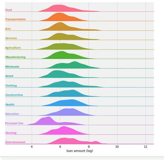
# Joy plot
tmp = loan[[‘loan_amount‘,‘sector‘]]
tmp[‘loan_amount‘] = np.log(tmp[‘loan_amount‘])
g = sns.FacetGrid(tmp,row=‘sector‘,hue=‘sector‘,aspect=15, size=0.6)

# Draw the densities in a few steps
g.map(sns.kdeplot, "loan_amount", clip_on=False, shade=True, alpha=1, lw=1.5, bw=.2)
g.map(sns.kdeplot, "loan_amount", clip_on=False, color="w", lw=2, bw=.2)
g.map(plt.axhline, y=0, lw=2, clip_on=False)

# Define and use a simple function to label the plot in axes coordinates
def label(x, color, label):
    ax = plt.gca()
    ax.text(0, .2, label, fontweight="bold", color=color, ha="left", va="center", transform=ax.transAxes)

g.map(label, "loan_amount")

# Set the subplots to overlap
g.fig.subplots_adjust(hspace=0)

# Remove axes details that don‘t play will with overlap
g.set_titles("")
g.set(yticks=[])
g.set(xlabel = ‘loan amount (log)‘)
g.despine(bottom=True, left=True)
g.savefig(‘F:\\joy.png‘)
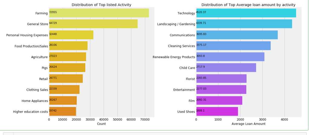
f,ax = plt.subplots(1,2,figsize=(16,8))
poo = loan[‘activity‘].value_counts()[:10]
sns.barplot(poo.values,poo.index, palette=‘Wistia‘,ax= ax[0])
ax[0].set_title(‘Distribution of Top listed Activity‘)
ax[0].set_xlabel(‘Count‘)
for i, v in enumerate(poo.values):
    ax[0].text(.6,i, round(v,2),fontsize=10,color=‘k‘)

poo = loan.groupby(‘activity‘).mean()[‘loan_amount‘].sort_values(ascending=False)[:10]
sns.barplot(poo.values, poo.index, palette=‘cool‘, ax=ax[1])
ax[1].set_title(‘Distribution of Top Average loan amount by activity‘)
ax[1].set_ylabel(‘‘)
ax[1].set_xlabel(‘Average Loan Amount‘)
for i, v in enumerate(poo.values):
    ax[1].text(1,i, round(v,2),fontsize=10,color=‘k‘)
plt.subplots_adjust(wspace=0.4)
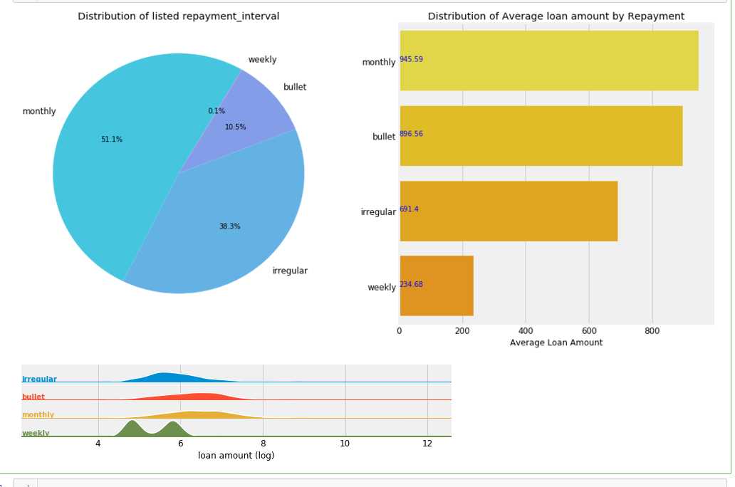
plt.figure(figsize =(16,8))
gridspec.GridSpec(2,2)

plt.subplot2grid((1,2),(0,0))
poo = loan[‘repayment_interval‘].value_counts()
plt.pie(poo.values,labels= poo.index,autopct=‘%1.1f%%‘,startangle=60,colors=sns.color_palette(‘cool‘,desat=.7))
plt.title(‘Distribution of listed repayment_interval‘)

plt.subplot2grid((1,2),(0,1))
poo = loan.groupby(‘repayment_interval‘).mean()[‘loan_amount‘].sort_values(ascending=False)
sns.barplot(poo.values,poo.index, palette=‘Wistia‘)
plt.title(‘Distribution of Average loan amount by Repayment‘)
plt.xlabel(‘Average Loan Amount‘)
plt.ylabel(‘‘)
for i, v in enumerate(poo.values):
    plt.text(1,i, round(v,2),fontsize=10,color=‘b‘)


# Joy plot
tmp = loan[[‘loan_amount‘,‘repayment_interval‘]]
tmp[‘loan_amount‘] = np.log(tmp[‘loan_amount‘])
g = sns.FacetGrid(tmp,row=‘repayment_interval‘,hue=‘repayment_interval‘,aspect=15, size=0.6)

# Draw the densities in a few steps
g.map(sns.kdeplot, "loan_amount", clip_on=False, shade=True, alpha=1, lw=1.5, bw=.2)
g.map(sns.kdeplot, "loan_amount", clip_on=False, color="w", lw=2, bw=.2)
g.map(plt.axhline, y=0, lw=2, clip_on=False)

# Define and use a simple function to label the plot in axes coordinates
def label(x, color, label):
    ax = plt.gca()
    ax.text(0, .2, label, fontweight="bold", color=color, ha="left", va="center", transform=ax.transAxes)

g.map(label, "loan_amount")

# Set the subplots to overlap
g.fig.subplots_adjust(hspace=0)

# Remove axes details that don‘t play will with overlap
g.set_titles("")
g.set(yticks=[])
g.set(xlabel = ‘loan amount (log)‘)
g.despine(bottom=True, left=True)

plt.subplots_adjust(wspace=0.3);
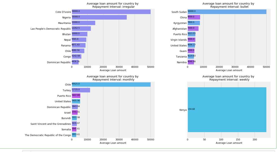
f,ax = plt.subplots(2,2,figsize=(16,12))
axs = ax.ravel()
for i,c in enumerate(loan[‘repayment_interval‘].unique()):
    k = loan[loan[‘repayment_interval‘] == c]
    agg = k.groupby([‘country‘]).mean()[‘loan_amount‘].sort_values(ascending=False).dropna()[:10]
    if i<4:
        sns.barplot(x = agg.values,y = agg.index, ax= axs[i],palette=sns.color_palette(‘cool‘,n_colors=i+1))
        axs[i].set_title(‘Average loan amount for country by \n Repayment Interval: {}‘.format(c))
        axs[i].set_ylabel(‘‘)
        axs[i].set_xlabel(‘Average Loan amount‘)
        for j, v in enumerate(agg.values):
            axs[i].text(1,j, round(v,2),fontsize=10,color=‘k‘)
plt.subplots_adjust(wspace=0.4,hspace=0.3)
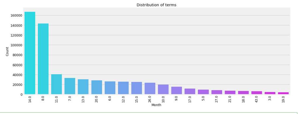
plt.figure(figsize=(16,6))
poo = loan[‘term_in_months‘].value_counts().iloc[:20]
sns.barplot(y = poo.values, x = poo.index, palette= ‘cool‘,order=poo.index)
plt.xticks(rotation=90)
plt.xlabel(‘Month‘)
plt.ylabel(‘Count‘)
plt.title(‘Distribution of terms‘);
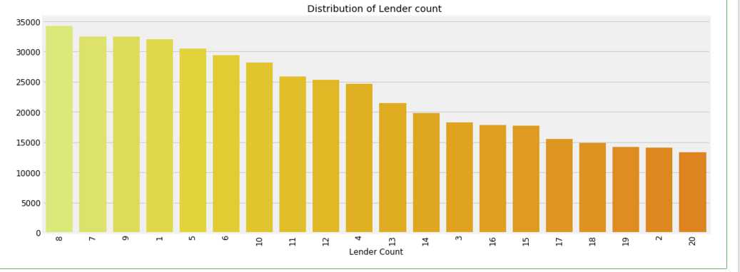
plt.figure(figsize=(16,6))
poo = loan[‘lender_count‘].value_counts().iloc[:20]
sns.barplot(y = poo.values, x = poo.index, palette= ‘Wistia‘,order=poo.index)
plt.xticks(rotation=90)
plt.xlabel(‘Lender Count‘)
plt.title(‘Distribution of Lender count ‘);
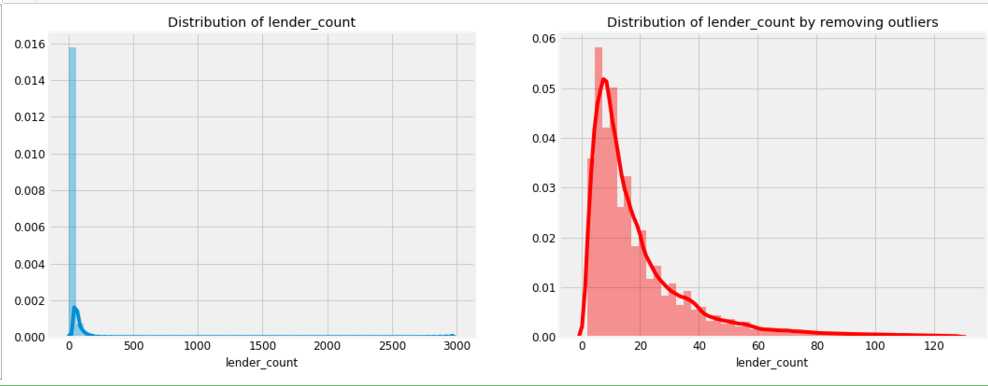
f,ax = plt.subplots(1,2,figsize=(16,6))
sns.distplot(loan[‘lender_count‘],ax=ax[0])
ax[0].set_title(‘Distribution of lender_count‘)

ulimit = np.percentile(loan[‘lender_count‘],99)
llimit= np.percentile(loan[‘lender_count‘],1)
value = loan[(llimit<loan[‘lender_count‘])&(loan[‘lender_count‘]<ulimit)][‘lender_count‘]
sns.distplot(value,color=‘r‘,ax=ax[1])
ax[1].set_title(‘Distribution of lender_count by removing outliers‘);
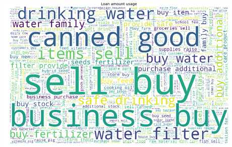
#use
wc = (WordCloud(height= 1000,width=1600, stopwords=STOPWORDS,max_words=1000,background_color=‘white‘).generate(" ".join(loan[‘use‘].astype(str))) )
plt.figure(figsize=(16,10))
plt.imshow(wc)
plt.axis(‘off‘)
#plt.savefig(‘use_cloud.png‘)
plt.title(‘Loan amount usage‘);
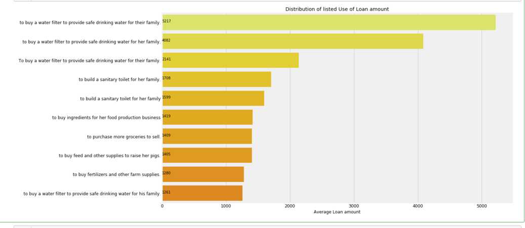
plt.figure(figsize=(16,10))
poo = loan[‘use‘].value_counts()[:10]
sns.barplot(poo.values,poo.index, palette=‘Wistia‘)
plt.title(‘Distribution of listed Use of Loan amount‘)
plt.xlabel(‘Average Loan amount‘)
for i, v in enumerate(poo.values):
    plt.text(.6,i, round(v,2),fontsize=10,color=‘k‘)
    plt.rc(‘ytick‘, labelsize=20);
plt.rc(‘ytick‘, labelsize=10);
#tags
wc = (WordCloud(height= 1000,width=1600, stopwords=STOPWORDS,max_words=1000,background_color=‘white‘).generate(" ".join(loan[‘tags‘].astype(str))) )
plt.figure(figsize=(16,10))
plt.imshow(wc)
plt.axis(‘off‘)
plt.title(‘Loan amount Tags‘);

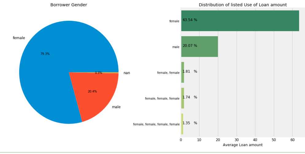
gender = ",".join(loan[‘borrower_genders‘].astype(str).str.replace(‘ ‘,‘‘))

cnt = pd.DataFrame(gender.strip().split(‘,‘),columns=[‘Gender‘])
cnt = cnt[‘Gender‘].value_counts()

f,ax = plt.subplots(1,2,figsize=(16,8))
ax[0].pie(cnt.values,labels=cnt.index,autopct=‘%0.1f%%‘)
ax[0].set_title(‘Borrower Gender‘)

poo = loan[‘borrower_genders‘].value_counts()[:5]*100/loan.shape[0]
#ax[1].pie(poo.values,labels=poo.index,autopct=‘%0.1f%%‘)
sns.barplot(poo.values,poo.index, palette=‘summer‘)
ax[1].set_title(‘Distribution of listed Use of Loan amount‘)
ax[1].set_xlabel(‘Average Loan amount‘)
for i,v in enumerate(poo.values):
    ax[1].text(1,i,round(v,2),fontsize=12)
    ax[1].text(7,i,‘%‘,fontsize=12)
plt.subplots_adjust(wspace=0.4)
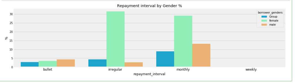
poo = (loan.groupby([‘borrower_genders‘,‘repayment_interval‘]).agg([‘count‘])[‘id‘].reset_index())
poo.loc[:,‘borrower_genders‘][~((poo[‘borrower_genders‘] == ‘female‘) |(poo[‘borrower_genders‘] == ‘male‘))] = ‘Group‘

plt.figure(figsize=(16,4))
cnt = poo.groupby([‘borrower_genders‘,‘repayment_interval‘])[‘count‘].sum().reset_index()
cnt[‘count‘] = cnt[‘count‘]*100/cnt[‘count‘].sum()
sns.barplot(y= cnt[‘count‘],x = cnt[‘repayment_interval‘],hue=cnt[‘borrower_genders‘],palette=‘rainbow‘)
plt.title(‘Repayment interval by Gender %‘)
plt.ylabel(‘%‘);
loan[‘date‘] = pd.to_datetime(loan[‘date‘])
loan[‘disbursed_time‘] = pd.to_datetime(loan[‘disbursed_time‘])
loan[‘funded_time‘] = pd.to_datetime(loan[‘funded_time‘])
loan[‘posted_time‘] = pd.to_datetime(loan[‘posted_time‘])
loan_ts = loan.set_index(‘date‘)
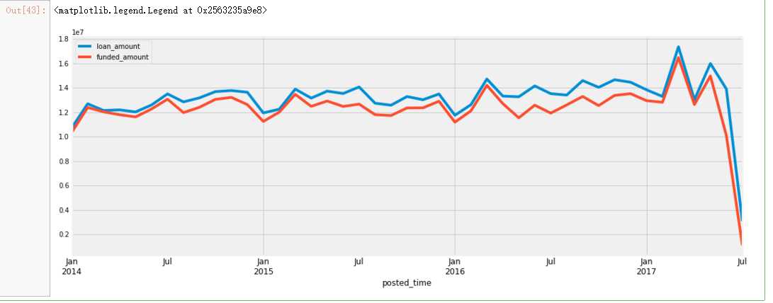
plt.figure(figsize=(16,6))
date_feature = [‘posted_time‘,‘funded_time‘]
loan.set_index(‘posted_time‘)[‘loan_amount‘].resample(‘M‘).sum().plot()
loan.set_index(‘posted_time‘)[‘funded_amount‘].resample(‘M‘).sum().plot()
plt.legend()
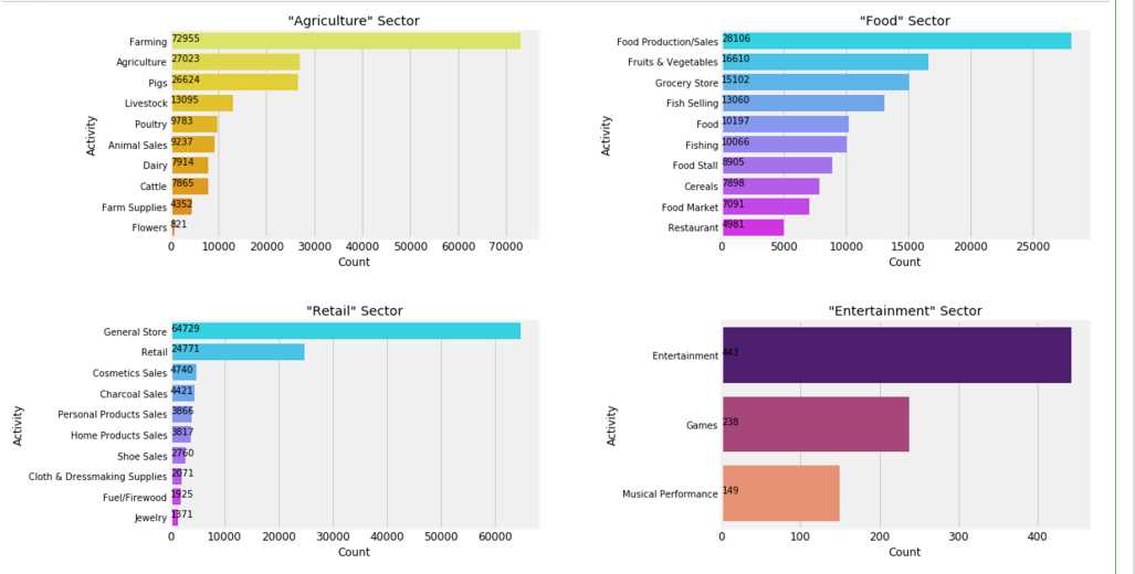
plt.figure(figsize=(16,10))
gridspec.GridSpec(2,2)
# Agriclure
plt.subplot2grid((2,2),(0,0))
poo = loan[loan[‘sector‘] ==‘Agriculture‘][‘activity‘].value_counts()[:10]
sns.barplot(poo.values,poo.index,palette=‘Wistia‘)
plt.ylabel(‘Activity‘)
plt.xlabel(‘Count‘)
plt.title(‘"Agriculture" Sector‘)
for i, v in enumerate(poo.values):
    plt.text(.6,i, round(v,2),fontsize=10,color=‘k‘)

plt.subplot2grid((2,2),(0,1))
poo = loan[loan[‘sector‘] ==‘Food‘][‘activity‘].value_counts()[:10]
sns.barplot(poo.values,poo.index,palette=‘cool‘)
plt.ylabel(‘Activity‘)
plt.xlabel(‘Count‘)
plt.title(‘"Food" Sector‘)
for i, v in enumerate(poo.values):
    plt.text(.6,i, round(v,2),fontsize=10,color=‘k‘)

plt.subplot2grid((2,2),(1,0))
poo = loan[loan[‘sector‘] ==‘Retail‘][‘activity‘].value_counts()[:10]
sns.barplot(poo.values,poo.index,palette=‘cool‘)
plt.ylabel(‘Activity‘)
plt.xlabel(‘Count‘)
plt.title(‘"Retail" Sector‘)
for i, v in enumerate(poo.values):
    plt.text(.6,i, round(v,2),fontsize=10,color=‘k‘)

plt.subplot2grid((2,2),(1,1))
poo = loan[loan[‘sector‘] ==‘Entertainment‘][‘activity‘].value_counts()[:10]
sns.barplot(poo.values,poo.index,palette=‘magma‘)
plt.ylabel(‘Activity‘)
plt.xlabel(‘Count‘)
plt.title(‘"Entertainment" Sector‘)
for i, v in enumerate(poo.values):
    plt.text(.6,i, round(v,2),fontsize=10,color=‘k‘)

plt.subplots_adjust(hspace=0.4,wspace=0.5);
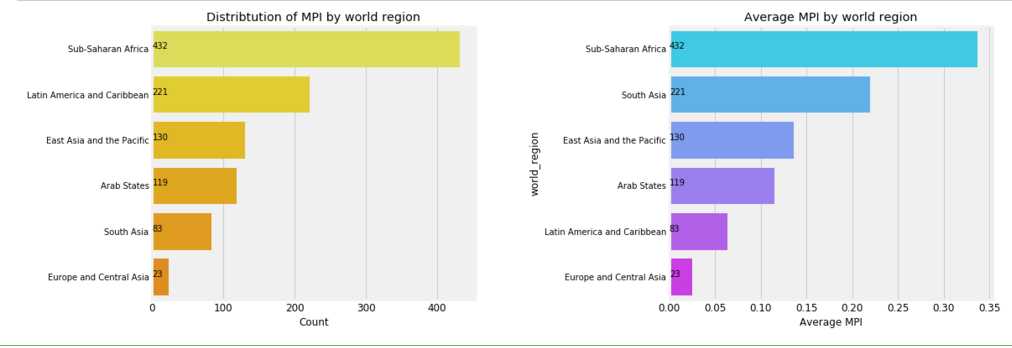
f,ax = plt.subplots(1,2,figsize=(16,6))
poo = mpi[‘world_region‘].value_counts()
sns.barplot(poo.values, poo.index,palette=sns.color_palette(‘Wistia‘),ax=ax[0])
ax[0].set_title(‘Distribtution of MPI by world region‘)
ax[0].set_xlabel(‘Count‘)
for i, v in enumerate(poo.values):
    ax[0].text(.6,i, round(v,2),fontsize=10,color=‘k‘)
agg = mpi.groupby([‘world_region‘]).mean()[‘MPI‘].sort_values().dropna().sort_values( ascending=False)
sns.barplot(agg.values, agg.index,palette=sns.color_palette(‘cool‘),ax=ax[1])
ax[1].set_xlabel(‘Average MPI‘)
ax[1].set_title(‘Average MPI by world region‘)
for i, v in enumerate(poo.values):
    ax[1].text(0,i, round(v,2),fontsize=10,color=‘k‘)
plt.subplots_adjust(wspace=0.6);
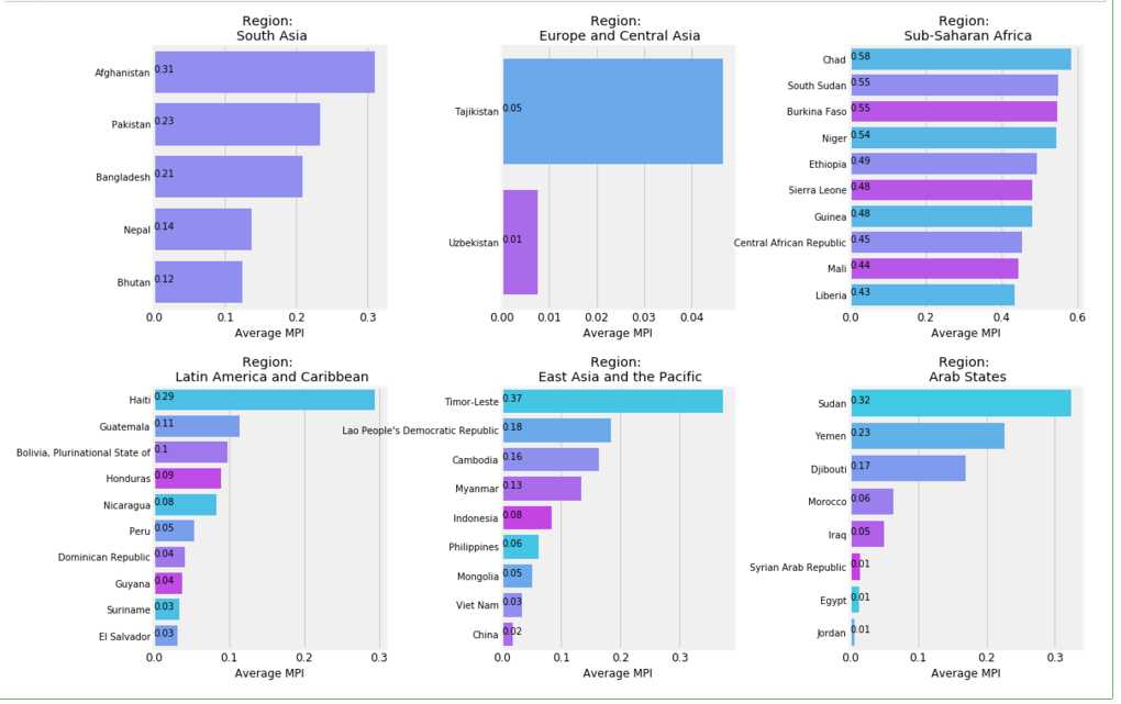
f,ax = plt.subplots(2,3,figsize=(16,12))
axs = ax.ravel()
for i,c in enumerate(mpi[‘world_region‘].unique()):
    k = mpi[mpi[‘world_region‘] == c]
    agg = k.groupby([‘country‘]).mean()[‘MPI‘].sort_values(ascending=False).dropna()[:10]
    if i<6:
        sns.barplot(x = agg.values,y = agg.index, ax= axs[i],palette=sns.color_palette(‘cool‘,n_colors=i+1))
        axs[i].set_title(‘Region: \n {}‘.format(c))
        axs[i].set_xlabel(‘Average MPI‘)
        axs[i].set_ylabel(‘‘)
        for j, v in enumerate(agg.values):
            axs[i].text(0,j,round(v,2),fontsize=10,color=‘k‘)

plt.subplots_adjust(wspace=0.5,hspace=0.3);
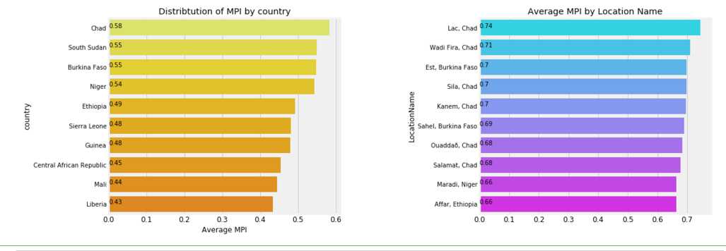
f,ax = plt.subplots(1,2,figsize=(16,6))
agg = mpi.groupby([‘country‘]).mean()[‘MPI‘].sort_values().dropna().sort_values( ascending=False)[:10]
sns.barplot(agg.values, agg.index,palette=‘Wistia‘,ax=ax[0])
ax[0].set_title(‘Distribtution of MPI by country‘)
ax[0].set_xlabel(‘Average MPI‘)
for i, v in enumerate(agg.values):
    ax[0].text(0,i, round(v,2),fontsize=10,color=‘k‘)

agg = mpi.groupby([‘LocationName‘]).mean()[‘MPI‘].sort_values().dropna().sort_values( ascending=False)[:10]
sns.barplot(agg.values, agg.index,palette=‘cool‘,ax=ax[1])
for i, v in enumerate(agg.values):
    ax[1].text(0,i, round(v,2),fontsize=10,color=‘k‘)

ax[1].set_title(‘Average MPI by Location Name‘)
ax[0].set_xlabel(‘Average MPI‘)
plt.subplots_adjust(wspace=0.6);
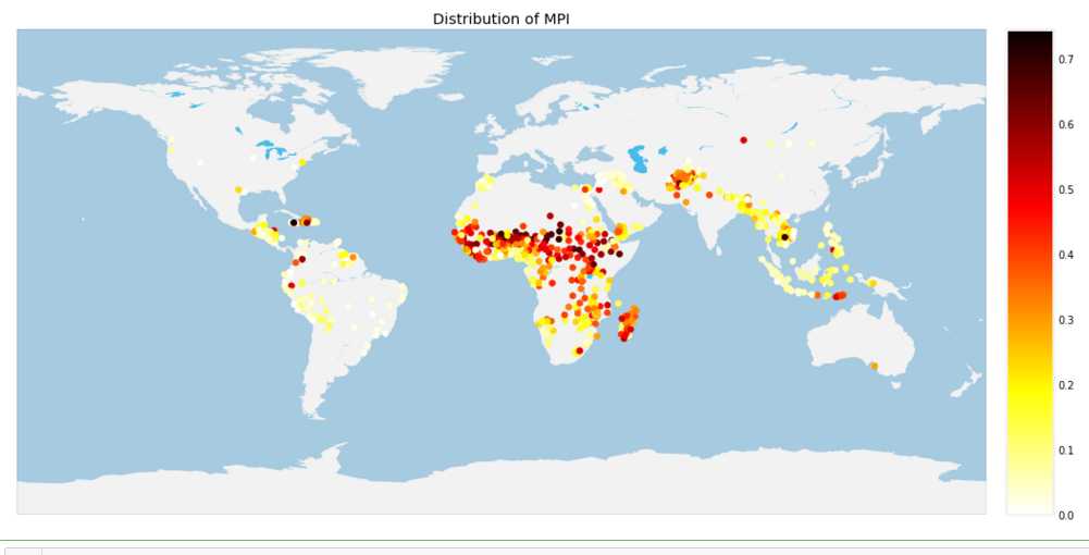
# MPI
plt.figure(figsize=(16,10))
m = Basemap(projection=‘cyl‘,resolution=‘c‘,)
m.drawcoastlines(linewidth=0.1, color="white")
m.fillcontinents(color=‘#f2f2f2‘,lake_color=‘#46bcec‘)
m.drawmapboundary(fill_color=‘#A6CAE0‘, linewidth=0.1)
#m.bluemarble(alpha=0.4)
m.shadedrelief()

values = mpi[‘MPI‘]
mloc = m(mpi[‘lon‘],mpi[‘lat‘])
m.scatter(mloc[0],mloc[1],c = values,zorder=20,cmap=‘hot_r‘)
m.colorbar()
plt.title(‘Distribution of MPI‘)
plt.show()
m
gc.collect();
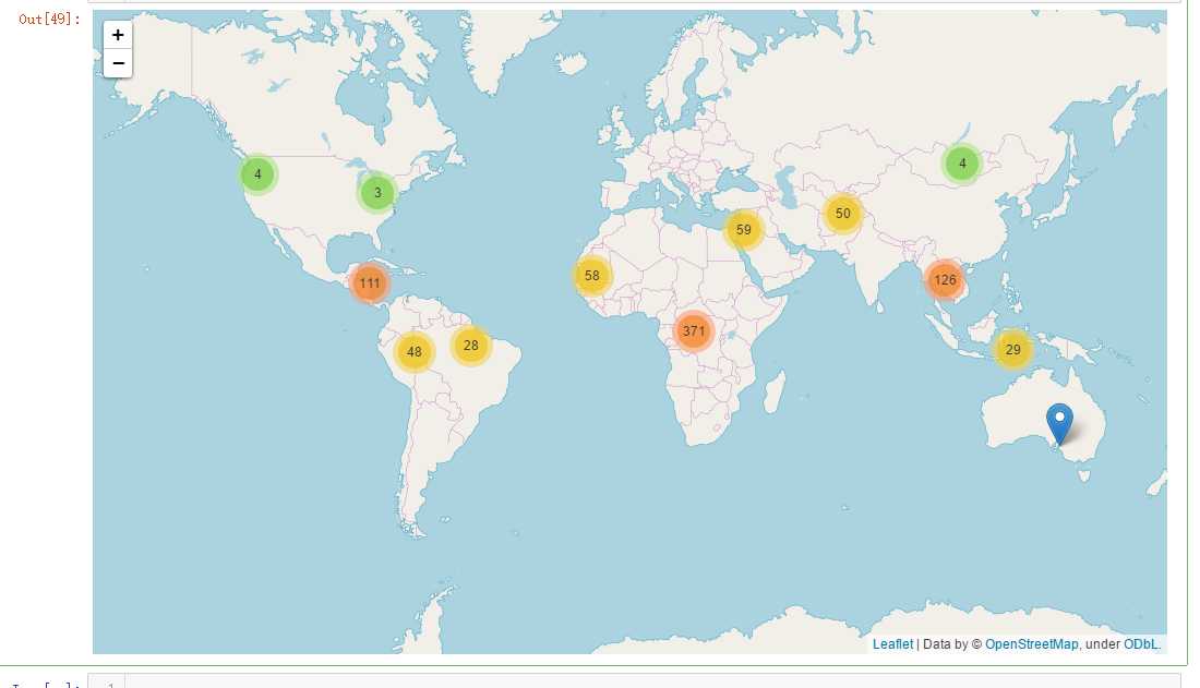
# http://nbviewer.jupyter.org/github/python-visualization/folium/blob/master/examples/MarkerCluster.ipynb
loc = mpi[[‘lon‘,‘lat‘,‘region‘,‘MPI‘]].dropna()
m1 = folium.Map(location=[0,0],zoom_start=2)

locations = list(zip(loc[‘lat‘],loc[‘lon‘]))
popups = [‘lat: {} lon: {} <br> MPI: {}‘.format(round(lat,2),round(lon,2),m) for (lat,lon,m) in zip(mpi[‘lat‘],mpi[‘lon‘],mpi[‘MPI‘])]

marker = plugins.MarkerCluster(locations, popups=popups)
marker.add_to(m1)
m1
gc.collect()
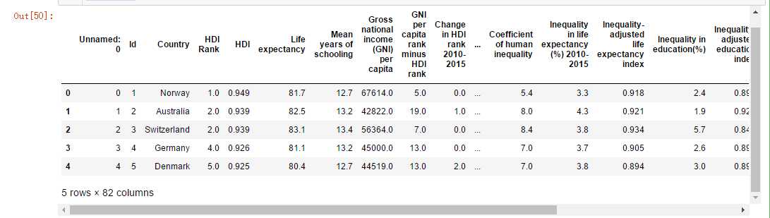
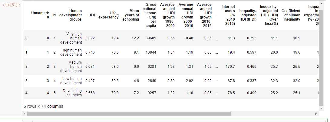
hdi.head()
continent_hdi.head()
kiva_country = loan[‘country‘].unique()
len(kiva_country)
kiva_hdi = hdi[hdi[‘Country‘].apply(lambda c: c in kiva_country)]
kiva_hdi[‘Country‘].apply(lambda c: c in kiva_country)
m = folium.Map(location=[0,0],zoom_start=2)

m.choropleth(geo_data= geo_world_data,data = hdi, columns=[‘Country‘,‘HDI‘],key_on=‘feature.properties.name‘,name=‘HDI‘,fill_opacity=1,fill_color=‘GnBu‘,highlight=True, legend_name=‘HDI‘)
folium.LayerControl().add_to(m)
m
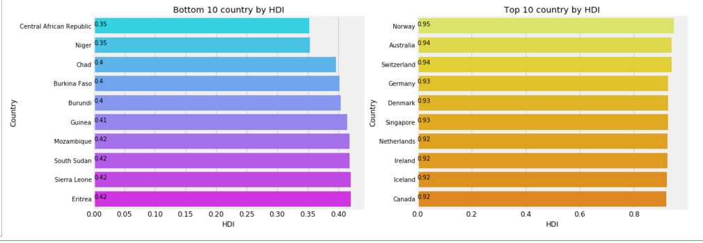
f,ax = plt.subplots(1,2,figsize=(16,6))
value = (hdi[[‘HDI‘,‘Country‘]].sort_values(by=‘HDI‘)[:10])
sns.barplot(value[‘HDI‘],value[‘Country‘],palette=‘cool‘,ax=ax[0])
ax[0].set_title(‘Bottom 10 country by HDI‘)
for i, v in enumerate(value[‘HDI‘]):
    ax[0].text(0,i, round(v,2),fontsize=10,color=‘k‘)

value = (hdi[[‘HDI‘,‘Country‘]].sort_values(by=‘HDI‘,ascending=False)[:10])
sns.barplot(value[‘HDI‘],value[‘Country‘],palette=‘Wistia‘,ax=ax[1])
ax[1].set_title(‘Top 10 country by HDI‘);
for i, v in enumerate(value[‘HDI‘]):
    ax[1].text(0,i, round(v,2),fontsize=10,color=‘k‘)
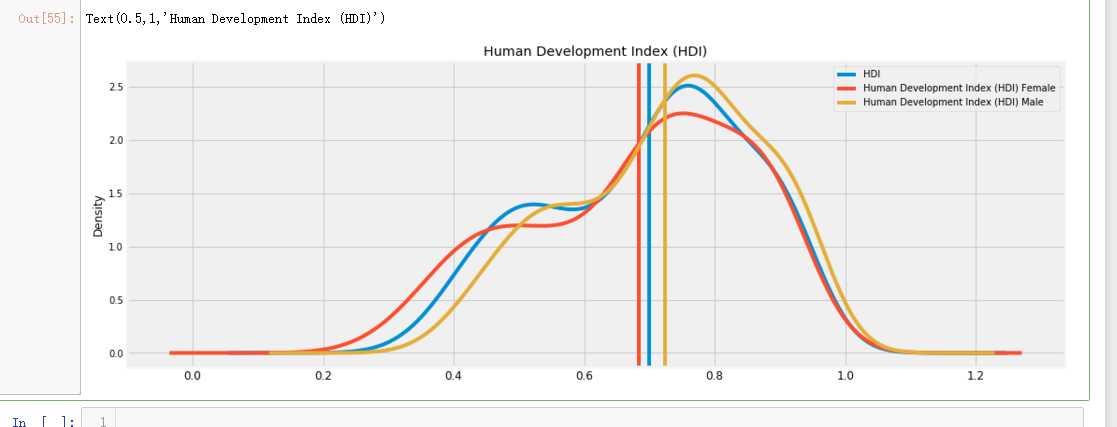
### col = hdi.columns[hdi.columns.str.contains(‘HDI‘)]
col = [‘HDI‘,‘Human Development Index (HDI) Female‘,‘Human Development Index (HDI) Male‘]
f,ax = plt.subplots(figsize=(16,6))
for i,C in enumerate(col):
    hdi[C].plot(kind=‘kde‘,ax=ax,color=‘C{}‘.format(i))
    mean = hdi[C].mean()
    ax.axvline(mean,c=‘C{}‘.format(i))
    print(‘Mean value of {}: {}‘.format(C,mean,))
    #ax.text(round(mean,0),0.1,round(mean,2))
    ax.legend()
plt.title(‘Human Development Index (HDI)‘)
#plt.savefig(‘hdi.png‘);
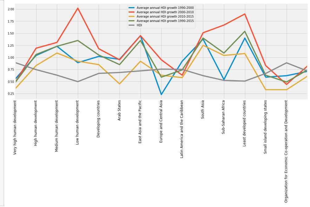
f,ax=plt.subplots(figsize=(16,6))
continent_hdi[[‘Human development groups‘,‘Average annual HDI growth 1990-2000‘,‘Average annual HDI growth 2000-2010‘,
       ‘Average annual HDI growth 2010-2015‘,‘Average annual HDI growth 1990-2015‘,‘HDI‘]].plot(ax=ax)
plt.xticks(np.arange(14),continent_hdi[‘Human development groups‘],rotation=90);
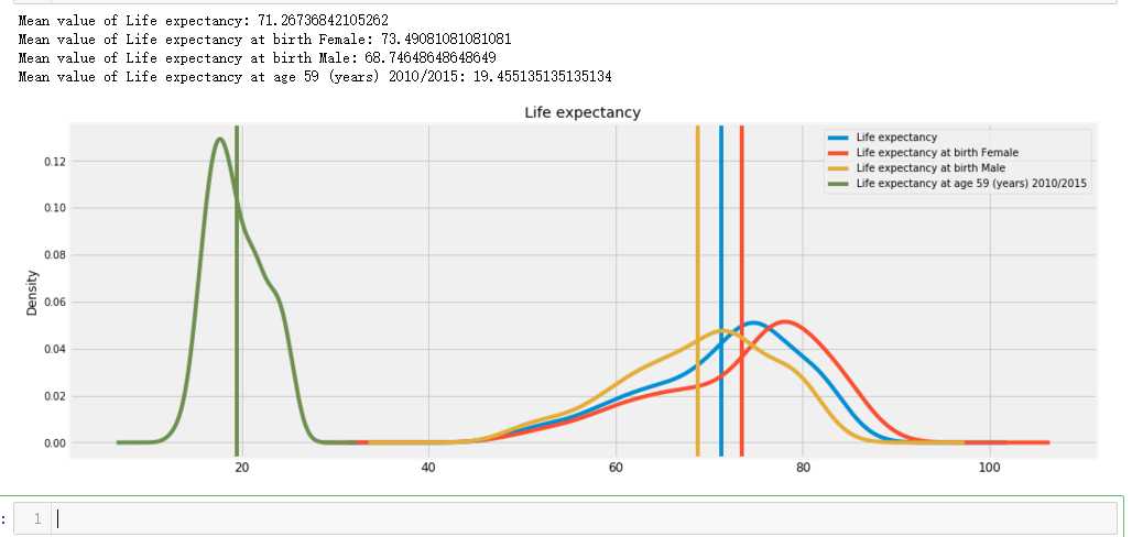
col = hdi.columns[hdi.columns.str.startswith(‘Life expectancy‘)]
f,ax = plt.subplots(figsize=(16,6))
for i,C in enumerate(col):
    hdi[C].plot(kind=‘kde‘,ax=ax,c=‘C{}‘.format(i))
    mean = hdi[C].mean()
    ax.axvline(mean,c=‘C{}‘.format(i))
    print(‘Mean value of {}: {}‘.format(C,mean,))
    #ax.text(round(mean,0),0.1,round(mean,2))
    ax.legend()
plt.title(‘Life expectancy‘);
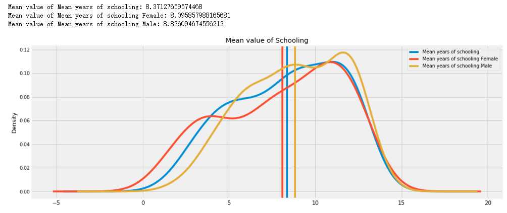
col = hdi.columns[hdi.columns.str.startswith(‘Mean years‘)]
f,ax = plt.subplots(figsize=(16,6))
for i,C in enumerate(col):
    hdi[C].plot(kind=‘kde‘,ax=ax,c=‘C{}‘.format(i))
    mean = hdi[C].mean()
    ax.axvline(mean,c=‘C{}‘.format(i))
    print(‘Mean value of {}: {}‘.format(C,mean,))
    #ax.text(round(mean,0),0.1,round(mean,2))
    ax.legend()
plt.title(‘Mean value of Schooling‘);
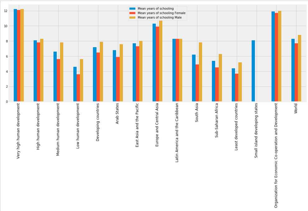
f,ax=plt.subplots(figsize=(16,6))
col = continent_hdi.columns[continent_hdi.columns.str.startswith(‘Mean years‘)]

continent_hdi[col].plot(ax=ax,kind=‘bar‘)
plt.xticks(np.arange(15),continent_hdi[‘Human development groups‘],rotation=90);
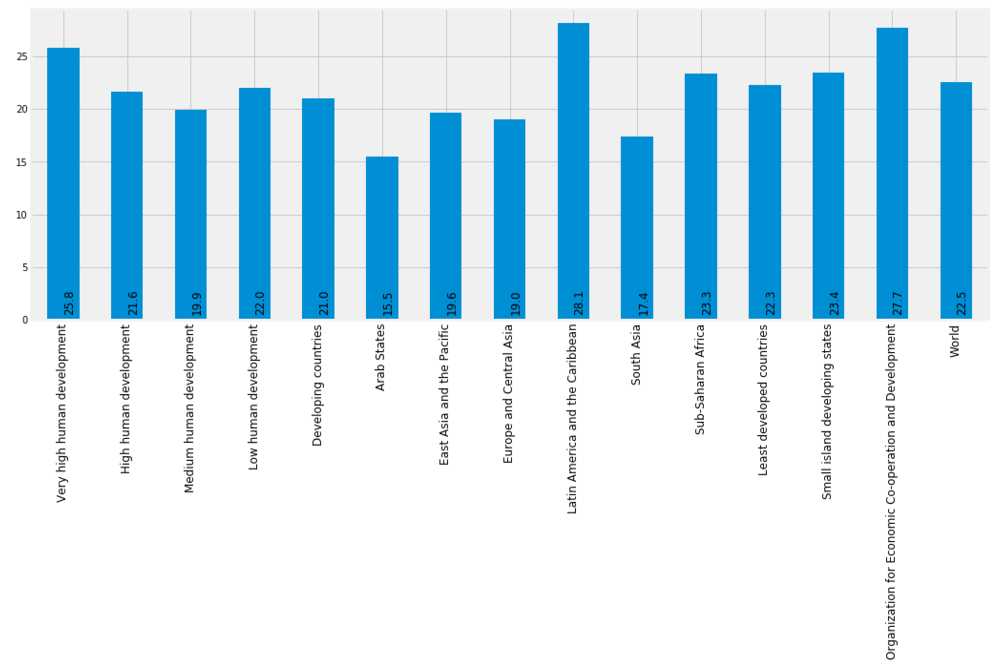
f,ax=plt.subplots(figsize=(16,6))

continent_hdi[‘Share of seats in parliament (% held by women)‘].plot(kind=‘bar‘,ax=ax)
plt.xticks(np.arange(15),continent_hdi[‘Human development groups‘],rotation=90)
for i,v in enumerate(continent_hdi[‘Share of seats in parliament (% held by women)‘]):
    plt.text(i,2,round(v,2),fontsize=12,rotation=90);
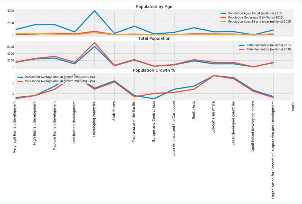
f,ax=plt.subplots(3,1,figsize=(16,6),sharex=True)
axs = ax.ravel()
col = [‘Population Ages 15–64 (millions) 2015‘,‘Population Under age 5 (millions) 2015‘,
       ‘Population Ages 65 and older (millions) 2015‘,‘Human development groups‘]
continent_hdi[col].plot(ax=axs[0],kind=‘line‘)
axs[0].set_title(‘Population by Age‘)
col = [‘Total Population (millions) 2015‘, ‘Total Population (millions) 2030‘,]
continent_hdi[col].plot(ax=axs[1],kind=‘line‘)
axs[1].set_title(‘Total Population‘)

col = [‘Population Average annual growth 2000/2005 (%) ‘,‘Population Average annual growth 2010/2015 (%) ‘]
continent_hdi[col].plot(ax=axs[2],kind=‘line‘)
axs[2].set_title(‘Population Growth %‘)
plt.xticks(np.arange(15),continent_hdi[‘Human development groups‘],rotation=90);
#axs[2].set_xticklabels([x for x in continent_hdi[‘Human development groups‘]], rotation=90);
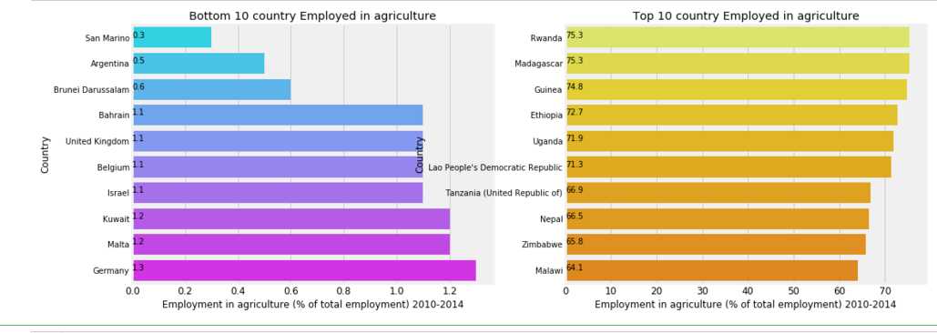
f,ax = plt.subplots(1,2,figsize=(16,6))
value = (hdi[[‘Employment in agriculture (% of total employment) 2010-2014‘,‘Country‘]].sort_values(by=‘Employment in agriculture (% of total employment) 2010-2014‘)[:10])
sns.barplot(value[‘Employment in agriculture (% of total employment) 2010-2014‘],value[‘Country‘],palette=‘cool‘,ax=ax[0])
ax[0].set_title(‘Bottom 10 country Employed in agriculture‘)
for i, v in enumerate(value[‘Employment in agriculture (% of total employment) 2010-2014‘]):
    ax[0].text(0,i, round(v,2),fontsize=10,color=‘k‘)

value = (hdi[[‘Employment in agriculture (% of total employment) 2010-2014‘,‘Country‘]].sort_values(by=‘Employment in agriculture (% of total employment) 2010-2014‘,ascending=False)[:10])
sns.barplot(value[‘Employment in agriculture (% of total employment) 2010-2014‘],value[‘Country‘],palette=‘Wistia‘,ax=ax[1])
ax[1].set_title(‘Top 10 country Employed in agriculture‘);
for i, v in enumerate(value[‘Employment in agriculture (% of total employment) 2010-2014‘]):
    ax[1].text(0,i, round(v,2),fontsize=10,color=‘k‘)
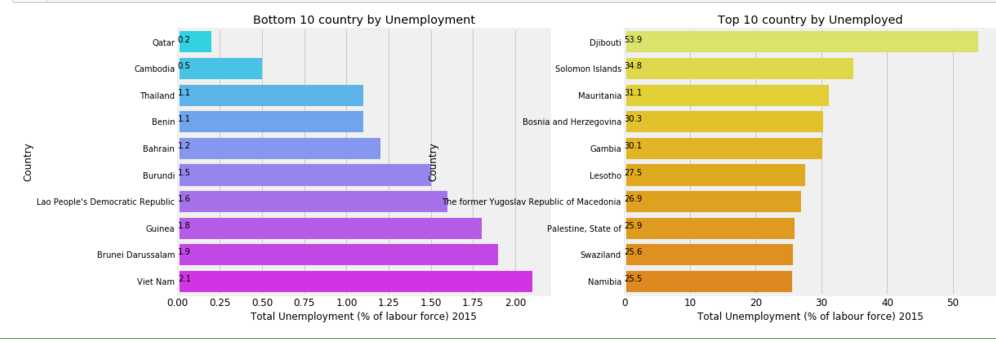
f,ax = plt.subplots(1,2,figsize=(16,6))
value = (hdi[[‘Total Unemployment (% of labour force) 2015‘,‘Country‘]].sort_values(by=‘Total Unemployment (% of labour force) 2015‘)[:10])
sns.barplot(value[‘Total Unemployment (% of labour force) 2015‘],value[‘Country‘],palette=‘cool‘,ax=ax[0])
ax[0].set_title(‘Bottom 10 country by Unemployment‘)
for i, v in enumerate(value[‘Total Unemployment (% of labour force) 2015‘]):
    ax[0].text(0,i, round(v,2),fontsize=10,color=‘k‘)

value = (hdi[[‘Total Unemployment (% of labour force) 2015‘,‘Country‘]].sort_values(by=‘Total Unemployment (% of labour force) 2015‘,ascending=False)[:10])
sns.barplot(value[‘Total Unemployment (% of labour force) 2015‘],value[‘Country‘],palette=‘Wistia‘,ax=ax[1])
ax[1].set_title(‘Top 10 country by Unemployed‘);
for i, v in enumerate(value[‘Total Unemployment (% of labour force) 2015‘]):
    ax[1].text(0,i, round(v,2),fontsize=10,color=‘k‘)
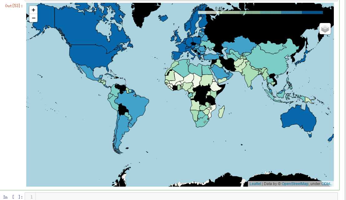
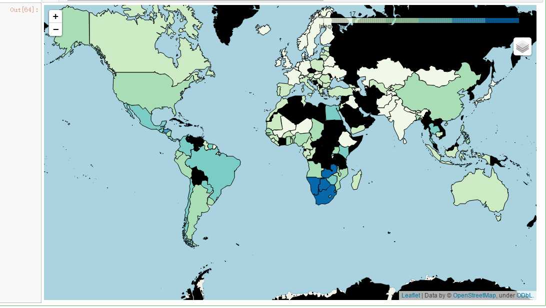
m = folium.Map(location=[0,0],zoom_start=2)

m.choropleth(geo_data= geo_world_data,data = hdi, columns=[‘Country‘,‘Inequality in income (%)‘],key_on=‘feature.properties.name‘,name=‘Inequality in income (%)‘,fill_opacity=1,fill_color=‘GnBu‘,highlight=True, legend_name=‘Inequality in income (%)‘)
folium.LayerControl().add_to(m)
m
吴裕雄--天生自然 PYTHON数据分析:人类发展报告——HDI, GDI,健康,全球人口数据数据分析
标签:zip aci groupby dex dataset img edr line generate
原文地址:https://www.cnblogs.com/tszr/p/11240220.html