标签:文件 png idt jsp explore column chrome cursor percent
1. 创建spirngboot项目,引入以下启动器。
    <!-- servlet 依赖. -->
        <dependency>
            <groupId>javax.servlet</groupId>
            <artifactId>javax.servlet-api</artifactId>
            <scope>provided</scope>
        </dependency>
    <!-- jstl依赖. -->
        <dependency>
            <groupId>javax.servlet</groupId>
            <artifactId>jstl</artifactId>
        </dependency>
        <!--SpringBoot默认不支持JSP,需要在项目中添加相关的依赖-->
        <dependency>
            <groupId>org.apache.tomcat.embed</groupId>
            <artifactId>tomcat-embed-jasper</artifactId>
        </dependency>
        <dependency>
            <groupId>org.springframework.boot</groupId>
            <artifactId>spring-boot-starter-data-jdbc</artifactId>
        </dependency>
        <dependency>
            <groupId>org.springframework.boot</groupId>
            <artifactId>spring-boot-starter-data-jpa</artifactId>
        </dependency>
        <dependency>
            <groupId>org.springframework.boot</groupId>
            <artifactId>spring-boot-starter-web</artifactId>
        </dependency>

        <dependency>
            <groupId>mysql</groupId>
            <artifactId>mysql-connector-java</artifactId>
            <scope>runtime</scope>
        </dependency>
        <dependency>
            <groupId>mysql</groupId>
            <artifactId>mysql-connector-java</artifactId>
            <version>5.1.47</version>
        </dependency>
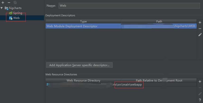
2.在项目中添加web模块
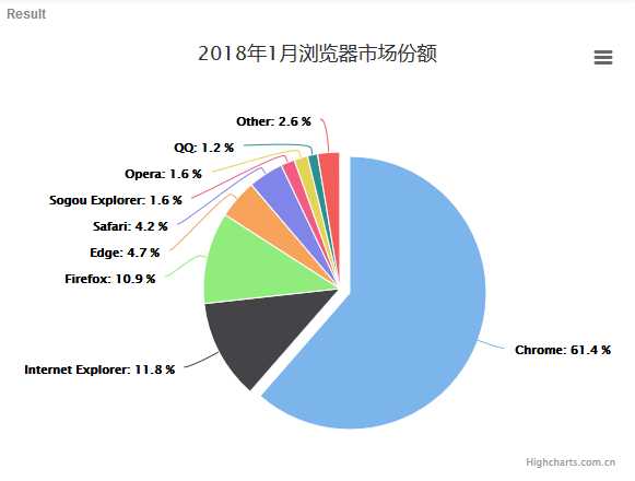
3. 先从highcharts 官网copy一个基本的饼状图。地址
//在DOM中声明一个 chart  对象。chart 可以调用它内部的函数。
var chart = Highcharts.chart(‘container‘, {
    chart: {
        plotBackgroundColor: null,
        plotBorderWidth: null,
        plotShadow: false,
        type: ‘pie‘
    },
    title: {
        text: ‘2018年1月浏览器市场份额‘
    },
    tooltip: {
        pointFormat: ‘{series.name}: <b>{point.percentage:.1f}%</b>‘
    },
    plotOptions: {
        pie: {
            allowPointSelect: true,
            cursor: ‘pointer‘,
            dataLabels: {
                enabled: true,
                format: ‘<b>{point.name}</b>: {point.percentage:.1f} %‘,
                style: {
                    color: (Highcharts.theme && Highcharts.theme.contrastTextColor) || ‘black‘
                }
            }
        }
    },
    series: [{
        name: ‘Brands‘,
        colorByPoint: true,
        data: [{
            name: ‘Chrome‘,
            y: 61.41,
            sliced: true,
            selected: true
        }, {
            name: ‘Internet Explorer‘,
            y: 11.84
        }, {
            name: ‘Firefox‘,
            y: 10.85
        }, {
            name: ‘Edge‘,
            y: 4.67
        }, {
            name: ‘Safari‘,
            y: 4.18
        }, {
            name: ‘Sogou Explorer‘,
            y: 1.64
        }, {
            name: ‘Opera‘,
            y: 1.6
        }, {
            name: ‘QQ‘,
            y: 1.2
        }, {
            name: ‘Other‘,
            y: 2.61
        }]
    }]
});
效果
4.可以知道,如果我们想要实现这样一个效果只需要传特定的参数给他即可,其他样式可以参考官方文档
data: [{
            name: ‘Chrome‘,
            y: 61.41,
            sliced: true,
            selected: true
        }, {
            name: ‘Internet Explorer‘,
            y: 11.84
        }, {
            name: ‘Firefox‘,
            y: 10.85
        }, {
            name: ‘Edge‘,
            y: 4.67
        }, {
            name: ‘Safari‘,
            y: 4.18
        }, {
            name: ‘Sogou Explorer‘,
            y: 1.64
        }, {
            name: ‘Opera‘,
            y: 1.6
        }, {
            name: ‘QQ‘,
            y: 1.2
        }, {
            name: ‘Other‘,
            y: 2.61
        }]
5. 数据库文件
DROP TABLE IF EXISTS `t_pai`;

CREATE TABLE `t_pai` (
  `name` varchar(30) NOT NULL,
  `y` double DEFAULT NULL,
  PRIMARY KEY (`name`)
) ENGINE=InnoDB DEFAULT CHARSET=utf8;

/
insert  into `t_pai`(`name`,`y`) values

(‘a‘,61.41),

(‘Edge‘,4.67),

(‘Firefox‘,10.85),

(‘Opera‘,1.6),

(‘Other‘,2.61),

(‘QQ‘,1.2),

(‘r‘,11.84),

(‘Safari‘,4.18),

(‘Sogou Explorer‘,1.64);
6. 因为方法比较简单,不在粘实体类和数据访问层的代码。只要返回结果符合上面的格式即可。
7. 页面代码
需要引入
https://code.highcharts.com.cn/highcharts/highcharts.js
//该js是可以将当前数据导出,不引入没关系
https://code.highcharts.com.cn/highcharts/modules/exporting.js
//该js就是为了汉化的,不引入也没关系
https://img.hcharts.cn/highcharts-plugins/highcharts-zh_CN.js
body部分
<div id="container" style="min-width:400px;height:400px"></div>
script部分
    //将创建 chart 对象的方法封装起来,将所需要的集合传进去
    function initPai(pai_data) {
        console.log("第一行"+pai_data);
        Highcharts.chart(‘container‘, {
            chart: {
                plotBackgroundColor: null,
                plotBorderWidth: null,
                plotShadow: false,
                type: ‘pie‘
            },
            title: {
                text: ‘2018年1月浏览器市场份额‘
            },
            tooltip: {
                pointFormat: ‘{series.name}: <b>{point.percentage:.1f}%</b>‘
            },
            plotOptions: {
                pie: {
                    allowPointSelect: true,
                    cursor: ‘pointer‘,
                    dataLabels: {
                        enabled: true,
                        format: ‘<b>{point.name}</b>: {point.percentage:.1f} %‘,
                        style: {
                            color: (Highcharts.theme && Highcharts.theme.contrastTextColor) || ‘black‘
                        }
                    }
                }
            },
            series: [{
                name: ‘Brands‘,
                colorByPoint: true,
                data: pai_data
            }]
        });
    }
    //在页面加载时发送ajax请求获取数据,再调用initPai方法,将饼状图展现在页面。
    $(document).ready(function () {
        var aa = [];
        $.ajax({
            url:"http://localhost:8082/findAll",
            dataType:‘json‘,
            type: "get",
            async: false,
            success:function(res){
                for(var i = 0;i<res.length;i++){
                    aa[i]={name:res[i].name,y:parseFloat(res[i].y)}
                }
                console.log(aa);
            }
        })
        //调用方法
        initPai(aa);
    })
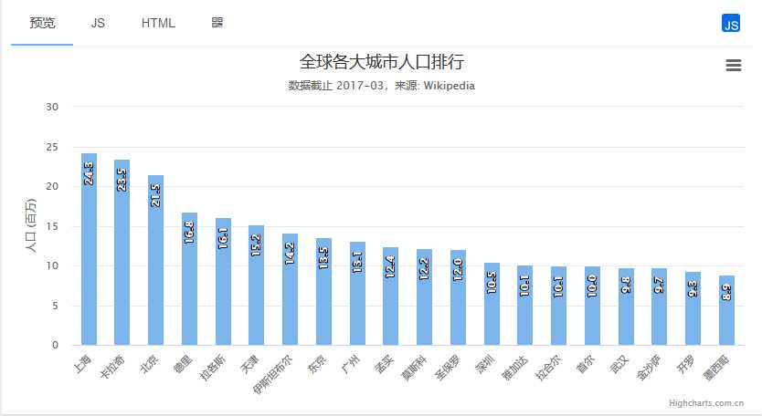
1.首先去官网copy一个示例
var chart = Highcharts.chart(‘container‘, {
    chart: {
        type: ‘column‘
    },
    title: {
        text: ‘全球各大城市人口排行‘
    },
    subtitle: {
        text: ‘数据截止 2017-03,来源: <a href="https://en.wikipedia.org/wiki/List_of_cities_proper_by_population">Wikipedia</a>‘
    },
    xAxis: {
        type: ‘category‘,
        labels: {
            rotation: -45  // 设置轴标签旋转角度
        }
    },
    yAxis: {
        min: 0,
        title: {
            text: ‘人口 (百万)‘
        }
    },
    legend: {
        enabled: false
    },
    tooltip: {
        pointFormat: ‘人口总量: <b>{point.y:.1f} 百万</b>‘
    },
    series: [{
        name: ‘总人口‘,
        data: [
            [‘上海‘, 24.25],
            [‘卡拉奇‘, 23.50],
            [‘北京‘, 21.51],
            [‘德里‘, 16.78],
            [‘拉各斯‘, 16.06],
            [‘天津‘, 15.20],
            [‘伊斯坦布尔‘, 14.16],
            [‘东京‘, 13.51],
            [‘广州‘, 13.08],
            [‘孟买‘, 12.44],
            [‘莫斯科‘, 12.19],
            [‘圣保罗‘, 12.03],
            [‘深圳‘, 10.46],
            [‘雅加达‘, 10.07],
            [‘拉合尔‘, 10.05],
            [‘首尔‘, 9.99],
            [‘武汉‘, 9.78],
            [‘金沙萨‘, 9.73],
            [‘开罗‘, 9.27],
            [‘墨西哥‘, 8.87]
        ],
        dataLabels: {
            enabled: true,
            rotation: -90,
            color: ‘#FFFFFF‘,
            align: ‘right‘,
            format: ‘{point.y:.1f}‘, // :.1f 为保留 1 位小数
            y: 10
        }
    }]
});
效果
2. 如果我们想要实现动态查询,只需要改变 data 的值即可,同样的,也需要符合格式
3.数据库文件
CREATE TABLE `t_cloumn` (
  `name` varchar(30) DEFAULT NULL,
  `area` float DEFAULT NULL
) ENGINE=InnoDB DEFAULT CHARSET=utf8;

/*Data for the table `t_cloumn` */

insert  into `t_cloumn`(`name`,`area`) values

(‘上海‘,24.25),

(‘卡拉奇‘,23.5),

(‘北京‘,21.51),

(‘德里‘,16.78),

(‘拉各斯‘,16.06),

(‘天津‘,15.2),

(‘伊斯坦布尔‘,14.16);
4. 无论你使用哪种方式查询数据,只要符合格式即可。
5.页面代码
body部分
<div id="container" style="min-width:400px;height:400px"></div>
script部分,和饼状图的实现思路一样
 function initColumn(diqu) {
        console.log("第一行"+diqu);
        Highcharts.chart(‘container‘, {
            chart: {
                type: ‘column‘
            },
            title: {
                text: ‘全球各大城市人口排行‘
            },
            subtitle: {
                text: ‘数据截止 2017-03,来源: <a href="https://en.wikipedia.org/wiki/List_of_cities_proper_by_population">Wikipedia</a>‘
            },
            xAxis: {
                type: ‘category‘,
                labels: {
                    rotation: -45  // 设置轴标签旋转角度
                }
            },
            yAxis: {
                min: 0,
                title: {
                    text: ‘人口 (百万)‘
                }
            },
            legend: {
                enabled: false
            },
            tooltip: {
                pointFormat: ‘人口总量: <b>{point.y:.1f} 百万</b>‘
            },
            series: [{
                name: ‘总人口‘,
                data: diqu,
                dataLabels: {
                    enabled: true,
                    rotation: -90,
                    color: ‘#FFFFFF‘,
                    align: ‘right‘,
                    format: ‘{point.y:.1f}‘, // :.1f 为保留 1 位小数
                    y: 10
                }
            }]
        });
    }
    $(document).ready(function () {
        var aa = [];
        $.ajax({
            url:"http://localhost:8082/findAllCloumn",
            async:false,
            dataType:‘json‘,
            type: "get",
            success:function (res) {
                for(var i = 0;i<res.length;i++){
                    //这里一定要转成相对应的数据类型。
                    aa[i]=[res[i].name,parseFloat(res[i].area)]
                }
                console.log(aa);
            }
        })
        initColumn(aa);
    })
需要引入
<script type="text/javascript" src="/jquery.js"></script>
    <script type="text/javascript" src="https://code.highcharts.com.cn/highcharts/highcharts.js"></script>
    <script type="text/javascript" src="https://code.highcharts.com.cn/highcharts/modules/exporting.js"></script>
    <script type="text/javascript" src="https://img.hcharts.cn/highcharts-plugins/highcharts-zh_CN.js"></script>
创建一个 Highcharts 的时候可以看作创建了一个对象,这个对象可以调用很多方法,官方文档
对于方法的使用可以参考
更新的五种方法:https://blog.csdn.net/eengel/article/details/73497208
演示:https://jsfiddle.net/slowlyswimming/6ad5pp3t/16/
当然还有其他的方法等待我们去使用,一起学习。
highcharts+jsp+springDataJpa实现饼状图,树状图
标签:文件 png idt jsp explore column chrome cursor percent
原文地址:https://www.cnblogs.com/autonomy/p/11853990.html