标签:shadow ott size absolute width form 顺时针 方向 title
rotate 旋转
2D 旋转指的是让元素在二维平面内顺时针或者逆时针旋转rotate 语法、使用步骤:
(1)给元素添加转换属性 transform
(2)属性值为 rotate(角度), 如 transform:rotate(30deg) 顺时针方向旋转30度
   /* 单位是:deg */
   transform: rotate(度数)
div{
transform: rotate(0deg);
}重点知识点
rotate 里面跟度数,单位是 deg代码演示
img:hover {
  transform: rotate(360deg)
}
<!DOCTYPE html>
<html lang="en">
<head>
<meta charset="UTF-8">
<meta name="viewport" content="width=device-width, initial-scale=1.0">
<meta http-equiv="X-UA-Compatible" content="ie=edge">
<title>Document</title>
<style>
img {
width: 150px;
/* 顺时针旋转45度 */
/* transform: rotate(45deg); */
border-radius: 50%;
border: 5px solid pink;
/* 过渡写到本身上,谁做动画给谁加 */
transition: all 0.3s;
}
/* 这里不能写成 div:hover,否则鼠标悬停时,图片会快速闪。 */
img:hover {
transform: rotate(360deg);
}
</style>
</head>
<body>
<img src="media/pic.jpg" alt="">
</body>
</html>
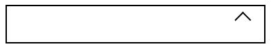
<!DOCTYPE html>
<html lang="en">

<head>
    <meta charset="UTF-8">
    <meta name="viewport" content="width=device-width, initial-scale=1.0">
    <meta http-equiv="X-UA-Compatible" content="ie=edge">
    <title>Document</title>
    <style>
        div {
            position: relative;
            width: 249px;
            height: 35px;
            border: 1px solid #000;
        }

        div::after {
            content: "";
            position: absolute;
            top: 8px;
            right: 15px;
            width: 10px;
            height: 10px;
            border-right: 1px solid #000;
            border-bottom: 1px solid #000;
            transform: rotate(45deg);
            transition: all 0.2s;
        }
        /* 鼠标经过div  里面的三角旋转 */
        div:hover::after {
            transform: rotate(225deg);
        }
    </style>
</head>

<body>
    <div></div>
</body>

</html>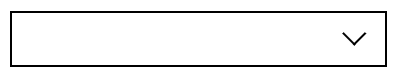
标签:shadow ott size absolute width form 顺时针 方向 title
原文地址:https://www.cnblogs.com/jianjie/p/12127155.html