标签:down relative enabled setter binding get names depend ima
一 代码结构
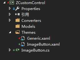
如图所示,采用自定义控件(CustomControl)的方式对Button控件进行封装。其中ImageButton.xaml为默认控件模板,ImageButton.cs为控件的逻辑控制文件,其中包含了ImageButton控件所需要的新的依赖属性,包括图片源属性等。
二 模板代码
<ResourceDictionary
xmlns="http://schemas.microsoft.com/winfx/2006/xaml/presentation"
xmlns:x="http://schemas.microsoft.com/winfx/2006/xaml"
xmlns:local="clr-namespace:CustomControl">
<Style TargetType="{x:Type local:ImageButton}">
<Setter Property="Cursor" Value="Hand"/>
<Setter Property="Template">
<Setter.Value>
<ControlTemplate TargetType="{x:Type local:ImageButton}">
<Border Background="{TemplateBinding Background}"
BorderBrush="{TemplateBinding BorderBrush}"
BorderThickness="{TemplateBinding BorderThickness}">
<Grid x:Name="grid" Background="{TemplateBinding Background}">
<Border x:Name="PART_Border" Background="{TemplateBinding Background}" BorderBrush="{TemplateBinding BorderBrush}" BorderThickness="{TemplateBinding BorderThickness}" CornerRadius="{TemplateBinding CornerRadius}"/>
<Grid HorizontalAlignment="{TemplateBinding HorizontalContentAlignment}">
<StackPanel HorizontalAlignment="Center" Orientation="{TemplateBinding IconContentOrientation}" VerticalAlignment="Center" Margin="{TemplateBinding Padding}">
<Grid HorizontalAlignment="Center" VerticalAlignment="{TemplateBinding VerticalContentAlignment}">
<Image x:Name="PART_Icon" Source="{TemplateBinding Icon}" Height="{TemplateBinding IconHeight}" Width="{TemplateBinding IconWidth}"/>
<Image x:Name="PART_MouseOverIcon" Visibility="Collapsed" Source="{TemplateBinding IconMouseOver}" Height="{TemplateBinding IconHeight}" Width="{TemplateBinding IconWidth}"/>
<Image x:Name="PART_PressIcon" Visibility="Collapsed" Source="{TemplateBinding IconPress}" Height="{TemplateBinding IconHeight}" Width="{TemplateBinding IconWidth}"/>
</Grid>
<TextBlock x:Name="PART_Content" Text="{TemplateBinding Content}"
HorizontalAlignment="{TemplateBinding HorizontalContentAlignment}"
VerticalAlignment="{TemplateBinding VerticalContentAlignment}"
SnapsToDevicePixels="{TemplateBinding SnapsToDevicePixels}"
Margin="{TemplateBinding IconContentMargin}"
Foreground="{TemplateBinding Foreground}"
TextTrimming="CharacterEllipsis"/>
</StackPanel>
</Grid>
</Grid>
</Border>
<ControlTemplate.Triggers>
<Trigger Property="IsMouseOver" Value="True">
<Setter Property="Foreground" TargetName="PART_Content" Value="{Binding MouseOverForeground,RelativeSource={RelativeSource FindAncestor, AncestorType={x:Type local:ImageButton}}}"/>
<Setter Property="Background" TargetName="PART_Border" Value="{Binding MouseOverBackground,RelativeSource={RelativeSource FindAncestor, AncestorType={x:Type local:ImageButton}}}"/>
<Setter Property="BorderBrush" TargetName="PART_Border" Value="{Binding MouseOverBorderBrush,RelativeSource={RelativeSource FindAncestor, AncestorType={x:Type local:ImageButton}}}"/>
<Setter Property="Visibility" TargetName="PART_MouseOverIcon" Value="Visible"/>
<Setter Property="Visibility" TargetName="PART_Icon" Value="Collapsed"/>
<Setter Property="Visibility" TargetName="PART_PressIcon" Value="Collapsed"/>
</Trigger>
<Trigger Property="IsPressed" Value="True">
<Setter Property="Foreground" TargetName="PART_Content" Value="{Binding MouseDownForeground,RelativeSource={RelativeSource FindAncestor, AncestorType={x:Type local:ImageButton}}}"/>
<Setter Property="Background" TargetName="PART_Border" Value="{Binding MouseDownBackground,RelativeSource={RelativeSource FindAncestor, AncestorType={x:Type local:ImageButton}}}"/>
<Setter Property="BorderBrush" TargetName="PART_Border" Value="{Binding MouseDownBorderBrush,RelativeSource={RelativeSource FindAncestor, AncestorType={x:Type local:ImageButton}}}"/>
<Setter Property="Visibility" TargetName="PART_PressIcon" Value="Visible"/>
<Setter Property="Visibility" TargetName="PART_Icon" Value="Collapsed"/>
<Setter Property="Visibility" TargetName="PART_MouseOverIcon" Value="Collapsed"/>
</Trigger>
<Trigger Property="IsEnabled" Value="False">
<Setter Property="Opacity" Value="0.5" />
</Trigger>
<Trigger Property="Text" SourceName="PART_Content" Value="">
<Setter Property="Visibility" TargetName="PART_Content" Value="Collapsed"/>
</Trigger>
<Trigger Property="Text" SourceName="PART_Content" Value="{x:Null}">
<Setter Property="Visibility" TargetName="PART_Content" Value="Collapsed"/>
</Trigger>
</ControlTemplate.Triggers>
</ControlTemplate>
</Setter.Value>
</Setter>
</Style>
</ResourceDictionary>
在模板中,通过TemplateBinding 的方式绑定了控件中的自定义属性,并默认显示给定的图标和文字。
然后通过触发器,当鼠标悬停或按下的时候,控制相关图标的显示隐藏以及文字的背景色、前景色和边框颜色。
三 自定义依赖属性
在ImageButton.cs中定义依赖属性,这些依赖属性包含了图片按钮控件的边框、前景色、背景色,图片等属性。在复写的OnApplyTemplate方法中,会判断如果某些依赖属性的值为null,则使用默认属性。
public class ImageButton : Button
{
static ImageButton()
{
DefaultStyleKeyProperty.OverrideMetadata(typeof(ImageButton), new FrameworkPropertyMetadata(typeof(ImageButton)));
}
public override void OnApplyTemplate()
{
base.OnApplyTemplate();
if (this.MouseOverBackground == null)
{
this.MouseOverBackground = Background;
}
if (this.MouseDownBackground == null)
{
if (this.MouseOverBackground == null)
{
this.MouseDownBackground = Background;
}
else
{
this.MouseDownBackground = MouseOverBackground;
}
}
if (this.MouseOverBorderBrush == null)
{
this.MouseOverBorderBrush = BorderBrush;
}
if (this.MouseDownBorderBrush == null)
{
if (this.MouseOverBorderBrush == null)
{
this.MouseDownBorderBrush = BorderBrush;
}
else
{
this.MouseDownBorderBrush = MouseOverBorderBrush;
}
}
if (this.MouseOverForeground == null)
{
this.MouseOverForeground = Foreground;
}
if (this.MouseDownForeground == null)
{
if (this.MouseOverForeground == null)
{
this.MouseDownForeground = Foreground;
}
else
{
this.MouseDownForeground = this.MouseOverForeground;
}
}
}
#region Dependency Properties
/// <summary>
/// 鼠标移上去的背景颜色
/// </summary>
public static readonly DependencyProperty MouseOverBackgroundProperty
= DependencyProperty.Register("MouseOverBackground", typeof(Brush), typeof(ImageButton));
/// <summary>
/// 鼠标按下去的背景颜色
/// </summary>
public static readonly DependencyProperty MouseDownBackgroundProperty
= DependencyProperty.Register("MouseDownBackground", typeof(Brush), typeof(ImageButton));
/// <summary>
/// 鼠标移上去的字体颜色
/// </summary>
public static readonly DependencyProperty MouseOverForegroundProperty
= DependencyProperty.Register("MouseOverForeground", typeof(Brush), typeof(ImageButton), new PropertyMetadata(null, null));
/// <summary>
/// 鼠标按下去的字体颜色
/// </summary>
public static readonly DependencyProperty MouseDownForegroundProperty
= DependencyProperty.Register("MouseDownForeground", typeof(Brush), typeof(ImageButton), new PropertyMetadata(null, null));
/// <summary>
/// 鼠标移上去的边框颜色
/// </summary>
public static readonly DependencyProperty MouseOverBorderBrushProperty
= DependencyProperty.Register("MouseOverBorderBrush", typeof(Brush), typeof(ImageButton), new PropertyMetadata(null, null));
/// <summary>
/// 鼠标按下去的边框颜色
/// </summary>
public static readonly DependencyProperty MouseDownBorderBrushProperty
= DependencyProperty.Register("MouseDownBorderBrush", typeof(Brush), typeof(ImageButton), new PropertyMetadata(null, null));
/// <summary>
/// 圆角
/// </summary>
public static readonly DependencyProperty CornerRadiusProperty
= DependencyProperty.Register("CornerRadius", typeof(CornerRadius), typeof(ImageButton), null);
//图标
public static readonly DependencyProperty IconProperty
= DependencyProperty.Register("Icon", typeof(ImageSource), typeof(ImageButton), null);
//鼠标移上去的图标图标
public static readonly DependencyProperty IconMouseOverProperty
= DependencyProperty.Register("IconMouseOver", typeof(ImageSource), typeof(ImageButton), null);
//鼠标按下去的图标图标
public static readonly DependencyProperty IconPressProperty
= DependencyProperty.Register("IconPress", typeof(ImageSource), typeof(ImageButton), null);
//图标高度
public static readonly DependencyProperty IconHeightProperty
= DependencyProperty.Register("IconHeight", typeof(double), typeof(ImageButton), new PropertyMetadata(24.0, null));
//图标宽度
public static readonly DependencyProperty IconWidthProperty
= DependencyProperty.Register("IconWidth", typeof(double), typeof(ImageButton), new PropertyMetadata(24.0, null));
//图标和内容的对齐方式
public static readonly DependencyProperty IconContentOrientationProperty
= DependencyProperty.Register("IconContentOrientation", typeof(Orientation), typeof(ImageButton), new PropertyMetadata(Orientation.Horizontal, null));
//图标和内容的距离
public static readonly DependencyProperty IconContentMarginProperty
= DependencyProperty.Register("IconContentMargin", typeof(Thickness), typeof(ImageButton), new PropertyMetadata(new Thickness(0, 0, 0, 0), null));
#endregion
#region Property Wrappers
public Brush MouseOverBackground
{
get
{
return (Brush)GetValue(MouseOverBackgroundProperty);
}
set { SetValue(MouseOverBackgroundProperty, value); }
}
public Brush MouseDownBackground
{
get
{
return (Brush)GetValue(MouseDownBackgroundProperty);
}
set { SetValue(MouseDownBackgroundProperty, value); }
}
public Brush MouseOverForeground
{
get
{
return (Brush)GetValue(MouseOverForegroundProperty);
}
set { SetValue(MouseOverForegroundProperty, value); }
}
public Brush MouseDownForeground
{
get
{
return (Brush)GetValue(MouseDownForegroundProperty);
}
set { SetValue(MouseDownForegroundProperty, value); }
}
public Brush MouseOverBorderBrush
{
get { return (Brush)GetValue(MouseOverBorderBrushProperty); }
set { SetValue(MouseOverBorderBrushProperty, value); }
}
public Brush MouseDownBorderBrush
{
get { return (Brush)GetValue(MouseDownBorderBrushProperty); }
set { SetValue(MouseDownBorderBrushProperty, value); }
}
public CornerRadius CornerRadius
{
get { return (CornerRadius)GetValue(CornerRadiusProperty); }
set { SetValue(CornerRadiusProperty, value); }
}
public ImageSource Icon
{
get { return (ImageSource)GetValue(IconProperty); }
set { SetValue(IconProperty, value); }
}
public ImageSource IconMouseOver
{
get { return (ImageSource)GetValue(IconMouseOverProperty); }
set { SetValue(IconMouseOverProperty, value); }
}
public ImageSource IconPress
{
get { return (ImageSource)GetValue(IconPressProperty); }
set { SetValue(IconPressProperty, value); }
}
public double IconHeight
{
get { return (double)GetValue(IconHeightProperty); }
set { SetValue(IconHeightProperty, value); }
}
public double IconWidth
{
get { return (double)GetValue(IconWidthProperty); }
set { SetValue(IconWidthProperty, value); }
}
public Orientation IconContentOrientation
{
get { return (Orientation)GetValue(IconContentOrientationProperty); }
set { SetValue(IconContentOrientationProperty, value); }
}
public Thickness IconContentMargin
{
get { return (Thickness)GetValue(IconContentMarginProperty); }
set { SetValue(IconContentMarginProperty, value); }
}
#endregion
}
四 控件的应用
应用控件的时候,只需要简单的绑定控件的相关属性即可。
<control:ImageButton x:Name="btn_Image"
HorizontalContentAlignment="Center"
VerticalContentAlignment="Center"
Background="Red"
Margin="5,0,5,0" ToolTip="播放" Content="播放"
Height="30" Width="80"
Icon="Images\BroadcastWhite.png"
IconMouseOver="Images\BroadcastGray.png"
IconPress="Images\BroadcastBlue.png"
IconHeight="24"
IconWidth="24"
FontSize="16"
IconContentMargin="10,0,0,0"
Foreground="#FFFFFF"
MouseOverForeground="Gray"
MouseDownForeground="Blue"/>
标签:down relative enabled setter binding get names depend ima
原文地址:https://www.cnblogs.com/sword1983/p/12208865.html