标签:mamicode css isp 默认值 排列 mic sel enter ase
最近想写一些博客,顺便复习一些自己的基础知识所以想到说说自己对flex布局的一些理解
flex意思为“弹性布局”,是移动端开发必备的属性简洁、快速,为盒状模型提供了最大的灵活性。
flex的属性
属性和说明
1 flex-direction //决定item的排列方向
2 flex-wrap: //一行排列不下时,item的换行方式
3 flex-flow: //flex-direction和flex-wrap的结合,默认为row nowrap
4 justify-content: //item在主轴上的对齐方式
6 align-content: //对根轴线的对齐方式,如果项目只有一根轴线,该属性不起作用
8 align-items: //定义项目在交叉轴上如何对齐
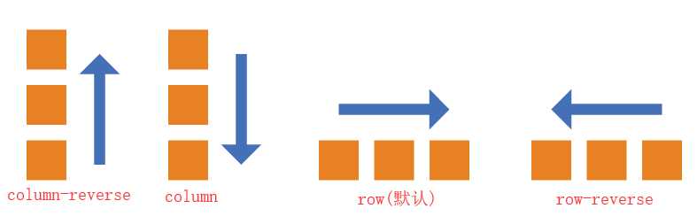
flex-direction属性决定主轴的方向
1 flex-direction: row | row-reverse | column | column-reverse
它有四个属性值
1 flex-direction: row //默认方向起点在左边
2 flex-direction:row-reverse //水平方向,起点在右边
3 flex-direction:column //垂直方向,起点在上边
4 flex-direction:colum-rverse //垂直方向,起点在下边
效果图
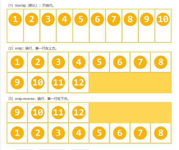
当项目在一条轴线上排不下时,是否换行
1 flex-wrap: nowrap | wrap | wrap-reverse;
它有三个属性值
1 flex-wrap:nowrap //默认 不换行,一行排列
2 flex-wrap:wrap //换行,第一行在上方
3 flex-wrap-reverse //换行,第一行在最下面
1 display: flex;

2 flex-wrap: nowrap | wrap | wrap-reverse;
flex-flow属性
flex-flow属性是flex-direction属性和flex-wrap属性的简写形式,默认值为row nowrap。
使用结合flex-direction属性和flex-wrap属性,如:row wrap|column wrap-reverse等。
1 flex-flow: row nowrap;
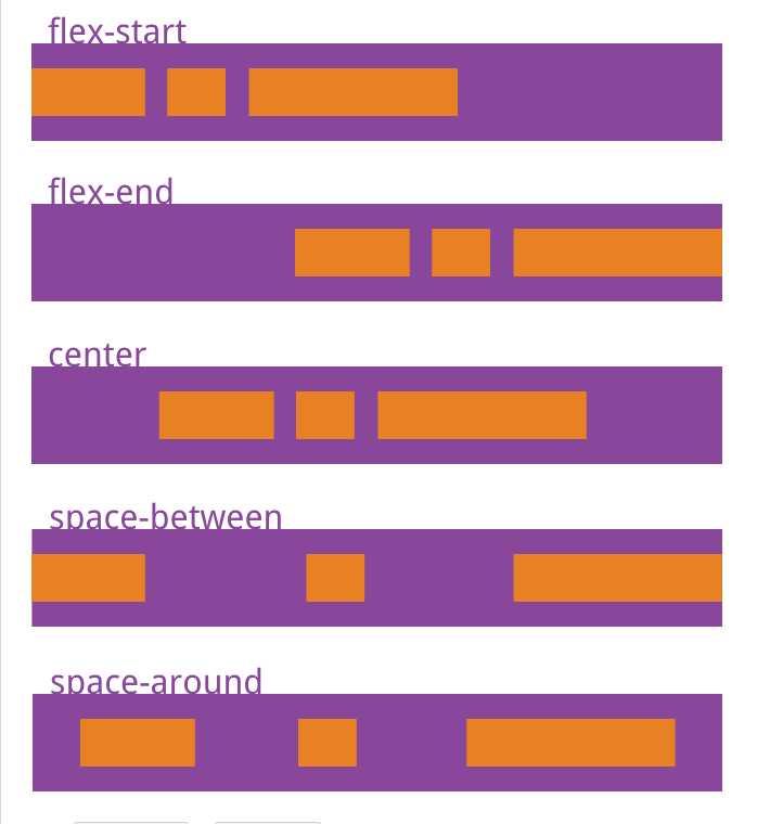
justify-content属性定义了项目在主轴上的对齐方式。
1 justify-content: flex-start | flex-end | center | space-between | space-around;
它有五种值
1 justify-content:flex-start //左对齐
2 justify-content:flex-end //右对齐
3 justify-content:center //居中
4 justify-content:space-between //两端对齐,项目之间的间隔都相等
5 justify-content:space-around //每个项目两侧的间隔相等。所以,项目之间的间隔比项目与边框的间隔大一倍
1 display: flex;

2 justify-content: flex-start | flex-end | center | space-between | space-around;
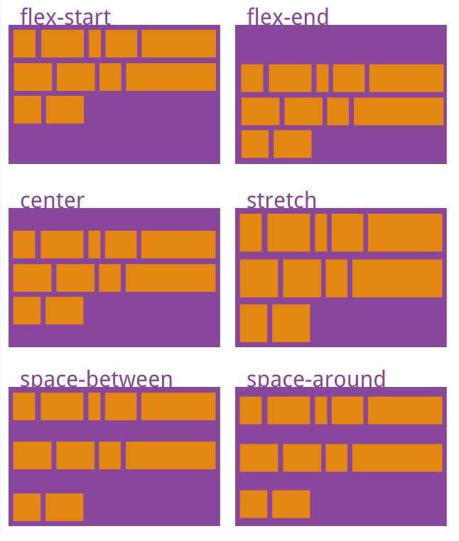
align-content属性定义项目在交叉轴上如何对齐。
1 align-content: flex-start | flex-end | center | space-between | space-around | stretch;
它有六种值
1 align-content:flex-start    // 交叉轴的起点对齐
2 align-content:flex-end //交叉轴的终点对齐
3 align-content:center //交叉轴的中点对齐
4 align-content:space-between //与交叉轴两端对齐,轴线之间的间隔平均分布
5 align-content:space-around //每根轴线两侧的间隔都相等。所以,轴线之间的间隔比轴线与边框的间隔大一倍
6 align-content:stretch //轴线占满整个交叉轴(默认值)
效果图
1 display: flex;

2 align-content: flex-start | flex-end | center | space-between | space-around | stretch;
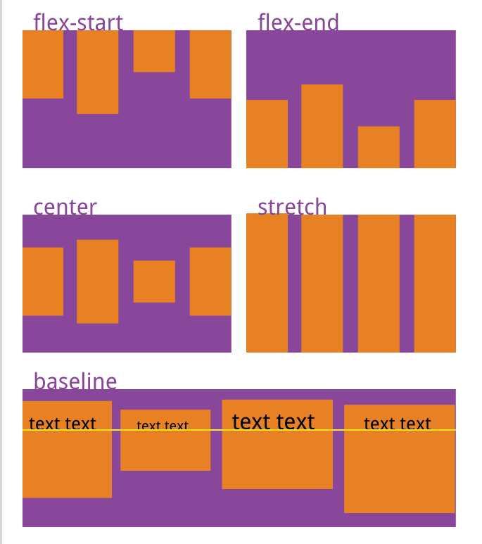
align-items属性定义项目在交叉轴上如何对齐
1 align-items: flex-start | flex-end | center | baseline | stretch;
align-items:flex-start    //交叉轴的起点对齐
align-items:flex-end    //交叉轴的终点对齐
align-items:center    //交叉轴的中点对齐
align-items:space-between    //项目的第一行文字的基线对齐
align-items:space-around    //如果项目未设置高度或设为auto,将占满整个容器的高度(默认值)
效果图
1 display: flex;

2 align-items: flex-start | flex-end | center | stretch | baseline;
标签:mamicode css isp 默认值 排列 mic sel enter ase
原文地址:https://www.cnblogs.com/qdjj/p/12376740.html