标签:form import ellipsis 大小 考试 20px sla 行级元素 工作
 <div style="
      width:100px;
      height:100px;
      background-color: red;
"></div><!DOCTYPE html>
<html lang="en">
<head>
<meta charset="utf-8">
<title>Document</title>
<style type="text/css">
div{
width:100px;
height:100px;
background-color: greenyellow;
}
</style>
</head>
</html><!DOCTYPE html>
<html lang="en">
<head>
<meta charset="utf-8">
<title>Document</title>
<link rel="stylesheet" type="text/css" href="lesson3.css">
</head>
<body>
</html>id不能重复(唯一性)一对一
<div id="only">123</div>#only {
width:100px;
height: 100px;
border-radius: 50%;
background-color: red;
}多对多
<div class="demo demo1">123</div>.demo{
background-color: blue!important;
color: #ff4400;
}<div>123</div>
<div>
<span>234</span>
</div>span {
background-color: black;
color: #ff4400;
}<span>123</span>
<strong>aaa</strong>* {
background-color: gray;
}<div id="only3">789</div>[id="only3"] {
background-color: aqua;
}<div>
<span>123</span>
</div>
<div class="wrapper">
<strong class="box">
<em>456</em>
</strong>
</div>
<em>789</em>
<span>234</span>/*父子选择器(派生选择器)有空格*/
div span{
background-color: red;
}
.wrapper .box em{
background-color: blue;
}一个例子:
<section>
    <div>
        <p>
            <a href="">
                <span></span>
            </a>
        </p>
        <ul>
            <li>
                <a href="">
                    <span>
                        <em>1</em>
                    </span>
                </a>
                <p></p>
            </li>
            <li></li>
        </ul>
    </div>
    <a href="">
        <p>
            <em>2</em>
        </p>
        <div></div>
    </a>
</section>
section div ul li a em{
background-color: red;
}结论:浏览器遍历父子选择器顺序:右->左
<div>
    <em>1</em>
    <strong>
        <em>2</em>
    </strong>
</div>
/*直接子元素选择器*/
div > em{
background-color: aquamarine;
}<div>1</div>
<div class="demo">2</div>
<p class="demo">3</p>
<p>选择元素的多种方式</p>
<div class="wrapper">
<div class="content">
<em class="box" id="only">
100
</em>
</div>
</div>/*并列选择器:无空格*/
div.demo{
background-color: green;
}<em>1</em>
<strong>2</strong>
<span>3</span>
<div id="b">画三角形</div>
<div id="a"></div> /*分组选择器,用逗号将选择器分组*/
em,
strong,
span{
background-color: red;
}/*a:hover{ } 鼠标悬停的链接*/
a:hover{
background-color: #ff4400;
}#only{
background-color: red;
}
.content em{
background-color: green;
}
.wrapper > .content > .box{
background-color: gray;
}
div.wrapper > div[class="content"] > em#only.box{
background-color: blue;
}? !important > 行间样式 > id > class/属性> 标签 > *
| 选择器 | 权重 |
|---|---|
| !important | 无穷 |
| 行间样式 | 1000 |
| id | 100 |
| class/属性/伪类 | 10 |
| 标签/伪元素 | 1 |
| 通配符* | 0 |
<!DOCTYPE html>
<html lang="en">
<head>
    <meta charset="UTF-8">
    <title>Document</title>
    <link rel="stylesheet" type="text/css" href="lesson5.css">
</head>
<body>

<div>真实</div>
</body>
</html>
div{
height: 200px;
width: 200px;
border: 1px solid black;
text-align: center;/*对齐方式*/
line-height: 200px;
}div{
border: 1px solid black;
text-indent: 2em;/*首行缩进*/
line-height: 1.2em;/*1.2倍行高*/
}
/*1em = 1 * font-size*/del{
text-decoration: none;
}
span{
text-decoration: underline;
color: rgb(0, 0, 238);
cursor: pointer;/*光标定位*/
}| 分类 | 特点 | 举例 |
|---|---|---|
| 行级元素inline | 内容决定元素位置,不可通过CSS改变宽高 | span strong em a del 伪元素 |
| 块级元素block | 独占一行,可通过CSS改变宽高 | div p ul li ol form address |
| 行级块元素inline-block | 内容决定大小,可通过CSS改变宽高 | img |
例:多个img标签中若有换行符,则图片元素会有空隙:
<img src="1.jpg" alt="1.jpg">
<img src="1.jpg" alt="1.jpg"><img src="1.jpg" alt="1.jpg">
<img src="1.jpg" alt="1.jpg">
注意:元素的默认属性可更改
span{
    display: block;
}

div{
    display: inline;
}外边距 margin的设置
例:原始图:
<div class="wrapper">
    <div class="box">
        <div class="content">
            <div class="content1"></div>
        </div>
    </div>
</div>
.content1{
height: 10px;
width: 10px;
background-color: #fff;
}
.content{
height: 10px;
width: 10px;
padding: 10px;
background-color: #000;
}
.box{
height: 30px;
width: 30px;
padding: 10px;
background-color: #fff;
}
.wrapper{
height: 50px;
width: 50px;
padding: 10px;
background-color: #000;
}注意:body的margin默认为8px,可设置为0:
body{
    margin: 0;
}absolute
脱离原来位置进行定位
相对于最近的有定位的父级进行定位,若没有,则相对于文档进行定位
常用于定位,更加灵活
relative
fixed
相对于屏幕进行定位
例:
*{
    margin: 0;
    padding: 0;
}
.demo{
    position: relative;
    width: 100px;
    height: 100px;
    left:100px;
    top:100px;
    background-color: red;
    z-index: 1;
}
/*
.demo{
    position: absolute;
    width: 100px;
    height: 100px;
    background-color: red;
    opacity: 0.5;
}
*/
.box{
    width: 150px;
    height: 150px;
    background-color: green;
}
实现元素居中显示
div{
    position: absolute;/*或fixed*/
    left: 50%;
    top: 50%;
    width: 100px;
    height: 100px;
    background-color: red;
    margin-left: -50px;
    margin-top: -50px;
}
例:奥运五环(居中显示)

<!DOCTYPE html>
<html lang="en">
<head>
    <meta charset="UTF-8">
    <title>Document</title>
    <link rel="stylesheet" type="text/css" href="lesson5.css">
</head>
<body>

<div id="father">
    <div id="a"></div>
    <div id="b"></div>
    <div id="c"></div>
    <div id="d"></div>
    <div id="e"></div>
</div>

</body>
</html>
*{
margin: 0;
padding: 0;
}
#a, #b, #c, #d, #e{
position: absolute;
width: 100px;
height: 100px;
border-radius: 50%;
border-width: 10px;
border-style: solid;
}
#a{
top: 0;
left: 0;
border-color: blue;
}
#b{
top: 0;
left: 140px;
border-color: black;
}
#c{
top: 0;
left: 280px;
border-color: red;
}
#d{
top: 50px;
left: 70px;
border-color: yellow;
}
#e{
top: 50px;
left: 210px;
border-color: green;
}
#father{
position: absolute;/*或fixed*/
left: 50%;
top: 50%;
margin-left: -200px;
margin-top: -85px;
}<div class="right"></div>
<div class="left"></div>*{
margin: 0;
padding: 0;
}
.right{
position: absolute;
right: 0;
width: 100px;
height: 100px;
background-color: #ff4400;
}
.left{
opacity: 50%;
margin-right: 100px;
height: 100px;
background-color: blue;
}触发bfc方式:
将父级盒子元素设为:(四选一)
1.overflow: hidden;
2.display: inline-block;
3.position: absolute;
4.float: left/right;
例:
<div class="wrapper">
    <div class="content"></div>
</div>
*{
margin: 0;
padding: 0;
}
.wrapper{
margin-left: 100px;
margin-top: 100px;
width: 100px;
height: 100px;
background-color: black;
overflow: hidden;
/*display: inline-block;*/
/*position: absolute;*/
/*float: left;*/
}
.content{
margin-left: 70px;
margin-top: 50px;
width: 50px;
height: 50px;
background-color: red;
}将其放入bfc容器中(html和css均改)
注意:为了避免修改html,不解决此bug
例:
<span class="box1">123</span>
<span class="box2">456</span>

<div class="wrapper">
    <div class="demo1">2</div>
</div>
<div class="wrapper">
    <div class="demo2">2</div>
</div>
*{
margin: 0;
padding: 0;
}
.box1{
background-color: #ff4400;
margin-right: 100px;
}
.box2{
background-color: blue;
margin-left: 100px;
}
.demo1{
background-color: blue;
margin-bottom: 100px;
}
.demo2{
background-color: aquamarine;
margin-top: 100px;
}
.wrapper{
overflow: hidden;
}float: left/right;例:
<div class="wrapper">
    <div class="content">1</div>
    <div class="content">2</div>
    <div class="content">3</div>
    <div class="content">4</div>
    <div class="content">5</div>
    <div class="content">6</div>
    <div class="content">7</div>
    <div class="content">8</div>
    <div class="content">9</div>
</div>
.wrapper{
width: 400px;
height: 300px;
border: 1px solid black;
}
.content{
float: left;
color:#fff;
background-color: black;
width: 100px;
height: 100px;
}浮动元素产生浮动流
<div class="box"></div>
<div class="demo"></div>
*{
margin: 0;
padding: 0;
}
.box{
float: left;
width: 100px;
height: 100px;
background-color: black;
opacity: 50%;
}
.demo{
display: inline-block;
width: 300px;
height: 300px;
background-color: green;
}<div class="wrapper">
<div class="content">1</div>
<div class="content">2</div>
<div class="content">3</div>
<p></p>
</div>.wrapper{
border: 1px solid black;
}
.content{
float: left;
color:#fff;
background-color: black;
width: 100px;
height: 100px;
}
p{
clear: both;
}<div class="wrapper">
<div class="content">1</div>
<div class="content">2</div>
<div class="content">3</div>
</div>.wrapper::after{
content: "";
display: block;/*能清除的元素必须为块级元素*/
clear: both;
}
.wrapper{
border: 1px solid black;
}
.content{
float: left;
color:#fff;
background-color: black;
width: 100px;
height: 100px;
}<span>123</span>span::before{''
content:"0"
}
span::after{
content:"5"
}<div class="wrapper">
<div class="content">1</div>
<div class="content">2</div>
<div class="content">3</div>
</div>.wrapper{
position: absolute;
border: 2px solid red;
}
.content{
float: left;
color:#fff;
background-color: black;
width: 100px;
height: 100px;
}注意:凡是:position:absolute;或float:left/right;触发bfc后会在内部将元素转化为inline-block;此时边框宽度若不加设置,则默认由内容决定。
例:
<span>123</span>span{
position: absolute;
background-color: red;
width: 100px;
height: 100px;
}注意:触发position:absolute;或float:left/right后会在内部将元素转化为inline-block;
<img src="1.jpg" alt="1">《千与千寻》是宫崎骏执导、编剧,柊瑠美、入野自由、中村彰男、夏木真理等配音,吉卜力工作室制作的动画电影。该片讲述了少女千寻意外来到神灵异世界后,为了救爸爸妈妈,经历了很多磨难的故事。该片于2001年7月20日在日本上映,后于2019年6月21日在中国正式上映。《千与千寻》是宫崎骏执导、编剧,柊瑠美、入野自由、中村彰男、夏木真理等配音,吉卜力工作室制作的动画电影。该片讲述了少女千寻意外来到神灵异世界后,为了救爸爸妈妈,经历了很多磨难的故事。该片于2001年7月20日在日本上映,后于2019年6月21日在中国正式上映。《千与千寻》是宫崎骏执导、编剧,柊瑠美、入野自由、中村彰男、夏木真理等配音,吉卜力工作室制作的动画电影。该片讲述了少女千寻意外来到神灵异世界后,为了救爸爸妈妈,经历了很多磨难的故事。该片于2001年7月20日在日本上映,后于2019年6月21日在中国正式上映。《千与千寻》是宫崎骏执导、编剧,柊瑠美、入野自由、中村彰男、夏木真理等配音,吉卜力工作室制作的动画电影。该片讲述了少女千寻意外来到神灵异世界后,为了救爸爸妈妈,经历了很多磨难的故事。该片于2001年7月20日在日本上映,后于2019年6月21日在中国正式上映。img{
margin-right: 10px;
float: left;
width: 50px;
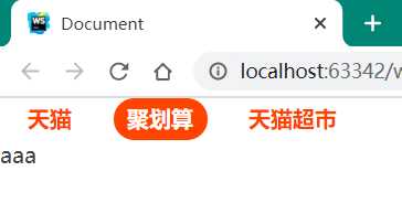
}<ul class="nav">
<li class="list-item"><a href="#">天猫</a></li>
<li class="list-item"><a href="#">聚划算</a></li>
<li class="list-item"><a href="#">天猫超市</a></li>
</ul>
aaa*{
margin: 0;
padding: 0;
color: #424242;
}
a{
text-decoration: none;
}
.nav{
list-style: none;
}
.nav .list-item{
float: left;
margin: 0 10px;
height: 30px;
line-height: 30px;/*使文字上下居中*/
}
/*清除浮动流,避免对后续元素产生影响*/
.nav::after{
content: "";
display: block;
clear: both;
}
.nav .list-item a{
padding: 0 10px;
color: #ff4400;
font-weight: bold;
height: 30px;
display: inline-block;
border-radius: 15px;
}
.nav .list-item a:hover{
background-color: #ff4400;
color: #ffffff;
}
文字溢出容器需打点展示
<p>腾讯推出的专业职业培训在线教育平台,聚合大量优质教育机构和名师,下设职业培训、公务员考试、托福雅思、考证考级、英语口语、中小学教育等众多在线学习精品</p>*{
margin: 0;
padding: 0
}
p{
width: 300px;
height: 20px;
line-height: 20px;
border: 1px solid black;
/*三件套*/
white-space: nowrap;/*不换行*/
overflow: hidden;
text-overflow: ellipsis;
}p{
width: 300px;
height: 20px;
line-height: 20px;
border: 1px solid black;
overflow: hidden;
}div{
width: 200px;
height: 200px;
border: 1px solid black;
background-image: url("1.jpg");
background-size: 100px 150px;
background-repeat: no-repeat;/*不重复出现*/
background-position: 50px 50px;/*或left top*//*或center center == 50% 50%*/
}文字代替图片处理
? 当网络不佳时仍可以保证网页功能
<a href="http://www.taobao.com" target="_blank">淘宝网</a>方法一
a{
    display: inline-block;
    text-decoration: none;
    color: #424242;
    width: 190px;
    height: 70px;
    background-image: url("taobao.png");
    background-size: 190px 70px;

    text-indent: 190px; /*css丢失时显示文字,css未丢失时文字溢出隐藏*/
    white-space: nowrap;
    overflow: hidden;
}
方法二
a{
    display: inline-block;
    text-decoration: none;
    color: #424242;
    width: 190px;
    height: 0;
    padding-top: 70px;
    overflow: hidden;
    background-image: url("taobao.png");
    background-size: 190px 70px;

}行级元素只能嵌套行级元素
块级元素可以嵌套任何元素
p标签不能嵌套块级元素
a标签不能嵌套a标签
<div class="wrapper">
    <div class="content">
    </div>
</div>

*{
    margin: 0;
    padding: 0
}

.wrapper{
    height: 30px;
    background-color: #123;
}

.content{
    margin: 0 auto;
    width: 1200px;
    height: 30px;
    background-color: gray;
}
效果:
文本类元素若含有文字,则外部文字保持与所含文字对齐:
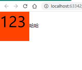
<span>123</span>哈哈

*{
    margin: 0;
    padding: 0
}

span{
    display: inline-block;
    width: 100px;
    height: 100px;
    background-color: #ff4400;
    font-size: 50px;
}
改变文本对齐线
利用vertical-align属性设置:
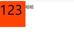
span{
    display: inline-block;
    width: 100px;
    height: 100px;
    background-color: #ff4400;
    font-size: 50px;
    vertical-align: -25px;/*或middle*/
}<div>
<ul style="float: left"> </ul>
<ul style="float: right">
</ul>
</div>.red{
background-color: red;
}
.gray{
background-color: gray;
}
.size1{
width: 100px;
height: 100px;
}
.size2{
width: 200px;
height: 200px;
}<div class="red size1"></div>
<div class="gray size2"></div>ul{
list-style: none;
padding: 0;
margin: 0;
}
a{
font-style: normal;
color: #424242;
}
em{
font-style: normal;
color: #cc0000;
}
/*通配符选择器初始化所有标签*/
*{
padding: 0;
margin: 0;
text-decoration: none;
list-style: none;
}#b{
font-size: 40px;/*默认16,一般12*/
font-weight: bold;/*默认normal, lighter normal bold bolder 或 100 200 -- 900*/
font-style: italic;
font-family: cursive;
color:rgb(255, 0, 255);
/*border:1px solid black;*/
border-width: 10px;
border-style: dashed;
width: 100px;
height: 100px;
border-left-color: green;
}
#a{
width: 0;
height: 0;
border: 100px solid green;
border-top-color: transparent;
border-right-color: blue;
border-bottom-color: black;
}<!DOCTYPE html>
<html lang="en">
<head>
<meta charset="UTF-8">
<title>Calculator</title>
<style>
/* Basic Reset */
* {
border: none;
font-family: 'Open Sans', sans-serif;
margin: 0;
padding: 0;
}
body {
}
.center {
background-color: #fff;
border-radius: 50%;
height: 600px;
margin: auto;
width: 600px;
}
h1 {
color: #495678;
font-size: 30px;
margin-top: 20px;
padding-top: 50px;
display: block;
text-align: center;
text-decoration: none;
}
a {
color: #495678;
font-size: 30px;
display: block;
text-align: center;
text-decoration: none;
padding-top: 20px;
}
form {
background-color: #495678;
box-shadow: 4px 4px #3d4a65;
margin: 40px auto;
padding: 40px 0 30px 40px;
width: 280px;
}
.btn {
outline: none;
cursor: pointer;
font-size: 20px;
height: 45px;
margin: 5px 0 5px 10px;
width: 45px;
}
.btn:first-child {
margin: 5px 0 5px 10px;
}
.btn, #display, form {
border-radius: 25px;
}
#display {
outline: none;
background-color: #98d1dc;
box-shadow: inset 6px 6px 0px #3facc0;
color: #495678;
font-size: 20px;
height: 47px;
text-align: right;
width: 165px;
padding-right: 10px;
margin-left: 10px;
}
.number {
background-color: #72778b;
box-shadow: 0 5px #5f6680;
color: #dededc;
}
.number:active {
box-shadow: 0 2px #5f6680;
-webkit-transform: translateY(2px);
-ms-transform: translateY(2px);
-moz-tranform: translateY(2px);
transform: translateY(2px);
}
.operator {
background-color: #dededc;
box-shadow: 0 5px #bebebe;
color: #72778b;
}
.operator:active {
box-shadow: 0 2px #bebebe;
-webkit-transform: translateY(2px);
-ms-transform: translateY(2px);
-moz-tranform: translateY(2px);
transform: translateY(2px);
}
.other {
background-color: #e3844c;
box-shadow: 0 5px #e76a3d;
color: #dededc;
}
.other:active {
box-shadow: 0 2px #e76a3d;
-webkit-transform: translateY(2px);
-ms-transform: translateY(2px);
-moz-tranform: translateY(2px);
transform: translateY(2px);
}
</style>
</head>
<body>
<div class="center">
<h1>HTML, CSS, JavaScript 计算器</h1>
<a href="https://github.com/guuibayer/simple-calculator" target="_blank"><i class="fa fa-github"></i></a>
<form name="calculator">
<input type="button" id="clear" class="btn other" value="C">
<input type="text" id="display">
<br>
<input type="button" class="btn number" value="7" onclick="get(this.value);">
<input type="button" class="btn number" value="8" onclick="get(this.value);">
<input type="button" class="btn number" value="9" onclick="get(this.value);">
<input type="button" class="btn operator" value="+" onclick="get(this.value);">
<br>
<input type="button" class="btn number" value="4" onclick="get(this.value);">
<input type="button" class="btn number" value="5" onclick="get(this.value);">
<input type="button" class="btn number" value="6" onclick="get(this.value);">
<input type="button" class="btn operator" value="*" onclick="get(this.value);">
<br>
<input type="button" class="btn number" value="1" onclick="get(this.value);">
<input type="button" class="btn number" value="2" onclick="get(this.value);">
<input type="button" class="btn number" value="3" onclick="get(this.value);">
<input type="button" class="btn operator" value="-" onclick="get(this.value);">
<br>
<input type="button" class="btn number" value="0" onclick="get(this.value);">
<input type="button" class="btn operator" value="." onclick="get(this.value);">
<input type="button" class="btn operator" value="/" onclick="get(this.value);">
<input type="button" class="btn other" value="=" onclick="calculates();">
</form>
</div>
<script>
/* limpa o display */
document.getElementById("clear").addEventListener("click", function() {
document.getElementById("display").value = "";
});
/* recebe os valores */
function get(value) {
document.getElementById("display").value += value;
}
/* calcula */
function calculates() {
var result = 0;
result = document.getElementById("display").value;
document.getElementById("display").value = "";
document.getElementById("display").value = eval(result);
};
</script>
</body>
</html>标签:form import ellipsis 大小 考试 20px sla 行级元素 工作
原文地址:https://www.cnblogs.com/amonia/p/12507690.html