标签:content learning state nim audio sla 数据 个人 一个
一、继续完善之前的页面
<!DOCTYPE html>

<html lang="en">

<head>

    <meta charset="UTF-8">

    <title>D188_3DPlayerXia</title>

    <style>

        *{

            margin:0px;

            padding:0px;

        }

        body{

            background:url("image/taobaoFocusPicture.jpg") no-repeat;

            background-size:cover;/*这个属性表示我们的图片肯定会填满整个网页,无论图片的大小*/

            overflow:hidden;/*代表的就是超出屏幕不会出现滚动条*/

        }

        ul{

            height: 200px;

            width: 200px;

            /*background-color: red;*/

            top:150px;

            position:absolute;

            left:50%;

            margin-left:-100px;

            transform-style: preserve-3d;/*注意这个3D效果设置在了父元素上*/

            /*transform:rotateX(-10deg);!*这一行的目的就是为了让我们的3D效果显示更加明显*!*/

            animation:sport 10s linear 0s infinite normal;/*动画效果*/

?

        }

        ul li {

            background-color: black;

            list-style: none;

            width: 200px;

            height: 200px;

            font-size:60px;

            text-align: center;

            line-height:200px;

            position:absolute;

            left:0;

            top:0;

?

        }

        ul li:nth-child(1){

            /*background-color: grey;*/

            transform:rotateY(60deg) translateZ(200px);/*分别代表Y轴旋转60度,沿着Z轴移动200个像素*/

?

        }

        ul li:nth-child(2){

            /*background-color: blue;*/

            transform:rotateY(120deg) translateZ(200px);

        }

        ul li:nth-child(3){

            /*background-color: yellow;*/

            transform:rotateY(180deg) translateZ(200px);

        }

        ul li:nth-child(4){

            /*background-color: green;*/

            transform:rotateY(240deg) translateZ(200px);

        }

        ul li:nth-child(5){

            /*background-color: skyblue;*/

            transform:rotateY(300deg) translateZ(200px);

        }

        ul li:nth-child(6){

            /*background-color: purple;*/

            transform:rotateY(360deg) translateZ(200px);

        }

        ul li image{

            width: 200px;

            height: 200px;

            border:5px solid skyblue;

            box-sizing:border-box;

?

        }

        ul:hover{

            animation-play-state: paused;/*鼠标放到上面就停了*/

        }

        ul:hover li img{

            opacity:0.5;/*鼠标放到ul上时,li添加蒙版*/

        }

        ul li:hover  img{

            opacity: 1;/*这个就是鼠标放到某个li标签,不添加蒙版*/

        }

        @keyframes sport {

            from {

                transform: rotateX(-20deg) rotateY(0deg);

            }

            to{

                transform: rotateX(-20deg) rotateY(360deg);

            }

        }

        .heart{

            position:absolute;

            left:100px;

            bottom:100px;

            animation: move 1s linear 0s infinite normal;

?

        }

        @keyframes move {

            0%{

                left:100px;

                bottom:100px;

                opacity:1;

            }

            50%{

                left:300px;

                bottom:300px;

                opacity: 0;

            }

            100%{

                left:600px;

                bottom:600px;

                opacity: 1;

            }

        }

</style>

</head>

<body>

<ul>

    <li><img src="image/play_tennis2.jpg"></li>

    <li><img src="image/play_tennis.jpg"></li>

    <li><img src="image/line_left.jpg"></li>

    <li><img src="image/26alphabet.jpg"></li>

    <li><img src="image/content_aside.jpg"></li>

    <li><img src="image/wangyi_center.jpg"></li>

</ul>

<img src="image/baidu_logo.png" class="heart"alt="">

<audio src="某一首歌" autoplay="autoplay" loop="loop"></audio>

<!--自动无限循环播放一个音乐-->

</body>

</html>
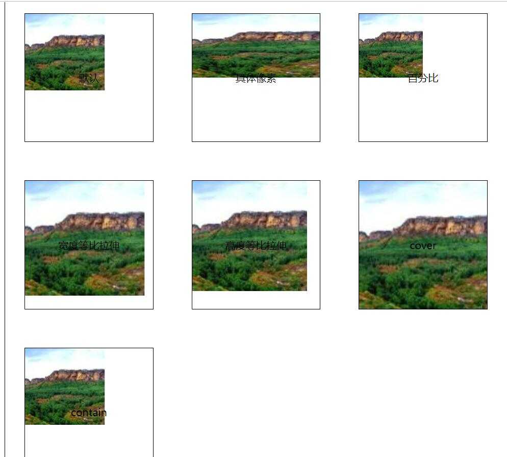
二、背景尺寸属性
1.?定义:背景尺寸属性时CSS3中新增的一个属性,专门用于设置背景图片大小
<!DOCTYPE html>

<html lang="en">

<head>

    <meta charset="UTF-8">

    <title>D189_AttributeOfBackgroundSize</title>

    <style>

        *{

            margin:0px;

            padding:0px;

        }

        ul{

            width: 800px;

            height: 800px;

            border:1px solid black;

            margin:0 auto;

        }

        ul li{

            list-style: none;

            width: 200px;

            height: 200px;

            float: left;

            margin:30px 30px;

            border:1px solid black;

            line-height: 200px;

            text-align: center;

        }

        ul li:nth-child(1){

            background:url("image/mountain.jpg" ) no-repeat;

        }

        ul li:nth-child(2){

            background:url("image/mountain.jpg" ) no-repeat;

            background-size:200px 100px;/*背景图片的宽度 高度*/

        }

        ul li:nth-child(3){

            background:url("image/mountain.jpg" ) no-repeat;

            background-size:50% 50%;/*当前这个“框”的宽度和高度的一半*/

        }

        ul li:nth-child(4){

            background:url("image/mountain.jpg" ) no-repeat;

            background-size:auto 180px;/*宽度的等比拉伸(图片的比例)*/

        }

        ul li:nth-child(5){

            background:url("image/mountain.jpg" ) no-repeat;

            background-size:180px auto;/*高度的等比拉伸(图片的比例)*/

        }

        ul li:nth-child(7){

            background:url("image/mountain.jpg" ) no-repeat;

            background-size:content/*首先是等比拉伸,直到宽度和高度有一个占满了这个“框”*/

        }

        ul li:nth-child(6){

            background:url("image/mountain.jpg" ) no-repeat;

            background-size:cover;/*这张图片首先需要等比拉伸,然后图片必须要覆盖整个“框”*/

        }

</style>

</head>

<body>

<ul>

    <li>默认</li>

    <li>具体像素</li>

    <li>百分比</li>

    <li>宽度等比拉伸</li>

    <li>高度等比拉伸</li>

    <li>cover</li>

    <li>contain</li>

</ul>

</body>

</html>
三、源码:
D188_3DPlayerXia.html
D189_AttributeOfBackgroundSize.html
地址:
https://github.com/ruigege66/HTML_learning/blob/master/D188_3DPlayerXia.html
https://github.com/ruigege66/HTML_learning/blob/master/D189_AttributeOfBackgroundSize.html
2.CSDN:https://blog.csdn.net/weixin_44630050
3.博客园:https://www.cnblogs.com/ruigege0000/
4.欢迎关注微信公众号:傅里叶变换,个人账号,仅用于技术交流,后台回复“礼包”获取Java大数据学习视频礼包

标签:content learning state nim audio sla 数据 个人 一个
原文地址:https://www.cnblogs.com/ruigege0000/p/12585316.html