标签:18C charset last href section 通过 提升 table 方式
在CSS布局中,定位布局也是一种非常常见的技术手段,我们以京东为例:
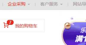
上面是非常好的例子,对于定位布局来说它可以将一个元素放在页面上的任意一个位置。
但是定位布局也不能滥用,因为它可能会出现一些意料之外的问题,所以我们只对一些需要定位的元素进行定位,而不需要定位的元素则使用文档流与浮动即可。
我们可以对一个元素使用position让它来进行定位,共有以下的定位选项。
| 选项 | 说明 |
|---|---|
| static | 默认形为,参考文档流 |
| relative | 相对定位 |
| absolute | 绝对定位,脱离文档流 |
| fixed | 固定定位,脱离文档流 |
| sticky | 粘性定位 |
上面说过,定位布局就是为了将一个元素可以放在页面上的任意一个位置而产生的,那么我们就可以对某些以添加定位选项的定位元素设置上,下,左,右的位置偏移。
| 选项 | 说明 |
|---|---|
| top | 距离顶边 |
| bottom | 距离下边 |
| left | 距离左部 |
| right | 距离右边 |
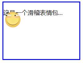
相对定位relative是相对于元素原本的位置进行控制,当元素发生偏移时,原位置保留(未脱离文档流,就会原位置留空)。
原本位置:
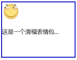
相对定位,距离顶边30px:
我们可以看到,下方的文字并没有去填补<img>原本的位置。

<!DOCTYPE html>
<html lang="en">
<head>
        <meta charset="UTF-8">
        <meta name="viewport" content="width=device-width, initial-scale=1.0">
        <title>Document</title>
?
        <style>
                article{
                        width: 200px;
                        height: 150px;
                        border: 2px solid blue;
                }
                article img{
                        width: 50px;
                        height: 50px;
                        position: relative;
                        top: 30px;
                }
        </style>
?
</head>
<body>
        <article>
                <img src="./huaji.png" alt="">
                <p>这是一个滑稽表情包...</p>
        </article>
</body>
</html>
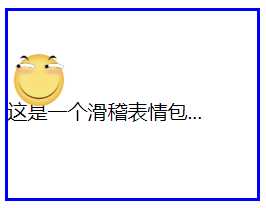
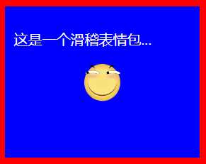
绝对定位absolute是脱离于文档流的,你可以将它理解为漂浮,被绝对定位后的元素拥有inline-block特性(不独占一行,能设置宽高)。
此外还要注意一点,绝对定位的元素是会影响同级的正常文档流元素的,即后面元素会自动向上补齐。
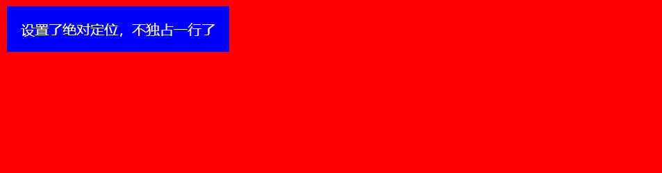
可以看到,下面绝对定位后的<img>标签空间位置被<p>标签占用了。
<!DOCTYPE html>
<html lang="en">
<head>
        <meta charset="UTF-8">
        <meta name="viewport" content="width=device-width, initial-scale=1.0">
        <title>Document</title>
?
        <style>
                body{

                }
                div{

                        color: white;
                        padding: 1em;
                        position: absolute;
                }
        </style>
?
</head>
<body>
        <div>设置了绝对定位,不独占一行了</div>
</body>
</html>
<!DOCTYPE html>
<html lang="en">
<head>
        <meta charset="UTF-8">
        <meta name="viewport" content="width=device-width, initial-scale=1.0">
        <title>Document</title>
?
        <style>
                article{
                        width: 200px;
                        height: 150px;
                        border: 2px solid blue;
                }
                article img{
                        width: 50px;
                        height: 50px;
                        position: absolute;
                        top: 30px;
                }
        </style>
?
</head>
<body>
        <article>
                <img src="./huaji.png" alt="">
                <p>这是一个滑稽表情包...</p>
        </article>
</body>
</html>
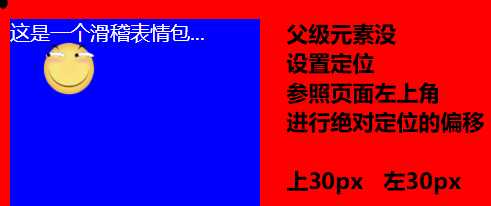
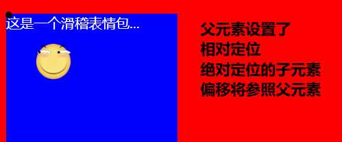
绝对定位的元素不受文档流的控制,所以默认它是按照页面左上角来进行偏移。
但是如果被绝对定位元素的父元素设置了relative或者fixed以及sticky定位的话,则该绝对定位子元素将会参照此父元素进行定位。
<!DOCTYPE html>
<html lang="en">
<head>
        <meta charset="UTF-8">
        <meta name="viewport" content="width=device-width, initial-scale=1.0">
        <title>Document</title>
?
        <style>
                body{

                }
                article{
                        width: 200px;
                        height: 150px;

                        color: white;
                        position: relative;
?
                }
                article img{
                        width: 50px;
                        height: 50px;
                        position: absolute;
                        top: 30px;
                        left: 30px;
                }
        </style>
?
</head>
<body>
        <article>
                <img src="./huaji.png" alt="">
                <p>这是一个滑稽表情包...</p>
        </article>
</body>
</html>
如果被定位的子元素没有设置任何偏移,那么它将会受到父元素padding等属性的影响。但是使用定位的元素一般都会进行偏移设置。
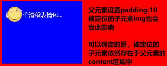
<!DOCTYPE html>
<html lang="en">
<head>
        <meta charset="UTF-8">
        <meta name="viewport" content="width=device-width, initial-scale=1.0">
        <title>Document</title>
?
        <style>
                body{

                }
                article{
                        width: 200px;
                        height: 150px;

                        color: white;
                        position: relative;
                        padding: 10px;
?
                }
                article img{
                        width: 50px;
                        height: 50px;
                        position: absolute;
                }
        </style>
?
</head>
<body>
        <article>
                <img src="./huaji.png" alt="">
                <p>这是一个滑稽表情包...</p>
        </article>
</body>
</html>
我们可以为定位的元素设定偏移值来改变该元素的尺寸大小。
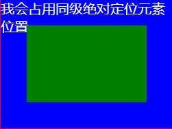
<!DOCTYPE html>
<html lang="en">
<head>
        <meta charset="UTF-8">
        <meta name="viewport" content="width=device-width, initial-scale=1.0">
        <title>Document</title>
?
        <style>
                body{

                }
                article{
                        width: 200px;
                        height: 150px;

                        color: white;
                        position: relative;
?
                }
                article div{

                        position: absolute;
                        left: 30px;
                        top: 30px;
                        bottom: 30px;
                        right: 30px;
                }
        </style>
?
</head>
<body>
        <article>
                <div></div>
                <p>我会占用同级绝对定位元素位置...</p>
        </article>
</body>
</html>
通过将 left 设置为50% ,并向左偏移子元素宽度一半可以实现水平居中,垂直居中使用方式类似。
<!DOCTYPE html>
<html lang="en">
<head>
        <meta charset="UTF-8">
        <meta name="viewport" content="width=device-width, initial-scale=1.0">
        <title>Document</title>
?
        <style>
                body{

                }
                article{
                        width: 200px;
                        height: 150px;

                        color: white;
                        position: relative;
                        padding: 10px;
?
                }
                article img{
                        width: 50px;
                        height: 50px;
                        position: absolute;
                        left: 50%;
                        top: 50%;
                        margin-left: -25px;
                        margin-top: -25px;

                }
        </style>
?
</head>
<body>
        <article>
                <img src="./huaji.png" alt="">
                <p>这是一个滑稽表情包...</p>
        </article>
</body>
</html>
无论是绝对定位或者相对定位的元素,都会随着滚动条发生滚动。
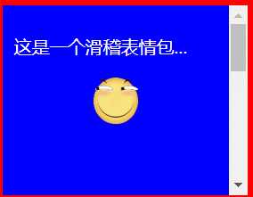
<!DOCTYPE html>
<html lang="en">
<head>
        <meta charset="UTF-8">
        <meta name="viewport" content="width=device-width, initial-scale=1.0">
        <title>Document</title>
?
        <style>
                body{

                }
                article{
                        width: 200px;
                        height: 150px;

                        color: white;
                        position: relative;
                        padding: 10px;
                        /* 显示滚动条 Y轴 */
                        overflow-y: scroll;
?
                }
                article img{
                        width: 50px;
                        height: 50px;
                        position: absolute;
                        left: 50%;
                        top: 50%;
                        margin-left: -25px;
                        margin-top: -25px;

                }
                article p{
                        /* 内容足够长,出现滚动条 */
                        height: 500px;
                }
        </style>
?
</head>
<body>
        <article>
                <img src="./huaji.png" alt="">
                <p>这是一个滑稽表情包...</p>
        </article>
</body>
</html>
如果两个同级的元素都进行定位且位置相同,那么后定位的元素会层叠在先定位的元素之上,这个时候我们就需要用到z-index来改变层叠优先级。
未定位:
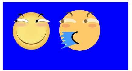
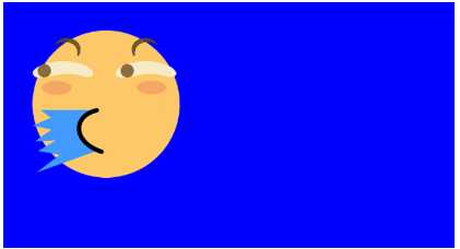
两个都进行绝对定位,依照蓝色父盒子的左上角,层叠在一起,可以看到只显示出一个,这是因为喷水滑稽比普通滑稽要大一点:
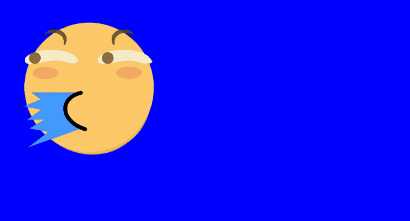
改变喷水滑稽的尺寸大小,就可以它下面的看见普通滑稽了。
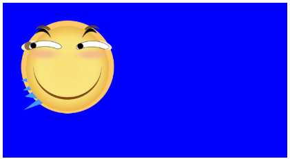
此时我们可以将喷水的滑稽进行偏移挪开,或者使用z-index提升优先级,让原本在下面的普通滑稽层叠在喷水滑稽上面。
<!DOCTYPE html>
<html lang="en">
<head>
        <meta charset="UTF-8">
        <meta name="viewport" content="width=device-width, initial-scale=1.0">
        <title>Document</title>
        <style>
?
                article section{
                        width: 200px;
                        height: 100px;
                        padding: 10px;

                        position: relative;
                }
?
                article section img:first-of-type{
                        width: 80px;
                        position: absolute;
                        /* 默认的层叠都是0,所以我们提成1即可 */
                        z-index: 1;
                }
                article section img:last-of-type{
                        width: 80px;
                        position: absolute;
                }
        </style>
</head>
<body>
        <article>
                <section>
                        <img src="./huaji.png" alt="">
                        <!-- 排列在后的叠在排列前的上面 -->
                        <img src="./ps.png" alt="">
                </section>
        </article>
</body>
</html>
固定定位fixed是脱离文档流(影响后面元素排列,固定定位元素不会留下空间)的一种定位方式,固定定位的元素不会随着滚动条进行滚动,它的偏移参照点是页面左上角。
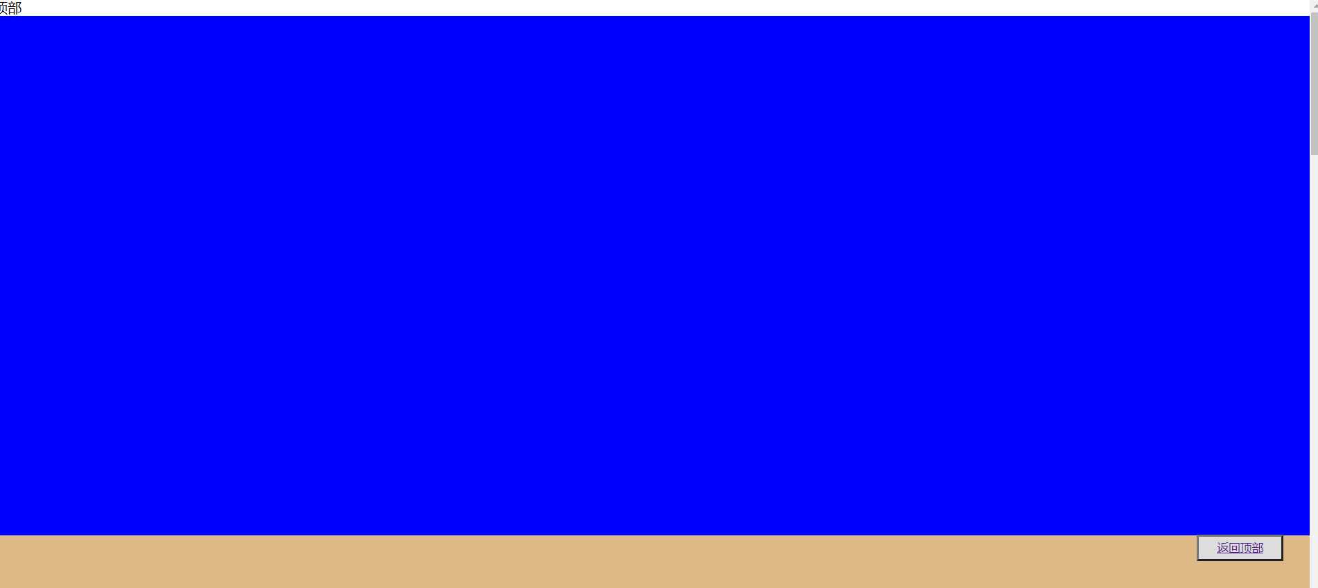
<!DOCTYPE html>
<html lang="en">
<head>
        <meta charset="UTF-8">
        <meta name="viewport" content="width=device-width, initial-scale=1.0">
        <title>Document</title>
        <style>
                *{
                        padding: 0;
                        margin: 0;
                }
                main>button{
                        position: fixed;
                        height: 30px;
                        width: 100px;

                        right: 2%;
                        bottom: 10%;
                        text-decoration: none;
                }
                main>section{
                        height: 600px;
                }
                main>section:nth-of-type(1){

                }
                main>section:nth-of-type(2){

                }
                main>section:nth-of-type(3){

                }
                main>section:nth-of-type(4){

                }
                main>section:last-of-type{
?

                }
        </style>
</head>
<body>
        <main>
                <span di="top">顶部</span>
                <section> </section>
                <section> </section>
                <section> </section>
                <section> </section>
                <section> </section>
                <button><a href="#top">返回顶部</a></button>
        </main>
</body>
</html>
同级粘性定位sticky是会进行层叠的,后面的粘性定位元素不会挤掉上面的粘性定位元素。
同级指的就是不同的粘性定位元素粘的是同一个父级元素。
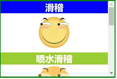
<!DOCTYPE html>
<html lang="en">
?
<head>
        <meta charset="UTF-8">
        <meta name="viewport" content="width=device-width, initial-scale=1.0">
        <title>Document</title>
        <style>
                * {
                        margin: 0;
                        padding: 0;
                }
?
                img {
                        width: 100px;

                }
?
                main {
                        border: 3px solid green;
                        width: 300px;
                        height: 200px;
                        overflow-y: scroll;
                }
?
                main section {
                        height: 700px;
                        text-align: center;
                }
?
                main section h2 {
                        color: white;
                        position: sticky;
                        top: 0;
                }
?
                main section h2:nth-of-type(even) {

?
                }
?
                main section h2:nth-of-type(odd) {

?
                }
        </style>
</head>
?
<body>
        <main>
                <section>
                        <h2>滑稽</h2>
                        <img src="./huaji.png" alt="">
?
                        <h2>喷水滑稽</h2>
                        <img src="./ps.png" alt="">
?
                        <h2>墨镜哥</h2>
                        <img src="./mjg.png" alt="">
?
                        <h2>眩晕怪</h2>
                        <img src="./xyg.png" alt="">
                </section>
        </main>
</body>
?
</html>
非同级粘性定位sticky是不会进行层叠的,后面的粘性定位元素会挤掉上面的粘性定位元素。
非同级指的就是不同的粘性定位元素粘的不是同一个父级元素。
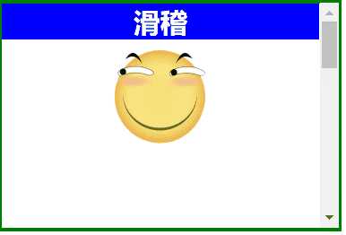
<!DOCTYPE html>
<html lang="en">
?
<head>
        <meta charset="UTF-8">
        <meta name="viewport" content="width=device-width, initial-scale=1.0">
        <title>Document</title>
        <style>
                *{
                        margin: 0;
                        padding: 0;
                }
                img {
                        width: 100px;
                }
?
                main {
                        border: 3px solid green;
                        width: 300px;
                        height: 200px;
                        overflow-y: scroll;
                }
?
                main section{
                        height: 200px;
                        text-align: center;
                }
?
                main section h2 {
                        color: white;
                        position:sticky;
                        top:0;
                }
?
                main section:nth-of-type(even) h2 {

?
                }
?
                main section:nth-of-type(odd) h2 {

?
                }
        </style>
</head>
?
<body>
        <main>
                <section>
                        <h2>滑稽</h2>
                        <img src="./huaji.png" alt="">
                </section>
                <section>
                        <h2>喷水滑稽</h2>
                        <img src="./ps.png" alt="">
                </section>
                <section>
                        <h2>墨镜哥</h2>
                        <img src="./mjg.png" alt="">
                </section>
                <section>
                        <h2>眩晕怪</h2>
                        <img src="./xyg.png" alt="">
                </section>
        </main>
</body>
?
</html>
<!DOCTYPE html>
<html lang="en">
?
<head>
        <meta charset="UTF-8">
        <meta name="viewport" content="width=device-width, initial-scale=1.0">
        <title>Document</title>
        <style>
                * {
                        padding: 0;
                        margin: 0;
                }
?
                main {
                        width: 600px;
                        padding: 100px;
                        margin: 0 auto;
                }
?
                main article {
                        width: 150px;
                        position: relative;
                        cursor: pointer;
                        font-size: 14px;
                        color: #555;
                }
?
                main article:hover div:nth-of-type(1) {
                        border-bottom: none;
                }
?
                main article:hover div:nth-of-type(2) {
                        display: block;
                }
?
                main article div {
                        box-sizing: border-box;
                        height: 50px;
                        line-height: 3.5em;
                        text-align: center;
                        border: solid 2px blueviolet;
                        background: white;
                }
?
                main article div:nth-of-type(1) {
                        position: relative;
                         /* 掩盖第二个DIV的上边框线 */
                        z-index: 2;
                }
?
                main article div:nth-of-type(2) {
                        display: none;
                        position: absolute;
                        right: 0;
                        /* 掩盖上边框线 */
                        top: 48px;
                        left: -150px;
                        z-index: 1;
                }
        </style>
</head>
?
<body>
        <main>
                <article>
                        <div>我的购物车</div>
                        <div>购物车中暂无产品</div>
                </article>
        </main>
</body>
?
</html>
标签:18C charset last href section 通过 提升 table 方式
原文地址:https://www.cnblogs.com/Yunya-Cnblogs/p/13307233.html
