标签:标签 ssi 直接 获取 12px 限制用户 effect 购物 blocks
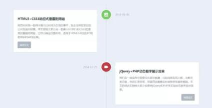
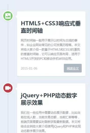
html5+css3响应式垂直时间轴,使用了html5标签<section>,时间轴中所有的内容包括标题、简介、时间和图像都放在.cd-timeline-block的div中,多个div形成一个序列,并把这些div放在<section>中。
PC端:
移动端:
html代码:
<!DOCTYPE html>
<html>

	<head>
		<meta charset="utf-8">
		<meta name="viewport" content="width=device-width, initial-scale=1.0">
		<title>演示:html5+css3响应式垂直时间轴</title>
		<link rel="stylesheet" href="style.css" />
		<style type="text/css">
			h2.top_title {
				border-bottom: none;
				background: none;
				text-align: center;
				line-height: 32px;
				font-size: 20px
			}

			h2.top_title span {
				font-size: 12px;
				color: #666;
				font-weight: 500
			}
		</style>
	</head>
	<body>
		<h2 class="top_title">html5+css3响应式垂直时间轴<br/><span>请使用IE9+或Chrome,Firefox高级浏览器或手机访问本页</span></h2>
		<section id="cd-timeline" class="cd-container">
			<div class="cd-timeline-block">
				<div class="cd-timeline-img cd-picture">
					<img src="img/cd-icon-picture.svg" alt="Picture">
				</div>
				<div class="cd-timeline-content">
					<h2>html5+css3响应式垂直时间轴</h2>
					<p>网页时间轴一般用于展示以时间为主线的事件,如企业网站常见的公司发展历程等。本文将给大家介绍一款基于html5和css3的漂亮的垂直时间轴,它可以响应页面布局,适用于html5开发的PC和移动手机WEB应用。</p>
					<a href="#" class="cd-read-more" target="_blank">阅读全文</a>
					<span class="cd-date">2015-01-06</span>
				</div>
			</div>
			<div class="cd-timeline-block">
				<div class="cd-timeline-img cd-movie">
					<img src="img/cd-icon-movie.svg" alt="Movie">
				</div>
				<div class="cd-timeline-content">
					<h2>jQuery+php动态数字展示效果</h2>
					<p>我们在一些应用中需要动态展示数据,比如当前在线人数,当前交易总额,当前汇率等等,前端页面需要实时刷新获取最新数据。本文将结合实例给大家介绍使用jQuery和php来实现动态数字展示效果。</p>
					<a href="#" class="cd-read-more" target="_blank">阅读全文</a>
					<span class="cd-date">2014-12-25</span>
				</div>
			</div>
			<div class="cd-timeline-block">
				<div class="cd-timeline-img cd-picture">
					<img src="img/cd-icon-picture.svg" alt="Picture">
				</div>
				<div class="cd-timeline-content">
					<h2>php操作Session和Cookie</h2>
					<p>我们跟踪用户信息时需要用到Session和Cookie,比如用户登录验证、记录用户浏览历史,存储购物车数据,限制用户会话有效时间等。今天我们来了解下php是如何操作Session和Cookie的。</p>
					<a href="#" class="cd-read-more" target="_blank">阅读全文</a>
					<span class="cd-date">2014-12-20</span>
				</div>
			</div>
			<div class="cd-timeline-block">
				<div class="cd-timeline-img cd-movie">
					<img src="img/cd-icon-movie.svg" alt="Movie">
				</div>
				<div class="cd-timeline-content">
					<h2>jQuery数字加减插件</h2>
					<p>我们在网上购物提交订单时,在网页上一般会有一个选择数量的控件,要求买家选择购买商品的件数,开发者会把该控件做成可以通过点击实现加减等微调操作,当然也可以直接输入数字件数。本文将介绍常见的几种使用spinner数字微调器来实现数字加减的功能的方法。</p>
					<a href="#" class="cd-read-more" target="_blank">阅读全文</a>
					<span class="cd-date">2014-12-14</span>
				</div>
			</div>
			<div class="cd-timeline-block">
				<div class="cd-timeline-img cd-movie">
					<img src="img/cd-icon-location.svg" alt="Location">
				</div>
				<div class="cd-timeline-content">
					<h2>收集整理的非常有用的php函数</h2>
					<p>项目中经常会需要一些让人头疼的函数,作为开发者应该整理一个自己的函数库,在需要之时复制过来即可。本文作者收集整理数十个php项目中常用的函数,保证能正常运行,你只要复制粘贴到你项目中即可。</p>
					<a href="#" class="cd-read-more" target="_blank">阅读全文</a>
					<span class="cd-date">2014-12-05</span>
				</div>
			</div>
		</section>
	</body>
</html>
摄图网https://www.wode007.com/sites/73204.html VJ师网https://www.wode007.com/sites/73287.html
css代码
<style>
	html * {
		-webkit-font-smoothing: antialiased;
		-moz-osx-font-smoothing: grayscale;
	}
	*,*:after,*:before {
		-webkit-box-sizing: border-box;
		-moz-box-sizing: border-box;
		box-sizing: border-box;
	}
	body {
		font-size: 100%;
		color: #7f8c97;
		background-color: #e9f0f5;
	}
	img {
		max-width: 100%;
	}
	/* --------------------------------Modules - reusable parts of our design-------------------------------- */
	.cd-container {
		/* this class is used to give a max-width to the element it is applied to, and center it horizontally when it reaches that max-width */
		width: 90%;
		max-width: 1170px;
		margin: 0 auto;
	}
	.cd-container::after {
		/* clearfix */
		content: ‘‘;
		display: table;
		clear: both;
	}
	/* --------------------------------Main components-------------------------------- */
	#cd-timeline {
		position: relative;
		padding: 2em 0;
		margin-top: 2em;
		margin-bottom: 2em;
	}

	#cd-timeline::before {
		/* this is the vertical line */
		content: ‘‘;
		position: absolute;
		top: 0;
		left: 18px;
		height: 100%;
		width: 4px;
		background: #d7e4ed;
	}

	@media only screen and (min-width: 1170px) {
		#cd-timeline {
			margin-top: 3em;
			margin-bottom: 3em;
		}
		#cd-timeline::before {
			left: 50%;
			margin-left: -2px;
		}
	}

	.cd-timeline-block {
		position: relative;
		margin: 2em 0;
	}

	.cd-timeline-block:after {
		content: "";
		display: table;
		clear: both;
	}
	.cd-timeline-block:first-child {
		margin-top: 0;
	}
	.cd-timeline-block:last-child {
		margin-bottom: 0;
	}
	@media only screen and (min-width: 1170px) {
		.cd-timeline-block {
			margin: 4em 0;
		}
		.cd-timeline-block:first-child {
			margin-top: 0;
		}
		.cd-timeline-block:last-child {
			margin-bottom: 0;
		}
	}
	.cd-timeline-img {
		position: absolute;
		top: 0;
		left: 0;
		width: 40px;
		height: 40px;
		border-radius: 50%;
		box-shadow: 0 0 0 4px white, inset 0 2px 0 rgba(0, 0, 0, 0.08), 0 3px 0 4px rgba(0, 0, 0, 0.05);
	}
	.cd-timeline-img img {
		display: block;
		width: 24px;
		height: 24px;
		position: relative;
		left: 50%;
		top: 50%;
		margin-left: -12px;
		margin-top: -12px;
	}
	.cd-timeline-img.cd-picture {
		background: #75ce66;
	}
	.cd-timeline-img.cd-movie {
		background: #c03b44;
	}
	.cd-timeline-img.cd-location {
		background: #f0ca45;
	}
	@media only screen and (min-width: 1170px) {
		.cd-timeline-img {
			width: 60px;
			height: 60px;
			left: 50%;
			margin-left: -30px;
			/* Force Hardware Acceleration in WebKit */
			-webkit-transform: translateZ(0);
			-webkit-backface-visibility: hidden;
		}
		.cssanimations .cd-timeline-img.is-hidden {
			visibility: hidden;
		}
		.cssanimations .cd-timeline-img.bounce-in {
			visibility: visible;
			-webkit-animation: cd-bounce-1 0.6s;
			-moz-animation: cd-bounce-1 0.6s;
			animation: cd-bounce-1 0.6s;
		}
	}
	.cd-timeline-content {
		position: relative;
		margin-left: 60px;
		background: white;
		border-radius: 0.25em;
		padding: 1em;
		box-shadow: 0 3px 0 #d7e4ed;
	}
	.cd-timeline-content:after {
		content: "";
		display: table;
		clear: both;
	}
	.cd-timeline-content h2 {
		color: #303e49;
	}
	.cd-timeline-content p,.cd-timeline-content .cd-read-more,.cd-timeline-content .cd-date {
		font-size: 13px;
		font-size: 0.8125rem;
	}
	.cd-timeline-content .cd-read-more,.cd-timeline-content .cd-date {
		display: inline-block;
	}
	.cd-timeline-content p {
		margin: 1em 0;
		line-height: 1.6;
	}
	.cd-timeline-content .cd-read-more {
		float: right;
		padding: .8em 1em;
		background: #acb7c0;
		color: white;
		border-radius: 0.25em;
	}
	.no-touch .cd-timeline-content .cd-read-more:hover {
		background-color: #bac4cb;
	}
	a.cd-read-more:hover {
		text-decoration: none;
		background-color: #424242;
	}
	.cd-timeline-content .cd-date {
		float: left;
		padding: .8em 0;
		opacity: .7;
	}
	.cd-timeline-content::before {
		content: ‘‘;
		position: absolute;
		top: 16px;
		right: 100%;
		height: 0;
		width: 0;
		border: 7px solid transparent;
		border-right: 7px solid white;
	}
	@media only screen and (min-width: 768px) {
		.cd-timeline-content h2 {
			font-size: 20px;
			font-size: 1.25rem;
		}
		.cd-timeline-content p {
			font-size: 16px;
			font-size: 1rem;
		}
		.cd-timeline-content .cd-read-more,.cd-timeline-content .cd-date {
			font-size: 14px;
			font-size: 0.875rem;
		}
	}

	@media only screen and (min-width: 1170px) {
		.cd-timeline-content {
			margin-left: 0;
			padding: 1.6em;
			width: 45%;
		}
		.cd-timeline-content::before {
			top: 24px;
			left: 100%;
			border-color: transparent;
			border-left-color: white;
		}
		.cd-timeline-content .cd-read-more {
			float: left;
		}
		.cd-timeline-content .cd-date {
			position: absolute;
			width: 100%;
			left: 122%;
			top: 6px;
			font-size: 16px;
			font-size: 1rem;
		}
		.cd-timeline-block:nth-child(even) .cd-timeline-content {
			float: right;
		}
		.cd-timeline-block:nth-child(even) .cd-timeline-content::before {
			top: 24px;
			left: auto;
			right: 100%;
			border-color: transparent;
			border-right-color: white;
		}
		.cd-timeline-block:nth-child(even) .cd-timeline-content .cd-read-more {
			float: right;
		}
		.cd-timeline-block:nth-child(even) .cd-timeline-content .cd-date {
			left: auto;
			right: 122%;
			text-align: right;
		}
		.cssanimations .cd-timeline-content.is-hidden {
			visibility: hidden;
		}
		.cssanimations .cd-timeline-content.bounce-in {
			visibility: visible;
			-webkit-animation: cd-bounce-2 0.6s;
			-moz-animation: cd-bounce-2 0.6s;
			animation: cd-bounce-2 0.6s;
		}
	}
	@media only screen and (min-width: 1170px) {
		/* inverse bounce effect on even content blocks */
		.cssanimations .cd-timeline-block:nth-child(even) .cd-timeline-content.bounce-in {
			-webkit-animation: cd-bounce-2-inverse 0.6s;
			-moz-animation: cd-bounce-2-inverse 0.6s;
			animation: cd-bounce-2-inverse 0.6s;
		}
	}
</style>
标签:标签 ssi 直接 获取 12px 限制用户 effect 购物 blocks
原文地址:https://www.cnblogs.com/ypppt/p/13340510.html