标签:type hidden watch screen discover alert fse mac VID
  :root{
      --box:120px
    }
    .box {
      /*width: var(--box);   120px*/
      /*width: min(var(--box),100px);   100px*/
      /*width: max(var(--box), 100px);   120px*/
      /*width:calc(var(--box) - 20px);   100px*/
      height: 100px;
      background-color: khaki;
    }
 .box {
      width: 100px;
      height: 100px;
      background-color: khaki;
    }
    .box::after{
      content:attr(data-text);
    }
<div class="box" data-text="min()"></div>
把内容 min() 添加到内容里面
.box {
      width: min(550px,50%);
      height: 100px;
      background-color: khaki;
    }
    .box1{
      width: 50%;
      max-width:550px;
      height: 100px;
      background-color: black;
    }
两者的效果相同,都是屏幕<=550px
同理 min-width 和max() 的效果也是一样的
就是结合min() max()
font-size: clamp(20px,8vw,50px) // 字体大小等于 8vw 不小于20px 不大于40px
确定范围,我们给width 设置 最小值和最大值
      min-width:800px;
      max-width:1000px;
	范围800px到1000px;写成calp()
      width: clamp(500px, 100%, 800px); // 范围就是500px 到 800px
width: calc(100%-40px); // 就是始终保持40px的间距
随着屏幕大小的增加而增加
 font-size: calc(1rem + .5vw);
  line-height: calc(1.2rem + .5vw);
通过计算的逻辑
如果你想占总宽度的1/12,就可以这样写
width:calc(100%/12)
文字给左右的padding,图片百分百
 <style>
         .aaa{
           min-width: 400px;
           max-width: 600px;
           height: 300px;
           margin: 30px auto;
           background-color: firebrick;
           --padding:20px;
           padding: var(--padding);
         }
          .bbb {
            width: calc(100% + var(--padding) * 2);
            margin-left: calc(var(--padding) * -1);
            height: 200px;
            background-color: cornsilk;
          }
  </style>
<div class="aaa">
    <p style="word-break: break-word">
ddddddddddddddddddddddddddddddddddddddddddddddddddddddddd
    </p>
	<div class="bbb"></div>
</div>
<div class="aaa" data-num="200"></div>
<style>
  .aaa::after{
        content:attr(data-num);
      }
</style>
  <style>
    .video {
      /*算出纵横比*/
      --aspect: calc(var(--height) / var(--width));
      /*给height 添加单位*/
      --units: calc(var(--height) * 1px);
      max-width: 100%;
      height: min(calc(100vw * var(--aspect)), var(--units));
    }
  </style>

<article class="article">
  <h1>Adaptive video with custom properties</h1>

  <iframe
    style="--width: 560; --height: 315;"
    class="video"
    width="560" height="315"
    src="//player.bilibili.com/player.html?aid=21032426&bvid=BV1PW411g7T3&cid=34444684&page=1" scrolling="no" border="0"
    frameborder="no" framespacing="0" allowfullscreen="true"></iframe>
</article>
子元素使用
flex-shrink: 0;就可以解决
let x=‘6‘
console.log(x +++ 3, x)
// 9  7
++优于+,并将字符串强制转化为数字,所以解析为(x++)+3所以结果是9 ,由于是后加加,所以x本身为7
const twit={
  names:‘a‘,
  a(){
    return this.names
  },
  b:function(){
    return this.names
  },
  c:()=>{
    return this.names
  }
}

console.log(twit.a());// a
console.log(twit.b());// a
console.log(twit.c());// window
function add(){
  this.a=1;
  const twit={
    c:()=>{
      return this.a
    }
  }
  console.log(twit.c());
}
add();// 1
this 功能是作用于上下文
由于箭头函数的this是指向上一层的this ,object不存在this,所以只想window
但是当我们在上面写成函数,那个函数指向上一层的函数
console.log(typeof Object,typeof Number,typeof Array)
// ‘function‘ ‘function‘  ‘function‘
因为内置函数也是函数,所以打印的都是函数,
如果把内置函数传递参数
Number(1)应该就是大家能理解的意思
<button accesskey="c" onClick="alert(333)">CLick Me</button>
Alt+ accessKey (window)会触发函数
control+Alt+ assessKey(mac) 会触发函数
display:none
视图上隐藏,但是保留位置
visibility:hidden ;
跟visibility 类似
opacity:0
  position: absolute;
  top: -9999px;
  left: -9999px;
transform:scale(0)
出现环绕的效果
<style>
.box{
width: 300px;
border: 1px solid #00230b;
margin: 40px auto;
}
.box-c {
--image-url: url("data:image/svg+xml,<svg width=‘150px‘ height=‘150px‘ xmlns=‘http://www.w3.org/2000/svg‘> <clipPath id=‘emojiClipPath‘> <text x=‘0‘ y=‘130px‘ font-size=‘130px‘>??</text> </clipPath> <rect x=‘0‘ y=‘0‘ fill=‘green‘ width=‘150px‘ height=‘150px‘ clip-path=‘url(%23emojiClipPath)‘/> </svg>");
background: var(--image-url);
shape-outside: var(--image-url);
float: left;
width: 150px;
height: 150px;
margin-left: -13px;
margin-top: 8px;
}
</style>
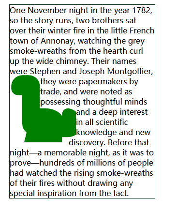
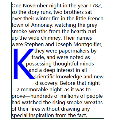
<div class="box">
One November night in the year 1782, so the story runs, two brothers sat over their winter fire in the little French town of Annonay, watching the grey smoke-wreaths from the hearth curl up the wide chimney. Their names were Stephen and
<div class="box-c"></div>
Joseph Montgolfier, they were papermakers by trade, and were noted as possessing thoughtful minds
and a deep interest in all scientific knowledge and new discovery. Before that night—a memorable night, as it was to prove—hundreds of millions of people had watched the rising smoke-wreaths of their fires without drawing any special inspiration from the fact.
</div>
总结关键代码
flat:left
shape-outside:
margin  可以自定义调试
同样应用于字母
 .emoji {
      --image-url: url("data:image/svg+xml,<svg width=‘150px‘ height=‘150px‘ xmlns=‘http://www.w3.org/2000/svg‘> <clipPath id=‘emojiClipPath‘> <text x=‘0‘ y=‘130px‘  font-size=‘130px‘>K</text> </clipPath> <rect x=‘0‘ y=‘0‘ fill=‘blue‘ width=‘150px‘ height=‘150px‘ clip-path=‘url(%23emojiClipPath)‘ /> </svg>");
      background: var(--image-url);
      shape-outside: var(--image-url);
      width: 150px;
      float: left;
      height: 150px;
      margin-left: -6px;
      margin-top: -6px;
      display: inline-block;
    }
<!doctype html>
<html lang="en">
<head>
  <meta charset="UTF-8">
  <meta name="viewport"
        content="width=device-width, user-scalable=no, initial-scale=1.0, maximum-scale=1.0, minimum-scale=1.0">
  <meta http-equiv="X-UA-Compatible" content="ie=edge">
  <title>Document</title>
  <style>
    body {
      width: 100vw;
      height: 100vh;
      overflow: hidden;
      background-color: #9a5353;
      display: flex;
      justify-content: center;
      align-items: center;
    }

    .container {
      width: 80%;
      height: 80%;
      overflow: hidden;
      position: relative;
      box-shadow: inset 0 0 2px 1em rgba(0, 0, 0, .5),
      0 4px 1em rgba(0, 0, 0, .5);
    }
    .img{
      background: center no-repeat url("https://assets.codepen.io/2555216/Akihabara.jpeg");
      background-size: cover;
      filter:blur(4px);
      width: 100%;
      height: 100%;
    }
    .cursor{
      position: absolute;
      background: center no-repeat url("https://assets.codepen.io/2555216/Akihabara.jpeg");
      background-size: cover;
      width: 200px;
      height: 200px;
      border-radius: 50%;
      transition:all .1s linear;
    }

  </style>
</head>
<body>
<div class="container">
  <div class="img"></div>
  <div class="cursor"></div>
</div>
<script>
  window.onload=function(){
    const container = document.querySelector(‘.container‘);
    const contReat=container.getBoundingClientRect()
    const cursor=document.querySelector(‘.cursor‘)
    const obj=cursor.getBoundingClientRect()
    container.addEventListener(‘mousemove‘,e=>{
      e.stopPropagation()
      let x=e.pageX-contReat.left-obj.width/2;
      let y=e.pageY-contReat.top-obj.height/2;
      cursor.style.left=x+‘px‘
      cursor.style.top=y+‘px‘
    })
  }

</script>
</body>
</html>
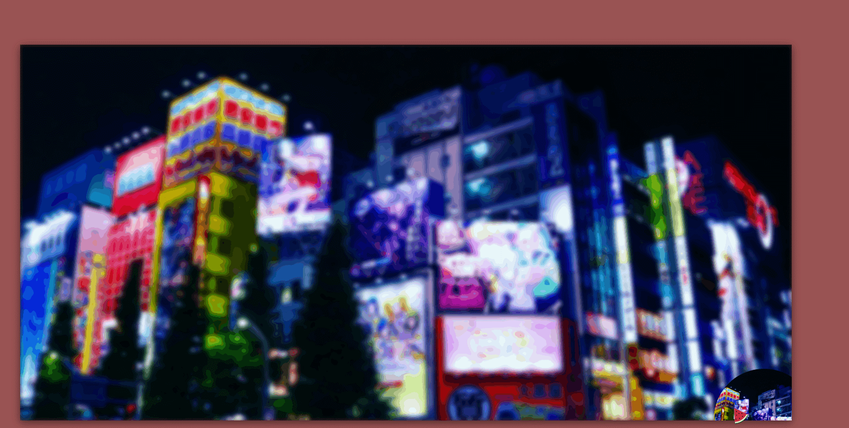
介绍部分
- dom部分
首先给两个dom,一个dom给上过滤器,一个不给且限制大小作为窗口
- 逻辑部分
当页面的鼠标发生移动的时候,因为这个窗口dom只需要改他的left,top的距离就可以啦,因为它是定位
e.pageX/e.pageY 需要减去 大盒子距离左边的距离
offsetLeft/offsetTop然后减去盒子自身的width/height的一半,那个盒子鼠标就在盒子的中心,可以给这个盒子添加过渡效果
标签:type hidden watch screen discover alert fse mac VID
原文地址:https://www.cnblogs.com/fangdongdemao/p/13898147.html