标签:none outline device out img 方法 ace nbsp cursor
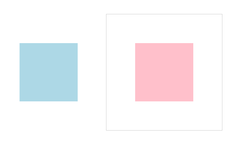
使用translate控制元素二维移动:
<!DOCTYPE html>
<html lang="en">
<head>
    <meta charset="UTF-8">
    <title>Document</title>

    <style>
        *{
            margin:0;
            padding:0;
            box-sizing:border-box;
        }
      main{
            width:400px;
            height:400px;
            border:1px solid silver;
            position:absolute;
            top:50%;
            left:50%;
            margin-top:-200px;
            margin-left:-200px;
        }
        div{
            width:200px;
            height:200px;
            position:absolute;
            top:50%;
            left:50%;
            margin-top:-100px;
            margin-left:-100px;
        }
        div:nth-child(1){
            background:pink;
        }
        div:nth-child(2){
            background:lightblue;
            transition:1s;
        }
        main:hover div:nth-child(2){
            transform:translateX(100px);
            transform:translateX(-200px);
            /* 百分比是参考元素本身宽度 */
            transform:translateX(-200%);
        }
    </style>
</head>
<body>
    <main>
        <div></div>
        <div></div>
    </main>
</body>
</html>
多条规则注意事项与二维移动统一控制:
<!DOCTYPE html>
<html lang="en">
<head>
    <meta charset="UTF-8">
    <title>Document</title>

    <style>
        *{
            margin:0;
            padding:0;
            box-sizing:border-box;
        }
      main{
            width:400px;
            height:400px;
            border:1px solid silver;
            position:absolute;
            top:50%;
            left:50%;
            margin-top:-200px;
            margin-left:-200px;
        }
        div{
            width:200px;
            height:200px;
            position:absolute;
            top:50%;
            left:50%;
            margin-top:-100px;
            margin-left:-100px;
        }
        div:nth-child(1){
            background:pink;
        }
        div:nth-child(2){
            background:lightblue;
            transition:1s;
        }
        main:hover div:nth-child(2){
            transform:translateX(200px) translateY(200%);
            /* 简写 */
            transform:translate(100px,100%);
        }
    </style>
</head>
<body>
    <main>
        <div></div>
        <div></div>
    </main>
</body>
</html>
控制元素居中的多种技巧分析:
【方式1,display:flex】
<!DOCTYPE html>
<html lang="en">
<head>
    <meta charset="UTF-8">
    <title>Document</title>

    <style>
        *{
            margin:0;
            padding:0;
            box-sizing:border-box;
        }
        body{
            width:100vw;
            height:100vh;
            display:flex;
            justify-content:center;
            align-items:center;
        }
      main{
            width:400px;
            height:400px;
            border:1px solid silver;
            position:absolute;
            /* top:50%;
            left:50%;
            margin-top:-200px;
            margin-left:-200px; */
        }
        div{
            width:200px;
            height:200px;
            position:absolute;
            top:50%;
            left:50%;
            margin-top:-100px;
            margin-left:-100px;
        }
        div:nth-child(1){
            background:pink;
        }
        div:nth-child(2){
            background:lightblue;
            transition:1s;
        }
        main:hover div:nth-child(2){

        }
    </style>
</head>
<body>
    <main>
        <div></div>
        <div></div>
    </main>
</body>
</html>
【方式2:绝对定位】
<!DOCTYPE html>
<html lang="en">
<head>
    <meta charset="UTF-8">
    <title>Document</title>

    <style>
        *{
            margin:0;
            padding:0;
            box-sizing:border-box;
        }
        body{
            width:100vw;
            height:100vh;
            /* display:flex;
            justify-content:center;
            align-items:center; */
        }
      main{
            width:400px;
            height:400px;
            border:1px solid silver;
            position:absolute;
            top:50%;
            left:50%;
            margin-top:-200px;
            margin-left:-200px;
        }
        div{
            width:200px;
            height:200px;
            position:absolute;
            top:50%;
            left:50%;
            margin-top:-100px;
            margin-left:-100px;
        }
        div:nth-child(1){
            background:pink;
        }
        div:nth-child(2){
            background:lightblue;
            transition:1s;
        }
        main:hover div:nth-child(2){

        }
    </style>
</head>
<body>
    <main>
        <div></div>
        <div></div>
    </main>
</body>
</html>
【方式3:绝对定位+translate】
<!DOCTYPE html>
<html lang="en">
<head>
    <meta charset="UTF-8">
    <title>Document</title>

    <style>
        *{
            margin:0;
            padding:0;
            box-sizing:border-box;
        }
        body{
            width:100vw;
            height:100vh;
            /* display:flex;
            justify-content:center;
            align-items:center; */
        }
      main{
            width:400px;
            height:400px;
            border:1px solid silver;
            position:absolute;
            top:50%;
            left:50%;
            transform:translate(-50%,-50%);
        }
        div{
            width:200px;
            height:200px;
            position:absolute;
            top:50%;
            left:50%;
            margin-top:-100px;
            margin-left:-100px;
        }
        div:nth-child(1){
            background:pink;
        }
        div:nth-child(2){
            background:lightblue;
            transition:1s;
        }
        main:hover div:nth-child(2){

        }
    </style>
</head>
<body>
    <main>
        <div></div>
        <div></div>
    </main>
</body>
</html>
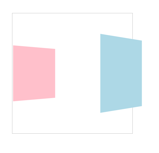
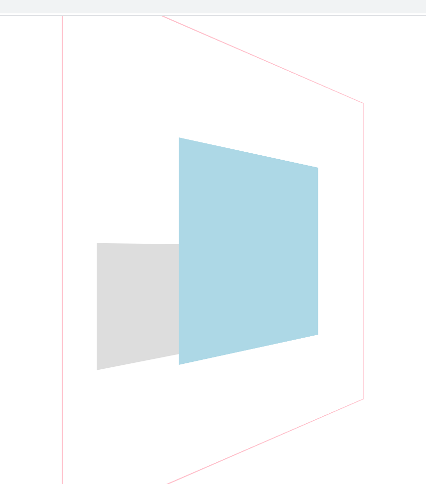
体验三维Z轴的效果:
<!DOCTYPE html>
<html lang="en">
<head>
    <meta charset="UTF-8">
    <title>Document</title>

    <style>
        *{
            margin:0;
            padding:0;
            box-sizing:border-box;
        }
        body{
            width:100vw;
            height:100vh;
        }
      main{
            width:400px;
            height:400px;
            border:1px solid silver;
            position:absolute;
            top:50%;
            left:50%;
            transform:translate(-50%,-50%);
        }
        div{
            width:200px;
            height:200px;
            position:absolute;
            top:50%;
            left:50%;
            margin-top:-100px;
            margin-left:-100px;
            transition:1s;
        }
        div:nth-child(1){
            background:pink;
            transform:perspective(900px) rotateY(45deg);
        }
        div:nth-child(2){
            background:lightblue;
            transform:perspective(900px) rotateY(45deg);
        }
        main:hover div:nth-child(1){
            transform:perspective(900px) rotateY(45deg) translateZ(-200px);
        }
        main:hover div:nth-child(2){
            transform:perspective(900px) rotateY(45deg) translateZ(200px);
        }
    </style>
</head>
<body>
    <main>
        <div></div>
        <div></div>
    </main>
</body>
</html>
注意Z轴移动只能是具体的单位,不能是百分比
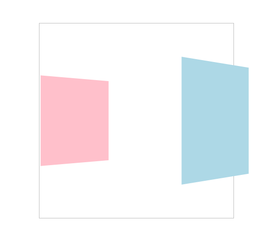
使用translate3d控制3D移动:
<!DOCTYPE html>
<html lang="en">
<head>
    <meta charset="UTF-8">
    <title>Document</title>

    <style>
        *{
            margin:0;
            padding:0;
            box-sizing:border-box;
        }
        body{
            width:100vw;
            height:100vh;
        }
      main{
            width:400px;
            height:400px;
            border:1px solid silver;
            position:absolute;
            top:50%;
            left:50%;
            transform:translate(-50%,-50%);
        }
        div{
            width:200px;
            height:200px;
            position:absolute;
            top:50%;
            left:50%;
            margin-top:-100px;
            margin-left:-100px;
            transition:1s;
        }
        div:nth-child(1){
            background:pink;
            transform:perspective(900px) rotateY(45deg) translate3d(0,0,0);
        }
        div:nth-child(2){
            background:lightblue;
            transform:perspective(900px) rotateY(45deg) translate3d(0,0,0);
        }
        main:hover div:nth-child(1){
            transform:perspective(900px) rotateY(45deg) translate3d(0,0,-200px);
        }
        main:hover div:nth-child(2){
            transform:perspective(900px) rotateY(45deg) translate3d(0,0,200px);
        }
    </style>
</head>
<body>
    <main>
        <div></div>
        <div></div>
    </main>
</body>
</html>
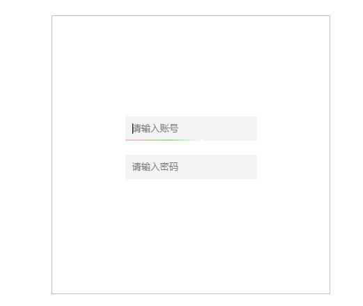
漂亮的动感表单效果:
<!DOCTYPE html>
<html lang="en">
<head>
    <meta charset="UTF-8">
    <title>Document</title>

    <style>
        *{
            margin:0;
            padding:0;
            box-sizing:border-box;
        }
        body{
            width:100vw;
            height:100vh;
        }
      main{
            width:400px;
            height:400px;
            border:1px solid silver;
            position:absolute;
            top:50%;
            left:50%;
            transform:translate(-50%,-50%);
            display:flex;
            flex-direction:column;
            justify-content:center;
            align-items:center;

        }
        .field{
            position:relative;
            overflow:hidden;
            margin-bottom:20px;
        }
        .field::before{
            content:‘‘;
            position:absolute;
            left:0;
            bottom:0;
            height:2px;
            right:0;
            background-image:linear-gradient(to right,white,lightblue,pink, lightgreen,white);
            transform:translateX(-100%);
            transition:2s;
        }
        .field:hover::before{
            transform:translateX(100%);
        }
        .field input{
            border:none;
            outline:none;
            padding:10px;
            background:#f3f3f3;
        }
    </style>
</head>
<body>
    <main>
        <div class="field"><input type="text" placeholder="请输入账号"></div>
        <div class="field"><input type="text" placeholder="请输入密码"></div>
    </main>
</body>
</html>
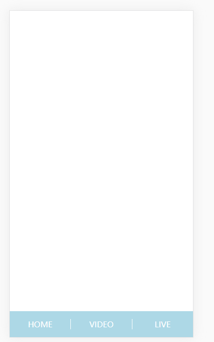
超酷的移动端视图切换:
<!DOCTYPE html>
<html lang="en">
<head>
    <meta charset="UTF-8">
    <title>demo</title>
    <meta name="viewport" content="width=device-width,minimum-scale=1.0,maximum-scale=1.0,user-scalable=no">

    <style>
        *{
            margin:0;
            padding:0;
            box-sizing:border-box;
        }
        body{
            width:100vw;
            height:100vh;
            display:flex;
            flex-direction:column;
        }
        main{
            flex:1;
        }
        nav{
            height:8vh;
            background:lightblue;
            display:flex;
            justify-content:space-evenly;
            align-items:center;
        }
        nav a{
            text-decoration: none;
            color:white;
            text-transform:uppercase;
            flex:1;
            text-align:center;
        }
        nav a:nth-child(2){
            border-left:1px solid white;
            border-right:1px solid white;
        }

    </style>
</head>
<body>
    <main></main>
    <nav>
        <a href="">home</a>
        <a href="">video</a>
        <a href="">live</a>
    </nav>
</body>
</html>
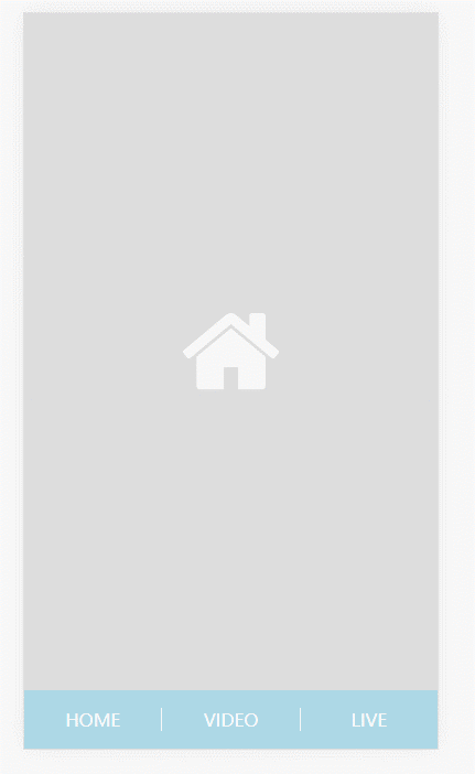
移动端多视图切换呈现:
<!DOCTYPE html>
<html lang="en">
<head>
    <meta charset="UTF-8">
    <title>demo</title>
    <meta name="viewport" content="width=device-width,minimum-scale=1.0,maximum-scale=1.0,user-scalable=no">
    <link rel="stylesheet" href="fa/css/font-awesome.css">

    <style>
        *{
            margin:0;
            padding:0;
            box-sizing:border-box;
        }
        body{
            width:100vw;
            height:100vh;
            display:flex;
            flex-direction:column;
            background:red;
        }
        body::after{
            content:‘cyy‘;
            position:absolute;
            top:50%;
            left:50%;
            transform:translate(-50%,-50%);
            font-size:2em;
            opacity:.3;
        }
        main{
            flex:1;
            position:relative;
        }
        nav{
            height:8vh;
            background:lightblue;
            display:flex;
            justify-content:space-evenly;
            align-items:center;
        }
        nav a{
            text-decoration: none;
            color:white;
            text-transform:uppercase;
            flex:1;
            text-align:center;
        }
        nav a:nth-child(2){
            border-left:1px solid white;
            border-right:1px solid white;
        }
        main>div{
            width:100%;
            height:100%;
            position:absolute;
            left:0;
            top:0;

            display:flex;
            flex-direction:column;
            justify-content:space-evenly;
            align-items:center;

            transform:translateY(-100%);
            transition:1s;

            z-index:1;
        }
        main>div:target{
            transform:translateY(0);
        }
        /* :target被点击触发时 */
        main>div:nth-child(1):target{
            background:#ddd;
        }
        main>div:nth-child(2):target{
            background:orange;
        }
        main>div:nth-child(3):target{
            background:lightgreen;
        }
        i[class^=‘fa‘]{
            font-size:6em;
            color:white;
        }
    </style>
</head>
<body>
    <main>
        <div id="home"><i class="fa fa-home"></i></div>
        <div id="video"><i class="fa fa-ban"></i></div>
        <div id="live"><i class="fa fa-camera"></i></div>
    </main>
    <nav>
        <a href="#home">home</a>
        <a href="#video">video</a>
        <a href="#live">live</a>
    </nav>
</body>
</html>
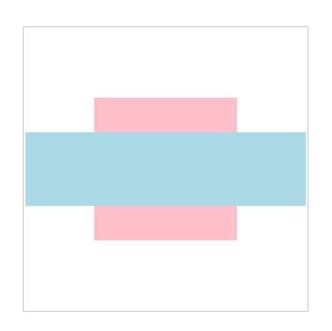
2D缩放使用方法:
<!DOCTYPE html>
<html lang="en">
<head>
    <meta charset="UTF-8">
    <title>Document</title>

    <style>
        *{
            margin:0;
            padding:0;
            box-sizing:border-box;
        }
        body{
            width:100vw;
            height:100vh;
        }
      main{
            width:400px;
            height:400px;
            border:1px solid silver;
            position:absolute;
            top:50%;
            left:50%;
            transform:translate(-50%,-50%);
        }
        div{
            width:200px;
            height:200px;
            position:absolute;
            top:50%;
            left:50%;
            margin-top:-100px;
            margin-left:-100px;
            transition:1s;
        }
        div:nth-child(1){
            background:pink;
        }
        div:nth-child(2){
            background:lightblue;
        }
        main:hover div:nth-child(1){
        }
        main:hover div:nth-child(2){
                    transform:scaleX(2);
                    transform:scaleY(.5);
                    transform:scale(2,.5);
        }
    </style>
</head>
<body>
    <main>
        <div></div>
        <div></div>
    </main>
</body>
</html>
3D视图中Z轴缩放使用:
<!DOCTYPE html>
<html lang="en">
<head>
    <meta charset="UTF-8">
    <meta name="viewport" content="width=device-width, initial-scale=1.0">
    <meta name="keywords" content="关键词1,关键词2,关键词3">
    <meta name="description" content="网站描述bla bla">
    <title>网站标题</title>
    <style>
        *{
            margin:0;
            padding:0;
        }
        body{
            width:100vw;
            height:100vh;
        }
        main{
            position:absolute;
            width:400px;
            height:400px;
            border:1px solid pink;
            left:50%;
            top:50%;
            transform:translate(-50%,-50%) perspective(900px) rotateY(45deg);
            transform-style:preserve-3d;
            transition:1s;
        }
        body:hover main{
            /* 把Z轴变长 */
            transform:translate(-50%,-50%) perspective(900px) rotateY(45deg) scaleZ(3);
             /* 把Z轴变短 */
            transform:translate(-50%,-50%) perspective(900px) rotateY(45deg) scaleZ(.5);
        }
        div{
            width:200px;
            height:200px;

            position:absolute;
            left:50%;
            top:50%;
            transform:translate(-50%,-50%);
            transition:1s;

        }
        div:nth-child(1){
            background:lightblue;

        }
        div:nth-child(2){
            background:#ddd;

        }
        main:hover div:nth-child(2){
            transform:translateZ(-400px);

        }

    </style>
</head>
<body>
    <main>
        <div></div>
        <div></div>
    </main>
</body>
</html>

使用slace3d同时改变三轴缩放:
<!DOCTYPE html>
<html lang="en">
<head>
    <meta charset="UTF-8">
    <meta name="viewport" content="width=device-width, initial-scale=1.0">
    <meta name="keywords" content="关键词1,关键词2,关键词3">
    <meta name="description" content="网站描述bla bla">
    <title>网站标题</title>
    <style>
        *{
            margin:0;
            padding:0;
        }
        body{
            width:100vw;
            height:100vh;
        }
        main{
            position:absolute;
            width:400px;
            height:400px;
            border:1px solid pink;
            left:50%;
            top:50%;
            transform:translate(-50%,-50%) perspective(900px) rotateY(45deg);
            transform-style:preserve-3d;
            transition:1s;
        }
        body:hover main{
            transform:translate(-50%,-50%) perspective(900px) rotateY(45deg) scale3d(2,2,2);
        }
        div{
            width:200px;
            height:200px;

            position:absolute;
            left:50%;
            top:50%;
            transform:translate(-50%,-50%);
            transition:1s;

        }
        div:nth-child(1){
            background:lightblue;

        }
        div:nth-child(2){
            background:#ddd;

        }
        main:hover div:nth-child(2){
            transform:translateZ(-400px);

        }

    </style>
</head>
<body>
    <main>
        <div></div>
        <div></div>
    </main>
</body>
</html>
开发缩放菜单案例:
<!DOCTYPE html>
<html lang="en">
<head>
    <meta charset="UTF-8">
    <meta name="viewport" content="width=device-width, initial-scale=1.0">
    <meta name="keywords" content="关键词1,关键词2,关键词3">
    <meta name="description" content="网站描述bla bla">
    <title>网站标题</title>
    <style>
        *{
            margin:0;
            padding:0;
            box-sizing:border-box;
        }
        body{
            width:100vw;
            height:100vh;
        }
        main{
            position:absolute;
            left:50%;
            top:50%;
            transform:translate(-50%,-50%);
        }
        ul{
            display:flex;
            list-style:none;
        }
        ul li{
            margin-right:10px;

        }
        ul li strong{
            padding:5px 30px;
            text-transform:uppercase;
            background:lightgreen;
            color:white;
            cursor:pointer;
        }
        strong+div{
            background:#ddd;
            padding:10px;
            display:flex;
            flex-direction:column;
            transform:scale(0);
            transition:.5s;
            position:relative;
            z-index:-1;
            transform-origin:center top;
        }
        strong+div>a{
            color:#333;
            padding:5px 0;
            text-decoration:none;
        }
        ul li:hover strong+div{
            transform:scale(1);
        }

    </style>
</head>
<body>
    <main>
        <ul>
            <li>
                <strong>video</strong>
                <div>
                    <a href="">html</a>
                    <a href="">css</a>
                </div>

            </li>
            <li>
                <strong>live</strong>
                <div>
                    <a href="">js</a>
                    <a href="">jq</a>
                </div>

            </li>
        </ul>
    </main>
</body>
</html>
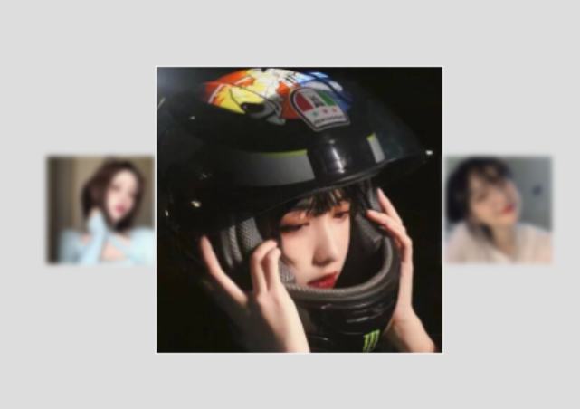
图集效果案例:
【鼠标移入,放大元素】
<!DOCTYPE html>
<html lang="en">
<head>
    <meta charset="UTF-8">
    <meta name="viewport" content="width=device-width, initial-scale=1.0">
    <meta name="keywords" content="关键词1,关键词2,关键词3">
    <meta name="description" content="网站描述bla bla">
    <title>网站标题</title>
    <style>
        *{
            margin:0;
            padding:0;
            box-sizing:border-box;
        }
        body{
            width:100vw;
            height:100vh;
            display:flex;
            justify-content:center;
            align-items:center;
            background:#ddd;
        }
        main{
            display:flex;
            justify-content:center;
            align-items:center;
        }
        div{
            width:200px;
            height:200px;
            margin-right:20px;
            overflow:hidden;
            border:1px solid #eee;
            transition:1s;
        }
        div>img{
            height:100%;
            cursor:pointer;
        }
        main:hover div{
            /* 滤镜:高斯模糊 */
            filter:blur(5px);
            transform:scale(.6);
        }
        main:hover div:hover{
            filter:none;
            transform:scale(1.6);
        }
    </style>
</head>
<body>
    <main>
        <div><img src="https://timgsa.baidu.com/timg?image&quality=80&size=b9999_10000&sec=1605020760089&di=7dea6c630e281d32d2e9d43ec9447024&imgtype=0&src=http%3A%2F%2Fc-ssl.duitang.com%2Fuploads%2Fitem%2F202006%2F15%2F20200615144625_tyEUV.thumb.400_0.jpeg" alt=""></div>
        <div><img src="https://timgsa.baidu.com/timg?image&quality=80&size=b9999_10000&sec=1605020764640&di=da5cbad756be09978194787be4c88324&imgtype=0&src=http%3A%2F%2Fc-ssl.duitang.com%2Fuploads%2Fitem%2F202003%2F05%2F20200305152336_HzjWi.thumb.400_0.jpeg" alt=""></div>
        <div><img src="https://timgsa.baidu.com/timg?image&quality=80&size=b9999_10000&sec=1605020833326&di=d4c101472a43d47d574fab6a3327d98e&imgtype=0&src=http%3A%2F%2Fm.imeitou.com%2Fuploads%2Fallimg%2F2020100608%2Fh2ohk0shtuw.jpg" alt=""></div>
    </main>
</body>
</html>
【鼠标移入,放大图片】
<!DOCTYPE html>
<html lang="en">
<head>
    <meta charset="UTF-8">
    <meta name="viewport" content="width=device-width, initial-scale=1.0">
    <meta name="keywords" content="关键词1,关键词2,关键词3">
    <meta name="description" content="网站描述bla bla">
    <title>网站标题</title>
    <style>
        *{
            margin:0;
            padding:0;
            box-sizing:border-box;
        }
        body{
            width:100vw;
            height:100vh;
            display:flex;
            justify-content:center;
            align-items:center;
            background:#ddd;
        }
        main{
            display:flex;
            justify-content:center;
            align-items:center;
        }
        div{
            width:200px;
            height:200px;
            margin-right:20px;
            overflow:hidden;
            border:1px solid #eee;

        }
        div>img{
            height:100%;
            cursor:pointer;
            transition:1s;
            filter:blur(2px);
        }
        img:hover{
            transform:scale(1.6);
            filter:none;
        }
    </style>
</head>
<body>
    <main>
        <div><img src="https://timgsa.baidu.com/timg?image&quality=80&size=b9999_10000&sec=1605020760089&di=7dea6c630e281d32d2e9d43ec9447024&imgtype=0&src=http%3A%2F%2Fc-ssl.duitang.com%2Fuploads%2Fitem%2F202006%2F15%2F20200615144625_tyEUV.thumb.400_0.jpeg" alt=""></div>
        <div><img src="https://timgsa.baidu.com/timg?image&quality=80&size=b9999_10000&sec=1605020764640&di=da5cbad756be09978194787be4c88324&imgtype=0&src=http%3A%2F%2Fc-ssl.duitang.com%2Fuploads%2Fitem%2F202003%2F05%2F20200305152336_HzjWi.thumb.400_0.jpeg" alt=""></div>
        <div><img src="https://timgsa.baidu.com/timg?image&quality=80&size=b9999_10000&sec=1605020833326&di=d4c101472a43d47d574fab6a3327d98e&imgtype=0&src=http%3A%2F%2Fm.imeitou.com%2Fuploads%2Fallimg%2F2020100608%2Fh2ohk0shtuw.jpg" alt=""></div>
    </main>
</body>
</html>

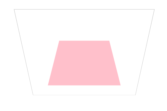
按X轴旋转物体与透视查看:
<!DOCTYPE html>
<html lang="en">
<head>
    <meta charset="UTF-8">
    <title>Document</title>

    <style>
        *{
            margin:0;
            padding:0;
            box-sizing:border-box;
        }
        body{
            width:100vw;
            height:100vh;
        }
      main{
            width:400px;
            height:400px;
            border:1px solid silver;
            position:absolute;
            top:50%;
            left:50%;
            margin-left:-200px;
            margin-top:-200px;
            transform:perspective(900px) rotateX(-45deg);
            /* 3d透视,能看到z轴的内容 */
            transform-style:preserve-3d;
        }
        div{
            width:200px;
            height:200px;
            position:absolute;
            top:50%;
            left:50%;
            margin-top:-100px;
            margin-left:-100px;
            transition:1s;

        }
        div:nth-child(1){
            background:pink;
        }
        main:hover div:nth-child(1){
            transform:perspective(900px) rotateX(90deg);
        }
    </style>
</head>
<body>
    <main>
        <div></div>
    </main>
</body>
</html>
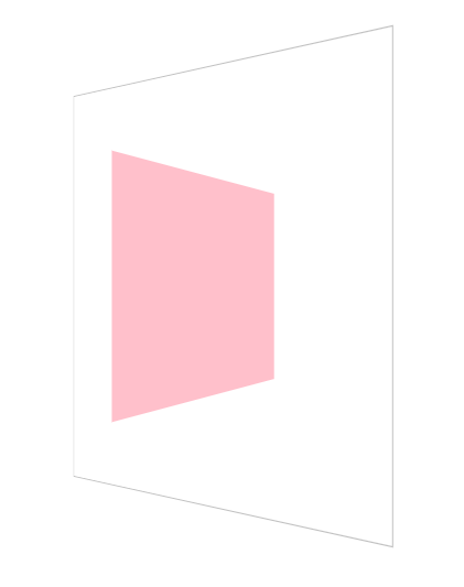
YZ轴旋转操作体验:
【y轴】
<!DOCTYPE html>
<html lang="en">
<head>
    <meta charset="UTF-8">
    <title>Document</title>

    <style>
        *{
            margin:0;
            padding:0;
            box-sizing:border-box;
        }
        body{
            width:100vw;
            height:100vh;
        }
      main{
            width:400px;
            height:400px;
            border:1px solid silver;
            position:absolute;
            top:50%;
            left:50%;
            margin-left:-200px;
            margin-top:-200px;
            transform:perspective(900px) rotateY(-45deg);
            /* 3d透视,能看到z轴的内容 */
            transform-style:preserve-3d;
        }
        div{
            width:200px;
            height:200px;
            position:absolute;
            top:50%;
            left:50%;
            margin-top:-100px;
            margin-left:-100px;
            transition:1s;

        }
        div:nth-child(1){
            background:pink;
        }
        main:hover div:nth-child(1){
            transform:perspective(900px) rotateY(90deg);
        }
    </style>
</head>
<body>
    <main>
        <div></div>
    </main>
</body>
</html>
【z轴】
<!DOCTYPE html>
<html lang="en">
<head>
    <meta charset="UTF-8">
    <title>Document</title>

    <style>
        *{
            margin:0;
            padding:0;
            box-sizing:border-box;
        }
        body{
            width:100vw;
            height:100vh;
        }
      main{
            width:400px;
            height:400px;
            border:1px solid silver;
            position:absolute;
            top:50%;
            left:50%;
            margin-left:-200px;
            margin-top:-200px;
            transform:perspective(900px) rotateY(-45deg);
            /* 3d透视,能看到z轴的内容 */
            transform-style:preserve-3d;
        }
        div{
            width:200px;
            height:200px;
            position:absolute;
            top:50%;
            left:50%;
            margin-top:-100px;
            margin-left:-100px;
            transition:1s;

        }
        div:nth-child(1){
            background:pink;
        }
        main:hover div:nth-child(1){
            transform:perspective(900px) rotateZ(90deg);
        }
    </style>
</head>
<body>
    <main>
        <div></div>
    </main>
</body>
</html>
平面2d旋转:rotate
<!DOCTYPE html>
<html lang="en">
<head>
    <meta charset="UTF-8">
    <title>Document</title>

    <style>
        *{
            margin:0;
            padding:0;
            box-sizing:border-box;
        }
        body{
            width:100vw;
            height:100vh;
        }
      main{
            width:400px;
            height:400px;
            border:1px solid silver;
            position:absolute;
            top:50%;
            left:50%;
            margin-left:-200px;
            margin-top:-200px;
            transform:perspective(900px) rotateY(-45deg);
            /* 3d透视,能看到z轴的内容 */
            transform-style:preserve-3d;
        }
        div{
            width:200px;
            height:200px;
            position:absolute;
            top:50%;
            left:50%;
            margin-top:-100px;
            margin-left:-100px;
            transition:1s;

        }
        div:nth-child(1){
            background:pink;
        }
        main:hover div:nth-child(1){
            transform:perspective(900px) rotate(390deg);
        }
    </style>
</head>
<body>
    <main>
        <div></div>
    </main>
</body>
</html>
rotate3d控制3d向量旋转:
<!DOCTYPE html>
<html lang="en">
<head>
    <meta charset="UTF-8">
    <title>Document</title>

    <style>
        *{
            margin:0;
            padding:0;
            box-sizing:border-box;
        }
        body{
            width:100vw;
            height:100vh;
        }
      main{
            width:400px;
            height:400px;
            border:1px solid silver;
            position:absolute;
            top:50%;
            left:50%;
            margin-left:-200px;
            margin-top:-200px;
            transform:perspective(900px) rotateY(-45deg);
            /* 3d透视,能看到z轴的内容 */
            transform-style:preserve-3d;
        }
        div{
            width:200px;
            height:200px;
            position:absolute;
            top:50%;
            left:50%;
            margin-top:-100px;
            margin-left:-100px;
            transition:1s;

        }
        div:nth-child(1){
            background:pink;
        }
        main:hover div:nth-child(1){
            /* x轴旋转 */
            transform:perspective(900px) rotate3d(1,0,0,90deg);
            /* y轴旋转 */
            transform:perspective(900px) rotate3d(0,1,0,90deg);
            /* z轴旋转 */
            transform:perspective(900px) rotate3d(0,0,1,90deg);
            /* 对角线旋转 */
            transform:perspective(900px) rotate3d(1,1,0,90deg);
            transform:perspective(900px) rotate3d(1,0,1,90deg);
        }
    </style>
</head>
<body>
    <main>
        <div></div>
    </main>
</body>
</html>
参数叠加与顺序对变形结果的影响:
参数不会叠加,后面的会覆盖掉前面的 ;
顺序不同,变形结果也不同;
标签:none outline device out img 方法 ace nbsp cursor
原文地址:https://www.cnblogs.com/chenyingying0/p/13954565.html