标签:using led list padding cond loading use submit update
Exp: If you want to style a header.. you can use flexbox, since it shows in X axis.
    <div class="navbar display-flex">
      <span class="h3">?? NoteTaker</span>
      <nav>
        ...
      </nav>
    </div>

The ‘span‘ & ‘nav‘ are showing in a row.

    <div class="navbar display-flex display-flex--wrap">
      <span class="h3">?? NoteTaker</span>
      <nav>
        <ul class="list-unstyled display-grid display-grid--columns">
          <li>
            <a href="javascript:;" class="button button--small">Pre-Order</a>
          </li>
          <li><a href="javascript:;">About</a></li>
          <li><a href="javascript:;">Contact</a></li>
        </ul>
      </nav>
    </div>
.display-grid {
  display: grid;
  grid-gap: 16px;

  &--columns {
    grid-auto-flow: column;
  }
}

    <div class="navbar display-flex display-flex--wrap">
      <span class="h3">?? NoteTaker</span>
      <nav>
        <ul class="list-unstyled display-grid display-grid--columns">
          <li>
            <a href="javascript:;" class="button button--small">Pre-Order</a>
          </li>
          <li><a href="javascript:;">About</a></li>
          <li><a href="javascript:;">Contact</a></li>
        </ul>
      </nav>
    </div>
.display-flex {
  display: flex;

  &--wrap {
    flex-wrap: wrap;
  }
}
width > 60rem:
width < 60rem:
So only apply ‘grid-auto-flow: column‘ when the screen size > 60rem
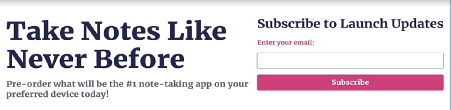
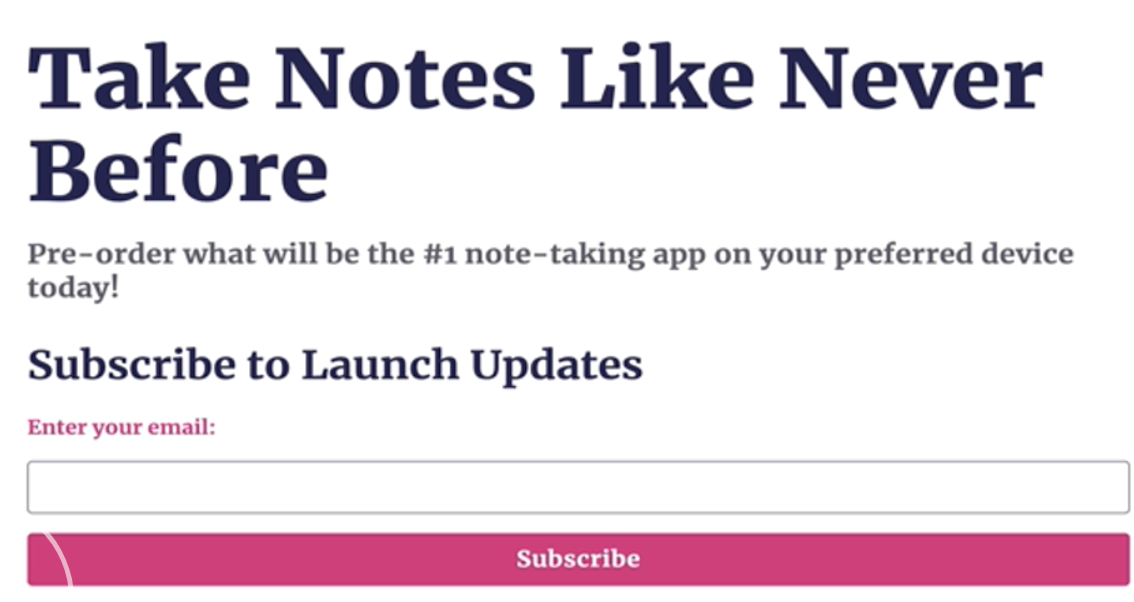
    <header class="my-lg display-grid container mx-auto alignitems--center">
      <div>
        <h1 class="mb-none">Take Notes Like Never Before</h1>
        <p class="lead mt-sm mb-none">
          Pre-order what will be the #1 note-taking app on your preferred device
          today!
        </p>
      </div>
      <div>
        <h2 class="h3">Subscribe to Launch Updates</h2>
        <form action="/" class="display-grid">
          <label for="email1">Enter your email:</label>
          <input id="email1" name="email" type="email" />
          <button class="button button--secondary" type="submit">
            Subscribe
          </button>
        </form>
      </div>
    </header>
// Components
.navbar {
  justify-content: space-between;
  padding: $unit * 2 $unit * 3;
}

header.display-grid {
  grid-gap: $unit * 4;

  @media (min-width: 60rem) {
    grid-auto-flow: column;
  }
}

// Display
.display-flex {
  display: flex;

  &--wrap {
    flex-wrap: wrap;
  }
}

.display-grid {
  display: grid;
  grid-gap: $unit * 2;

  &--columns {
    grid-auto-flow: column;
  }
}

.alignitems--center {
  align-items: center;
}

.container {
  max-width: 80rem;
  padding-left: $unit * 3;
  padding-right: $unit * 3;
}
4. When you found yourself need to use multi media query to do reposive layout, use Grid:
 .
. 
grid-template-columns: repeat(auto-fit, minmax(30ch, 1fr));
Once the element size is smaller than 30ch, it will move to a new row.
[CSS] Choose between Grid layout and flexbox
标签:using led list padding cond loading use submit update
原文地址:https://www.cnblogs.com/Answer1215/p/14500610.html