标签:
column的布局形式还没有使用过,后续的bug和解决方案有待检验。
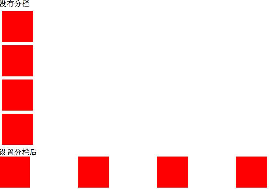
column
column-count:number; 设置内容分为多少栏显示
column-width:长度单位;设置每一栏的宽度而不设定元素的宽度
column-gap:长度单位;设置多栏之间的间隔距离
column-rule:宽度,颜色;在栏与栏之间增加一条间隔线。类似border.
column-span:all/none;设置是否跨栏显示

.txt{width:1000px;text-indent:2em;padding:0;margin:0; }
.txt2{-webkit-column-count:3; -webkit-column-gap:20px; -webkit-column-rule:2px dotted #ccc;}
<!DOCTYPE html>
<html lang="en">
<head>
	<meta charset="UTF-8">
	<title>CSS3 mask</title>
	<style>
	*{margin:0;padding: 0;overflow: hidden;}
	.box{width: 100px;height: 100px;background-color: red;display: block;}
	.txt{width:1000px;}
	.txt .box{margin:10px;}
	.txt2{-webkit-column-count:4;}
	.txt2 .box{margin:0;}

	</style>
</head>
<body>
 <h2>没有分栏</h2>
 <div class="txt">
  	<div class="box"></div>
	<div class="box"></div>
	<div class="box"></div>
	<div class="box"></div>
</div>

<h2>设置分栏后</h2>
 <div class="txt txt2">
  	<div class="box"></div>
	<div class="box"></div>
	<div class="box"></div>
	<div class="box"></div>
</div>

</body>
</html>
标签:
原文地址:http://www.cnblogs.com/dtdxrk/p/4530157.html