标签:
index
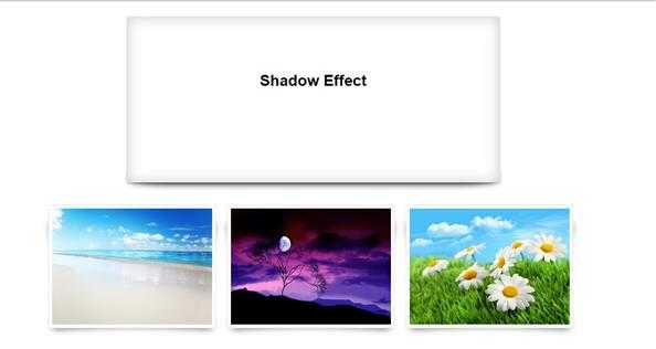
<!DOCTYPE html>
<html>
<head>
<meta charset=utf-8 />
<title>box-shadow</title>
<link rel="stylesheet" href="css/style.css">
</head>
<body>
  <div class="wrap effect">
     <h3>Shadow Effect</h3>
  </div>
  <ul class="box">
      <li><img src="images/photo1.jpg"/></li>
      <li><img src="images/photo2.jpg"/></li>
      <li><img src="images/photo3.jpg"/></li>
  </ul>
</body>
</html>
css
body{
    font-family: Arial;
    font-size: 24px;
}
/*位置样式*/
.wrap h3{
    text-align: center;
    position: relative;
    top:100px;
}
.wrap{
    width: 50%;
    height: 300px;
    background: #FFF;
    margin:20px auto;
}
/*阴影样式 box-shadow: h-shadow v-shadow blur spread color inset;*/
/*边框阴影*/
.effect{
    position: relative;
    box-shadow: 0 1px 4px rgba(0, 0, 0, 0.3), 0 0 40px rgba(0, 0, 0, 0.2) inset;
}
/*下边的曲线阴影*/
.effect:before,.effect:after{
    content:"";
    position: absolute;
    z-index: -1;
    left: 6px;
    right:6px;
    bottom: 0;
    top:95%;
    background: red;
    border-radius: 100px / 10px;
    box-shadow: 0 0 20px rgba(0, 0, 0, 0.8);
}

/*照片*/
.box{
    width: 980px;
    height: auto;
    margin:20px auto;
    padding: 0;
    clear: both;
    overflow: hidden;
}
.box li img {
    width: 290px;
    height: 210px;
    padding: 5px;
}
ul.box li{
    background: #fff;
    list-style: none;
    width: 300px;
    height: 220px;
    margin:20px 10px;
    line-height: 220px;
    border: 2px solid #efefef;
    position: relative;
    float: left;
    padding: 0;
    text-align: center;
}

/*照片阴影*/
ul.box li:before{
    content:"";
    position: absolute;
    z-index: -1;
    width: 85%;
    height: 80%;
    left: 20px;
    bottom: 5px;
    background: red;
    transform: skew(14deg) rotate(3deg) ;
    box-shadow: 0 0 20px rgba(0, 0, 0, 0.8);
}
ul.box li:after{
    content:"";
    position: absolute;
    z-index: -1;
    width: 85%;
    height: 80%;
    right: 20px;
    bottom: 5px;
    background: red;
    transform: skew(-14deg) rotate(-3deg) ;
    box-shadow: 0 0 20px rgba(0, 0, 0, 0.8);
}
标签:
原文地址:http://www.cnblogs.com/xuan-0107/p/4546403.html