标签:
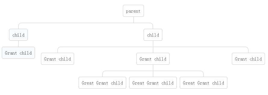
直接上图(原网址),自己CSS3练习demo。
【demo】
【HTML】
<div class="tree">
        <ul>
            <li>
                <a href="#">parent</a>
                <ul>
                    <li>
                        <a href="#">child</a>
                        <ul>
                            <li>
                                <a href="#">Grant child</a>
                            </li>
                        </ul>
                    </li>
                    <li>
                        <a href="#">child</a>
                        <ul>
                            <li><a href="#">Grant child</a></li>
                            <li>
                                <a href="#">Grant child</a>
                                <ul>
                                    <li><a href="#">Great Grant child</a></li>
                                    <li><a href="#">Great Grant child</a></li>
                                    <li><a href="#">Great Grant child</a></li>
                                </ul>
                            </li>
                            <li><a href="#">Grant child</a></li>
                        </ul>
                    </li>
                </ul>
            </li>
        </ul>
    </div>
【CSS3】
*{
margin:0;
padding:0;
}
.tree ul{
padding-top:20px;
position: relative;
webkit-transition: all 0.5s;
-moz-transition: all 0.5s;
transition:all .3s;
}
.tree li{
float:left;
list-style: none;
text-align: center;
position: relative;
padding:20px 5px 0 5px;
webkit-transition: all 0.5s;
-moz-transition: all 0.5s;
transition:all .3s;
}
/*利用::before,::after作分支线*/
.tree li::before,.tree li::after{
content:"";
position: absolute;
top:0;
right:50%;
width:50%;
height:20px;
border-top:1px solid #ccc;
}
.tree li:after{
right:auto;
left:50%;
border-left:1px solid #ccc;
}
.tree li:first-child::before,.tree li:last-child::after{
border:0 none;
}
.tree li:last-child::before{
border-right:1px solid #ccc;
-webkit-border-radius: 0 10px 0 0;
-moz-border-radius: 0 10px 0 0;
border-radius: 0 10px 0 0;
}
.tree li:first-child::after{
-webkit-border-radius: 10px 0 0 0;
-moz-border-radius: 10px 0 0 0;
border-radius: 10px 0 0 0;
}
/*删除仅只有一个分支的分支线*/
.tree li:only-child::before,.tree li:only-child::after{
border:none;
}
.tree li:only-child{
padding-top:0;
}
/*添加仅只有一个分支的下分支线*/
.tree ul ul::before{
content:"";
position: absolute;
top:0;
left:50%;
border-left:1px solid #ccc;
width:0;
height:20px;
}
.tree a{
display: inline-block;
border:1px solid #ccc;
padding: 5px 10px;
color:#666;
text-decoration: none;
padding:10px;
-webkit-border-radius: 5px;
-moz-border-radius: 5px;
border-radius: 5px;
webkit-transition: all 0.5s;
-moz-transition: all 0.5s;
transition:all .3s;
}
/*添加选中状态*/
.tree li a:hover,.tree li a:hover+ul li a{
background-color: #c8e4f8;
color: #000;
border: 1px solid #94a0b4;
}
.tree li a:hover+ul li:after,.tree li a:hover+ul li:before,.tree li a:hover+ul::before,.tree li a:hover+ul ul::before{
border-color: #94a0b4;
}
CSS3 垂直树状图——运用 :before 和 :after
标签:
原文地址:http://www.cnblogs.com/hypon-liu/p/4665404.html