标签:
根据块状元素和行内元素的特性来区分
块状元素:主要特点是能占据一行,高度行高内边距外边距能控制,能容纳内联元素和其他块状元素
行内元素:不能独占一行,随内容大小而定。无法设置宽高,设置的外边距只能在左右上起作用,上下没有作用
所以要根据元素的特性做的居中
父元素是块状元素,子元素是行内元素
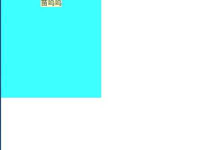
水平居中:
给父元素添加text-align:center
---------------------举一个栗子---------------------
|
1
2
3
4
5
6
7
8
9
10
11
12
13
|
.parent{ width: 200px; height: 200px; text-align: center; background: #3cffff;}.child{ background: #f9ffc3;}<div class="parent"> <span class="child" >苗呜呜</span></div> |
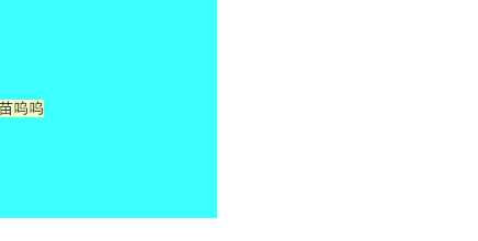
垂直居中:
子元素上添加line-height:父元素的高度
---------------------举一个栗子---------------------
|
1
2
3
4
5
6
7
8
9
10
11
|
.parent{ width: 200px; height: 200px; } .child{ line-height: 200px; } <div class="parent"> <span class="child" >苗呜呜</span> </div> |
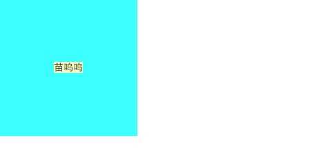
以上两个方法合在一起就是行内元素的垂直居中了
---------------------举一个栗子---------------------
|
1
2
3
4
5
6
7
8
9
10
11
12
13
|
.parent{ width: 200px; height: 200px; background: #3cffff; text-align:center;}.child{ line-height: 200px; background: #f9ffc3;}<div class="parent"> <span class="child" >苗呜呜</span></div> |
如果是子元素是img,img元素比较特殊,属于替换内联元素, line-height对img没有效果,无法实现垂直居中
---------------------举一个栗子---------------------
|
1
2
3
4
5
6
7
8
9
10
11
12
13
14
15
16
17
|
.parent{ width:1000px; height: 600px; background: #3cffff; text-align: center; }.child{ vertical-align: middle;}.child2{ height: 100%; width: 0;}<div class="parent"> <img class="child2"></div> |
css为child2的img是起到辅助作用,不要写src,否则会多一个边框,其实使用其他行内元素也行,比如span,只要把该元素的高度设置为父元素一样的高度就行了。vertical-align这个属性的特点,它是相对兄弟级行高(line-height)来定位,它只对行内样式有效。下面设置一个img只是撑开父元素的行高。
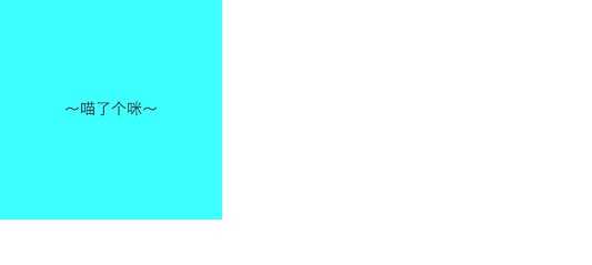
关于内联元素td的垂直水平居中
---------------------举一个栗子---------------------
|
1
2
3
4
5
6
7
8
9
10
11
|
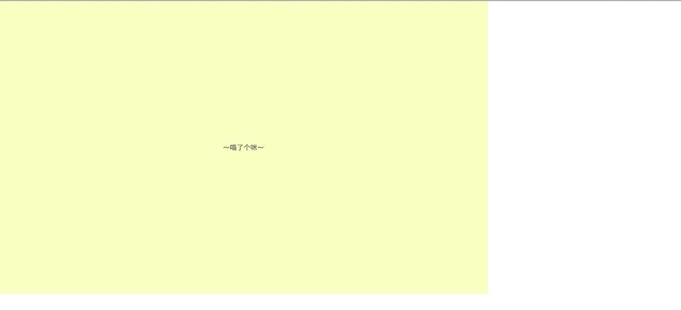
.parent{ width:200px; height:200px; text-align: center; background: #3cffff;}<table class="parent"> <tr> <td>~喵了个咪~</td> </tr></table> |
用table-cell ,文字和图片居中,但是background是铺满整个父元素,而不是居中
---------------------举一个栗子---------------------
|
1
2
3
4
5
6
7
8
9
10
11
12
13
14
15
16
17
|
.parent { width: 1000px; height: 600px; display: table; text-align: center; background: #3cffff;}.child { display: table-cell; vertical-align: middle; margin: 0 auto; background: #f9ffc3;}<div class="parent"> <div class="child">~喵了个咪~</div></div> |
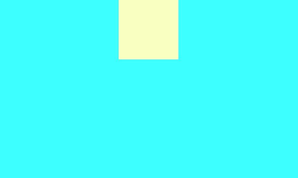
父元素是块状元素,内元素是块状元素
1.水平居中
---------------------举一个栗子---------------------
|
1
2
3
4
5
6
7
8
9
10
11
12
13
14
15
|
.parent{width:1000px;height:600px;position:relative;background: #3cffff;}.child{width:200px;height:200px;margin: 0 auto;background: #f9ffc3;}<div class="parent"> <div class="child"></div></div> |
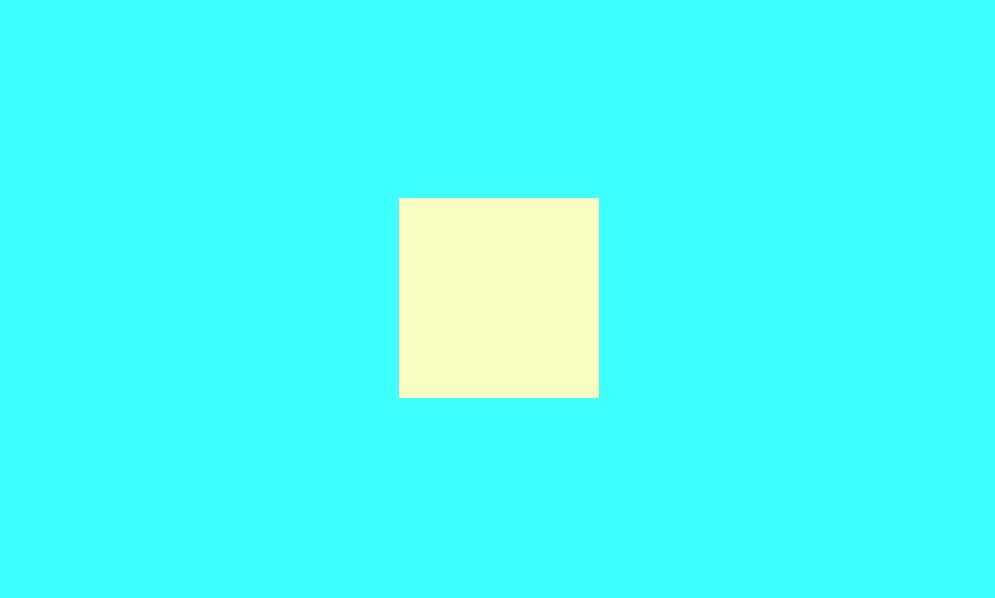
2.如果要让上面的垂直水平居中的话,要多加一个position:absolute,left:0;right:0;top:0;bottom:0;
---------------------举一个栗子---------------------
|
1
2
3
4
5
6
7
8
9
10
11
12
13
14
15
16
17
18
19
20
|
.parent{ width:1000px; height:600px; position:relative; background: #3cffff;}.child{ width:200px; height:200px; margin: auto; position:absolute; left:0; right:0; top:0; bottom:0; background: #f9ffc3;}<div class="parent"> <div class="child"></div></div> |
3.借助其他元素实现垂直水平居中
记得把辅助元素放在子元素前面哈。
---------------------举一个栗子---------------------
|
1
2
3
4
5
6
7
8
9
10
11
12
13
14
15
16
17
18
|
.parent{ position: relative; width:1000px; height:600px;}.child-2{ height: 50%; margin-bottom: -100px; /*是child的(padding+height)/2*/}.child{ width:200px; height:200px; margin: auto;}<div class="parent "> <div class="child-2"></div> <div class=" child"></div></div> |
4.垂直居中 行内元素 块状元素都可以
---------------------举一个栗子---------------------
|
1
2
3
4
5
6
7
8
9
10
11
12
13
14
15
16
17
18
19
20
21
|
.parent{ display: block; position: relative; width:1000px; height:600px; background: #3cffff;}.parent:after{ display: inline-block; vertical-align: middle; content: ‘‘; height: 100%; background: #f9ffc3;}.child{ display: inline-block; vertical-align: middle;}<div class="parent"> <div class="child"></div></div> |
5.弹性盒式布局 ie11以上才支持 只针对父元素做了设置,子元素不需要设置。
---------------------举一个栗子---------------------
|
1
2
3
4
5
6
7
8
9
10
11
12
13
14
15
16
17
18
19
20
21
22
|
.parent{ width:1000px; height:1000px; display: -webkit-box; display: -moz-box; display: -ms-flexbox; display: -webkit-flex; display: flex; -webkit-align-items:center; align-items:center; -webkit-justify-content:center; /*适用于父元素*/ justify-content:center; background: #3cffff;}.child{ width:200px; height:200px; background: #f9ffc3;}<div class="parent"> <div class="child"></div></div> |
6.使用margin-top;
---------------------举一个栗子---------------------
|
1
2
3
4
5
6
7
8
9
10
11
12
13
14
15
16
17
18
19
20
|
.parent{ position: relative; width:1000px; height:600px; background: #3cffff;}.child{ width:200px; height:200px; position: absolute; top:50%; left: 0; right: 0; margin: auto; margin-top: -100px; background: #f9ffc3;}<div class="parent"> <div class="child"></div></div> |
7.根据上面还有一种传统的大家都通用的办法,这个办法具有兼容性,兼容到ie6
父元素的position和子元素的position不能相同,要么父元素为absolute,子元素为relative,要么父元素为relative,子元素为absolute;
---------------------举一个栗子---------------------
|
1
2
3
4
5
6
7
8
9
10
11
12
13
14
15
16
17
18
19
20
|
.parent { width: 1000px; height: 600px; background: #c3ffff; position: relative; /*必须加上,否则child不能居中*/} .child { width: 200px; height: 200px; margin: -100px 0 0 -100px; position: absolute; left: 50%; top: 50%; background: #f9ffc3;}<div class="parent"> <div class="child"></div></div> |
8.用transform,只设置子元素
---------------------举一个栗子---------------------
|
1
2
3
4
5
6
7
8
9
10
11
12
13
14
15
16
17
18
|
.parent{ width:1000px; height:600px; background: #3cffff;}.child{ width:200px; height:200px; position:relative; top: 50%; left: 50%; transform:translate(-50%,-50%); -webkit-transform:translate(-50%,-50%); background: #f9ffc3;}<div class="parent"> <div class="child"></div></div> |
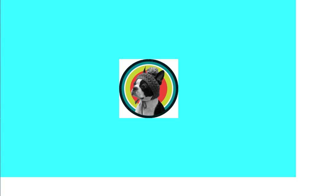
9.如果居中是一张图片的话,其实用background也就可以了
---------------------举一个栗子---------------------
|
1
2
3
4
5
6
|
.parent{ background: url(http://f5.topitme.com/5/93/a8/115632420139ea8935o.jpg) no-repeat center center #3cffff; width:1000px; height:600px;}<div class=" parent"></div> |
 就是这样,我已知的居中方法就这些,如果有人还有更好的方法或者我上面有错的地方及时提出哈~
标签:
原文地址:http://www.cnblogs.com/yinglin/p/5129763.html