标签:
什么是宽度自适应布局呢?
就是当浏览器窗口大小改变时,浏览器里的元素宽度也随之改变,从而达到自适应布局。
常见的宽度自适应布局有:
1、 两列:左边宽度不变,右边宽度自适应
2、 三列:左右两边宽度不变,中间部分自适应
3、 三列:左右两边宽度自适应,中间部分不变
利用div+float+margin,已在随笔‘float剖析’中讲解,具体代码和效果图见下:

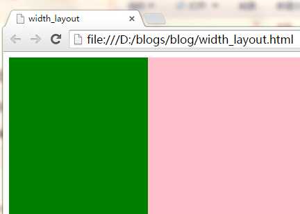
<!DOCTYPE html>
    <head>
        <title>width_layout</title>
        <meta http-equiv="Content-Type" content="text/html; charset=gb2312"/>
        <style type="text/css">
            .content {
                min-width:300px;
            }
            .div1 {
                width:200px;
                height:300px;
                background:green;
                float:left;
            }
            .div2 {
                height:300px;
                background:pink;
                margin-left:200px;
            }
        </style>
    </head>
    <body>

        <div class="content">
            <div class="div1"></div>
            <div class="div2"></div>
        </div>

    </body>
</html>
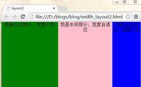
思路:将左右两列分别设置为左浮动和右浮动,中间的列宽度不管,将它的margin-left和margin-right设置为与左右两列的固定宽度一致。
具体代码和效果图见下:
<!DOCTYPE html>
    <head>
        <title>layout2</title>
        <meta http-equiv="Content-Type" content="text/html; charset=gb2312"/>
        <style>
            * {
                margin:0;
                padding:0;
            }
            .main {
                height:300px;
                width:100%;
                min-width:400px;
            }
            .main_left {
                height:300px;
                width:200px;
                float:left;
                background-color:green;
                text-align:center;
            }
            .main_center {
                height:300px;
                margin-left:200px;
                margin-right:100px;
                text-align:center;
                background-color:pink;
            }
            .main_right {
                height:300px;
                width:100px;
                float:right;
                text-align:center;
                background-color:blue;
            }
        </style>
    </head>
    <body>
        <div class="main">
            <div class="main_left">我是左边部分,宽度不变</div>
            <div class="main_right">我是右边部分,宽度不变</div>
            <div class="main_center">
                我是中间部分,宽度自适应
            </div>
        </div>
    </body>
</html>
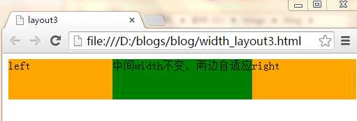
思路:倘若左右两列宽度一样,左右两列将其宽度各设置为父元素的50%,然后再将左右两列的margin-left设置为中间列固定宽度的一半,然后将这三列都左浮动,就ok了。
具体代码及效果见下:
<!DOCTYPE html>
    <head>
        <title>layout3</title>
        <meta http-equiv="Content-Type" content="text/html; charset=gb2312"/>
        <style>
            body {
                min-width:500px;
            }
            #left,
            #right {
                float: left;
                margin: 0 0 0 -101px;
                width: 50%;
                height:58px;
                *width: 49.9%;
            }

            #main {
                width: 200px;
                height:58px;
                float: left;
                background: green;
            }
            .inner {
                height: 100%;
            }

            #left .inner,
            #right .inner {
                margin: 0 0 0 101px;
                background: orange;
            }
        </style>
    </head>
    <body>
        <div id="left">
            <div class="inner">left</div>
        </div>
        <div id="main">
            <div class="inner">中间width不变,两边自适应</div>
        </div>
        <div id="right">
            <div class="inner">right</div>
        </div>
    </body>
</html>
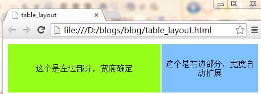
由于table自带一些特性,所以实现以上三种布局,比较容易。
在这里用到的table特性就是文字自动垂直居中,当不设置td的宽度width时,浏览器自动渲染。
<!DOCTYPE html>
    <head>
        <meta http-equiv="Content-Type" content="text/html; charset=gb2312"/>
        <title>table_layout</title>
        <style>
            .m_table {
                width:100%;
                height:100px;
                text-align:center;
            }
            .left_td {
                width:300px;
                background-color:#98FF1A;
            }
            .right_td {

                background-color:#7CC0FF;
            }
        </style>
    </head>
    <body>
        <table class="m_table">
            <tr>
                <td class="left_td">这个是左边部分,宽度确定</td>
                <td class="right_td">这个是右边部分,宽度自动扩展</td>
            </tr>
        </table>
    </body>
</html>
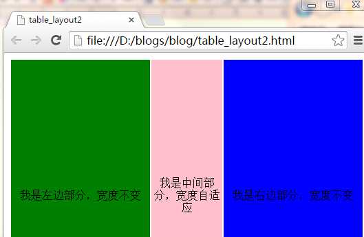
<!DOCTYPE html>
    <head>
        <meta http-equiv="Content-Type" content="text/html; charset=gb2312"/>
        <title>table_layout2</title>
        <style>
        .m_table {
            width:100%;
            height:400px;
            text-align:center;
        }
        .left_td {
            width:200px;
            height:300px;
            min-width:200px;
            background-color:green;
        }
        .center_td {
            height:300px;
            background-color:pink;
        }
        .right_td {
            width:200px;
            height:300px;
            min-width:200px;
            background-color:blue;
        }
    </style>
    </head>
    <body>
        <table class="m_table">
            <tr>
                <td class="left_td">我是左边部分,宽度不变</td>
                <td class="center_td">我是中间部分,宽度自适应</td>
                <td class="right_td">我是右边部分,宽度不变</td>
            </tr>
        </table>
    </body>
</html>
<!DOCTYPE html>
    <head>
        <meta http-equiv="Content-Type" content="text/html; charset=gb2312"/>
        <title>table_layout3</title>
        <style>
        .m_table {
            width:100%;
            min-width:500px;
            height:58px;
            text-align:center;
        }
        .left_td {
            height:58px;
            background-color:orange;
        }
        .center_td {
            height:58px;
            width:200px;
            background-color:green;
        }
        .right_td {
            height:58px;
            background-color:orange;
        }
        </style>
    </head>
    <body>
        <table class="m_table">
            <tr>
                <td class="left_td">我是左边部分,宽度自适应</td>
                <td class="center_td">我是中间部分,宽度不变</td>
                <td class="right_td">我是右边部分,宽度自适应</td>
            </tr>
        </table>
    </body>
</html>

对于这两个概念的区别以及优劣势,网站建设的设计师和SEO者已经是再熟悉不过了,众所周知DIV+CSS的优势,也都清楚table布局已经趋于淘汰,现在极少数人会使用table去建网站了。对于二者的区别,网上早有大量的文章,在下就列举几点谈谈。
1、 table结构的网站是按照表格一格一格的打开的速度很慢;DIV+CSS结构的网站打开速度快。
2、 div+css的网站适合百度蜘蛛爬行。可以这么说,百度蜘蛛喜欢div+css结构的站,不喜欢table结构的站,因为后者爬起来太费劲。
3、 table结构的站,架构过于单调,一眼看去就显得方方框框的感觉,如果想实现圆润或者流线的效果,必须绘制大量的边框图片。而div+css的站,样式及其丰富,可以利用结构做出丰富的效果。
4、 table结构的站,页面样式都在页面代码里面,不但代码冗余,可读性和再次开发性差,而且修改起来麻烦;Div+css的结构,结构与样式分离,可读性和二次修改都极其方便。
标签:
原文地址:http://www.cnblogs.com/giggle/p/5199354.html
